 flowmance
Vivid Design System


Vivid is a creative agency template that behaves like a gallery. It opens on a black screen with one sentence set huge in white, then cuts to white pages where full-height project images run edge to edge in a sideways strip. The type is a single grotesk, Switzer, at weight 500 and very large sizes; the interface is black, white and one muted taupe. The colour comes entirely from the work: surreal, saturated renders (a lilac sky with a whale over a vintage car, a teal tower lit by headlights, sun-yellow product shots).
Four signatures make it recognisable:
- The manifesto hero. Black, 100vh, a grey quote mark, then Every great design begins with an even better story. in 110px white Switzer 500 over three lines, and an attribution under a 60px rule: Jokubas Malone, in white and Vivid Founder in white at about 50%.
- The project strip. Full-height (about 736px) project images placed side by side with no gaps and no corners, sliding sideways as you scroll, each carrying its name in a 120px white looping title (Pendi pulvinar).
- Outlined uppercase pills. Buttons are 2px outlined pills, 56px tall, with 13px bold uppercase labels tracked +1px (VIEW ON WEBFLOW, HIRE US TODAY). They fill solid on hover.
- Two-column link nav. The vivid wordmark on the left, six links stacked in two short columns beside it (About Blog Contact / Pricing Style Guide Licensing), and the outlined pill on the far right.
Colors
Surfaces
#FFFFFFPage background
#FFFFFFSame as the canvas: Vivid has no grey panel step (--white-smoke #ECECEC is defined but not used)
#000000Hero and footer
#FFFFFFContact inputs; placeholder #535353
#DDDDDDWith field: Contact inputs; placeholder #535353
#333333Text on field
Ink
#222222Text on primary
#FFFFFFText on primary-hover
#000000Section titles and service titles
#222222Nav links, button borders and labels (--black-2)
#757575Paragraphs and list items (--grey-2, about 4.6:1)
#FFFFFFText on accent
#FFFFFFText on inverse-canvas
#FFFFFF · 57%Footer links (60% for footer text links)
#FFFFFF · 50%The role in the hero attribution
#222222#FFFFFFAction
#FFFFFFThe main button: an outlined pill whose fill is the canvas
#222222The same button on hover, filled solid
#AFA69BThe taupe partner band and its white headline (--dark-grey); also the outline icons
#EEF0E92px outlines on black, the subscribe pill, footer small titles (--floral-white)
Lines & effects
#C4C5B9Sage-grey fill behind a project image (--silver); never carries text
#AFA69B1px taupe borders and icon strokes
#2222222px button outlines on white
#121212The subscribe input on the black footer
#EEF0E92px outlines on black, the subscribe pill, footer small titles (--floral-white)
Typography
Switzer · display-marquee
The quick brown fox jumpsLooping CTA line Have a project in mind? (.text-rotator-2). 140px · 500 · 1.4 · 1px
Switzer · headline-lg
The quick brown fox jumpsSection titles Expertise, Insights, the partner band line (.title-2). 80px · 500 · 1.1
Switzer · title-lg
The quick brown fox jumpsFooter small titles in #EEF0E9. 22px · 500 · 1.2
Switzer · body-lg
The quick brown fox jumpsParagraphs (base p) in ink-muted; footer links. 19px · 400 · 1.3
Switzer · label-cta
The quick brown fox jumpsText inside the 200px circle button. 18px · 500 · 1.3
Switzer · caption
The quick brown fox jumpsBase text, inputs. 14px · 700 · 1.43
Spacing & shape
| Purpose | Value |
|---|---|
| Container | max 1200px, centred, with 5% side padding (content starts about 120px from the edge at 1440px) |
| Section rhythm | .section is 120px top and bottom (80px at ≤991px, 60px at ≤479px); the closing CTA section (.section.for-cta) pads 60px top and 40px bottom, 60px bottom at ≤767px (a .section-cta class with 150px exists in the CSS but is not what the home page renders) |
| Breakpoints | 991px, 767px and 479px |
Spacing scale
| Token | Value | Preview |
|---|---|---|
xs | 6px | |
sm | 16px | |
md | 30px | |
lg | 50px | |
xl | 60px | |
2xl | 100px |
Layout spacing
| Token | Value | Preview |
|---|---|---|
footer-bottom | 20px | |
nav-top | 50px | |
column-gap | 50px | |
section-cta | 60px | |
section | 120px | |
hero-top | 130px | |
footer-top | 140px |
Border radius
Motion
| Scroll reveal | opacity 0 → 1 over 1000ms outQuart with a move to y 0 from 40–100px, on scroll into view |
| Project strip | Images move sideways as the section scrolls through the viewport |
| Looping titles | .text-rotator lines slide horizontally while in view |
| Image hover | A filter change on project images, 300ms ease in and 500ms out |
| Size change | Width or height changes of 300ms ease and 500ms outExpo on hover |
| Circle CTA | Follows the cursor (mouse-move) and scales 1 → 1.3 over 500ms |
| Nav hide and show | y 0 → −100px on scroll down, back on scroll up, 500ms |
| Button and link hover | Colour fill or opacity, 200–300ms |
| Text roll | y 40px → 0, 300–400ms outExpo |
Do’s and don’ts
- Open with a black #000000 hero and one statement in Switzer 500 at 110px, line height 1.05.
- Use weight 500 for everything 40px and up; keep labels 600–700.
- Make the main button a 2px outlined pill (100px radius, 56px tall) with 13px bold uppercase text tracked +1px, filling #222222 on hover.
- Run project images edge to edge with square corners and no gaps.
- Set paragraphs in #757575 at 19px weight 400, line height 1.3.
- Keep the UI black, white and taupe #AFA69B and let the images carry colour.
- Use the unused variable colours (#FF5454, #74D5F5, #5482FF) or the neon #39FF14 in the UI.
- Add shadows, gradients or rounded image corners.
- Bold large headlines (600+ above 40px).
- Put small white text on the taupe #AFA69B band; white is only about 2.4:1 there, so keep it to the 80px headline.
- Fill the main button by default; its resting state is outlined.
- Use more than one typeface.
Example prompt
Any page in the Vivid style
More design systems like this
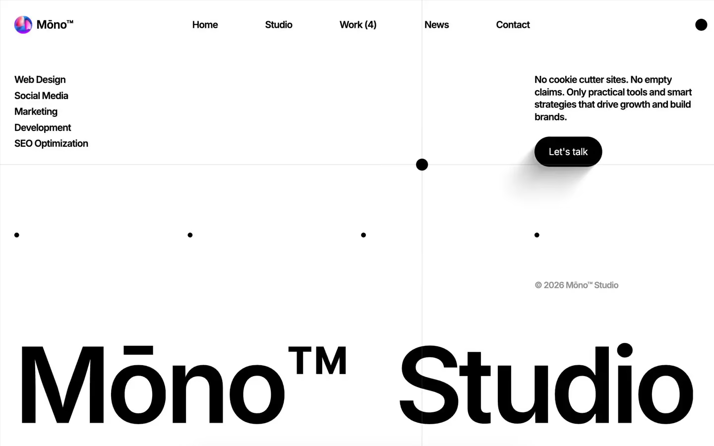
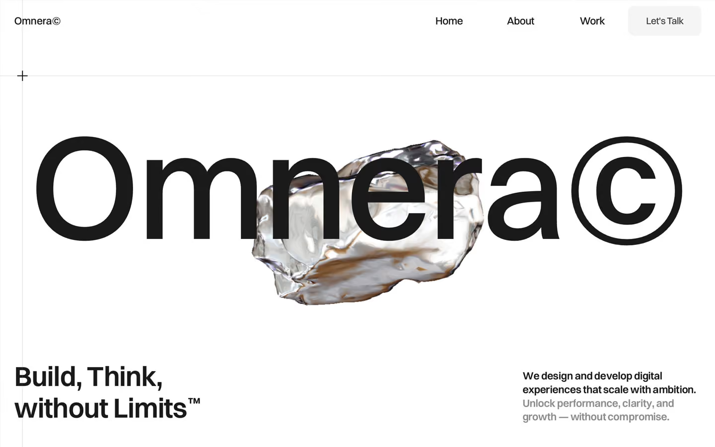
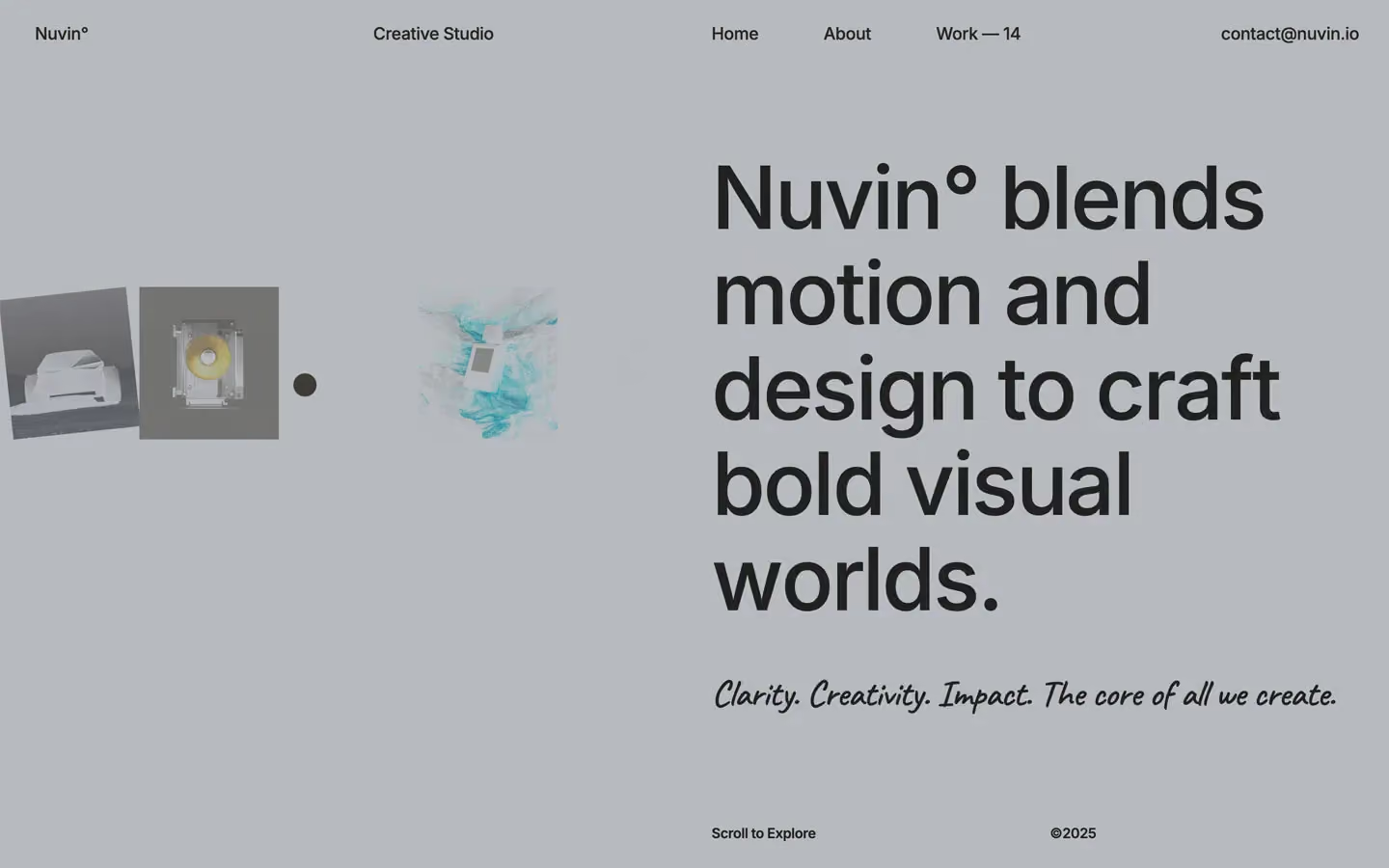
Agency design systems, the same colors first.

Bring any of them to your AI tool
All Access unlocks all 398 design systems, ready for Claude, ChatGPT, Gemini, Cursor, v0 and Lovable, plus 400+ templates on all 5 platforms.
Get All AccessUpgrade to All AccessHow to use the Vivid design system
Pick a file to see what it’s for and where it goes.
What it is
The whole design system in one markdown file, written for AI: every color, type style, spacing value, component and motion rule, plus do's, don'ts and a ready prompt.
Best for
Claude, ChatGPT, Gemini, Cursor and v0, or any other AI tool that builds pages or code.
How to use it
- Put
DESIGN.mdin your project and mention it in your request, or save it as.cursor/rules/vivid.mdc - For the rule file, start it with a front-matter block that sets
alwaysApply: true, so every chat uses it - Ask: “Build a pricing page using DESIGN.md.” Cursor follows the colors, fonts, spacing and rules
- Put
DESIGN.mdin the project root - Add one line to
CLAUDE.md: “Follow DESIGN.md for all UI.” - Ask for any page or component; Claude reads the file first
- Attach
DESIGN.mdto the chat (or paste it in) - Ask: “Build a landing page in this design system.”
- Keep the file in the chat or project knowledge, so follow-up pages stay on style
What it is
Every token as data, in the W3C Design Tokens format: colors with their roles, type styles, radius, spacing, and component tokens that point at them.
Best for
Figma (Tokens Studio), Style Dictionary and other design-token tools, and build scripts.
How to use it
- In Figma, open Tokens Studio, choose Import, and pick
tokens.json - Or point Style Dictionary’s
sourceat it to generate tokens for any platform - In code, import it like any JSON file
What it is
A Tailwind CSS v4 theme: every color, font, type style, radius and spacing value becomes a Tailwind utility, like bg-canvas, text-headline-lg or rounded-md.
Best for
Tailwind v4 projects, and AI builders that write Tailwind (v0, Lovable, Bolt).
How to use it
- Save
theme.cssnext to your main CSS file - Import it after Tailwind:
@import "tailwindcss"; @import "./theme.css"; - Use the classes:
bg-canvas text-ink rounded-md p-lg
What it is
The same tokens as plain CSS variables on :root. Component values point at the color variables, so changing one color updates everything that uses it.
Best for
Any website: plain CSS, Webflow custom code, Framer, WordPress.
How to use it
- Add it to your stylesheet, or in Webflow paste it into Site settings → Custom code inside a
<style>tag - Use the variables anywhere:
color: var(--color-ink) - Change a token once and every place that uses it follows