 flowmance
Nuvin Design System
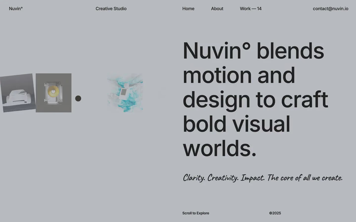
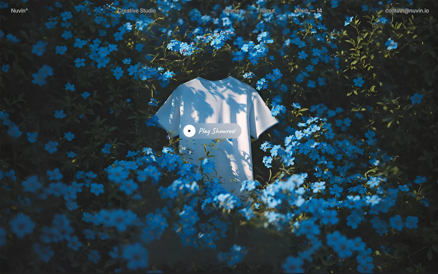
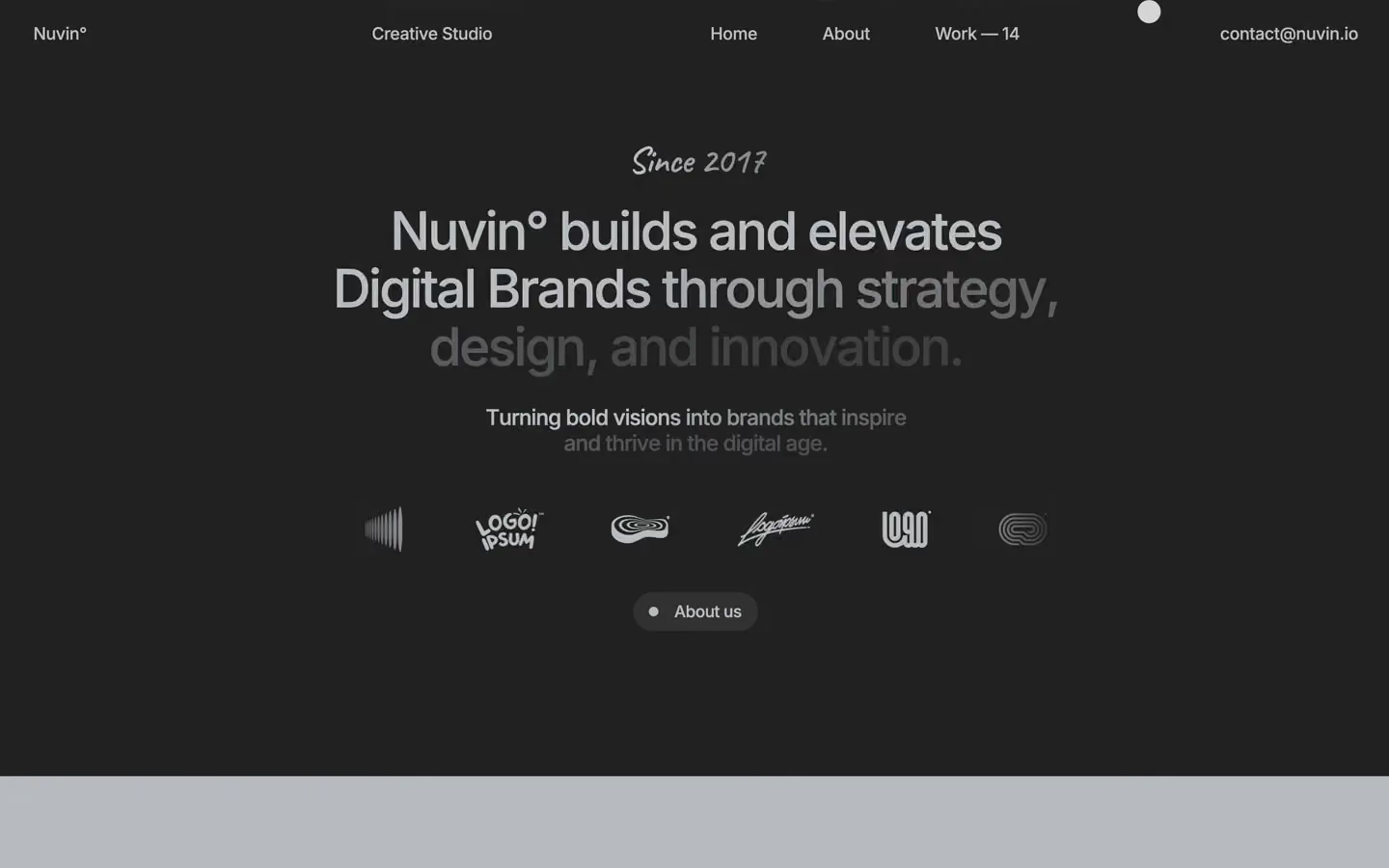
Nuvin is a calm, cool-grey studio site with a lot of image. The whole page sits on a mid grey (#B7BABE) with charcoal type, so it feels like matte paper rather than a white screen. Large, tightly tracked Inter headlines are paired with one handwritten line in Caveat, and the work is shown as huge, saturated, full-width images that stack as you scroll.
Four signatures make it recognisable:
- Grey paper canvas. The page is #B7BABE, not white. Text is charcoal #212121, and the one dark band flips it: #B7BABE text on #212121.
- The handwritten line. Each headline has a Caveat 38px line near it, set in the same colour: Clarity. Creativity. Impact. The core of all we create. under the hero, Since 2017 above the statement.
- The degree sign. The brand is written Nuvin°, in the logo and inside headlines (Nuvin° blends motion and design…). Counts use an em dash: Work — 14, ©21 — 25.
- Custom cursor and inverted nav. The system cursor is hidden (cursor: none); a round dot follows the mouse. The sticky nav uses mix-blend-mode: difference with filter: invert(), so it stays readable over grey, charcoal and photos without a background.
Nuvin is a single light-grey theme with one dark band and a dark footer.
Colors
Surfaces
#B7BABEPage background: hero, work and social sections
#FFFFFFWork card backing behind sticky images
#F5F5F5Light panel (whitesmoke), rare
#212121The statement band and the footer
Ink
#B7BABEText on primary
#C1C1BEText on secondary
#212121Headlines, nav, body text on the grey canvas
#212121Body copy; Nuvin does not grey its paragraphs on the canvas
#FFFFFFPlay button and white details on video
#B7BABEHeadlines and links on the dark band and footer (Since 2017, the address)
#FFFFFF · 80%Supporting lines on the dark band once revealed
#B7BABE · 30%Words not yet revealed in the scroll text reveal
Action
#313131The pill link (● About us) on the dark band
#212121The 42px square arrow button on work cards
Lines & effects
#212121Only the 1px blockquote rule
#F8F8F3 · 10%Blur tint variable (40px and 15px blur sizes)
Typography
Inter · display-hero
The quick brown fox jumpsHero H1, Selected Work, ©21 — 25. 89.6px · 500 · 1.10 · -2.4px
Inter · headline-xl
The quick brown fox jumpsPage titles on inner pages. 67.2px · 500 · 1.10 · -2.4px
Caveat · script
The quick brown fox jumpsSince 2017, Clarity. 38.4px · 500 · 0.70 · -0.8px
Inter · title
The quick brown fox jumpsSublines, address and email in the footer. 19.2px · 500 · 1.20 · -0.8px
Inter · body
The quick brown fox jumpsRunning text at weight 400 (10 runs); the body default itself is 17.6 / 500 / 1.0. 17.6px · 400 · 1.10 · -0.15px
Inter · label-nav
The quick brown fox jumpsLogo, nav links, Creative Studio, email. 17.6px · 500 · 1.10 · -0.3px
Spacing & shape
| Purpose | Value |
|---|---|
| Container | width 100%, max-width: 95% (1368px at 1440), centred |
| Grid | the nav is a 4-column grid with a 30px gap (3 columns at ≤767, flex at ≤479): logo, Creative Studio, the three links, the email |
| Section rhythm | 150px top and bottom on .section (40px at ≤991; 70px top / 20px bottom at ≤479) |
| Breakpoints | 991px, 767px and 479px, plus min-width: 768px and 1920px+ rules |
Spacing scale
| Token | Value | Preview |
|---|---|---|
xs | 10px | |
sm | 20px | |
md | 30px | |
lg | 50px | |
xl | 60px | |
2xl | 70px | |
3xl | 80px | |
4xl | 100px |
Layout spacing
| Token | Value | Preview |
|---|---|---|
column-gap | 30px | |
section | 150px | |
section-var | 250px |
Border radius
Surfaces
How the surfaces stack, from the page background up. Hex codes and roles are in Colors above.
Motion
| Headline split | SplitText lines or words, staggered over 0.54s, 0.86s and 1.45s, power1.in |
| Entrances | GSAP expo 0.8s |
| Scroll parallax | clamp(top bottom) → clamp(bottom top), scrub 0.8 |
| Text reveal | Words start at #B7BABE 30% and brighten as the section scrolls into view |
| Link roll | Move y 0% → −100% and back, 300ms ease |
| Fade and rise | Opacity 0 → 1 and y 10px → 0, 500ms; y 0vh and y 0% moves, 500ms, some outExpo |
| Scale in | scale 0.8 → 1, 500ms |
| Size and reveal | Width or height changes at 200ms inOutQuint, 300ms ease, 500ms and 1000ms outExpo |
| Rotation | 400–600ms inOutQuint, 600ms outExpo, 900ms cubic-bezier(0.135, 0.9, 0.15, 1) |
| Slow spin | One element rotates continuously over 40s |
| Hover filter | filter change, 400ms ease |
Do’s and don’ts
- Use #B7BABE as the page background and #212121 for text on it.
- Set display and headline lines (54–90px) in Inter 500 with −2.4px tracking.
- Add one Caveat 38px line per section, above or below the headline.
- Write the brand as Nuvin° and counts as Work — 14.
- Show work as full-width, square-cornered images on sticky 100vh cards.
- Use the #212121 band for the one big brand statement, with #B7BABE text.
- Keep the nav background-free with mix-blend-mode: difference.
- Use white as the page background, or add an accent colour.
- Add borders, drop shadows or rounded image corners.
- Use Caveat for more than one line, or Playfair Display on the home page.
- Put #B7BABE at 30% on anything meant to be read; it is only the start state of the scroll reveal.
- Hide the cursor without giving a visible replacement dot.
- Use weights above 600 or tracking looser than −0.8px on Inter above 19px.
Example prompt
Any page in the Nuvin style
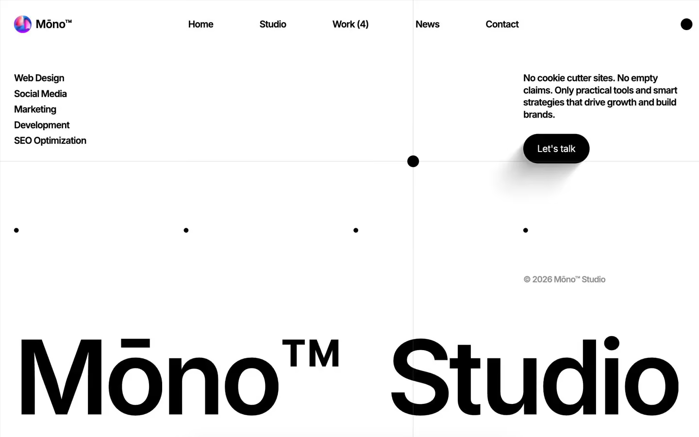
More design systems like this
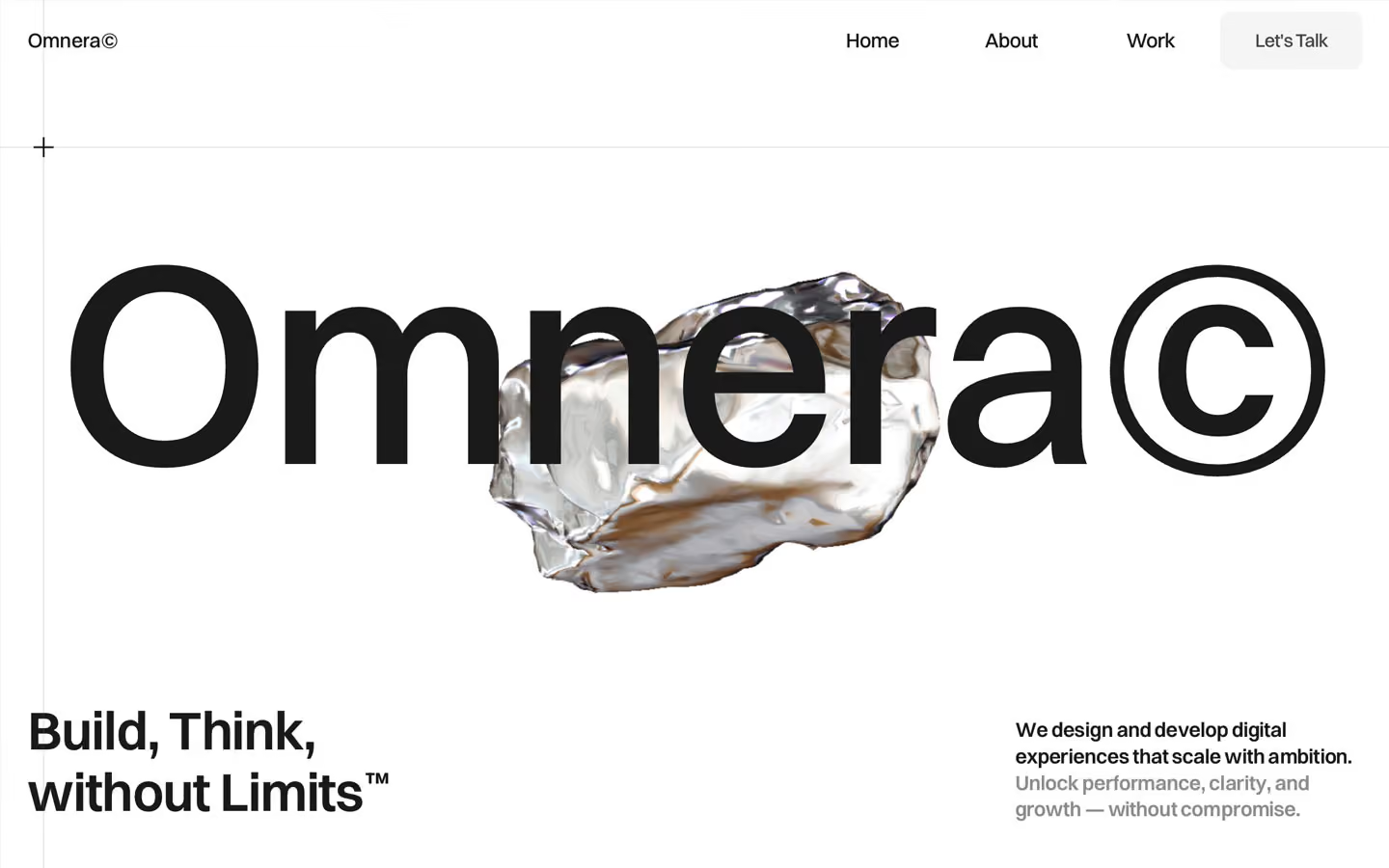
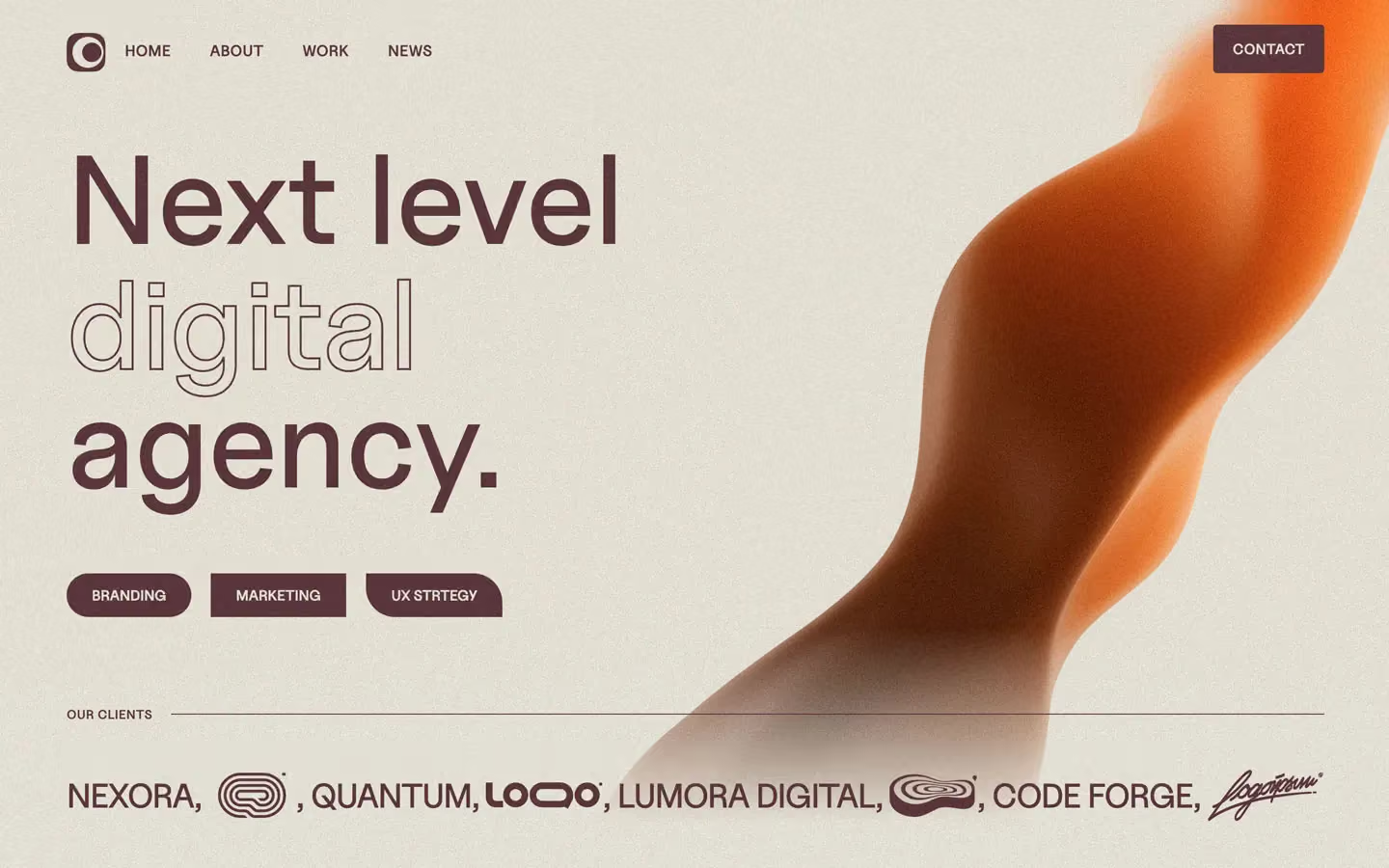
Agency design systems, the same colors first.

Bring any of them to your AI tool
All Access unlocks all 398 design systems, ready for Claude, ChatGPT, Gemini, Cursor, v0 and Lovable, plus 400+ templates on all 5 platforms.
Get All AccessUpgrade to All AccessHow to use the Nuvin design system
Pick a file to see what it’s for and where it goes.
What it is
The whole design system in one markdown file, written for AI: every color, type style, spacing value, component and motion rule, plus do's, don'ts and a ready prompt.
Best for
Claude, ChatGPT, Gemini, Cursor and v0, or any other AI tool that builds pages or code.
How to use it
- Put
DESIGN.mdin your project and mention it in your request, or save it as.cursor/rules/nuvin.mdc - For the rule file, start it with a front-matter block that sets
alwaysApply: true, so every chat uses it - Ask: “Build a pricing page using DESIGN.md.” Cursor follows the colors, fonts, spacing and rules
- Put
DESIGN.mdin the project root - Add one line to
CLAUDE.md: “Follow DESIGN.md for all UI.” - Ask for any page or component; Claude reads the file first
- Attach
DESIGN.mdto the chat (or paste it in) - Ask: “Build a landing page in this design system.”
- Keep the file in the chat or project knowledge, so follow-up pages stay on style
What it is
Every token as data, in the W3C Design Tokens format: colors with their roles, type styles, radius, spacing, and component tokens that point at them.
Best for
Figma (Tokens Studio), Style Dictionary and other design-token tools, and build scripts.
How to use it
- In Figma, open Tokens Studio, choose Import, and pick
tokens.json - Or point Style Dictionary’s
sourceat it to generate tokens for any platform - In code, import it like any JSON file
What it is
A Tailwind CSS v4 theme: every color, font, type style, radius and spacing value becomes a Tailwind utility, like bg-canvas, text-headline-lg or rounded-md.
Best for
Tailwind v4 projects, and AI builders that write Tailwind (v0, Lovable, Bolt).
How to use it
- Save
theme.cssnext to your main CSS file - Import it after Tailwind:
@import "tailwindcss"; @import "./theme.css"; - Use the classes:
bg-canvas text-ink rounded-md p-lg
What it is
The same tokens as plain CSS variables on :root. Component values point at the color variables, so changing one color updates everything that uses it.
Best for
Any website: plain CSS, Webflow custom code, Framer, WordPress.
How to use it
- Add it to your stylesheet, or in Webflow paste it into Site settings → Custom code inside a
<style>tag - Use the variables anywhere:
color: var(--color-ink) - Change a token once and every place that uses it follows