 flowmance
Solvo Design System
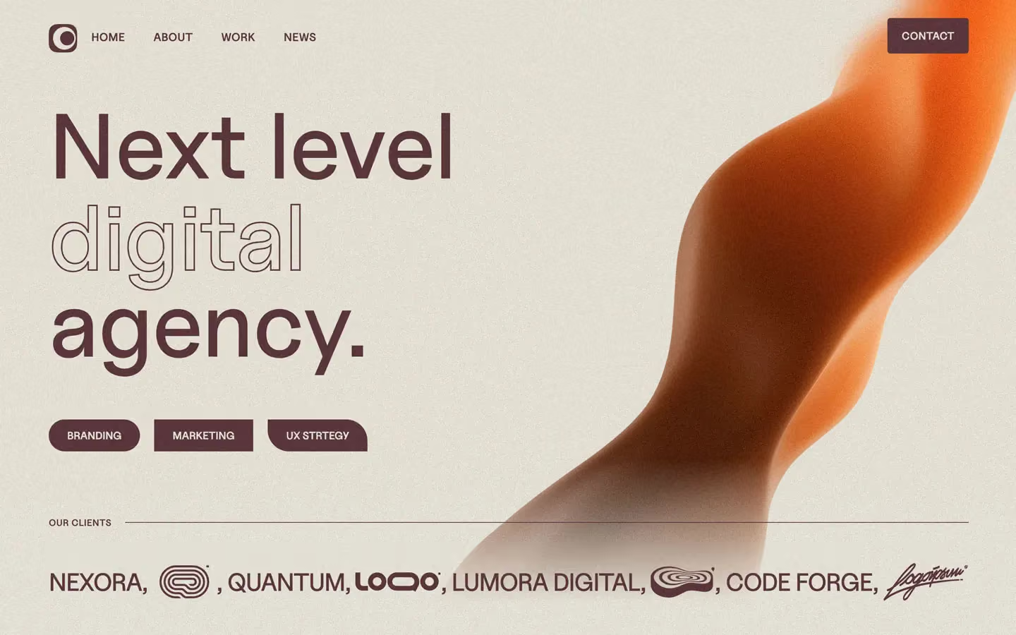
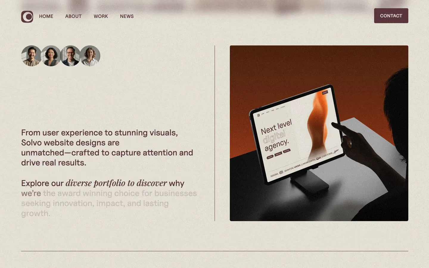

Solvo is a warm, tactile agency site that looks printed on uncoated paper. The whole page is two colours, oat beige #E8E4D9 and plum brown #573337, with a fine film grain over everything. Big Uncut Sans headlines mix a solid word and an outlined word. Paragraphs are large, mid-weight and slip into Playfair Display italic for a phrase or two. Photography is saturated and grainy, and it brings in the orange, sky blue and violet.
Four signatures make it recognisable:
- Solid + outline headlines. Every big title sets one word filled and the next as a hairline outline in the same ink: Next level / digital / agency., Our Work, The Team. The outlined word has a transparent fill and a thin plum stroke.
- Serif italics inside sans sentences. Lead paragraphs switch to Playfair Display italic mid-sentence: Explore our diverse portfolio to discover why….
- Two colours plus grain. There are no greys, no white and no accent. Plum on oat everywhere, and a visible noise texture on the page and on every photo.
- Ink rules as structure. 1px plum lines split every section, run vertically between columns, sit beside OUR CLIENTS, and become the skill bars.
Solvo is a light-only design.
Colors
Surfaces
#E8E4D9Page background (oat beige), under a grain texture
#E8E4D9Solvo has no separate surface
Ink
#E8E4D9Text on primary
#573337All text, rules, outlines, the logo tile
#573337Body text is full ink
#573337 · 20%The start state of scroll-revealed paragraphs, never a resting colour
#E8E4D9Tags and text placed on photos
Action
#573337Every filled button and chip: plum with oat text
#573337Lines & effects
#5733371px rules between sections, vertical column rules, skill bars
Typography
Uncut Sans · display-hero · shown in Inter (fallback)
The quick brown fox jumpsNext level / digital / agency. 130px · 500 · 0.9
Uncut Sans · headline-md · shown in Inter (fallback)
The quick brown fox jumpsExpertise, Skills & Specializations, with an optional Playfair italic word at the same size. 44px · 500 · 1.3 · -1px
Uncut Sans · body-lg · shown in Inter (fallback)
The quick brown fox jumpsLead paragraphs (the main reading size). 28px · 500 · 1.2
Uncut Sans · title-md · shown in Inter (fallback)
The quick brown fox jumpsTeam member names. 22px · 500 · 1 · -1px
Playfair Display · caption-serif
The quick brown fox jumpsTeam roles, Co Founder. 19px · 400 · 1.3
Uncut Sans · label-button · shown in Inter (fallback)
The quick brown fox jumpsForm submit Send Message. 16px · 600 · 1.4 · 1px
Spacing & shape
| Purpose | Value |
|---|---|
| Container | max 1400px, with 72px side padding (5% at 1440), so content runs from 72px to 1368px |
| Section rhythm | sections have no vertical padding of their own |
| Breakpoints | Webflow standard 991, 767 and 479px |
Spacing scale
| Token | Value | Preview |
|---|---|---|
xs | 10px | |
sm | 15px | |
md | 26px | |
lg | 30px | |
xl | 50px | |
2xl | 100px |
Layout spacing
| Token | Value | Preview |
|---|---|---|
column-gap | 30px | |
section-first | 50px | |
page-x | 72px | |
section | 100px | |
nav-height | 105px |
Border radius
Motion
| Scroll-lit paragraphs | SplitText words go from #573337 at 20% to full ink, scrubbed: top bottom → bottom 55, scrub: 0.8 (three paragraphs), with 0.8s expo tweens |
| Text rise on load and in view | y 100% → 0%, 500ms outBack or 600ms outBack; some blocks rise from 40–50px |
| Nav text roll on hover | Label moves to y −100% and a copy rises from y 100%, 300ms ease |
| Nav hide on scroll | Move to y −80px on scroll down, back on scroll up, 500ms |
| Image hover zoom | scale 1 → 1.1, 100ms ease |
| Skill bars | Width grows, 500ms ease |
| Colour and border changes | Background and text colour 400ms ease; border 200ms outSine |
| Rotations | 200–500ms ease |
| Mouse parallax | Elements return to x 0, y 0 over 1000ms ease |
Do’s and don’ts
- Use only #E8E4D9 (canvas) and #573337 (ink) for the interface, and add a fine grain texture.
- Set two-word titles as one solid word and one outlined word, at 110–130px, weight 500.
- Put a 2–4 word Playfair Display italic phrase inside long body-lg paragraphs.
- Separate sections with a full-width 1px #573337 rule and columns with vertical 1px rules.
- Keep buttons small and nearly square: 4–5px radius, uppercase 15–16px/600 labels.
- Use 7px radius on work images and an oat #E8E4D9 tag on top of each.
- Add white, black, grey or an accent colour to the UI.
- Use drop shadows, card backgrounds or bordered boxes.
- Make buttons pills or round them past 5px.
- Leave paragraphs at ink-faint (20%) once they are in view; it is only the scroll start state.
- Set long passages in Playfair or in the outline style.
- Add Roboto or a third family.
Example prompt
Any page in the Solvo style
More design systems like this
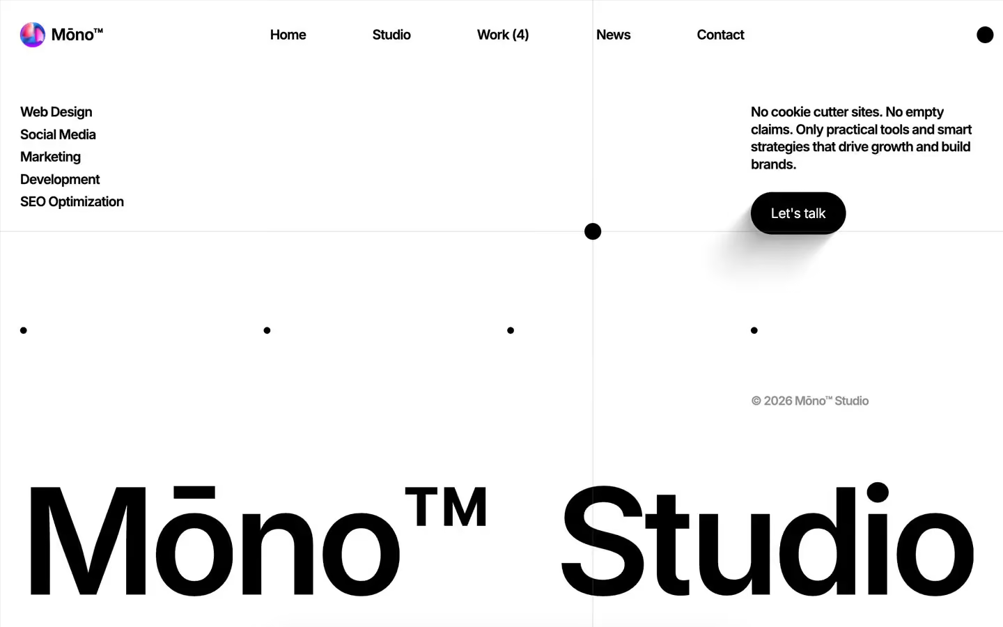
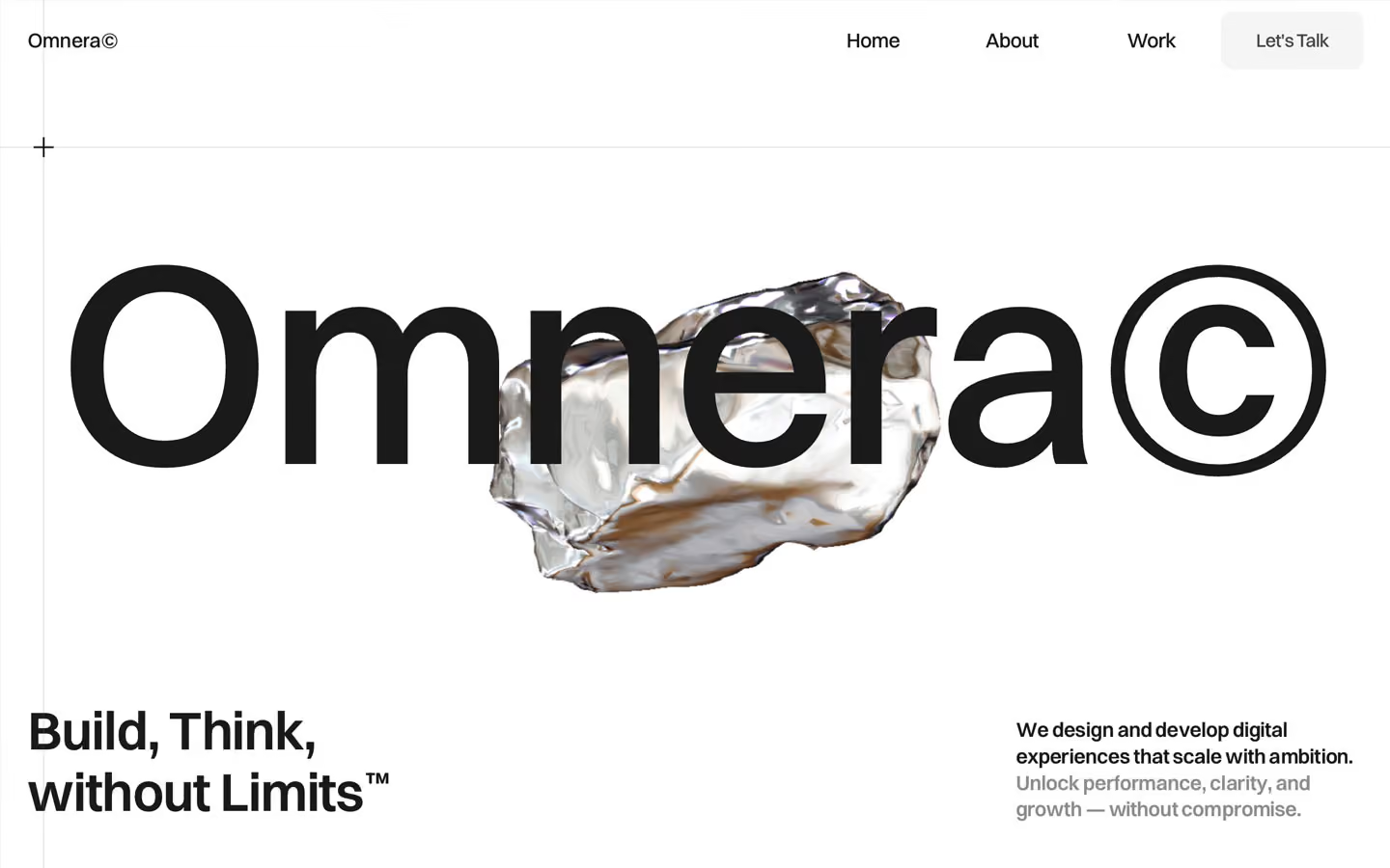
Agency design systems, the same colors first.

Bring any of them to your AI tool
All Access unlocks all 398 design systems, ready for Claude, ChatGPT, Gemini, Cursor, v0 and Lovable, plus 400+ templates on all 5 platforms.
Get All AccessUpgrade to All AccessHow to use the Solvo design system
Pick a file to see what it’s for and where it goes.
What it is
The whole design system in one markdown file, written for AI: every color, type style, spacing value, component and motion rule, plus do's, don'ts and a ready prompt.
Best for
Claude, ChatGPT, Gemini, Cursor and v0, or any other AI tool that builds pages or code.
How to use it
- Put
DESIGN.mdin your project and mention it in your request, or save it as.cursor/rules/solvo.mdc - For the rule file, start it with a front-matter block that sets
alwaysApply: true, so every chat uses it - Ask: “Build a pricing page using DESIGN.md.” Cursor follows the colors, fonts, spacing and rules
- Put
DESIGN.mdin the project root - Add one line to
CLAUDE.md: “Follow DESIGN.md for all UI.” - Ask for any page or component; Claude reads the file first
- Attach
DESIGN.mdto the chat (or paste it in) - Ask: “Build a landing page in this design system.”
- Keep the file in the chat or project knowledge, so follow-up pages stay on style
What it is
Every token as data, in the W3C Design Tokens format: colors with their roles, type styles, radius, spacing, and component tokens that point at them.
Best for
Figma (Tokens Studio), Style Dictionary and other design-token tools, and build scripts.
How to use it
- In Figma, open Tokens Studio, choose Import, and pick
tokens.json - Or point Style Dictionary’s
sourceat it to generate tokens for any platform - In code, import it like any JSON file
What it is
A Tailwind CSS v4 theme: every color, font, type style, radius and spacing value becomes a Tailwind utility, like bg-canvas, text-headline-lg or rounded-md.
Best for
Tailwind v4 projects, and AI builders that write Tailwind (v0, Lovable, Bolt).
How to use it
- Save
theme.cssnext to your main CSS file - Import it after Tailwind:
@import "tailwindcss"; @import "./theme.css"; - Use the classes:
bg-canvas text-ink rounded-md p-lg
What it is
The same tokens as plain CSS variables on :root. Component values point at the color variables, so changing one color updates everything that uses it.
Best for
Any website: plain CSS, Webflow custom code, Framer, WordPress.
How to use it
- Add it to your stylesheet, or in Webflow paste it into Site settings → Custom code inside a
<style>tag - Use the variables anywhere:
color: var(--color-ink) - Change a token once and every place that uses it follows