 flowmance
Omnera Design System
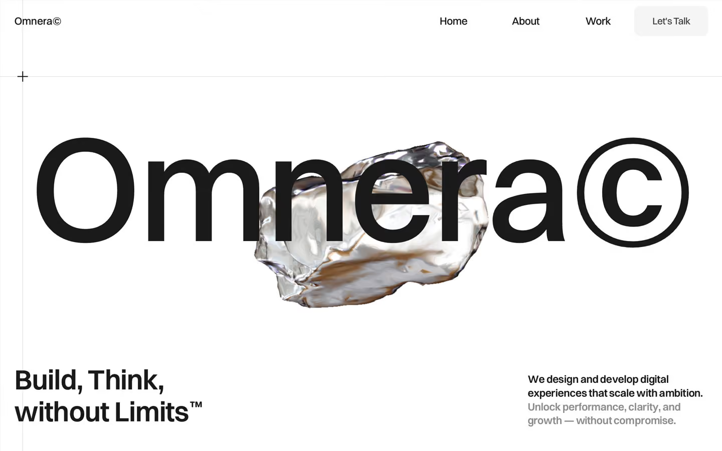
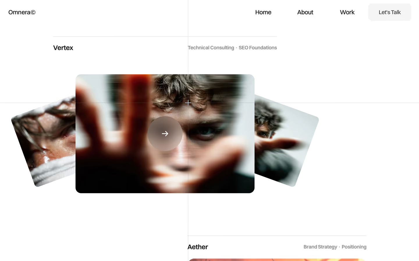
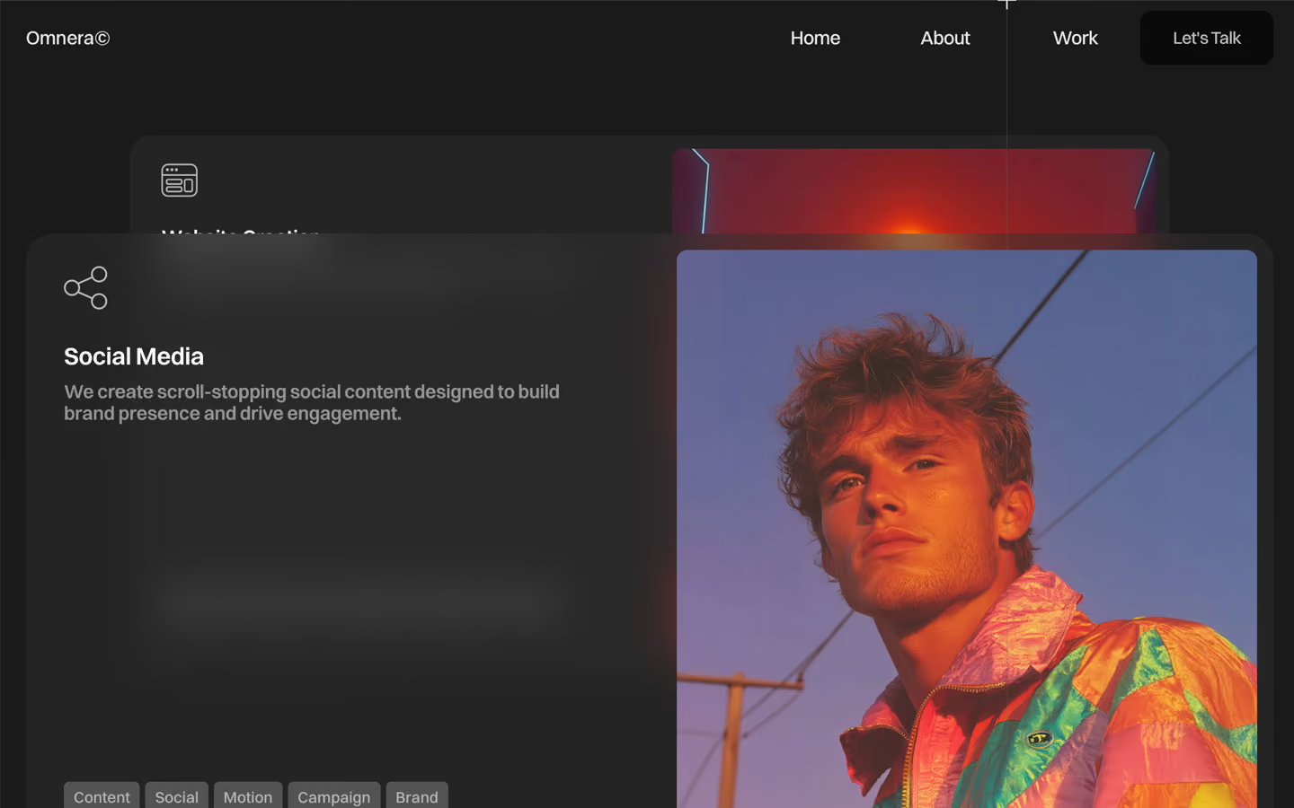
Omnera (styled Omnera©) is a calm, white studio site with one big theatrical moment: a 248px Omnera© wordmark centred on the first screen with a liquid-chrome 3D rock floating through it. Everything after that is restrained: semibold Switzer, tight tracking, long statements that light up as you scroll, and portraits lit in hot orange against deep blue. The page alternates white, soft grey (#F5F5F5) and charcoal (#1A1A1A) bands with 300px of vertical space.
Four signatures make it recognisable:
- Wordmark plus object hero. The centred wordmark sits over a WebGL chrome object (Unicorn Studio), with a two-line slogan bottom-left (Build, Think, / without Limits™) and a short lead bottom-right.
- Scroll-lit statements. Section statements are 46px, weight 600; each word starts at black 15% and darkens to #1A1A1A as you scroll.
- The © suffix. Every section name ends in ©: Meet Omnera©, Featured Works©, What we do©, Testimonials©, News©, Studio Partnership©.
- Small, varied radii. Nothing is a pill. Corners step from 3px (tags) to 4–7px (images, cards, buttons), 10px (nav button, testimonial cards) and 25px (the dark service panels).
Colors
Surfaces
#FFFFFFPage background
#F5F5F5What we do© and Custom Option© bands, testimonial cards, logo flip cards, the nav button
#1A1A1AThe services band and the footer
#FFFFFFContact inputs
Ink
#1A1A1AText on primary
#FFFFFFText on secondary
#1A1A1AHeadlines, nav, labels
#1A1A1A · 70%Paragraphs (p and .paragraph-opacity use opacity: 0.7)
#1A1A1A · 80%Second sentence of leads
#1A1A1A · 66%Work meta (Microinteractions · Engagement Optimization)
#000000 · 15%Unlit words of the scroll-lit statements (214 split words measured)
#FFFFFFText on inverse-canvas
#FFFFFF · 80%Paragraphs on dark and on photos
#FFFFFF · 56%Text on tag
#FFFFFFAction
#F5F5F5The main button (Let's Talk): light grey with dark text
#1A1A1AThe circle that rises behind the label on hover
#1A1A1ADark buttons (newsletter, pricing)
Lines & effects
#000000 · 12%The 1px rule above each work title
#2E2E2E · 50%Service panels on the dark band
#535353Tag chips on dark service panels
#000000 · 54%Placeholder text on field
#000000 · 75%Contact form submit
#BBBBBB · 25%Footer newsletter field at rest and on focus
#BBBBBB · 30%Footer newsletter field at rest and on focus
#000000 · 40%Overlay on the full-bleed photo section
Typography
Switzer · display-hero
The quick brown fox jumpsOmnera© wordmark, centred. 248px · 500 · 1.15 · -5px
Switzer · headline-xl
The quick brown fox jumpsPage titles (--page-title: 4rem), split by word (49 measured). 64px · 600 · 1.15 · -0.8px
Switzer · title-lg
The quick brown fox jumpsService titles Website Creation, plan names. 22.4px · 600 · 1.15 · -0.2px
Switzer · body-lg
The quick brown fox jumpsLeads and card paragraphs (the most-used style, 266). 17.6px · 600 · 1.3 · -0.2px
Switzer · label-strong
The quick brown fox jumpsMeet Omnera©, project names Atlas. 17.6px · 600 · 1.15 · -0.2px
Switzer · caption
The quick brown fox jumpsTags (Wireframe, Web Design). 14.4px · 500 · 1.3
Spacing & shape
| Purpose | Value |
|---|---|
| Container | max 1400px; the work list narrows to 1240px |
| Section rhythm | 300px top and bottom on desktop |
| Breakpoints | 991px, 767px and 479px |
Spacing scale
| Token | Value | Preview |
|---|---|---|
hair | 3px | |
xs | 10px | |
sm | 16px | |
md | 20px | |
lg | 30px | |
xl | 50px | |
2xl | 100px |
Layout spacing
| Token | Value | Preview |
|---|---|---|
column-gap | 16px | |
gutter | 29px |
Border radius
Surfaces
How the surfaces stack, from the page background up. Hex codes and roles are in Colors above.
Motion
| Scroll-lit statement | Words go from #00000026 to #1A1A1A, ScrollTrigger top bottom → bottom 50, scrub 0.8 |
| Pinned scenes | top top → bottom center (scrub 0.8) and 10% 40 → bottom center (scrub 0.9) |
| Line reveal | y 100% → 0%, 400ms; staggered word fades y 100% → 0 with opacity 0 → 1 at 100–250ms steps |
| Slide-in | xPercent −100 → 0, 250ms stagger, power1.out |
| Large reveals | 800–900ms expo |
| Button | Circle fill from below; scale 1 → 0.88 in 300ms |
| Image settle | scale 0.93 → 1 and y −10% → 0, 500ms |
| Logo flip | rotateY 180° then 360°, 1000ms swingTo |
| Menu | Panels move ±50vw and ±50vh, 500ms |
| Fades | opacity 0 → 1, 500ms; section intros 1000ms outQuart |
| Marquee | x 0% → −400% over 32s, linear loop |
| Custom cursor | System cursor hidden; a follower reacts to links (scale 0.5 ↔ 1, 300–500ms) |
Do’s and don’ts
- Open the home page with the centred display-hero wordmark (248px, −5px) and one floating 3D object.
- Light statements on scroll from #00000026 to #1A1A1A.
- Alternate white, #F5F5F5 and #1A1A1A bands with 300px vertical padding.
- Keep body text at #1A1A1A 70% and use weight 600 for leads and headlines.
- Use small radii (3–10px) for content and 25px only for the dark service panels.
- End section names with ©.
- Use pills or radii above 25px.
- Use the yellow #ffd500 variable or add any accent colour.
- Add drop shadows; use bands, glass and stacking.
- Use the loaded-but-unused fonts (Inter, IBM Plex Mono, Playfair Display, Libre Caslon).
- Set tag text (on-tag, white 56% on #535353) below 14px or use that pairing for anything longer than a one-word tag; it is below 4.5:1.
- Put white text on a photo without the 40% scrim.
Example prompt
Any page in the Omnera style
More design systems like this
Agency design systems, the same colors first.

Bring any of them to your AI tool
All Access unlocks all 398 design systems, ready for Claude, ChatGPT, Gemini, Cursor, v0 and Lovable, plus 400+ templates on all 5 platforms.
Get All AccessUpgrade to All AccessHow to use the Omnera design system
Pick a file to see what it’s for and where it goes.
What it is
The whole design system in one markdown file, written for AI: every color, type style, spacing value, component and motion rule, plus do's, don'ts and a ready prompt.
Best for
Claude, ChatGPT, Gemini, Cursor and v0, or any other AI tool that builds pages or code.
How to use it
- Put
DESIGN.mdin your project and mention it in your request, or save it as.cursor/rules/omnera.mdc - For the rule file, start it with a front-matter block that sets
alwaysApply: true, so every chat uses it - Ask: “Build a pricing page using DESIGN.md.” Cursor follows the colors, fonts, spacing and rules
- Put
DESIGN.mdin the project root - Add one line to
CLAUDE.md: “Follow DESIGN.md for all UI.” - Ask for any page or component; Claude reads the file first
- Attach
DESIGN.mdto the chat (or paste it in) - Ask: “Build a landing page in this design system.”
- Keep the file in the chat or project knowledge, so follow-up pages stay on style
What it is
Every token as data, in the W3C Design Tokens format: colors with their roles, type styles, radius, spacing, and component tokens that point at them.
Best for
Figma (Tokens Studio), Style Dictionary and other design-token tools, and build scripts.
How to use it
- In Figma, open Tokens Studio, choose Import, and pick
tokens.json - Or point Style Dictionary’s
sourceat it to generate tokens for any platform - In code, import it like any JSON file
What it is
A Tailwind CSS v4 theme: every color, font, type style, radius and spacing value becomes a Tailwind utility, like bg-canvas, text-headline-lg or rounded-md.
Best for
Tailwind v4 projects, and AI builders that write Tailwind (v0, Lovable, Bolt).
How to use it
- Save
theme.cssnext to your main CSS file - Import it after Tailwind:
@import "tailwindcss"; @import "./theme.css"; - Use the classes:
bg-canvas text-ink rounded-md p-lg
What it is
The same tokens as plain CSS variables on :root. Component values point at the color variables, so changing one color updates everything that uses it.
Best for
Any website: plain CSS, Webflow custom code, Framer, WordPress.
How to use it
- Add it to your stylesheet, or in Webflow paste it into Site settings → Custom code inside a
<style>tag - Use the variables anywhere:
color: var(--color-ink) - Change a token once and every place that uses it follows