 flowmance
Mōno™ Design System
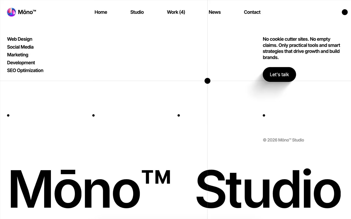
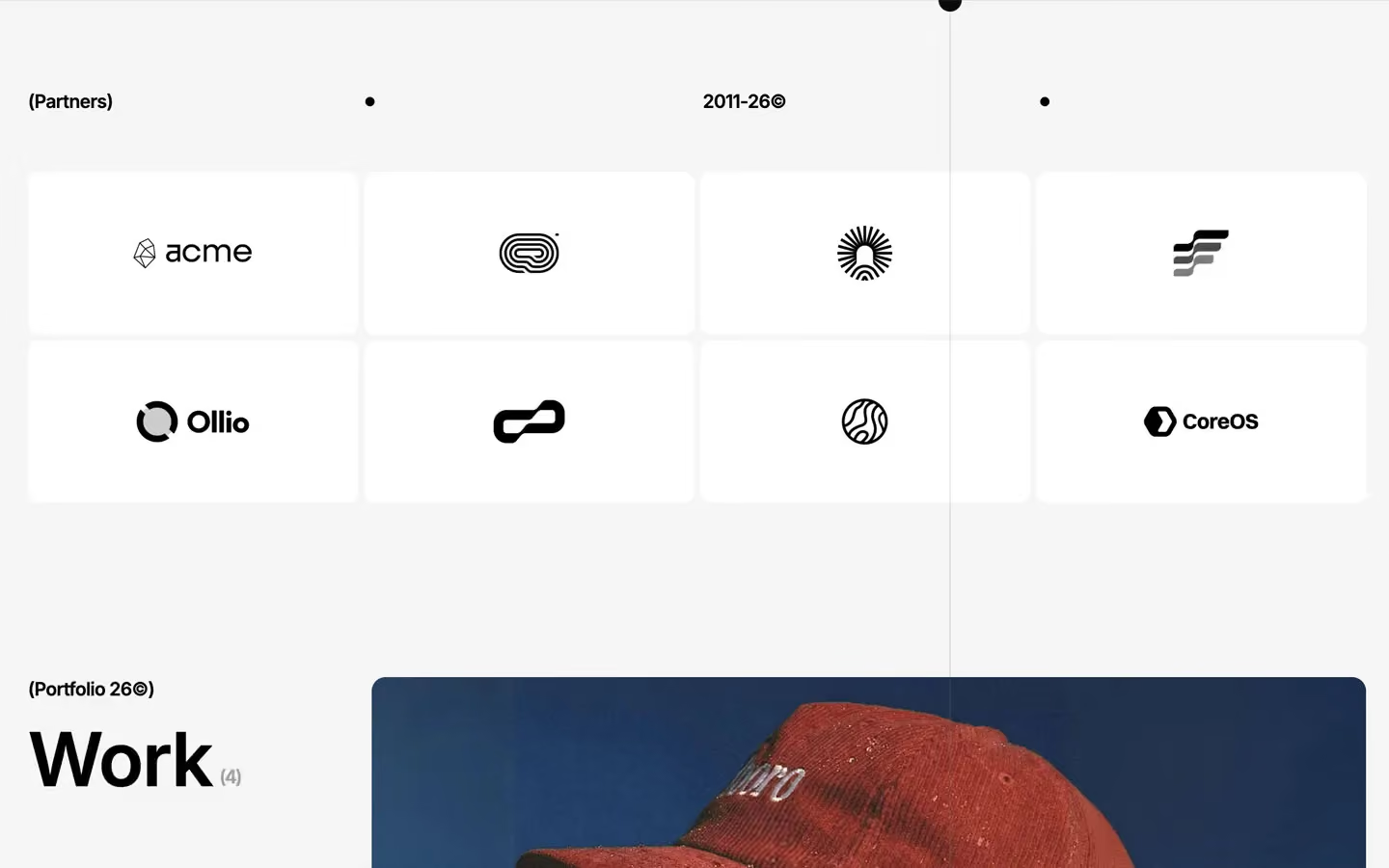
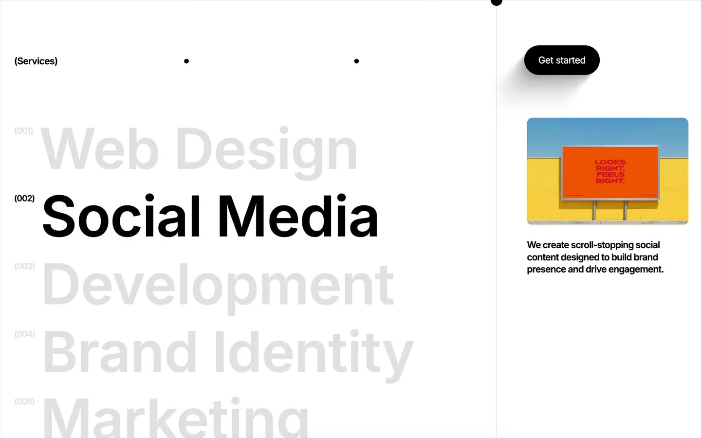
Mōno™ is a strict black-and-white agency site with Swiss manners. It is mostly empty white space, held together by a visible grid: rows of small black dots mark the column starts, tiny bracketed labels name each section, and huge Inter headlines with very tight tracking anchor the bottom of the screen. Colour arrives only through photography (a red hat on red, a white horse on deep blue) and the iridescent purple-blue orb used for the logo and the product mockups.
Four signatures make it recognisable:
- The dot grid. A row of 8px black dots sits on the column lines of a 4-column grid in the hero and above each content block, like registration marks.
- Bracketed labels. Each section is named in small bold text in brackets: (Who we are), (Team of experts), (Live collaboration), (Our Vision), (Performance Boost).
- The tight wordmark. Mōno™ and Studio in Inter 600 at 176px with −8px tracking and 0.85 line height, pinned to the bottom of the first screen and split to the two edges. The macron on the ō and the superscript ™ are part of the name.
- The floating nav bar. After the hero, a white bar (10px radius, soft shadow) floats at the bottom centre of the viewport: Home, Work (4), the orb logo with Mōno™, Studio, Contact. The cursor is a custom black dot (cursor: none on the body).
Mōno™ is a light design with full black bands.
Colors
Surfaces
#FFFFFFPage background
#F5F5F5The work band (whitesmoke), light cards; the light card fades from #FFFFFF to #F5F5F5 at 30%
#000000Dark bands: the scroll text section, the data section, the contact band; the hero area reads as #111111 behind its content
#000000Dark contact inputs (transparent on black); focus turns the border solid white
#000000With field: Dark contact inputs (transparent on black); focus turns the border solid white
Ink
#FFFFFFText on primary
#FFFFFFText on secondary
#000000Headlines, labels, nav, dots
#000000 · 70%Paragraphs (p { opacity: .7 })
#000000 · 42%Meta like © 2026 Mōno™ Studio (.lighter-text)
#FFFFFFText on dark bands
#F5F5F5Text on dark bands
#FFFFFFAction
#000000Black pill buttons (View all work, Let's talk)
#222222A softer black pill used for Let's talk in some sections
Lines & effects
#000000 · 12%Hairline dividers
#0000002px menu dividers
#1C1C1FDark cards, as a gradient from #1C1C1F to #0F0F12
#141414The back face of flipping stat cards
#FFFFFF · 24%Borders of dark inputs; white at 30% under large text links
#333333 · 55%Small arrow buttons on images
#FFFFFF · 88%Chat bubbles in the collaboration mockup
Typography
Inter · display-hero
The quick brown fox jumpsMōno™ and Studio (--work-title, 11rem). 176px · 600 · 0.85 · -8px
Inter · headline-lg
The quick brown fox jumpsWe shape brands with focus, intention, and impact., Work(4) (4rem). 64px · 600 · 1.1 · -1.3px
Inter · title-lg
The quick brown fox jumpsCard titles: Pricing with complete transparency, team members across the World. 27px · 600 · 1.1 · -1px
Inter · logo
The quick brown fox jumpsMōno™ beside the orb. 19px · 600 · 1.1 · -0.7px
Inter · body
The quick brown fox jumpsParagraphs at 70%. 16px · 500 · 1.3 · -0.5px
Inter · label
The quick brown fox jumpsCompact labels and menu items. 16px · 600 · 1.1 · -0.7px
Spacing & shape
| Purpose | Value |
|---|---|
| Container | 100% wide, max 1400px, centred |
| Grid | 4 columns with a 10px gap (.bottom-grid, 10 uses) carries the hero, the dot rows and the section heads |
| Section rhythm | most sections are 2% all round; sections with a headline start 144px down |
| Breakpoints | 991, 767 and 479px, plus a 1920px+ step |
Spacing scale
| Token | Value | Preview |
|---|---|---|
xs | 10px | |
sm | 20px | |
md | 30px | |
lg | 50px | |
xl | 60px | |
2xl | 120px |
Layout spacing
| Token | Value | Preview |
|---|---|---|
grid-gap | 16px | |
section-x | 29px | |
card-pad | 35px | |
logo-card-y | 70px | |
section-top | 144px | |
section | 250px |
Border radius
Surfaces
How the surfaces stack, from the page background up. Hex codes and roles are in Colors above.
Motion
| Smooth scroll | Lenis on the whole page |
| Button and nav text roll | yPercent 0 → 100 and a copy 100 → 0, 600ms, power2.inOut, staggered |
| Line reveal | y 100% → 0%, 300ms, power3.inOut, triggered at top bottom → top center |
| Fade-roll | yPercent 100 → 0 with opacity 0 → 1, 500ms, power2.inOut; exits yPercent → −100 |
| Number roll | Digits y → −100% / −200% / −300%, 600ms, power2.inOut |
| Skew reveal | skewX 30° → 0°, y 20% → 0%, opacity → 1, 400ms outCubic |
| Split wordmark | The two halves move x ±50vw, 500ms, tied to scroll |
| Image settle | scale 1.15 → 1, 300ms, sine.inOut |
| Showreel expand | Video grows 0 → 30vw × 50vh (270ms) then → 100vw × 100vh (230ms), sine.inOut |
| Testimonial scatter | Cards move x ±60–100%, y −120…140%, rotation 17–20°, rotationX 180°, 1000ms sine.inOut, scrubbed |
| Marquee | Rows move x ±100%, 1000ms linear steps, looping |
| Logo flip | RotateY 0 → 180° → 360°, 1000ms swingTo |
| Scrubbed scenes | ScrollTrigger scrub 0.8 on the pinned bands |
| Hover fades | Opacity and size 300ms ease; buttons 200ms; one 450ms cubic-bezier(0.22, 0.61, 0.36, 1) |
Do’s and don’ts
- Keep the page black #000000 on white #FFFFFF, with #F5F5F5 for the one grey band and light cards.
- Name every section with a bracketed body-strong label and mark the grid with 8px black dots.
- Use negative tracking at every size: −0.5px for body, −1.3px at 64px, −8px at 176px.
- Use black 51px pills (100px radius) for actions and the white floating nav bar with its soft shadow.
- Put colour only in photography and the iridescent orb.
- Stack work as sticky 80vh cards with a 12px radius.
- Add an accent colour or tint UI elements with the orb's purple and blue.
- Use a second typeface, uppercase or italics.
- Use ink-subtle (black at 42%) under 14px or for anything but meta lines; it is below 4.5:1 on white.
- Add drop shadows to cards; only the floating nav and the pill buttons have shadows.
- Loosen the display tracking or line height; the wordmark depends on 0.85 and −8px.
- Round cards beyond 12px, except pills and the 20px bubbles.
Example prompt
Any page in the Mōno™ style
More design systems like this
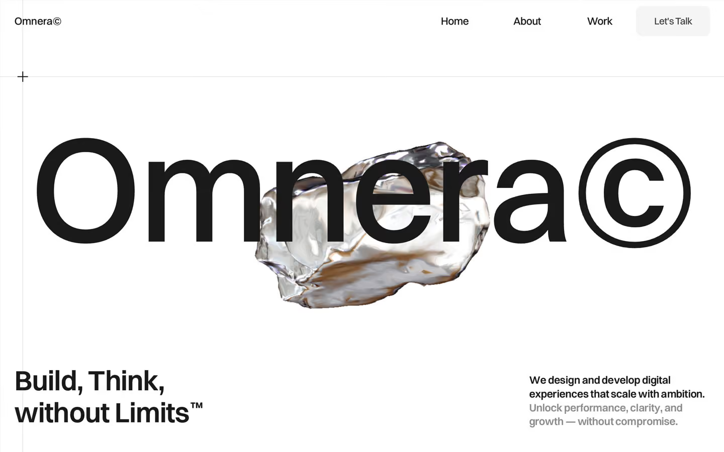
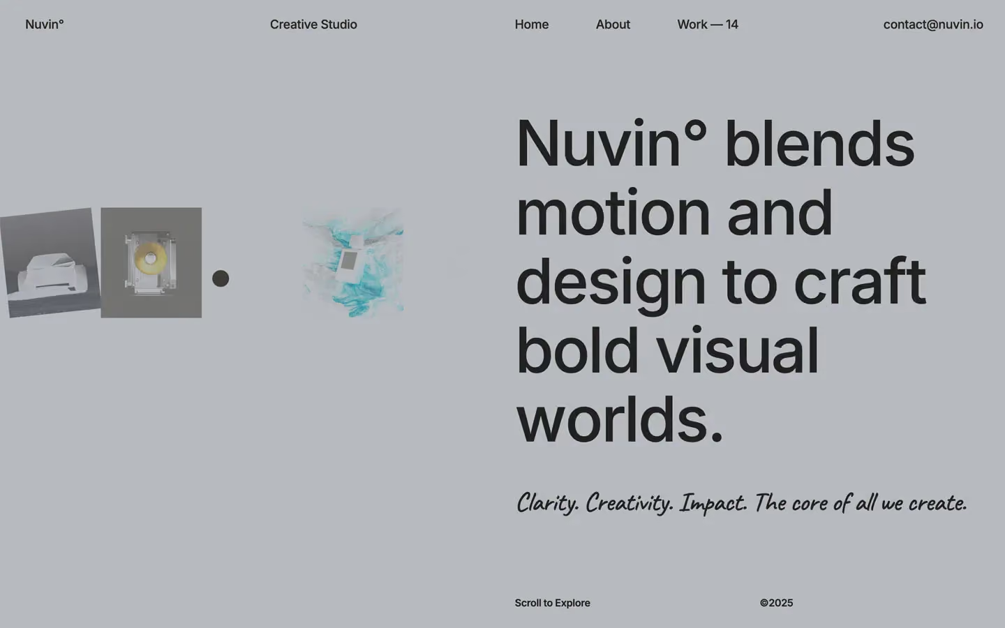
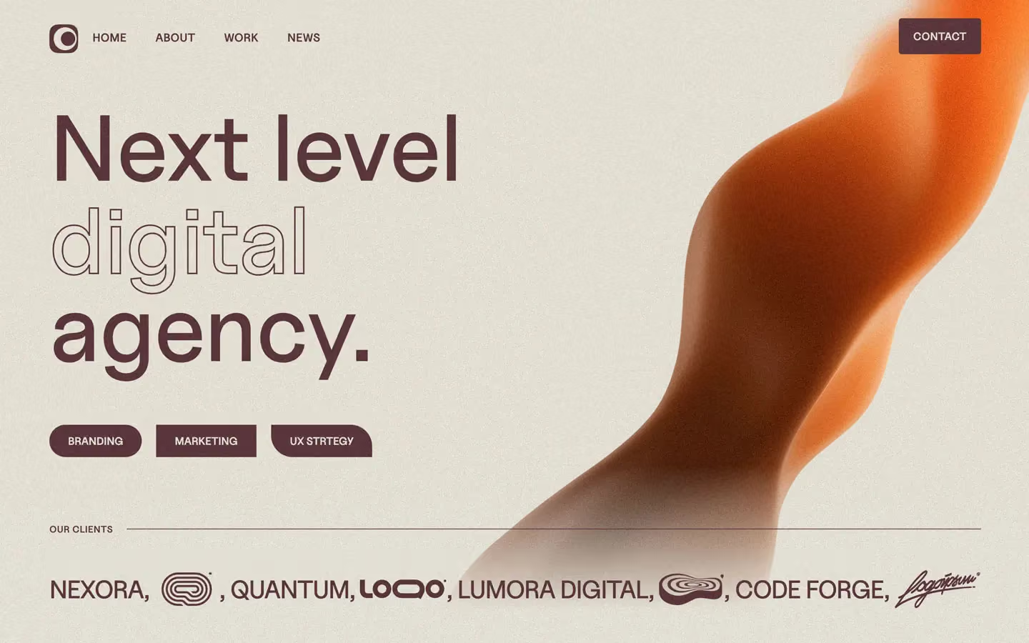
Agency design systems, the same colors first.

Bring any of them to your AI tool
All Access unlocks all 398 design systems, ready for Claude, ChatGPT, Gemini, Cursor, v0 and Lovable, plus 400+ templates on all 5 platforms.
Get All AccessUpgrade to All AccessHow to use the Mōno™ design system
Pick a file to see what it’s for and where it goes.
What it is
The whole design system in one markdown file, written for AI: every color, type style, spacing value, component and motion rule, plus do's, don'ts and a ready prompt.
Best for
Claude, ChatGPT, Gemini, Cursor and v0, or any other AI tool that builds pages or code.
How to use it
- Put
DESIGN.mdin your project and mention it in your request, or save it as.cursor/rules/mono.mdc - For the rule file, start it with a front-matter block that sets
alwaysApply: true, so every chat uses it - Ask: “Build a pricing page using DESIGN.md.” Cursor follows the colors, fonts, spacing and rules
- Put
DESIGN.mdin the project root - Add one line to
CLAUDE.md: “Follow DESIGN.md for all UI.” - Ask for any page or component; Claude reads the file first
- Attach
DESIGN.mdto the chat (or paste it in) - Ask: “Build a landing page in this design system.”
- Keep the file in the chat or project knowledge, so follow-up pages stay on style
What it is
Every token as data, in the W3C Design Tokens format: colors with their roles, type styles, radius, spacing, and component tokens that point at them.
Best for
Figma (Tokens Studio), Style Dictionary and other design-token tools, and build scripts.
How to use it
- In Figma, open Tokens Studio, choose Import, and pick
tokens.json - Or point Style Dictionary’s
sourceat it to generate tokens for any platform - In code, import it like any JSON file
What it is
A Tailwind CSS v4 theme: every color, font, type style, radius and spacing value becomes a Tailwind utility, like bg-canvas, text-headline-lg or rounded-md.
Best for
Tailwind v4 projects, and AI builders that write Tailwind (v0, Lovable, Bolt).
How to use it
- Save
theme.cssnext to your main CSS file - Import it after Tailwind:
@import "tailwindcss"; @import "./theme.css"; - Use the classes:
bg-canvas text-ink rounded-md p-lg
What it is
The same tokens as plain CSS variables on :root. Component values point at the color variables, so changing one color updates everything that uses it.
Best for
Any website: plain CSS, Webflow custom code, Framer, WordPress.
How to use it
- Add it to your stylesheet, or in Webflow paste it into Site settings → Custom code inside a
<style>tag - Use the variables anywhere:
color: var(--color-ink) - Change a token once and every place that uses it follows