 flowmance
UNI© Design System
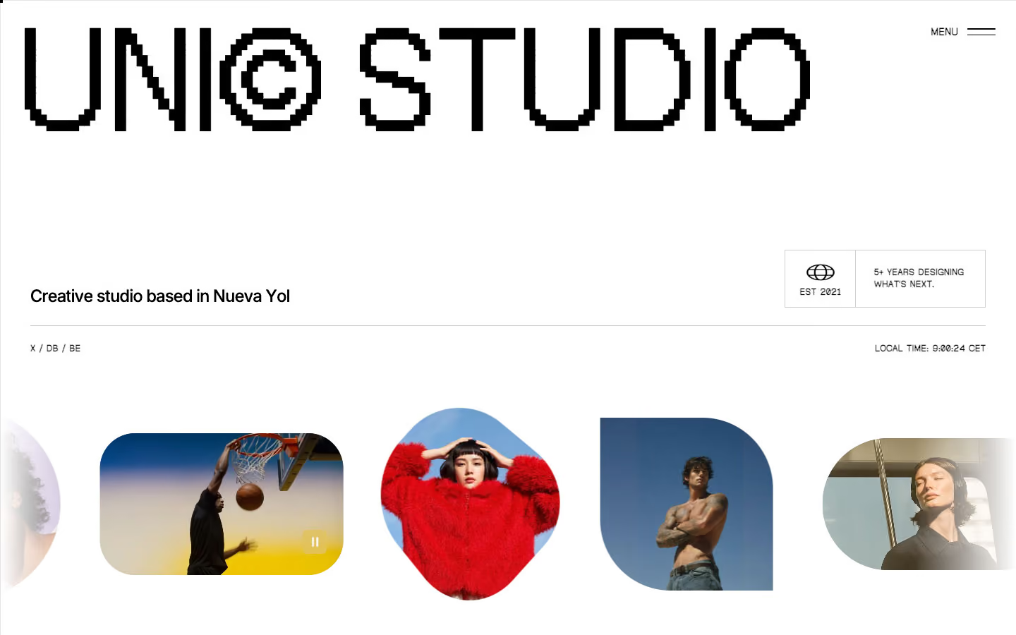
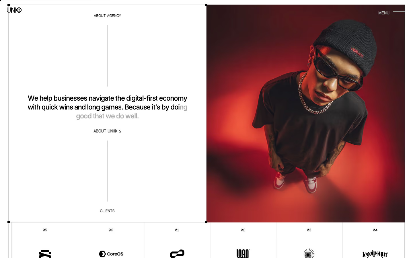

UNI© is a black-and-white creative-studio site with a digital, slightly retro edge. The headline face is Geist Pixel, a bitmap-style font set at poster size with very tight tracking, against plain Inter for reading text. The page alternates long white bands and long black bands; colour only arrives through fashion and sports photography and a smoky showreel video.
Four signatures make it recognisable:
- Pixel wordmark. UNI© and STUDIO in Geist Pixel at 201.6px (14vw), uppercase, line height 0.85, tracking −10px. Small labels (EST 2021, LOCAL TIME: 9:00:24 CET, STEP 01) use the same pixel face at 11–14px.
- Shape-shifting images in the hero. A strip of photos in mixed masks: a pill (200px), a leaf (0% 100px), a circle (100%), an oval (60%) and a 50px rounded square.
- Inverted nav. The fixed bar uses filter: invert() with mix-blend-mode: exclusion, so UNI© and MENU ═ flip between black and white over each band. MENU opens a white side panel (36vw) of huge condensed links.
- The cross-shaped showreel. A video masked into a plus sign, split by thin vertical lines, labelled VIEW SHOWREEL ©26 ↘ in white Geist Pixel.
The default cursor is hidden (cursor: none on body and links); a custom follower replaces it, with a round VIEW label over projects.
Colors
Surfaces
#FFFFFFPage background and white bands (65 fills)
#F5F5F5Testimonial cards
#D3D3D3Light grey fills (2 uses)
#000000Black bands: latest work, statement, process, project list (51 fills)
#FFFFFFForm inputs and their placeholder
#999999Placeholder text on field
Ink
#FFFFFFText on primary
#000000Text on secondary
#000000Text on white (1,884 uses), borders, the black button
#000000Same as ink: body copy on white is full black
#FFFFFFText on black (1,039 uses)
#ADADADGrey text on black: OUR PROCESS, LET'S WORK ↘, step text (111 uses)
#FFFFFFLogos and titles placed over photos
Action
#000000The black button and the form submit Contact Us
#F0F0F0The light GET IN TOUCH button
Lines & effects
#000000 · 25%0.5px borders on pricing cards and pricing rows
#0000001px solid rules (7 uses), form underline
#CFCFCF0.5px hero divider and logo-tile borders
#111111Raised blocks on black (6 fills)
#FFFFFF · 34%0.5px rules under project rows on black
#000000 · 25%Overlays on photos (also 20% and 35% variants, and a 60% dimming layer)
#FFFFFF · 42%Video controls and small frosted chips
Typography
Geist Pixel · display-hero
The quick brown fox jumpsUNI© (h1), STUDIO (h2). 202px · 400 · 0.85 · -10px
Humane · headline-menu · shown in Big Shoulders (fallback)
The quick brown fox jumpsMenu links HOME 01, STUDIO 02, WORK 03, CONTACT 04 (8rem). 128px · 400 · 1.1 · 0.8px
Geist Pixel · title-pixel
The quick brown fox jumpsVIEW SHOWREEL ©26 ↘ and similar overlay labels (52 uses). 32px · 600 · 1.1 · -0.5px
Inter · body-lg
The quick brown fox jumpsNav text MENU, short labels (1.1rem). 17.6px · 500 · 1.1 · -0.5px
Geist Pixel · label
The quick brown fox jumpsButton labels, LET'S WORK ↘ (.9rem). 14.4px · 600 · 1.1 · -0.5px
Geist Pixel · caption
The quick brown fox jumpsEST 2021, 5+ YEARS DESIGNING WHAT'S NEXT., LOCAL TIME, X / DB / BE (318 uses). 12.8px · 700 · 1.3
Spacing & shape
| Purpose | Value |
|---|---|
| Container | max 1600px (--page-container--container-large), 100% wide, 2% side padding (28.8px at 1440) |
| Section rhythm | .section is padding: 150px 2%; the top drops to 50px at ≤479 |
| Section header (on black) | OUR PROCESS left, a thin rule across, LET'S WORK ↘ right, in grey caption |
| Breakpoints | 991, 767 and 479px, plus a 1920px+ step |
Spacing scale
| Token | Value | Preview |
|---|---|---|
xs | 10px | |
sm | 20px | |
md | 30px | |
lg | 50px | |
xl | 60px | |
2xl | 120px |
Layout spacing
| Token | Value | Preview |
|---|---|---|
column-gap | 20px | |
gutter | 28.8px | |
section-footer | 100px | |
section | 150px |
Border radius
Surfaces
How the surfaces stack, from the page background up. Hex codes and roles are in Colors above.
Motion
| Text roll (buttons, links) | y 0% → −101%, power1.out, 0.4s, staggered |
| Nav and menu roll | y 100% → 0 and y −100% → 0%, power4.out, 0.5s |
| Line reveal | SplitText lines y 100% → 0%, 0.5–0.91s, staggered |
| Fade-up | y 30% → 0%, opacity 0 → 1, power2.out, 0.25s (also staggered) |
| Image parallax | y 5% → −5%, linear, scrubbed top bottom → bottom top, scrub 1.2 |
| Hero exit | y 0 → 20%, scale 1 → 0.95, scrubbed (scrub 0.8) |
| Image hover zoom | scale → 1.15, sine.out, 0.5s |
| Accordion | height → auto, 0.3s; icon rotation → 0°, 0.2s |
| Arrow slide | x −19px → 0, power1.in, 0.3s; lift y → −11px, 0.2s |
| Menu line wipe | width 0% → 100%, power1.in 0.4s or power2.out 0.25s |
| Icon pop | y −5px → 0, rotation 40° → 0°, scale 0.6 → 1, opacity 0 → 1, sine.inOut, 0.2s |
| Intro and shapes | expo 0.8s and 1.2s tweens |
Do’s and don’ts
- Set display text in Geist Pixel, uppercase, line height 0.85 and tight tracking (−10px at 201.6px, −2px at 48px).
- Pair pixel labels (12.8px weight 700, uppercase) with Inter text (24px weight 500, −1.3px for leads; 14.4px weight 600 for paragraphs).
- Alternate full white (#FFFFFF / #000000) and full black (#000000 / #FFFFFF) bands.
- Keep buttons, inputs and grid images square (0px radius).
- Use 0.5px hairlines (#00000040 on white, #FFFFFF57 on black) for structure.
- Use #ADADAD only for meta text on black bands.
- Add colour to the UI. The mint and coral fills are rare leftovers.
- Round buttons or cards beyond the 10px testimonial cards.
- Set Inter in uppercase or Geist Pixel in sentence case.
- Use grey #ADADAD or #999999 text on white.
- Use the hero's pill, leaf and circle masks elsewhere on the page.
- Add drop shadows. Depth comes from bands, scrims and blur.
Example prompt
Any page in the UNI© style
More design systems like this
Agency design systems, the same colors first.

Bring any of them to your AI tool
All Access unlocks all 398 design systems, ready for Claude, ChatGPT, Gemini, Cursor, v0 and Lovable, plus 400+ templates on all 5 platforms.
Get All AccessUpgrade to All AccessHow to use the UNI© design system
Pick a file to see what it’s for and where it goes.
What it is
The whole design system in one markdown file, written for AI: every color, type style, spacing value, component and motion rule, plus do's, don'ts and a ready prompt.
Best for
Claude, ChatGPT, Gemini, Cursor and v0, or any other AI tool that builds pages or code.
How to use it
- Put
DESIGN.mdin your project and mention it in your request, or save it as.cursor/rules/uni.mdc - For the rule file, start it with a front-matter block that sets
alwaysApply: true, so every chat uses it - Ask: “Build a pricing page using DESIGN.md.” Cursor follows the colors, fonts, spacing and rules
- Put
DESIGN.mdin the project root - Add one line to
CLAUDE.md: “Follow DESIGN.md for all UI.” - Ask for any page or component; Claude reads the file first
- Attach
DESIGN.mdto the chat (or paste it in) - Ask: “Build a landing page in this design system.”
- Keep the file in the chat or project knowledge, so follow-up pages stay on style
What it is
Every token as data, in the W3C Design Tokens format: colors with their roles, type styles, radius, spacing, and component tokens that point at them.
Best for
Figma (Tokens Studio), Style Dictionary and other design-token tools, and build scripts.
How to use it
- In Figma, open Tokens Studio, choose Import, and pick
tokens.json - Or point Style Dictionary’s
sourceat it to generate tokens for any platform - In code, import it like any JSON file
What it is
A Tailwind CSS v4 theme: every color, font, type style, radius and spacing value becomes a Tailwind utility, like bg-canvas, text-headline-lg or rounded-md.
Best for
Tailwind v4 projects, and AI builders that write Tailwind (v0, Lovable, Bolt).
How to use it
- Save
theme.cssnext to your main CSS file - Import it after Tailwind:
@import "tailwindcss"; @import "./theme.css"; - Use the classes:
bg-canvas text-ink rounded-md p-lg
What it is
The same tokens as plain CSS variables on :root. Component values point at the color variables, so changing one color updates everything that uses it.
Best for
Any website: plain CSS, Webflow custom code, Framer, WordPress.
How to use it
- Add it to your stylesheet, or in Webflow paste it into Site settings → Custom code inside a
<style>tag - Use the variables anywhere:
color: var(--color-ink) - Change a token once and every place that uses it follows