 flowmance
Techify Design System
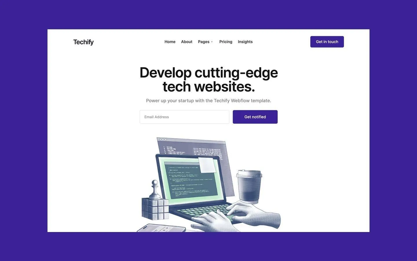
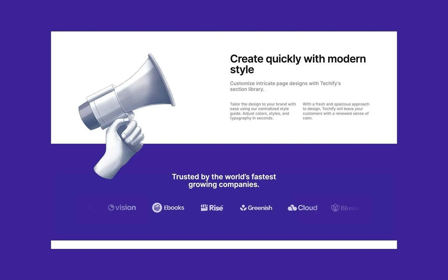
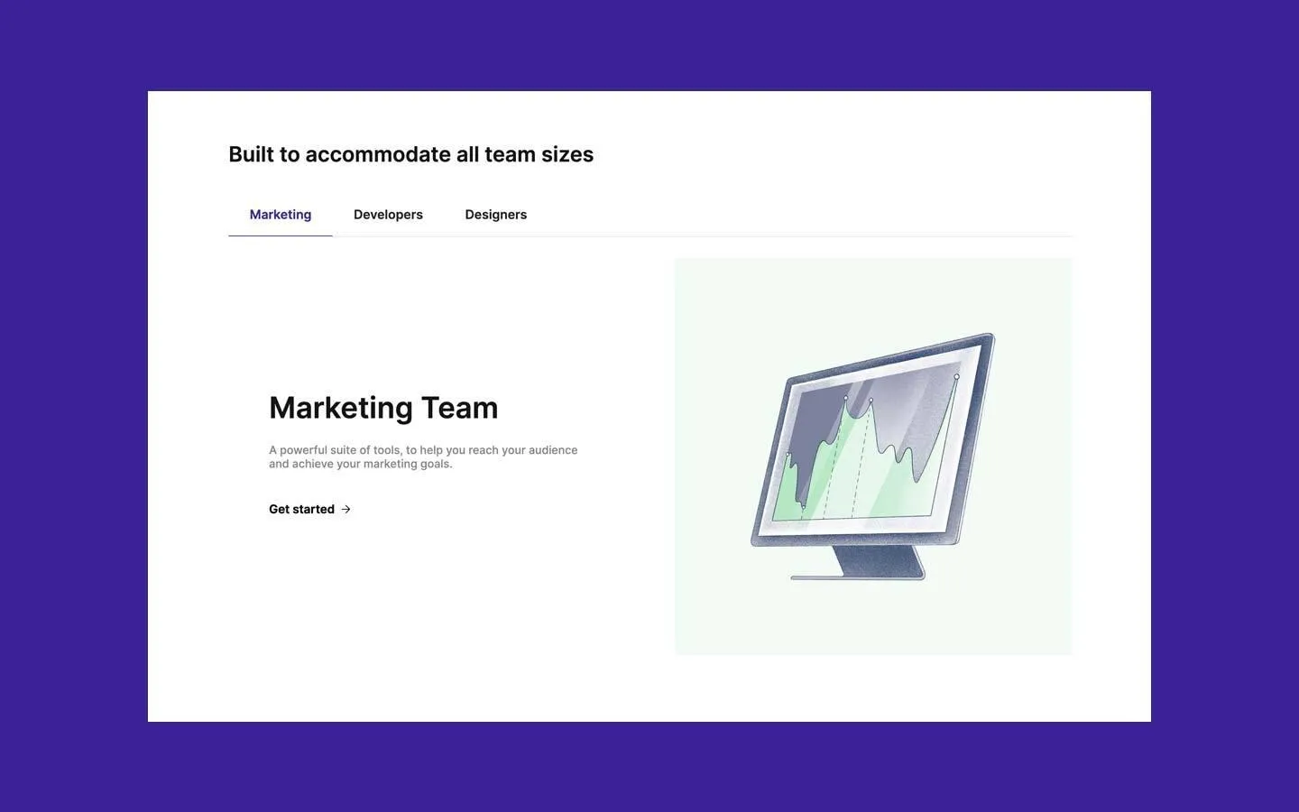
Techify is a calm, white startup site with a single deep violet. Large, tightly tracked Inter 600 headlines sit centred or left-aligned on plain white, body text is a soft grey, and the only solid colour comes from small square-cornered violet buttons and two full-width violet bands (logos and metrics). The personality comes from the artwork: grainy, engraved-looking navy illustrations with mint-green highlights (a laptop with code, a megaphone, a monitor with a chart).
Four signatures make it recognisable:
- Engraved illustrations. Stippled, monochrome navy-grey objects with mint-green screens, floating on white or on a pale mint panel. No outlines, no flat vector shapes.
- One violet, used sparingly. #392396 fills the buttons, the round play button and two full-bleed bands, and colours the active tab's text and underline. Everything else is white, near-black and grey.
- Square corners on images, 6px on controls. Photos and illustration panels have no radius; buttons and inputs have a small 6px radius; avatars and the play button are circles.
- Tight headline tracking. The metrics, the hero H1, the 44px section titles and the quote run at line height 1.0 with −1 to −2px letter spacing; the 42px and 30px titles and body copy stay at normal tracking.
Techify is a light-only design.
Colors
Surfaces
#FFFFFFPage background
#FFFFFFSame as canvas
#FFFFFFInputs: white with a 1px light grey border
#CCCCCCWith field: Inputs: white with a 1px light grey border
#392396Full-bleed logo band and metrics band
Ink
#FFFFFFText on violet
#141415Headlines, quotes, author names, Get started → links
#34353CNav links
#34353C · 60%Body copy, leads, input text and placeholders (27 text elements)
#222222Inactive tab labels
#FFFFFF#FFFFFFTitles and numbers / labels on the violet bands
#FFFFFF · 70%Titles and numbers / labels on the violet bands
Action
#392396Filled buttons, play button, active tab, violet bands
#392396#5440AAA lighter violet measured on three small text elements; use for inline text links only
Lines & effects
#777F83 · 20%Tab rail under the tab row, dividers
#777F83 · 30%Stronger dividers (one per page)
#EFF0F6Hairline card borders
#DCDFE4Hairline card borders
Typography
Inter · display-metric
The quick brown fox jumpsMetric numbers 3k, $1m, 99% on the violet band. 90px · 600 · 1.0 · -2px
Inter · headline-lg
The quick brown fox jumpsSection titles: Watch tutorial, Create quickly with modern style, Resources and insights. 44px · 600 · 1.0 · -1px
Inter · title-xl
The quick brown fox jumpsSmaller section titles: Built to accommodate all team sizes, band titles. 30px · 600 · 1.05
Inter · body-lg
The quick brown fox jumpsHero and section leads. 20px · 500 · 1.2
Inter · label-nav
The quick brown fox jumpsNav links. 17px · 600 · 1.18
Spacing & shape
| Purpose | Value |
|---|---|
| Container | 1200px max, centred, inside 72px side padding (5% at 1440px) |
| Section rhythm | 100px top and bottom |
| Breakpoints | Webflow's 991, 767 and 479px; split rows stack to one column at 767px |
Spacing scale
| Token | Value | Preview |
|---|---|---|
xs | 12px | |
sm | 15px | |
md | 24px | |
lg | 30px | |
xl | 50px | |
2xl | 70px |
Layout spacing
| Token | Value | Preview |
|---|---|---|
column-gap | 30px | |
gutter | 72px | |
section | 100px | |
section-logos | 120px |
Border radius
Motion
| Scroll reveal | opacity 0 → 1 over 1000ms outQuart as blocks scroll into view |
| Dropdown | Caret rotates over 300ms ease; list fades in 300–500ms ease |
| Tab underline | Border and size change over 200ms outSine / 300ms ease |
| Button | Background transition 0.2s cubic-bezier(0.645, 0.045, 0.355, 1) or 0.3s |
Do’s and don’ts
- Keep the page white (#FFFFFF) with near-black #141415 headlines and #34353C at 60% for body text.
- Use #392396 for every filled control and for full-bleed bands, with white text.
- Set display and section titles in Inter 600 at line height 1.0 with −1 to −2px tracking.
- Give buttons and inputs a 6px radius and keep photos square-cornered.
- Use engraved navy-and-mint illustrations for features and the hero.
- Alternate text and image sides in 2-column split rows with a 50–70px gap.
- Keep ink-muted body copy at 16px+ and weight 500; it is a light grey on white.
- Add a second accent or put mint green on UI controls.
- Round photos or illustration panels; only controls and circles are rounded.
- Use heavy shadows; the three measured shadows are 4–10% opacity.
- Use ink-muted for small 12–14px meta text; use ink-soft #34353C there.
- Invent a hover colour for buttons; none is measured.
- Use flat vector or 3D clay illustrations; the style is grainy engraving.
Example prompt
Any page in the Techify style
More design systems like this
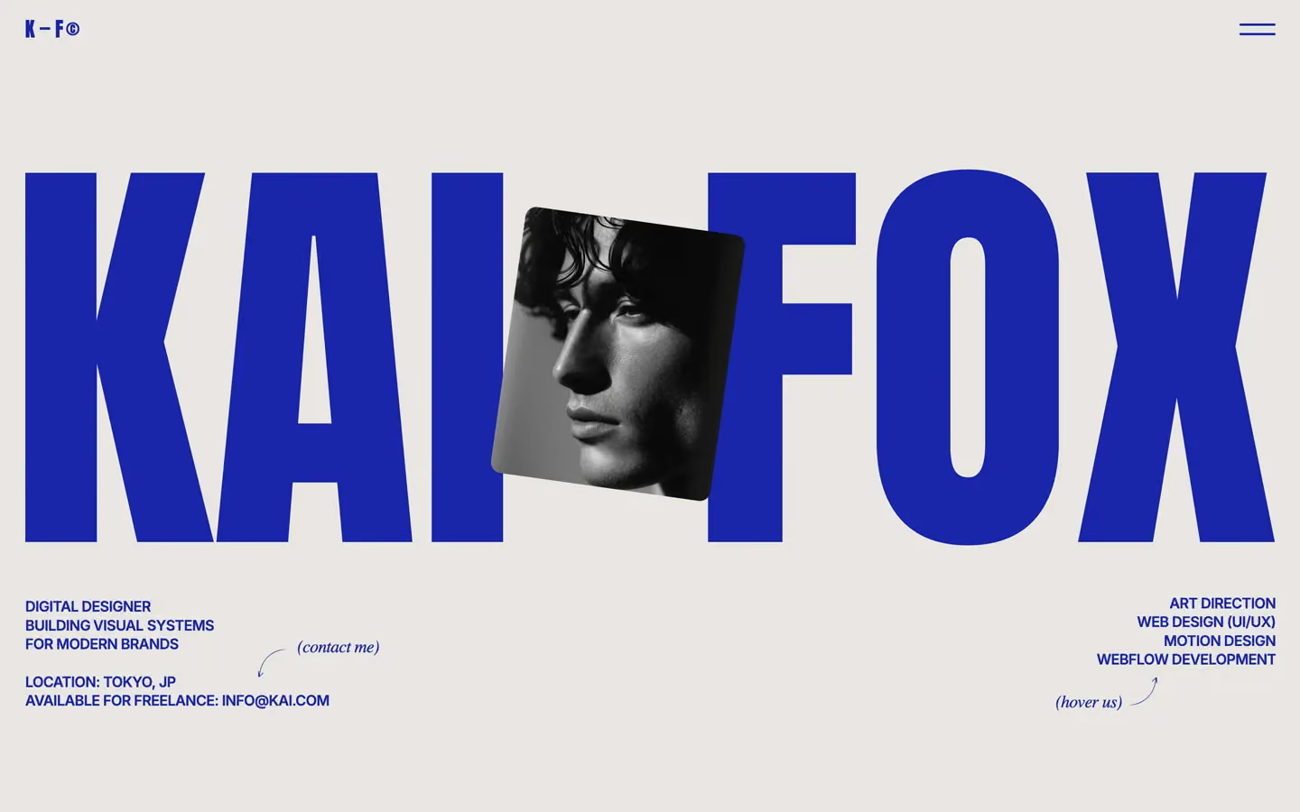
Design systems in the same colors.
Bring any of them to your AI tool
All Access unlocks all 398 design systems, ready for Claude, ChatGPT, Gemini, Cursor, v0 and Lovable, plus 400+ templates on all 5 platforms.
Get All AccessUpgrade to All AccessHow to use the Techify design system
Pick a file to see what it’s for and where it goes.
What it is
The whole design system in one markdown file, written for AI: every color, type style, spacing value, component and motion rule, plus do's, don'ts and a ready prompt.
Best for
Claude, ChatGPT, Gemini, Cursor and v0, or any other AI tool that builds pages or code.
How to use it
- Put
DESIGN.mdin your project and mention it in your request, or save it as.cursor/rules/techify.mdc - For the rule file, start it with a front-matter block that sets
alwaysApply: true, so every chat uses it - Ask: “Build a pricing page using DESIGN.md.” Cursor follows the colors, fonts, spacing and rules
- Put
DESIGN.mdin the project root - Add one line to
CLAUDE.md: “Follow DESIGN.md for all UI.” - Ask for any page or component; Claude reads the file first
- Attach
DESIGN.mdto the chat (or paste it in) - Ask: “Build a landing page in this design system.”
- Keep the file in the chat or project knowledge, so follow-up pages stay on style
What it is
Every token as data, in the W3C Design Tokens format: colors with their roles, type styles, radius, spacing, and component tokens that point at them.
Best for
Figma (Tokens Studio), Style Dictionary and other design-token tools, and build scripts.
How to use it
- In Figma, open Tokens Studio, choose Import, and pick
tokens.json - Or point Style Dictionary’s
sourceat it to generate tokens for any platform - In code, import it like any JSON file
What it is
A Tailwind CSS v4 theme: every color, font, type style, radius and spacing value becomes a Tailwind utility, like bg-canvas, text-headline-lg or rounded-md.
Best for
Tailwind v4 projects, and AI builders that write Tailwind (v0, Lovable, Bolt).
How to use it
- Save
theme.cssnext to your main CSS file - Import it after Tailwind:
@import "tailwindcss"; @import "./theme.css"; - Use the classes:
bg-canvas text-ink rounded-md p-lg
What it is
The same tokens as plain CSS variables on :root. Component values point at the color variables, so changing one color updates everything that uses it.
Best for
Any website: plain CSS, Webflow custom code, Framer, WordPress.
How to use it
- Add it to your stylesheet, or in Webflow paste it into Site settings → Custom code inside a
<style>tag - Use the variables anywhere:
color: var(--color-ink) - Change a token once and every place that uses it follows