 flowmance
Found Design System
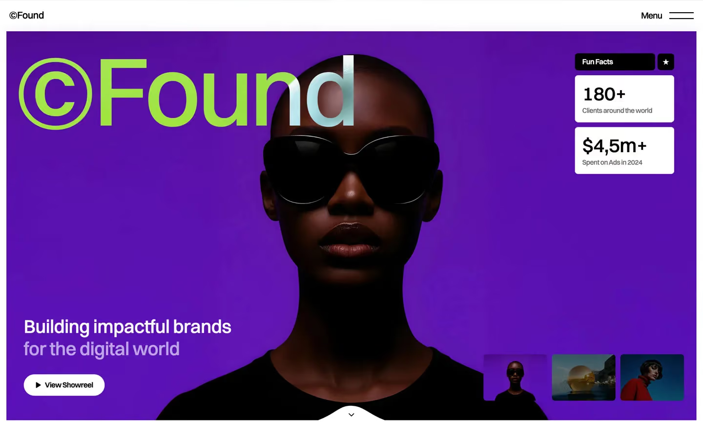
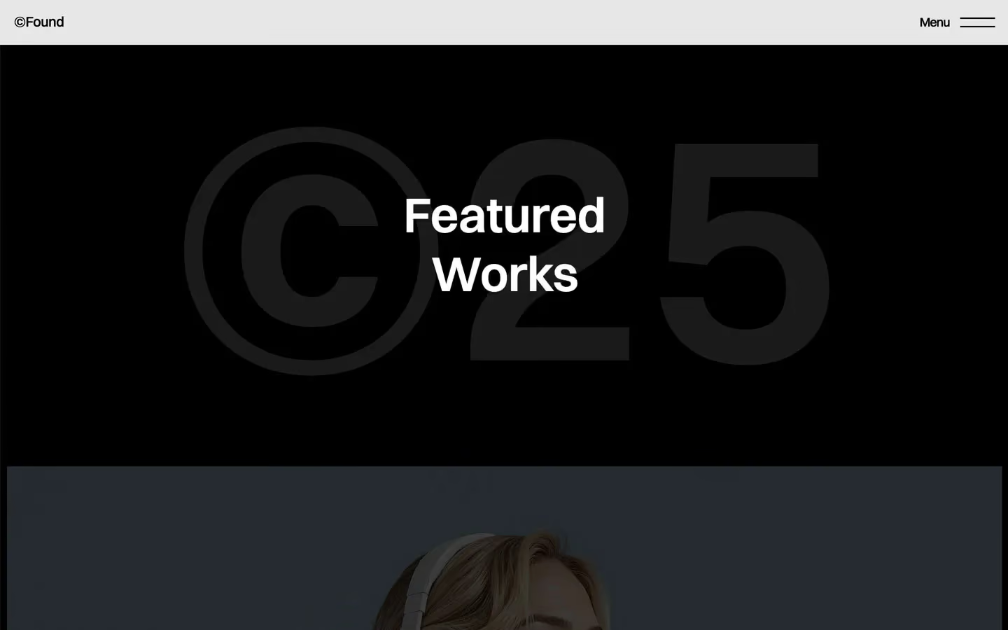

Found is a loud, high-contrast studio site. The interface is pure black on white, set in Switzer at poster sizes, and a single electric violet (#5B12B7) carries the brand from the hero photo to the submit button. Big imagery runs almost edge to edge, framed by a thin white or black margin, and the page alternates long white stretches with black bands.
Four signatures make it recognisable:
- The difference-blended wordmark. The hero's ©Found (200px, weight 500) sits in a mix-blend-mode: difference layer. White over the violet photo renders as acid green, and over the model's grey head it turns pale cyan. The © is part of the word, at full size.
- Fun Facts cards. Top-right of the hero: a black Fun Facts tag with a black ★ square beside it, then stacked white cards (6.4px radius) holding 180+ and $4,5m+ with a small grey caption.
- Bracketed table labels. The awards list is a real table: a black header row with [ Award ] [ Recognition ] [ Year ] in white, then rows split by 1px black rules.
- The text rotator. A viewport-wide strip of Let's Talk at 20vw (288px at 1440), repeated and scrolling sideways. On hover the whole strip inverts.
Found is light-first with full black bands. It is not a dark-mode design.
Colors
Surfaces
#FFFFFFPage background (--second-color: white), footer
#F3F3F3Form inputs
#000000 · 7%Small tags like Who we are and its ★ square
#F3F3F3Form inputs
#000000Black bands: the work section, the dark statement section, table header, fact tags
Ink
#FFFFFFText on primary
#000000Text on secondary
#000000Headlines, nav, table rows, links (--first-color: black)
#000000Body text
#000000 · 50%Plain paragraphs (p { opacity: .5 }), the lead under the statement
#FFFFFFText on inverse-canvas
#FFFFFF · 70%Uppercase eyebrows on black (.second-title)
#FFFFFFAction
#5B12B7Violet: the round CTA button, Submit Project, the hero photo backdrop (--violet)
#5B12B7#FFFFFFThe View Showreel pill on photos
#5B96FEThe blue circle that fills the showreel pill on hover (.btn-bg)
Lines & effects
#000000Table rules, subscribe field border, secondary dividers
#000000 · 15%With line: Table rules, subscribe field border, secondary dividers
#000000 · 50%With line: Table rules, subscribe field border, secondary dividers
#000000 · 55%#222222Two small dark blocks (with #171717 once)
#FFFFFF · 20%Light glass layers over imagery (3 uses)
#000000 · 60%Project label boxes on photos (Studio Focus)
#FFFFFF · 90%The fixed nav bar
Typography
Switzer · display-rotator
The quick brown fox jumpsLet's Talk text strip (.text-rotator, CSS 20vw). 288px · 500 · 0.9 · -1px
Switzer · headline-xl
The quick brown fox jumpsRight-aligned service names (.service-title-main). 99px · 600 · 1.0 · -0.5px
Switzer · title-lg
The quick brown fox jumpsProject names on photo labels. 27px · 500 · 1.1 · -0.5px
Switzer · link-lg
The quick brown fox jumpsUnderlined text links (.button-line). 20px · 500 · 1.0 · -0.5px
Switzer · body-lg
The quick brown fox jumpsParagraphs (p), usually at 50%. 18px · 500 · 1.5 · -0.5px
Switzer · eyebrow
The quick brown fox jumps.second-title on black, white at 70%. 18px · 400 · 1.5 · -0.5px
Spacing & shape
| Purpose | Value |
|---|---|
| Container | 1240px max (.container), centred |
| Section rhythm | .section is 300px top and bottom with 5% side padding (72px at 1440), 150px at ≤991 |
| Breakpoints | 991px, 767px and 479px (Webflow defaults), plus a few min-width: 768px rules |
Spacing scale
| Token | Value | Preview |
|---|---|---|
hair | 3px | |
xs | 10px | |
sm | 16px | |
md | 20px | |
lg | 30px | |
xl | 40px | |
2xl | 50px |
Layout spacing
| Token | Value | Preview |
|---|---|---|
frame | 10px | |
nav-height | 64px | |
section-x | 72px | |
logo-gap | 74px | |
strip | 95px |
Border radius
Surfaces
How the surfaces stack, from the page background up. Hex codes and roles are in Colors above.
Motion
| Headline reveal | Lines move y 110% or 130% → 0% inside a mask, 500ms; some also skew y 6deg → 0deg over 800ms ease |
| Fade | Opacity 0 → 1, 500ms (scroll into view) or 300ms ease (hover) |
| Underline grow | Width, 500ms (300ms ease on hover out) |
| Icon spin | Rotate, 500ms; 600ms outExpo on the round CTA |
| Menu open | Panel height and links, 600ms inOutQuint; burger lines 200ms inOutQuint |
| Menu link | Opacity 0.35 → 1, 300ms (CSS) |
| Text colour swap | 400ms ease |
| Small slides | y → 0%, 400ms outCubic |
| Scroll scenes | Scroll-linked scenes: sticky work frames and the text rotator |
Do’s and don’ts
- Keep the UI to #000000 and #FFFFFF, with #5B12B7 violet for the main action only.
- Set every text style in Switzer with −0.5px tracking.
- Put white text on photos and use black at 60% (glass-dark) for label boxes over images.
- Use 6.4px corners for cards and tags, and full pills for buttons and the subscribe field.
- Give sections the full 300px top and bottom padding with 5% sides.
- Mark table and meta labels with brackets: [ Year ].
- Add shadows. Depth is bands, blur and overlays.
- Use Inter or Geist; they load or are declared but never render.
- Introduce green. The hero green is mix-blend-mode: difference on white text.
- Put ink-subtle (black at 50%) on text under 18px. It is only 4.0:1 on white.
- Round images. Frame them with 10px padding instead.
- Animate longer than 800ms or use bounce easing.
Example prompt
Any page in the Found style
More design systems like this
Agency design systems, the same colors first.


Bring any of them to your AI tool
All Access unlocks all 398 design systems, ready for Claude, ChatGPT, Gemini, Cursor, v0 and Lovable, plus 400+ templates on all 5 platforms.
Get All AccessUpgrade to All AccessHow to use the Found design system
Pick a file to see what it’s for and where it goes.
What it is
The whole design system in one markdown file, written for AI: every color, type style, spacing value, component and motion rule, plus do's, don'ts and a ready prompt.
Best for
Claude, ChatGPT, Gemini, Cursor and v0, or any other AI tool that builds pages or code.
How to use it
- Put
DESIGN.mdin your project and mention it in your request, or save it as.cursor/rules/found.mdc - For the rule file, start it with a front-matter block that sets
alwaysApply: true, so every chat uses it - Ask: “Build a pricing page using DESIGN.md.” Cursor follows the colors, fonts, spacing and rules
- Put
DESIGN.mdin the project root - Add one line to
CLAUDE.md: “Follow DESIGN.md for all UI.” - Ask for any page or component; Claude reads the file first
- Attach
DESIGN.mdto the chat (or paste it in) - Ask: “Build a landing page in this design system.”
- Keep the file in the chat or project knowledge, so follow-up pages stay on style
What it is
Every token as data, in the W3C Design Tokens format: colors with their roles, type styles, radius, spacing, and component tokens that point at them.
Best for
Figma (Tokens Studio), Style Dictionary and other design-token tools, and build scripts.
How to use it
- In Figma, open Tokens Studio, choose Import, and pick
tokens.json - Or point Style Dictionary’s
sourceat it to generate tokens for any platform - In code, import it like any JSON file
What it is
A Tailwind CSS v4 theme: every color, font, type style, radius and spacing value becomes a Tailwind utility, like bg-canvas, text-headline-lg or rounded-md.
Best for
Tailwind v4 projects, and AI builders that write Tailwind (v0, Lovable, Bolt).
How to use it
- Save
theme.cssnext to your main CSS file - Import it after Tailwind:
@import "tailwindcss"; @import "./theme.css"; - Use the classes:
bg-canvas text-ink rounded-md p-lg
What it is
The same tokens as plain CSS variables on :root. Component values point at the color variables, so changing one color updates everything that uses it.
Best for
Any website: plain CSS, Webflow custom code, Framer, WordPress.
How to use it
- Add it to your stylesheet, or in Webflow paste it into Site settings → Custom code inside a
<style>tag - Use the variables anywhere:
color: var(--color-ink) - Change a token once and every place that uses it follows