 flowmance
Tessel Design System
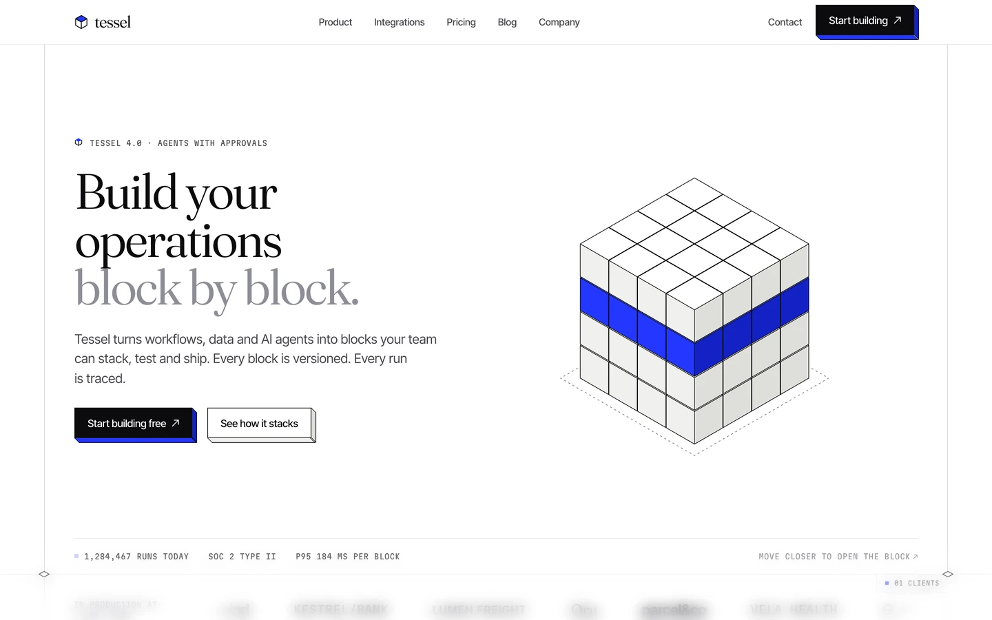
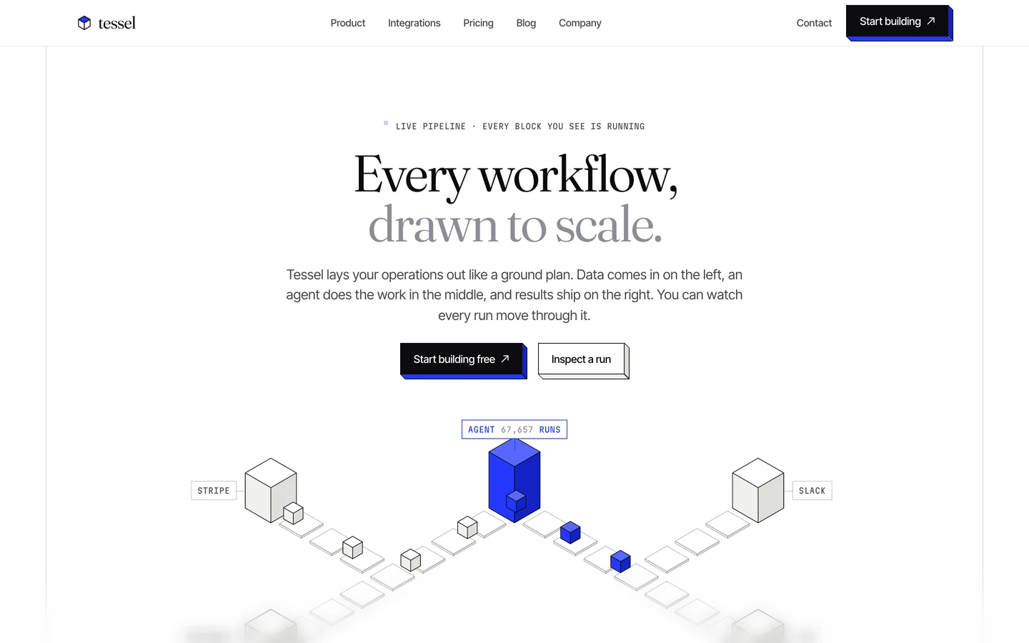
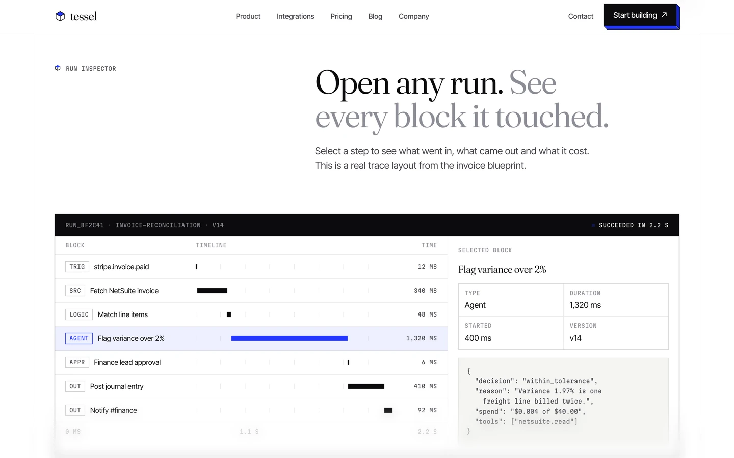
Tessel is a quiet, engineered SaaS template. It reads like a technical drawing on white paper: thin grey frame lines, mono labels in small caps, light Fraunces serif headlines and very little colour. The one colour, cobalt #2337FF, shows up as the side face of extruded buttons and in the isometric illustrations, so the whole site feels built from blocks.
The measured page is the template overview (Twenty-five pages. One isometric system.). Its thumbnails show the three homepages, pricing, contact and CMS pages, which all use the same system described here.
Four signatures make it recognisable:
- Isometric extruded buttons. Every button is a square-cornered block with a 1px border and a side and bottom face about 6px deep, so it looks like an isometric slab. The dark button's faces are cobalt #2337FF; the white button's faces are pale grey with an ink outline.
- Two-tone serif headlines. Most section headlines are two short sentences in Fraunces weight 360. The first is ink #0B0B0D, the second is ink-faint #8D8D95: Twenty-five pages. / One isometric system.
- The drafting frame. The 1312px content column is bounded by 1px vertical rules with tick marks every 120px down the left rail. Sections meet at a full-width hairline with small <> diamond markers on both rails and a mono tab at the right edge (■ 01 HOMEPAGES).
- Mono metadata. Labels are Martian Mono 11px uppercase with wide tracking, often after a tiny cube icon (TEMPLATE OVERVIEW, VERSION 1.0 · OCTOBER 2026, PRICING 01).
Tessel is light-only. Corners are square everywhere.
Colors
Surfaces
#FFFFFFPage background, cards, inputs
#F5F5F3Warm off-white panels and bands, the white button's extruded face
#FFFFFF#999999Input placeholder text
#0B0B0DInk
#FFFFFFText on primary
#0B0B0DText on secondary
#FFFFFF#0B0B0DHeadlines, first sentence of every headline, primary button fill, active labels
#47474EBody copy, leads, nav links, card text
#8D8D95Second sentence of headlines, meta labels (VERSION 1.0, PRICING 01)
#FFFFFFAction
#0B0B0DThe main filled button
#FFFFFFOutline button with a 1px ink border
#2337FFExtruded face of the primary button, the cube icon, section-tab square, isometric art
Lines & effects
#0B0B0D · 9%1px borders on cards, the nav bottom rule, section hairlines, the 30° grid pattern
#0B0B0D · 22%1px ring around page cards, input borders, rail tick marks
#FFFFFF · 82%Sticky nav, with saturate(1.4) blur(14px)
Typography
Fraunces · display-hero
The quick brown fox jumpsPage H1, two-tone. 72px · 360 · 0.96 · -2.52px
Fraunces · headline-card
The quick brown fox jumpsCard titles (Product, Plan cards, The block). 26px · 360 · 1.15 · -0.52px
Fraunces · title-serif
The quick brown fox jumpsSmaller serif titles. 24px · 360 · 1.20 · -0.48px
Fraunces · logo
The quick brown fox jumpsWordmark tessel, lower case. 24px · 380 · 1.00 · -0.72px
Inter Tight · body-lg
The quick brown fox jumpsHero and section leads. 19px · 400 · 1.50
Inter Tight · label
The quick brown fox jumpsMenu items, footer links. 14px · 500 · 1.30 · -0.14px
Spacing & shape
| Purpose | Value |
|---|---|
| Container | 1312px, centred, drawn as a frame: a 1px line rule on the left and right edge of the column, running the full page height |
| Section joins | each section ends at a full-width 1px line with a <> diamond on each rail and a mono tab hanging below the right rail: a small cobalt square, then 01 HOMEPAGES |
| Section rhythm | about 136px from a section join to the eyebrow, and about 130px under the last row (estimated from the screenshots) |
| Section header | a 2-column split with a 64px gap |
Spacing scale
| Token | Value | Preview |
|---|---|---|
hair | 8px | |
xs | 12px | |
sm | 20px | |
md | 24px | |
lg | 64px |
Layout spacing
| Token | Value | Preview |
|---|---|---|
column-gap | 20px | |
nav-height | 65px | |
rail-tick | 120px | |
section | 136px |
Border radius
Surfaces
How the surfaces stack, from the page background up. Hex codes and roles are in Colors above.
Motion
| Headline reveal | SplitText lines or words, y 36px → 0 and opacity 0 → 1, staggered over 1.56s, expo.out |
| Isometric block float | y 0 → −5px, 2.4s, sine.inOut |
| Block settle | y → −10px, 3.2s, expo.out |
| Block pulse | scale 1 → 1.12, 1.2s, power2.inOut |
| Cursor blink | opacity → 0.25, 0.8s, steps |
| Bar fills | width → 39% / 41% / 52%, 0.6s, power2.out |
| Long linear tween | One 7.17s tween with none easing |
| Scroll-linked tween | One ScrollTrigger from top bottom to bottom top |
| Card hover | transform and box-shadow 300ms cubic-bezier(0.2, 0.7, 0.1, 1) |
| Links, borders, fills | color 200ms, border-color 300ms, background-color 200–300ms, buttons 250ms |
Do’s and don’ts
- Keep every corner at 0px and give buttons the 6px extruded face (cobalt #2337FF under #0B0B0D).
- Write headlines as two sentences in Fraunces 360, first in #0B0B0D, second in #8D8D95.
- Put an eyebrow (cube icon + Martian Mono 11px uppercase, 0.44px tracking) before every section title.
- Set body copy in Inter Tight 16px / 1.5 in ink-muted #47474E.
- Draw structure with 1px lines: #0B0B0D16 for dividers, #0B0B0D38 for card rings and inputs.
- Keep the 1312px framed column with rails and <> markers at section joins.
- Pair one primary and one secondary button, side by side, never more.
- Round corners, add soft drop shadows or blur anything other than the nav.
- Fill sections, cards or text with cobalt. It belongs to extrusions, small squares and illustrations.
- Use #8D8D95 for body text or small actionable labels; it is only 3.3:1 on white.
- Uppercase Fraunces or Inter Tight, or use Fraunces above weight 380.
- Use stock photography or 3D renders with lighting; illustrations are flat isometric line art.
- Animate with bounce or elastic easing, or make hover moves longer than 300ms.
Example prompt
Any page in the Tessel style
More design systems like this
SaaS design systems, the same colors first.



Bring any of them to your AI tool
All Access unlocks all 398 design systems, ready for Claude, ChatGPT, Gemini, Cursor, v0 and Lovable, plus 400+ templates on all 5 platforms.
Get All AccessUpgrade to All AccessHow to use the Tessel design system
Pick a file to see what it’s for and where it goes.
What it is
The whole design system in one markdown file, written for AI: every color, type style, spacing value, component and motion rule, plus do's, don'ts and a ready prompt.
Best for
Claude, ChatGPT, Gemini, Cursor and v0, or any other AI tool that builds pages or code.
How to use it
- Put
DESIGN.mdin your project and mention it in your request, or save it as.cursor/rules/tessel.mdc - For the rule file, start it with a front-matter block that sets
alwaysApply: true, so every chat uses it - Ask: “Build a pricing page using DESIGN.md.” Cursor follows the colors, fonts, spacing and rules
- Put
DESIGN.mdin the project root - Add one line to
CLAUDE.md: “Follow DESIGN.md for all UI.” - Ask for any page or component; Claude reads the file first
- Attach
DESIGN.mdto the chat (or paste it in) - Ask: “Build a landing page in this design system.”
- Keep the file in the chat or project knowledge, so follow-up pages stay on style
What it is
Every token as data, in the W3C Design Tokens format: colors with their roles, type styles, radius, spacing, and component tokens that point at them.
Best for
Figma (Tokens Studio), Style Dictionary and other design-token tools, and build scripts.
How to use it
- In Figma, open Tokens Studio, choose Import, and pick
tokens.json - Or point Style Dictionary’s
sourceat it to generate tokens for any platform - In code, import it like any JSON file
What it is
A Tailwind CSS v4 theme: every color, font, type style, radius and spacing value becomes a Tailwind utility, like bg-canvas, text-headline-lg or rounded-md.
Best for
Tailwind v4 projects, and AI builders that write Tailwind (v0, Lovable, Bolt).
How to use it
- Save
theme.cssnext to your main CSS file - Import it after Tailwind:
@import "tailwindcss"; @import "./theme.css"; - Use the classes:
bg-canvas text-ink rounded-md p-lg
What it is
The same tokens as plain CSS variables on :root. Component values point at the color variables, so changing one color updates everything that uses it.
Best for
Any website: plain CSS, Webflow custom code, Framer, WordPress.
How to use it
- Add it to your stylesheet, or in Webflow paste it into Site settings → Custom code inside a
<style>tag - Use the variables anywhere:
color: var(--color-ink) - Change a token once and every place that uses it follows