 flowmance
Autona Design System
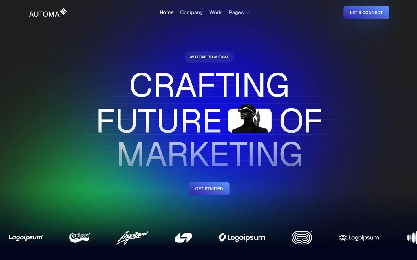
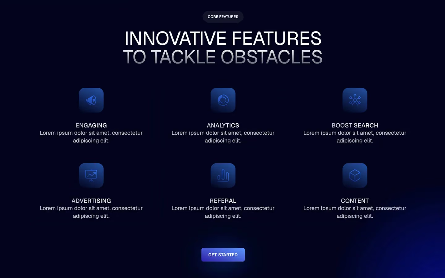
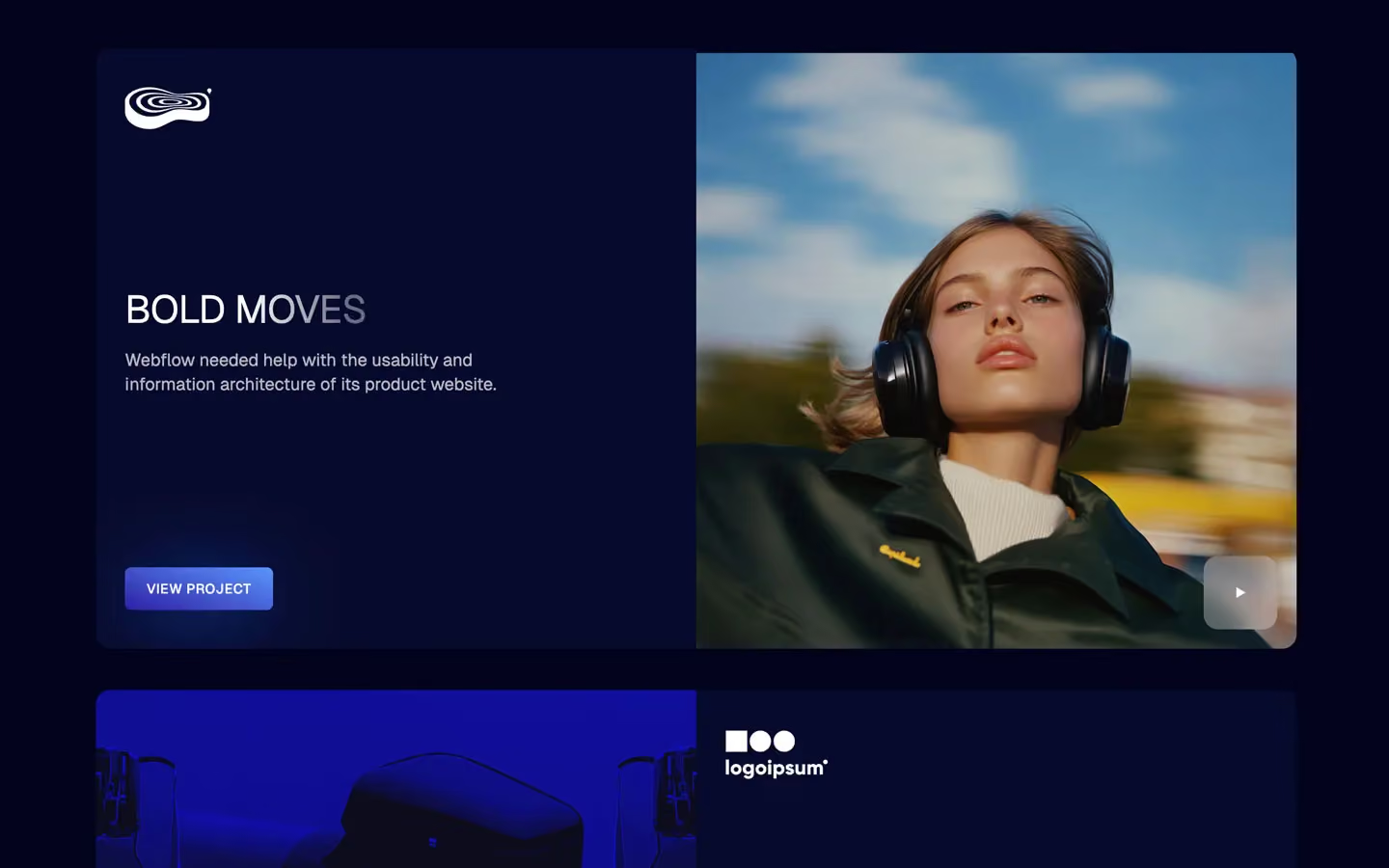
Autona is a dark, glowing marketing-agency site. Everything sits on a midnight navy (#00031C) lit by soft electric-blue light: a blue-and-green aurora in the hero, a blue radial glow behind the testimonials, blue haze in the corners of pricing cards. Headlines are wide, light-weight uppercase Geist, and every button is a small blue gradient block with a blue halo. The published preview uses the brand name AUTOMA in its logo and copy.
Four signatures make it recognisable:
- Fading uppercase headlines. Section titles are uppercase Geist 400 with −0.4px tracking. The last line fades from white to about 40% white with a vertical gradient fill (DESIGNED FOR CLIENTS / WITH SPECIFIC GOALS). Project names fade mid-word (STUDIO F|OCUS).
- Inline image in the headline. The hero CRAFTING / FUTURE [photo] OF / MARKETING sets a small rounded portrait (160×106px) between two words.
- Glowing gradient buttons. LET'S CONNECT and GET STARTED: a 20° gradient from #2D1DA5 to #5B96FE, 6.4px radius, white 14px uppercase text, and a 0 7px 80px −12px #0162FF glow underneath.
- Frosted pill eyebrows. Every section opens with a small uppercase pill (WELCOME TO AUTOMA, FUN FACTS, FEATURED WORK): white at 7%, 7px blur, 30px radius.
Autona is dark-only.
Colors
Surfaces
#00031CPage background (--second-color)
#070B2CWork cards, raised navy panels
#FFFFFF · 7%Eyebrow pills, dropdown and tab hover
#FFFFFF · 12%The 1px gradient border shell around pricing cards
#FFFFFF · 16%Form input border
#FFFFFFThe light nav dropdown panel
Ink
#FFFFFF#FFFFFF#FFFFFFHeadlines, nav active link, button text (--first-color)
#FFFFFF · 70%Paragraphs (p { opacity: .7 }), nav links at rest
#FFFFFF · 60%Plan names (CREATOR), footer links, category titles
#FFFFFF#222222Text on inverse-canvas
Action
#2D1DA5Button fill, linear-gradient(20deg, …)
#5B96FEWith primary: Button fill, linear-gradient(20deg, …)
#2D1DA5#110FDFActive pricing tab, testimonial band (--blue)
Lines & effects
#0162FFButton halo: 0 7px 80px -12px
#FFFFFF · 18%Testimonial card borders
#FFFFFF · 15%Tab menu border
#FFFFFF · 30%Most Popular badge
Typography
Geist · display-hero
The quick brown fox jumpsCRAFTING FUTURE OF MARKETING. 120px · 400 · 1.0 · -0.4px
Geist · headline-price
The quick brown fox jumpsPrices $29,00 (.pricing-large, 3rem). 48px · 400 · 1.1
Geist · title-md
The quick brown fox jumpsCard titles. 20px · 500 · 1.3
Geist · body-lg
The quick brown fox jumpsParagraphs at 70%; 1.6 in long text. 18px · 400 · 1.4
Geist · nav
The quick brown fox jumpsNav links (1.1rem). 17.6px · 500 · 1.14
Geist · label
The quick brown fox jumpsPricing features with checks (.p-for-price). 15px · 500 · 1.4
Spacing & shape
| Purpose | Value |
|---|---|
| Container | 1240px max (.container), centred; centred title blocks narrow to 700px |
| Section rhythm | .section is 120px top and bottom with 5% sides (72px at 1440) |
| Breakpoints | 991px, 767px and 479px (Webflow defaults), plus a few min-width: 768px rules |
Spacing scale
| Token | Value | Preview |
|---|---|---|
hair | 5px | |
xs | 10px | |
sm | 16px | |
md | 25px | |
lg | 35px | |
xl | 50px | |
2xl | 70px |
Layout spacing
| Token | Value | Preview |
|---|---|---|
section-x | 72px | |
logo-gap | 75px | |
nav-height | 90px | |
section | 120px | |
footer-gap | 150px | |
section-top | 160px |
Border radius
Surfaces
How the surfaces stack, from the page background up. Hex codes and roles are in Colors above.
Motion
| Fade-up reveal | Opacity 0 → 1 and move to 0px, 1000ms outQuart |
| Line reveal | y 100% or 200% → 0%, 500ms (outExpo on titles) |
| Scale in | scale 0.8 → 1, 500ms |
| Parallax | y −40px ↔ 40px, scroll-scrubbed |
| Filter fade | Filter, 300–400ms ease |
| Dropdown | Chevron rotate 400ms inOutQuint; panel 600ms inOutQuint |
| Hover | Opacity and background 300ms (transition: all .3s); testimonial cards transform .3s, color .3s |
| Size grow | 1000ms outExpo (bars and lines) |
Do’s and don’ts
- Keep the page on #00031C and use #070B2C only for raised navy tiles.
- Set headlines uppercase in Geist 400 with −0.4px tracking, and fade the last line with the white gradient fill.
- Use the gradient button (#2D1DA5 → #5B96FE, 6.4px radius) with the #0162FF glow for every main action.
- Open each section with a frosted eyebrow pill (white 7%, 30px radius, 12px uppercase).
- Put muted copy at white 70% and plan names or footer links at 60%.
- Light sections with radial blue washes rather than flat blue fills.
- Use flat drop shadows on cards; the only depth is glow, blur and gradient borders.
- Set headlines in bold or sentence case.
- Use green UI. --neon-green is declared but unused.
- Round buttons into pills; pills are only for eyebrows and the tab switch.
- Put gaps between work tiles; they sit edge to edge in one clipped block.
- Animate reveals longer than 1000ms.
Example prompt
Any page in the Autona style
More design systems like this
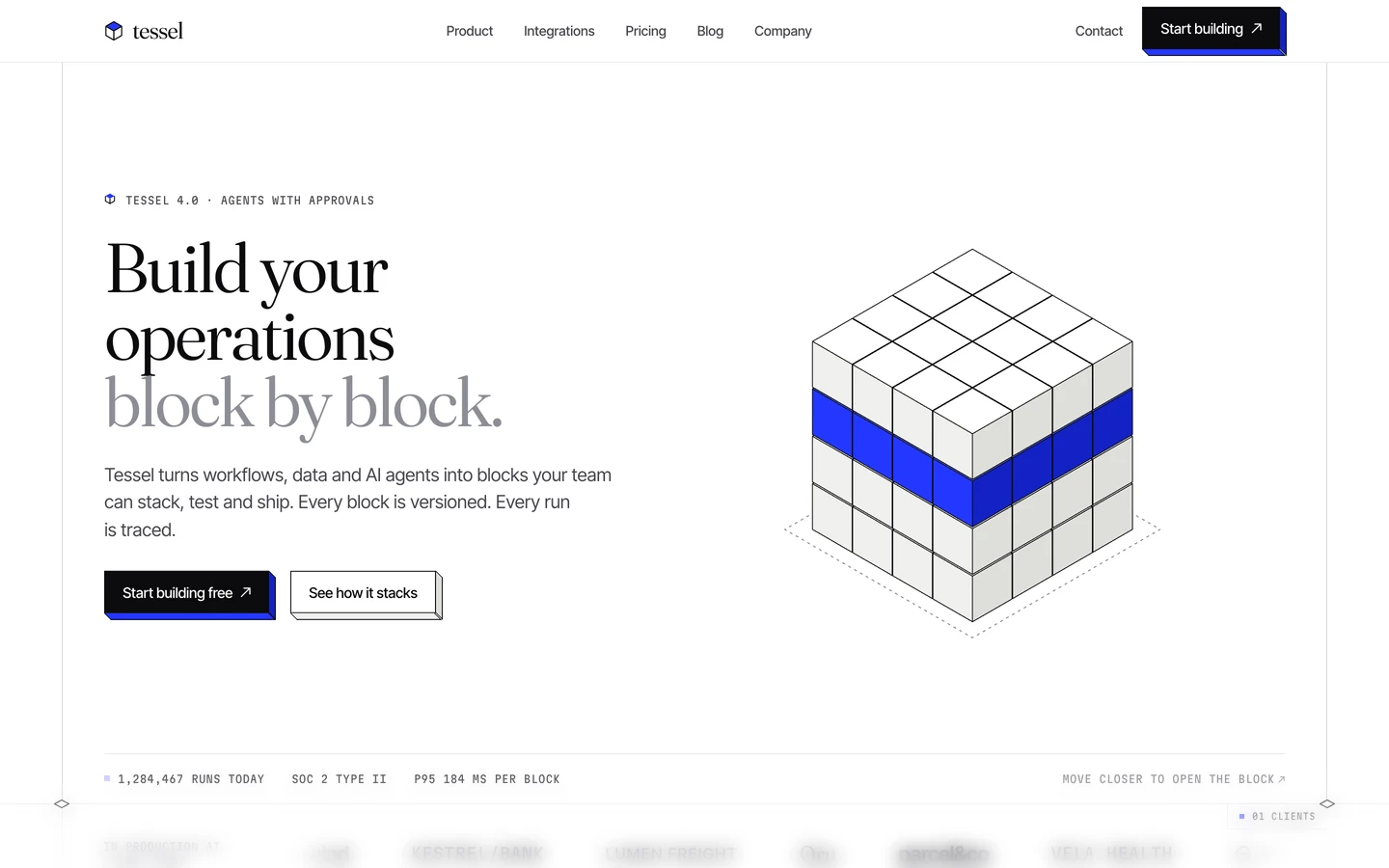
SaaS design systems, the same colors first.


Bring any of them to your AI tool
All Access unlocks all 398 design systems, ready for Claude, ChatGPT, Gemini, Cursor, v0 and Lovable, plus 400+ templates on all 5 platforms.
Get All AccessUpgrade to All AccessHow to use the Autona design system
Pick a file to see what it’s for and where it goes.
What it is
The whole design system in one markdown file, written for AI: every color, type style, spacing value, component and motion rule, plus do's, don'ts and a ready prompt.
Best for
Claude, ChatGPT, Gemini, Cursor and v0, or any other AI tool that builds pages or code.
How to use it
- Put
DESIGN.mdin your project and mention it in your request, or save it as.cursor/rules/autona.mdc - For the rule file, start it with a front-matter block that sets
alwaysApply: true, so every chat uses it - Ask: “Build a pricing page using DESIGN.md.” Cursor follows the colors, fonts, spacing and rules
- Put
DESIGN.mdin the project root - Add one line to
CLAUDE.md: “Follow DESIGN.md for all UI.” - Ask for any page or component; Claude reads the file first
- Attach
DESIGN.mdto the chat (or paste it in) - Ask: “Build a landing page in this design system.”
- Keep the file in the chat or project knowledge, so follow-up pages stay on style
What it is
Every token as data, in the W3C Design Tokens format: colors with their roles, type styles, radius, spacing, and component tokens that point at them.
Best for
Figma (Tokens Studio), Style Dictionary and other design-token tools, and build scripts.
How to use it
- In Figma, open Tokens Studio, choose Import, and pick
tokens.json - Or point Style Dictionary’s
sourceat it to generate tokens for any platform - In code, import it like any JSON file
What it is
A Tailwind CSS v4 theme: every color, font, type style, radius and spacing value becomes a Tailwind utility, like bg-canvas, text-headline-lg or rounded-md.
Best for
Tailwind v4 projects, and AI builders that write Tailwind (v0, Lovable, Bolt).
How to use it
- Save
theme.cssnext to your main CSS file - Import it after Tailwind:
@import "tailwindcss"; @import "./theme.css"; - Use the classes:
bg-canvas text-ink rounded-md p-lg
What it is
The same tokens as plain CSS variables on :root. Component values point at the color variables, so changing one color updates everything that uses it.
Best for
Any website: plain CSS, Webflow custom code, Framer, WordPress.
How to use it
- Add it to your stylesheet, or in Webflow paste it into Site settings → Custom code inside a
<style>tag - Use the variables anywhere:
color: var(--color-ink) - Change a token once and every place that uses it follows