 flowmance
Kai's Design System
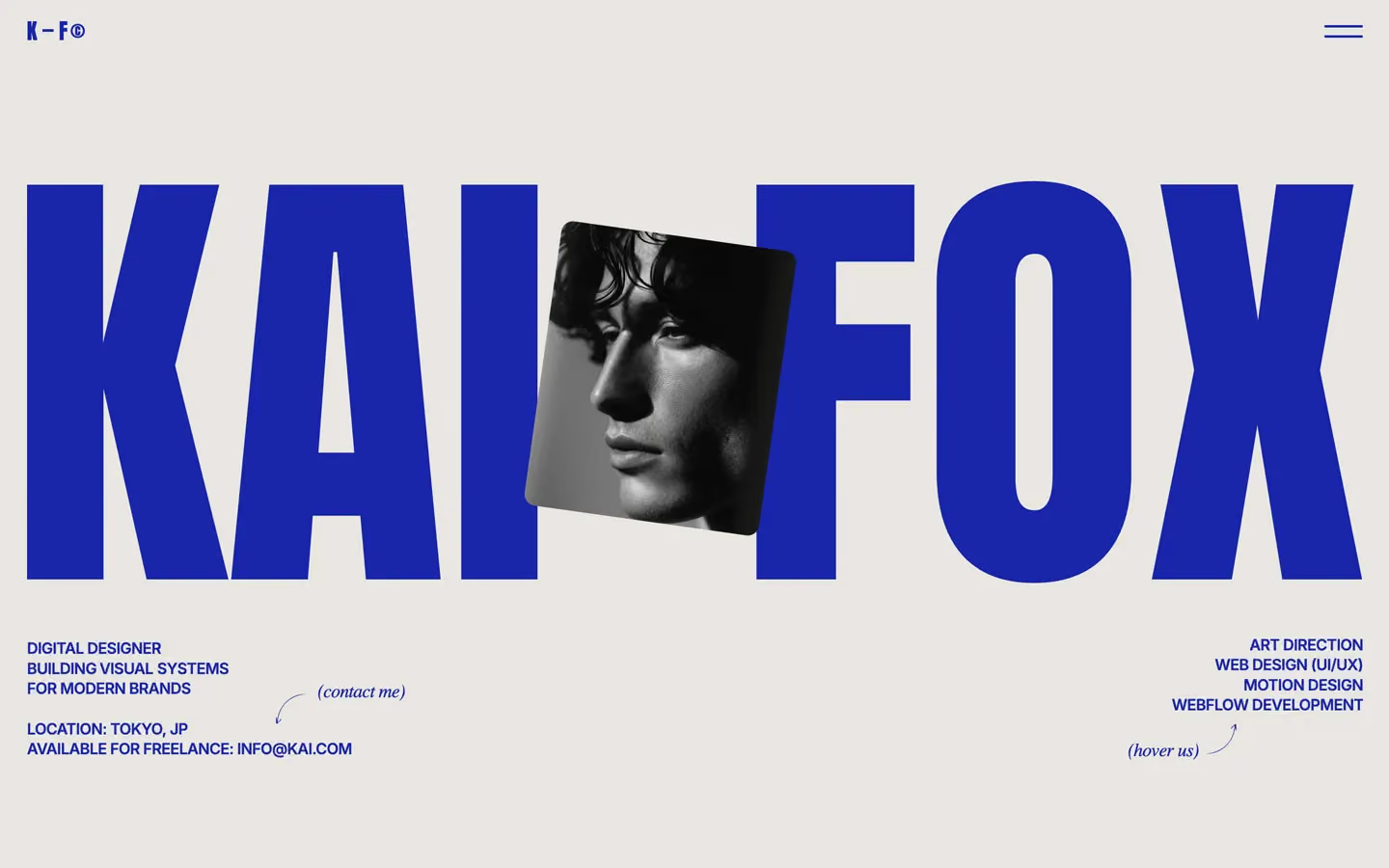
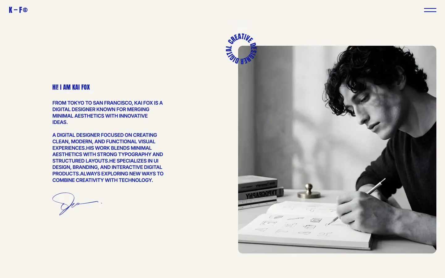
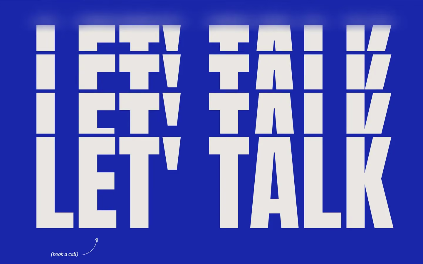
Kai's is a personal portfolio printed in two colours, like a risograph poster: a warm stone page (#E8E6E0) and one cobalt blue ink (#1925AA) for every word on the page and the logo. The hero is the owner's name, KAI FOX, in condensed Anton so large that the two words fill the width, with a tilted black-and-white portrait wedged between them. Everything else is small uppercase Inter set in the same blue.
Four signatures make it recognisable:
- One blue, no greys. Text is never black or grey; it is #1925AA at full strength on a warm off-white. The menu and footer invert it: stone text on a blue panel.
- The giant Anton name. KAI FOX at 33vw (475px at 1440) with line height 0.85. Section titles use the same face at 22vw (WORK). A tilted photo (rotated about 8°, 12px radius) overlaps the name.
- All-caps Inter paragraphs. Body copy, hero lines and service lists are Inter 16px, weight 600, uppercase, −0.5px tracking. The page reads like a typeset label, not an essay.
- Hand-drawn notes. Small italic annotations in brackets, (contact me) and (hover us), with thin curved arrows drawn in blue, point at the email and the service list. A scribbled signature closes the about text.
Kai's is a light design with blue (inverse) menu and footer panels.
Colors
Surfaces
#E8E6E0Page background (--colors--second-color), a warm stone
#F5F3EFThe about band (--colors--footer-color), one step lighter; its lower edge meets the next section in a wide curve
#1925AAMenu panel and footer
Ink
#1925AAText on primary
#1925AAAll text, logos, the hamburger, the signature and the drawn arrows
#1925AASame as ink
#E8E6E0Text on the blue panels
#FFFFFFText inside the circular hover cursor over images
Action
#E8E6E0There is no filled button
Lines & effects
#FFFFFF · 33%1px rules under the big menu links; a white line wipes over them on hover
Typography
Anton · display-hero
The quick brown fox jumpsKAI FOX (.name-heading, 33vw). 475px · 400 · 0.85
Anton · headline-md
The quick brown fox jumpsBig menu links (2.9rem). 46px · 400 · 1.1 · 0.8px
Anton · logo
The quick brown fox jumpsK — F©. 22px · 400 · 1.1 · 3px
Anton · title-work
The quick brown fox jumpsProject names CORE VISION and years © 25. 19px · 400 · 1.1 · 0.4px
Inter · label-lg
The quick brown fox jumpsThe © beside project years. 19px · 600 · 1.1 · 0.4px
Inter · body
The quick brown fox jumpsHero lines, about paragraphs, footer text. 16px · 600 · 1.3 · -0.5px
Spacing & shape
| Purpose | Value |
|---|---|
| Container | 100% wide, max 1400px, with 2% side padding (about 29px at 1440) |
| Section rhythm | 250px top and 150px bottom on the work section; the --section--padding-top-bottom variable is 250px, 100px at ≤991 and 60px at ≤767 |
| Breakpoints | 991, 767 and 479px, plus a 1920px+ step |
Spacing scale
| Token | Value | Preview |
|---|---|---|
xs | 10px | |
sm | 20px | |
md | 30px | |
lg | 50px | |
xl | 60px | |
2xl | 120px |
Layout spacing
| Token | Value | Preview |
|---|---|---|
grid-gap | 16px | |
section-x | 29px | |
gutter | 100px | |
section | 150px | |
footer-top | 200px | |
section-top | 250px |
Border radius
Surfaces
How the surfaces stack, from the page background up. Hex codes and roles are in Colors above.
Motion
| Smooth scroll | Lenis on the whole page |
| Underline wipe | x −110% → 0%, 300ms, power1.out |
| Text roll on hover | y 0 → −14px, 200ms, power1.in |
| Arrow slide | x −19px → 0, 300ms, power1.in |
| Menu line fill | width 0% → 100%, 400ms, power1.in |
| Pop-in | x 20px → 0, y 10px → 0, rotation 15° → 0°, scale 0.9 → 1, opacity 0 → 1, 300ms, sine.inOut |
| Icon pop | y −5px → 0, rotation 40° → 0°, scale 0.6 → 1, 200ms, sine.inOut |
| Split headline | Lines y → −130%, 400ms, power2.out, staggered |
| Menu panel | x 100% → 0%, 600ms, power1.out |
| Hero entrance | Letters and photo rise y 70% → 0%, 500ms, cubic-bezier(0.165, 0.84, 0.44, 1); the portrait rotates in (500ms inOutSine) |
| Hover circle | scale 1 → 3, 500ms inOutSine |
| Image hover | scale 1 → 1.1, 300ms ease |
| Fade-in | Opacity 0 → 1, 1000ms outQuart |
| Scroll trigger | center center → bottom top, played once, not scrubbed |
Do’s and don’ts
- Print every word in ink #1925AA on canvas #E8E6E0; invert to #E8E6E0 on #1925AA for the menu and footer.
- Set names and titles in Anton uppercase, line height 0.85 at display sizes, filling the width.
- Set paragraphs in Inter 16px, weight 600, uppercase, −0.5px tracking.
- Give photos a 10px radius and put the project name and © YY in a row beneath.
- Add at most one lowercase italic bracket note with a drawn arrow per screen.
- Keep the 110px blurred strip at the top so content softens under the nav.
- Use black, grey or a lighter blue for text. ink-muted is the same blue.
- Add filled buttons, borders or drop shadows.
- Write sentences in Anton or titles in Inter.
- Load Caveat expecting handwriting unless you also load it; as published the notes are a serif italic.
- Add a third interface colour; let the photos bring orange, green or red.
- Shrink the hero name to fit a layout; it should run edge to edge at 33vw.
Example prompt
Any page in the Kai's style
More design systems like this
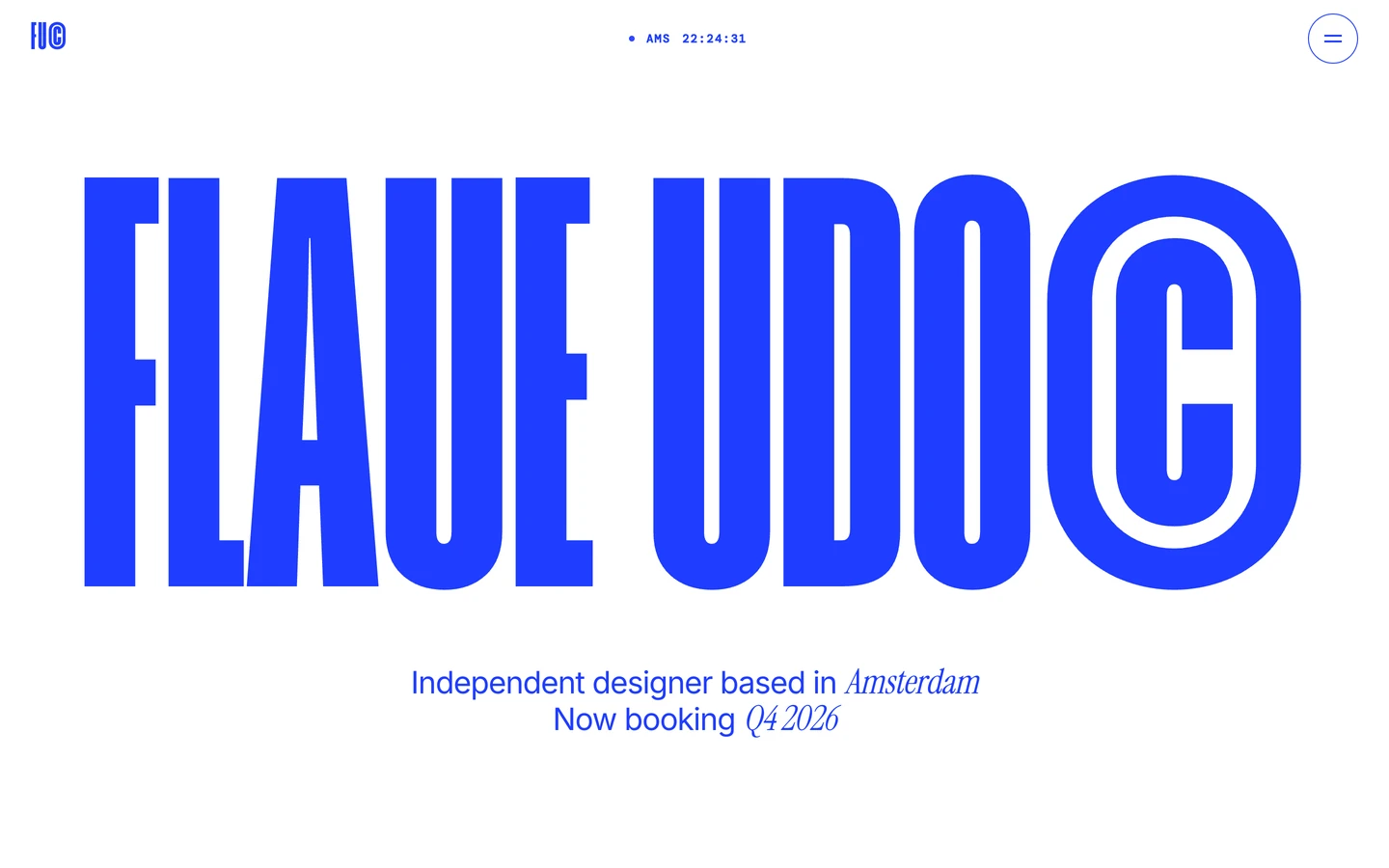
Portfolio design systems, the same colors first.


Bring any of them to your AI tool
All Access unlocks all 398 design systems, ready for Claude, ChatGPT, Gemini, Cursor, v0 and Lovable, plus 400+ templates on all 5 platforms.
Get All AccessUpgrade to All AccessHow to use the Kai's design system
Pick a file to see what it’s for and where it goes.
What it is
The whole design system in one markdown file, written for AI: every color, type style, spacing value, component and motion rule, plus do's, don'ts and a ready prompt.
Best for
Claude, ChatGPT, Gemini, Cursor and v0, or any other AI tool that builds pages or code.
How to use it
- Put
DESIGN.mdin your project and mention it in your request, or save it as.cursor/rules/kais.mdc - For the rule file, start it with a front-matter block that sets
alwaysApply: true, so every chat uses it - Ask: “Build a pricing page using DESIGN.md.” Cursor follows the colors, fonts, spacing and rules
- Put
DESIGN.mdin the project root - Add one line to
CLAUDE.md: “Follow DESIGN.md for all UI.” - Ask for any page or component; Claude reads the file first
- Attach
DESIGN.mdto the chat (or paste it in) - Ask: “Build a landing page in this design system.”
- Keep the file in the chat or project knowledge, so follow-up pages stay on style
What it is
Every token as data, in the W3C Design Tokens format: colors with their roles, type styles, radius, spacing, and component tokens that point at them.
Best for
Figma (Tokens Studio), Style Dictionary and other design-token tools, and build scripts.
How to use it
- In Figma, open Tokens Studio, choose Import, and pick
tokens.json - Or point Style Dictionary’s
sourceat it to generate tokens for any platform - In code, import it like any JSON file
What it is
A Tailwind CSS v4 theme: every color, font, type style, radius and spacing value becomes a Tailwind utility, like bg-canvas, text-headline-lg or rounded-md.
Best for
Tailwind v4 projects, and AI builders that write Tailwind (v0, Lovable, Bolt).
How to use it
- Save
theme.cssnext to your main CSS file - Import it after Tailwind:
@import "tailwindcss"; @import "./theme.css"; - Use the classes:
bg-canvas text-ink rounded-md p-lg
What it is
The same tokens as plain CSS variables on :root. Component values point at the color variables, so changing one color updates everything that uses it.
Best for
Any website: plain CSS, Webflow custom code, Framer, WordPress.
How to use it
- Add it to your stylesheet, or in Webflow paste it into Site settings → Custom code inside a
<style>tag - Use the variables anywhere:
color: var(--color-ink) - Change a token once and every place that uses it follows