 flowmance
Bryn Design System


Bryn is a loud, single-colour portfolio for a digital designer or a small agency. Almost everything on a white page is royal blue #2E5CFF: the uppercase General Sans headlines, the frames, the buttons and the two square tiles pinned to the top corners. Colour beyond the blue comes from flat, saturated backgrounds in the work (lime green, golden yellow, hot pink) and from playful photography.
The published preview opens on a presentation page (Meet Bryn, Home Demo, Work Demo, Contact Demo, Blog Demo) that shows every page of the template as a framed thumbnail. Those thumbnails, the CSS and the presentation page together define the system below.
Four signatures make it recognisable:
- Corner tiles. An 85×85px blue square at the top left holds the BR / YN stacked wordmark in white; a matching blue square at the top right holds a two-bar hamburger. Both are position: fixed and stay in the corners while the page scrolls.
- Uppercase blue General Sans. Headlines, labels, intros and even long statements (HEY! I'M BRYN DOE / I'M AWARD WINNING DIGITAL DESIGNER…) are set in uppercase blue, weight 500–600, with line height around 1.0–1.3.
- The line-and-label marker. Section labels start with a short 30px horizontal rule, then a tracked uppercase word: —— HOME DEMO, —— WHAT IS INCLUDED IN BRYN TEMPLATE. Inside the pages the same rule sits before a small index.
- The black menu with serif flips. The hamburger opens a full-screen #151619 overlay with four 100px uppercase blue links (WORK, ABOUT, NEWS, HIRE ME); the hovered link flips to EB Garamond italic.
Bryn is a light design with dark moments (the menu, some contact and work pages).
Colors
Surfaces
#FFFFFFPage background
#F5F5F5Light grey fills behind previews and image placeholders
#FFFFFFForm inputs and their 1px border
#C3C8CC · 60%With field: Form inputs and their 1px border
#151619Menu overlay, dark work and contact pages
Ink
#FFFFFFText and icons on blue
#2E5CFFHeadlines, labels, links, intros
#616161Paragraphs (p), the footer line © This is a Masterthemes template, input text
#A3A3A3Footer dark-link on hover
#FFFFFFText on the dark service cards and on the blue band
Action
#2E5CFFFilled pill buttons, the blue band, the corner tiles
#033BFF.button:hover, a deeper blue
#FFD22EGolden yellow: full-bleed work backgrounds, the style-guide swatch
#5BFF2ELime green: full-bleed work backgrounds, the style-guide swatch
Lines & effects
#2E5CFF2px solid frames around previews and service boxes
#1A1B1FDark service cards (service-card-wrapper)
Typography
General Sans · display-menu
The quick brown fox jumpsOverlay menu links (.navlinks), uppercase. 100px · 600 · 1.0
General Sans · headline-lg
The quick brown fox jumps.title-2 section titles (WHAT I DO, SELECTED WORK), uppercase. 48px · 600 · 1.15
General Sans · title-lg
The quick brown fox jumpsBase h3. 24px · 600 · 1.25
General Sans · body-lead
The quick brown fox jumpsHero intro, uppercase. 20px · 500 · 1.3
General Sans · label-button
The quick brown fox jumpsPill buttons, sentence case. 16px · 500 · 1.2
General Sans · eyebrow
The quick brown fox jumpsSection labels after the 30px rule, uppercase. 15px · 600 · 1.2 · 1px
Spacing & shape
| Purpose | Value |
|---|---|
| Container | .container max 1200px, centred, flex column; .medium-container max 1100px for the footer |
| Section rhythm | .section is 100px top and bottom with 5% side padding (72px at 1440); top and bottom drop to 50px at ≤991px |
| Breakpoints | 991px, 767px and 479px, plus min-width steps at 768, 1280, 1440 and 1920px (plain .title-1 is 7vw at ≥1280px and 6vw at ≥1920px) |
Spacing scale
| Token | Value | Preview |
|---|---|---|
xs | 5px | |
sm | 10px | |
md | 16px | |
lg | 20px | |
xl | 30px | |
2xl | 60px |
Layout spacing
| Token | Value | Preview |
|---|---|---|
column-gap | 30px | |
tile | 85px | |
section | 100px | |
menu-pad | 100px | |
hero-top | 150px |
Border radius
Surfaces
How the surfaces stack, from the page background up. Hex codes and roles are in Colors above.
Motion
| Scroll-in fade | opacity 0 → 1, 1000ms outQuart; or 500ms outExpo paired with y 30px → 0 |
| Lift on load | y -50px → 0 and y 30px → 0, 500ms, outExpo |
| Mouse-follow parallax | Images move x/y ±5px or ±10px with the cursor, 500ms |
| Menu open | display: none → flex, then opacity fade; scale 0 → 1 on menu parts, 500ms |
| Menu link flip | Hover moves the link's stack within its 100px mask to reveal the EB Garamond italic copy, 500ms |
| Hover rotate and resize | rotate 300ms ease; size 300ms ease on small icons and lines |
| Button hover | transition: all .3s, colour #2E5CFF → #033BFF |
Do’s and don’ts
- Set headlines and labels in uppercase General Sans in ink #2E5CFF on canvas #FFFFFF.
- Keep the two 85×85px #2E5CFF corner tiles (logo left, hamburger right) on every page.
- Open each section with the 30px blue rule and a 15px weight-600 tracked label.
- Use the #2E5CFF pill (30px radius, 53px tall, 17px 30px padding) for the main action and .button-line for the second.
- Frame previews and service boxes with 2px solid #2E5CFF and square corners.
- Use #FFD22E and #5BFF2E only as whole backgrounds behind blue type.
- Add a second brand colour for text or buttons. Blue is the only text colour besides #616161 body copy.
- Round images or cards beyond the scale: 0px images, 10px dark cards, 30px pills, circles for portraits.
- Use EB Garamond anywhere except the italic hover flip in the menu.
- Put blue #2E5CFF text on #151619 below display size; it is only about 3.5:1 there.
- Add drop shadows beyond the single 11px 11px 30px #00000026 shadow on floating previews.
- Use letter spacing on headlines; only labels and line links get 1px.
Example prompt
Any page in the Bryn style
More design systems like this
Portfolio design systems, the same colors first.
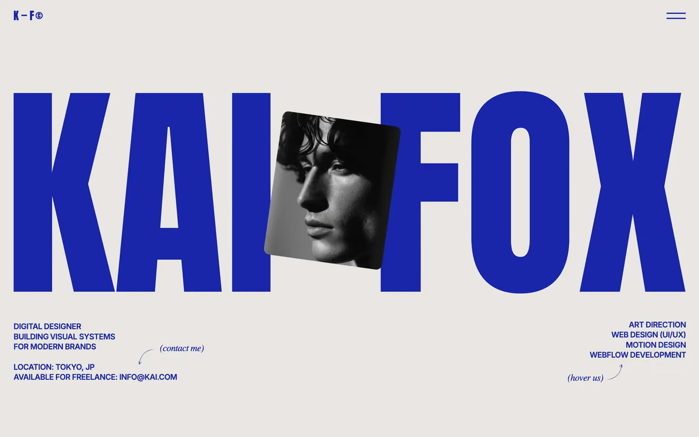
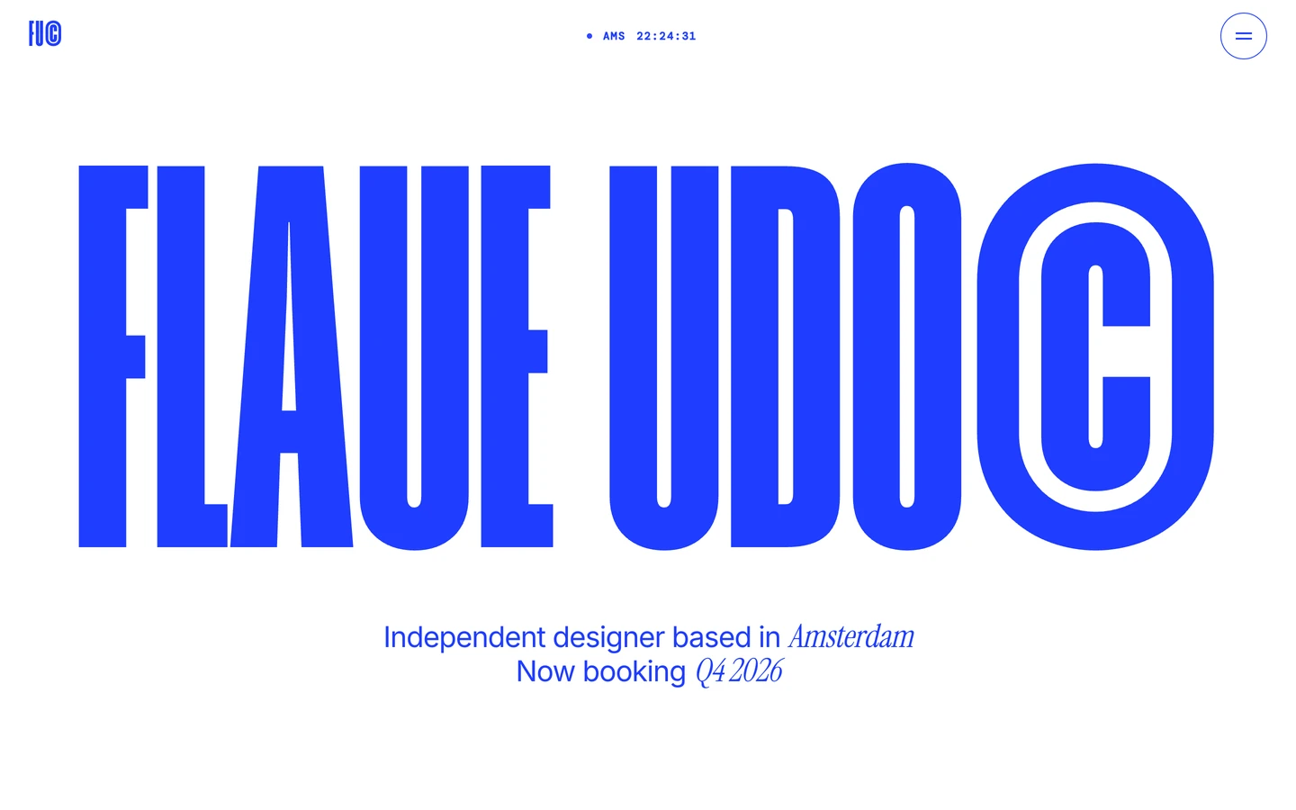
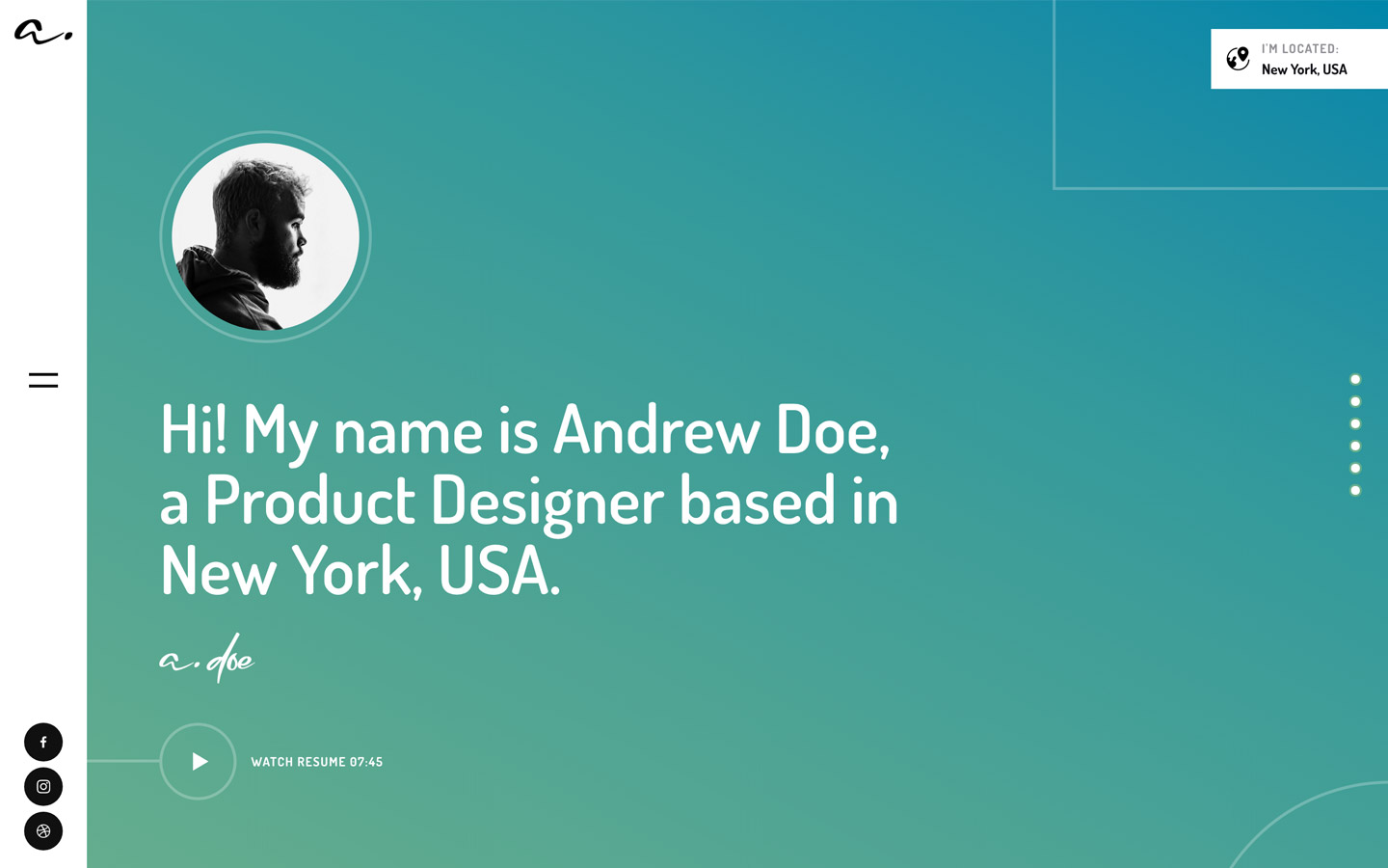

Bring any of them to your AI tool
All Access unlocks all 398 design systems, ready for Claude, ChatGPT, Gemini, Cursor, v0 and Lovable, plus 400+ templates on all 5 platforms.
Get All AccessUpgrade to All AccessHow to use the Bryn design system
Pick a file to see what it’s for and where it goes.
What it is
The whole design system in one markdown file, written for AI: every color, type style, spacing value, component and motion rule, plus do's, don'ts and a ready prompt.
Best for
Claude, ChatGPT, Gemini, Cursor and v0, or any other AI tool that builds pages or code.
How to use it
- Put
DESIGN.mdin your project and mention it in your request, or save it as.cursor/rules/bryn.mdc - For the rule file, start it with a front-matter block that sets
alwaysApply: true, so every chat uses it - Ask: “Build a pricing page using DESIGN.md.” Cursor follows the colors, fonts, spacing and rules
- Put
DESIGN.mdin the project root - Add one line to
CLAUDE.md: “Follow DESIGN.md for all UI.” - Ask for any page or component; Claude reads the file first
- Attach
DESIGN.mdto the chat (or paste it in) - Ask: “Build a landing page in this design system.”
- Keep the file in the chat or project knowledge, so follow-up pages stay on style
What it is
Every token as data, in the W3C Design Tokens format: colors with their roles, type styles, radius, spacing, and component tokens that point at them.
Best for
Figma (Tokens Studio), Style Dictionary and other design-token tools, and build scripts.
How to use it
- In Figma, open Tokens Studio, choose Import, and pick
tokens.json - Or point Style Dictionary’s
sourceat it to generate tokens for any platform - In code, import it like any JSON file
What it is
A Tailwind CSS v4 theme: every color, font, type style, radius and spacing value becomes a Tailwind utility, like bg-canvas, text-headline-lg or rounded-md.
Best for
Tailwind v4 projects, and AI builders that write Tailwind (v0, Lovable, Bolt).
How to use it
- Save
theme.cssnext to your main CSS file - Import it after Tailwind:
@import "tailwindcss"; @import "./theme.css"; - Use the classes:
bg-canvas text-ink rounded-md p-lg
What it is
The same tokens as plain CSS variables on :root. Component values point at the color variables, so changing one color updates everything that uses it.
Best for
Any website: plain CSS, Webflow custom code, Framer, WordPress.
How to use it
- Add it to your stylesheet, or in Webflow paste it into Site settings → Custom code inside a
<style>tag - Use the variables anywhere:
color: var(--color-ink) - Change a token once and every place that uses it follows