 flowmance
Artist Design System
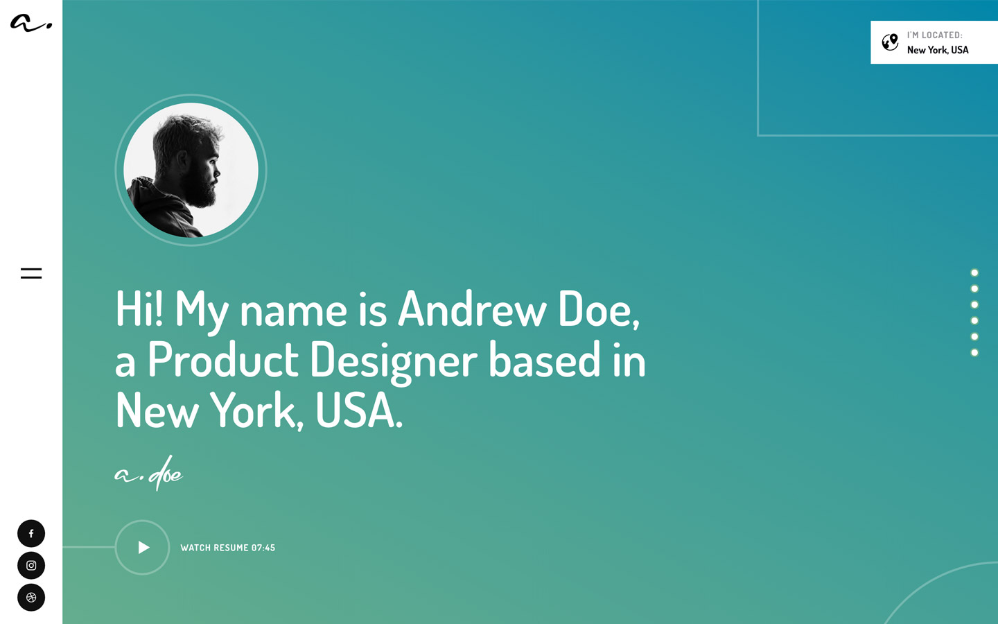
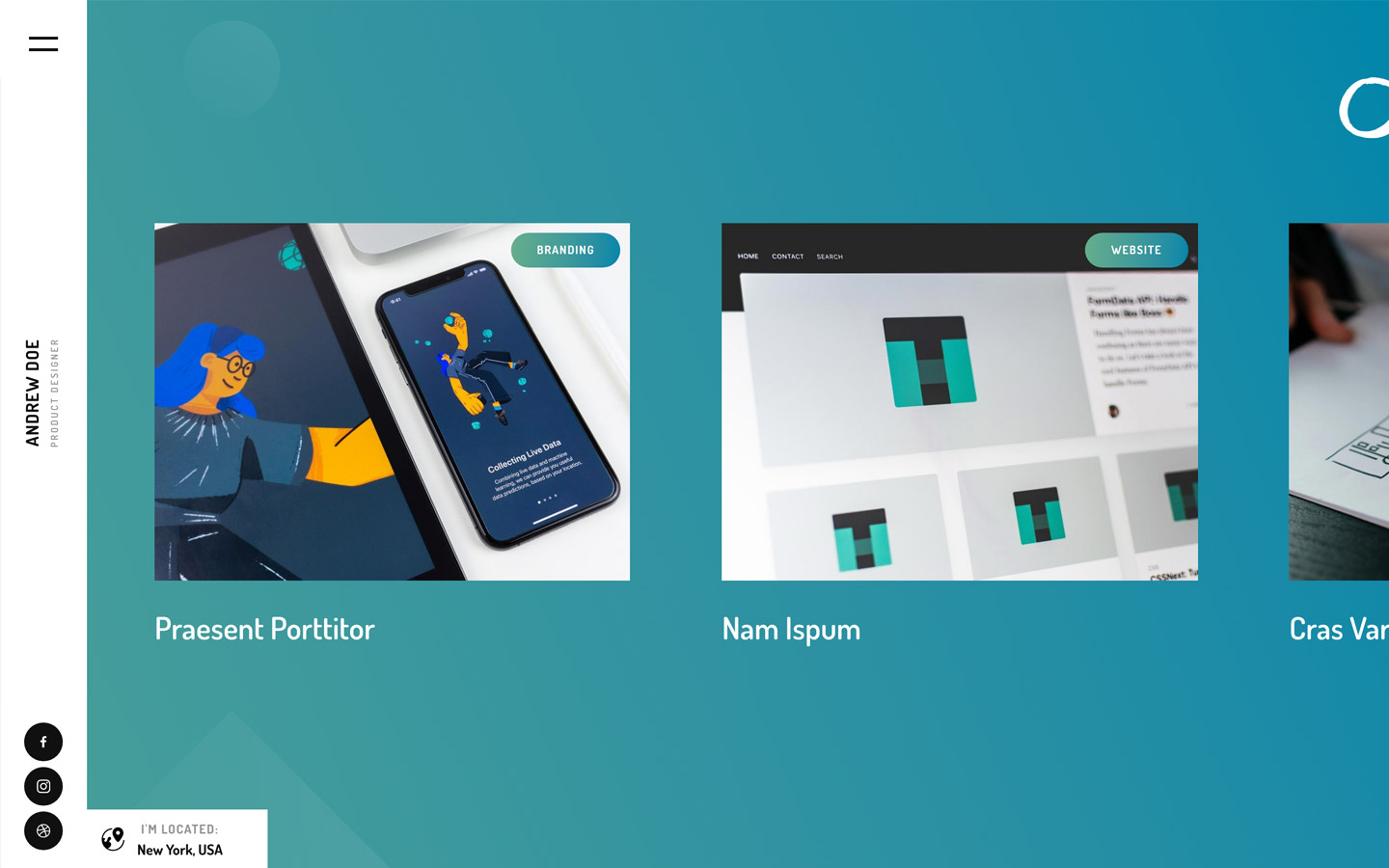
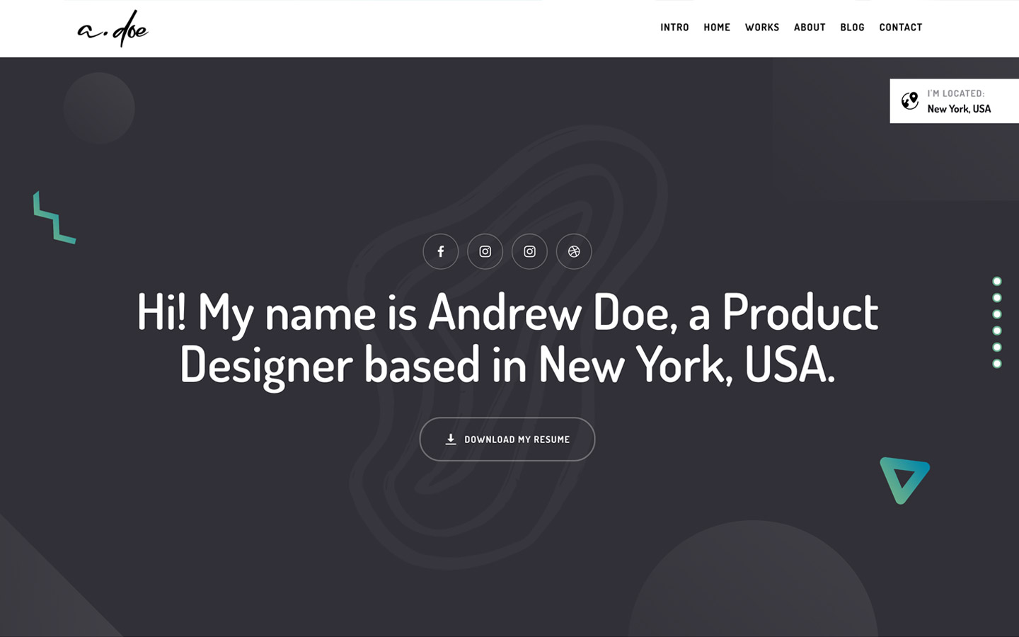
Artist is a light, friendly portfolio template with a fresh teal-green gradient. Heroes and small labels are filled with a diagonal blend from steel blue #0086AA to sea green #67AE8C; the rest is white or a barely blue #F8FBFD. Type is Dosis, a rounded, narrow sans, which keeps big headlines soft rather than corporate. The home page is a showcase of the template's layouts: gradient label pills over framed screenshots in a two-column grid.
Four signatures make it recognisable:
- The side rail. A fixed 90px white column on the left holds the handwritten a. logo at the top, a two-line hamburger in the middle and three black social circles at the bottom. There is no top nav.
- The teal-to-green gradient. linear-gradient(39deg, #0086AA, #67AE8C) fills the hero, every LAYOUT I-style label pill, and (with #349A9B at 65%) the round back-to-top button.
- Ghost words behind titles. A section title like Inner Pages sits over a huge pale uppercase word (CREATE) at 100px with 11px tracking in #F1F1F7 at 80%.
- Wide-tracked micro caps. Labels are 11–12px bold uppercase with 2–3px letter spacing: UNIQUE NAVIGATION, LAYOUT II, CLONE IT.
Artist is a light design with gradient heroes and a dark #313137 footer.
Colors
Surfaces
#FFFFFFPage, side rail, stats band, menu overlay
#F8FBFDThe long showcase section (--white)
#FFFFFFBorderless inputs on #F8FBFD
#313137Footer band
Ink
#67AE8CText on primary
#FFFFFF#121217Body colour, stat numbers, menu links
#111111Section titles, social circle fill
#515157Paragraphs, input text and placeholders
#AFAFBBStat labels (UNIQUE FOOTER), 12px bold caps only
#F1F1F7 · 80%Ghost words behind section titles
#FFFFFFText on the gradient and the footer
#FFFFFF · 70%Muted text on media
#FFFFFFText on inverse-canvas
Action
#FFFFFFThe outline button on white (no filled buttons)
#FFFFFF#0086AAGradient start (--steel-blue); solid stand-in for the hero and tags
#67AE8CGradient end (--dark-sea-green), menu underline, outline-button text
Lines & effects
#349A9B65% stop on the back-to-top gradient
#ACCFBF2px outline-button border on white
#FFFFFF · 29%2px outline-button border on the gradient
#A5A6AAFlat colour under the label-pill gradient
#FFFFFF · 15%Soft decorative circles on the hero
Typography
Dosis · display-ghost
The quick brown fox jumpsGhost words (CREATE, CONTACT) behind titles. 100px · 600 · 0.5 · 11px
Dosis · headline-lg
The quick brown fox jumpsSection titles (Inner Pages). 50px · 600 · 1.1
Dosis · body-xl
The quick brown fox jumpsLarge statement line (Create pixel-perfect websites, fast & easy). 28px · 400 · 1.14
Dosis · label
The quick brown fox jumpsFooter copyright line. 16px · 600 · 1.25
Dosis · eyebrow
The quick brown fox jumpsStat labels. 12px · 700 · 1.67 · 2px
Dosis · tag
The quick brown fox jumpsGradient label pills. 11px · 700 · 2.18 · 3px
Spacing & shape
| Purpose | Value |
|---|---|
| Container | max 1200px |
| Section title block | centred, with 100px below it |
| Breakpoints | 991px, 767px and 479px |
Spacing scale
| Token | Value | Preview |
|---|---|---|
xs | 5px | |
sm | 15px | |
md | 20px | |
lg | 30px | |
xl | 50px | |
2xl | 100px |
Layout spacing
| Token | Value | Preview |
|---|---|---|
grid-gap | 30px | |
field-height | 55px | |
rail | 90px | |
section | 140px | |
stats-height | 250px |
Border radius
Surfaces
How the surfaces stack, from the page background up. Hex codes and roles are in Colors above.
Motion
| Hover reveal | opacity 0 → 1 and x −10px → 0, 300ms ease; reverses on mouse-out |
| Hamburger to X | Lines move y ±6px and rotate, 300ms inOutBack |
| Menu open | Overlay width 0 → 100%, 500ms |
| Menu underline | Width grows, 300ms ease |
| Fade-up on scroll | opacity 0 → 1, y 20px → 0, 300ms ease |
| Button border | all 200ms |
Do’s and don’ts
- Use the fixed 90px white side rail (logo, hamburger, social circles) instead of a top nav.
- Fill heroes and label pills with linear-gradient(39deg, #0086AA, #67AE8C).
- Set everything in Dosis: 600 for headlines, 500 for paragraphs, 700 uppercase with 1–3px tracking for labels.
- Use outline pills for actions (30px radius, 2px border, 58px tall); keep the button text 13px bold uppercase, since #67AE8C on white is only about 2.6:1.
- Put a pale display-ghost word behind each section title.
- Keep images square-cornered.
- Add filled buttons or shadows.
- Use ink-subtle #AFAFBB for anything but 12px+ bold uppercase stat labels.
- Use ink-faint for readable text; it is decoration only.
- Introduce a second typeface or use Dosis below weight 500 for body copy.
- Round images or preview frames.
- Use the unused --blue #4830E6 as an accent.
- Put long or non-bold text on the gradient. White on #0086AA is about 4.2:1 and drops toward the #67AE8C end, so keep label pills to 11px+ bold caps.
Example prompt
Any page in the Artist style
More design systems like this
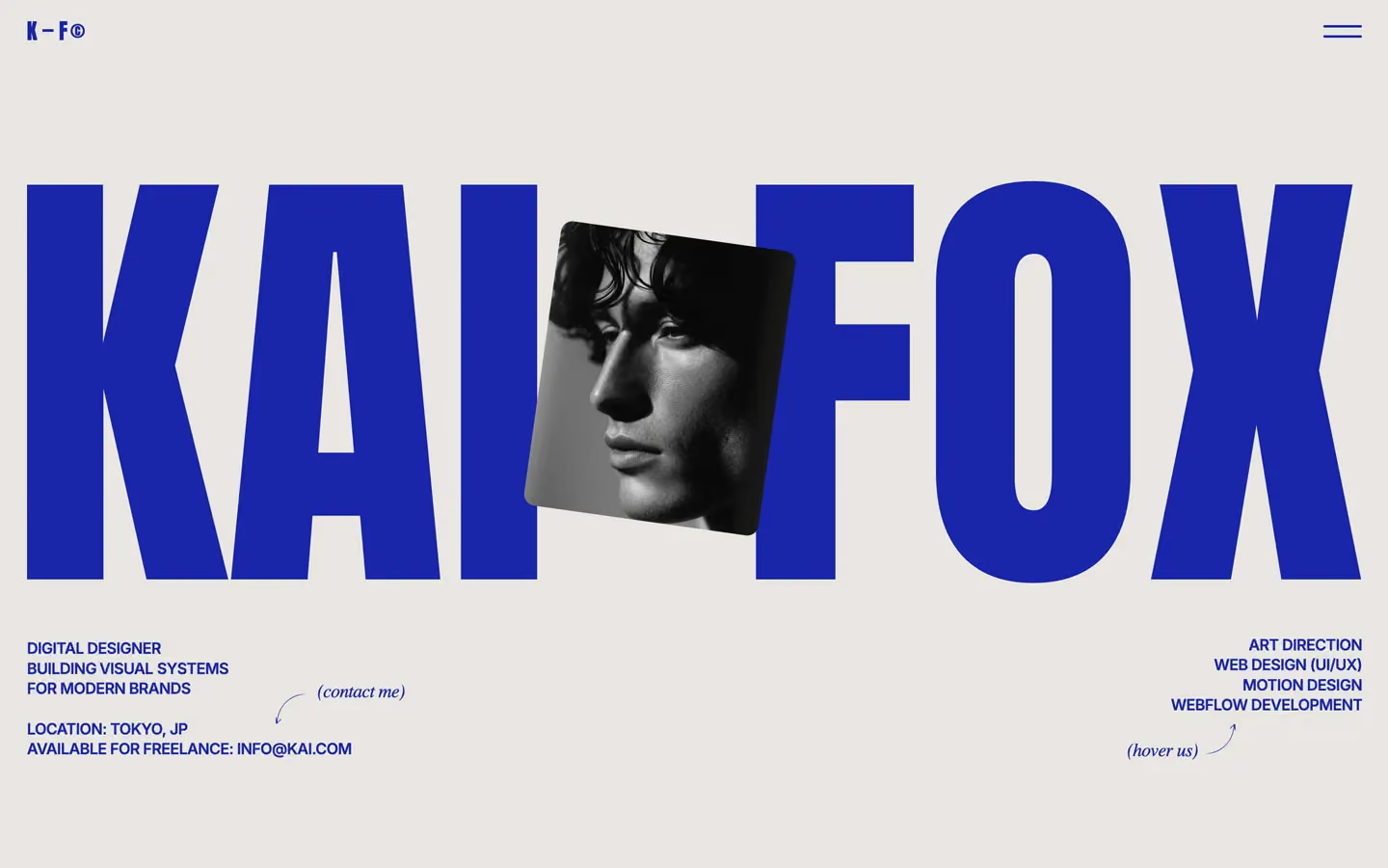
Portfolio design systems, the same colors first.


Bring any of them to your AI tool
All Access unlocks all 398 design systems, ready for Claude, ChatGPT, Gemini, Cursor, v0 and Lovable, plus 400+ templates on all 5 platforms.
Get All AccessUpgrade to All AccessHow to use the Artist design system
Pick a file to see what it’s for and where it goes.
What it is
The whole design system in one markdown file, written for AI: every color, type style, spacing value, component and motion rule, plus do's, don'ts and a ready prompt.
Best for
Claude, ChatGPT, Gemini, Cursor and v0, or any other AI tool that builds pages or code.
How to use it
- Put
DESIGN.mdin your project and mention it in your request, or save it as.cursor/rules/artist.mdc - For the rule file, start it with a front-matter block that sets
alwaysApply: true, so every chat uses it - Ask: “Build a pricing page using DESIGN.md.” Cursor follows the colors, fonts, spacing and rules
- Put
DESIGN.mdin the project root - Add one line to
CLAUDE.md: “Follow DESIGN.md for all UI.” - Ask for any page or component; Claude reads the file first
- Attach
DESIGN.mdto the chat (or paste it in) - Ask: “Build a landing page in this design system.”
- Keep the file in the chat or project knowledge, so follow-up pages stay on style
What it is
Every token as data, in the W3C Design Tokens format: colors with their roles, type styles, radius, spacing, and component tokens that point at them.
Best for
Figma (Tokens Studio), Style Dictionary and other design-token tools, and build scripts.
How to use it
- In Figma, open Tokens Studio, choose Import, and pick
tokens.json - Or point Style Dictionary’s
sourceat it to generate tokens for any platform - In code, import it like any JSON file
What it is
A Tailwind CSS v4 theme: every color, font, type style, radius and spacing value becomes a Tailwind utility, like bg-canvas, text-headline-lg or rounded-md.
Best for
Tailwind v4 projects, and AI builders that write Tailwind (v0, Lovable, Bolt).
How to use it
- Save
theme.cssnext to your main CSS file - Import it after Tailwind:
@import "tailwindcss"; @import "./theme.css"; - Use the classes:
bg-canvas text-ink rounded-md p-lg
What it is
The same tokens as plain CSS variables on :root. Component values point at the color variables, so changing one color updates everything that uses it.
Best for
Any website: plain CSS, Webflow custom code, Framer, WordPress.
How to use it
- Add it to your stylesheet, or in Webflow paste it into Site settings → Custom code inside a
<style>tag - Use the variables anywhere:
color: var(--color-ink) - Change a token once and every place that uses it follows