 flowmance
Brian Miller Design System


Brian Miller is a one-person designer portfolio with a black frame. The page is black, and the main content sits on white panels inset 5% from each edge, so a thin black border runs down both sides. Headings are a friendly slab serif (Roboto Slab) and all running text is a typewriter mono (DM Mono), with sky blue #01B7FF and aquamarine #44F0B5 as the only colours in the UI.
Four signatures make it recognisable:
- Slab plus mono. Roboto Slab 500–600 for names and titles, DM Mono for paragraphs, eyebrows, buttons and the big testimonial quote. The pairing reads like a designer's notebook.
- Floating skill chips. In the hero, white pills with a 40px radius (Web Development, Graphic Design, the email, Web Design) orbit a silhouette portrait set against a glowing blue disc. Each chip leads with a sky-blue icon circle of about 50px.
- The white panel with a notch. The works section is a white panel inset on black, and a small white triangle (a 60px arrow SVG) sits centred on its top edge, pointing up into the hero.
- Colour-pop product squares. Recent works are square photos of single objects on one flat colour each (red stapler, lime Game Boy, yellow telephone, blue skateboard), with no radius and no gap besides the 30px grid gutter.
Colors
Surfaces
#000000Page background, hero, testimonials band
#111111The announcement bar, the one raised dark surface; also the nav link colour on white
#FFFFFFThe nav, the inset works panel, the contact section
#FFFFFF#666666Placeholder and select text, DM Mono 14px
Ink
#FFFFFFText on primary
#FFFFFFHeadlines and text on black
#FFFFFFBody copy on black is full white (.paragraph-white), so ink-muted equals ink
#FFFFFF · 70%Testimonial name line John Doe - CEO at Webflow (.heading-white)
#FFFFFF#000000Text on inverse-canvas
#111111Nav links
#FFFFFFAction
#44F0B5The main pill button (View my Works), the fourth testimonial avatar, the gradient end
#01B7FFAll pill buttons fill sky blue on hover (.button:hover)
#01B7FFEyebrows (Hellow!, My Works, What They Think), the role under the logo, the 2px nav underline, chip icon circles, the hover fill of every button
Lines & effects
#EDEDEDNav bottom border
#CCCCCCSelect and input borders
#FFFFFF · 40%Inactive slider dots
#000000 · 30%Overlay on work tiles behind their white titles
Typography
Roboto Slab · display-hero
The quick brown fox jumpsI'm Brian Miller, creative designer. 67px · 500 · 1.01
Roboto Slab · headline-lg
The quick brown fox jumpsSection titles: Recent works, Testimonials (.second-heading). 48px · 600 · 1.04
Roboto Slab · title-lg
The quick brown fox jumpsWork tile titles, white (.project-title). 30px · 500 · 1.2
Roboto Slab · logo
The quick brown fox jumpsBrian Miller in the nav. 21px · 500 · 0.95
Roboto Slab · label-nav
The quick brown fox jumpsNav links. 16px · 600 · 1.25
DM Mono · body-lg
The quick brown fox jumpsLead lines. 18px · 500 · 1.33
Spacing & shape
| Purpose | Value |
|---|---|
| Container | max 1200px, centred |
| Section rhythm | .section is 100px top and bottom with 5% sides (70px at ≤991px) |
| Breakpoints | 991px, 767px and 479px (Webflow defaults), plus a min-width 768px set |
Spacing scale
| Token | Value | Preview |
|---|---|---|
xs | 10px | |
sm | 15px | |
md | 20px | |
lg | 30px | |
xl | 60px | |
2xl | 80px | |
3xl | 100px |
Layout spacing
| Token | Value | Preview |
|---|---|---|
section-band | 60px | |
section-side | 72px | |
nav-height | 81px | |
section | 100px | |
hero | 149px |
Border radius
Surfaces
How the surfaces stack, from the page background up. Hex codes and roles are in Colors above.
Motion
| Scroll-in reveal | Scroll-into-view triggers: opacity 0 → 1 and move to y 0, both 1000ms outQuart |
| Page load | Page-load triggers run the same fade on the hero |
| Button hover | transition: all .3s: fill to #01B7FF and padding 40 → 50px |
| Hover reveal | Scale 1 → 1.2, move y −30px → 0 and opacity 0 → 1, all 300ms ease; reverses on mouse-out |
| Nav underline | 2px #01B7FF line, width change 300ms ease |
| Close button | Opacity to 72% on hover, transition: all .3s |
| Colour transitions | background-color .1s, color .1s |
Do’s and don’ts
- Frame content: black #000000 page, white #FFFFFF panels inset to 90% width.
- Set headings in Roboto Slab 500–600 and all running text, buttons and eyebrows in DM Mono 500.
- Open each section with a centred #01B7FF mono eyebrow and a 48px slab title.
- Use 62px pill buttons (30px radius, 20px 40px padding) that fill #01B7FF and widen to 50px side padding on hover over 0.3s.
- Show work as square, square-cornered product photos on flat colour backgrounds in a 3-column grid with 30px gaps.
- Keep the only gradient (22°, #01B7FF → #44F0B5) for the stats band.
- Use white text on #44F0B5 below 16px. It is only 1.46:1, so keep the aquamarine button label at 16px or larger and use it once per screen; prefer #01B7FF or the outline button for anything important.
- Put #01B7FF text on white for anything longer than 2–3 words (the My Works eyebrow, the role under the logo); it is 2.28:1 there. White on #01B7FF buttons is the same 2.28:1, so keep labels at 16px+.
- Round images or add shadows; the template has neither.
- Use letter spacing or uppercase; the type is set at 0 tracking with sentence case.
- Use the unused CSS colours #644882 or #55A630.
- Bold DM Mono for body copy; 700 is only for form labels.
Example prompt
Any page in the Brian Miller style
More design systems like this
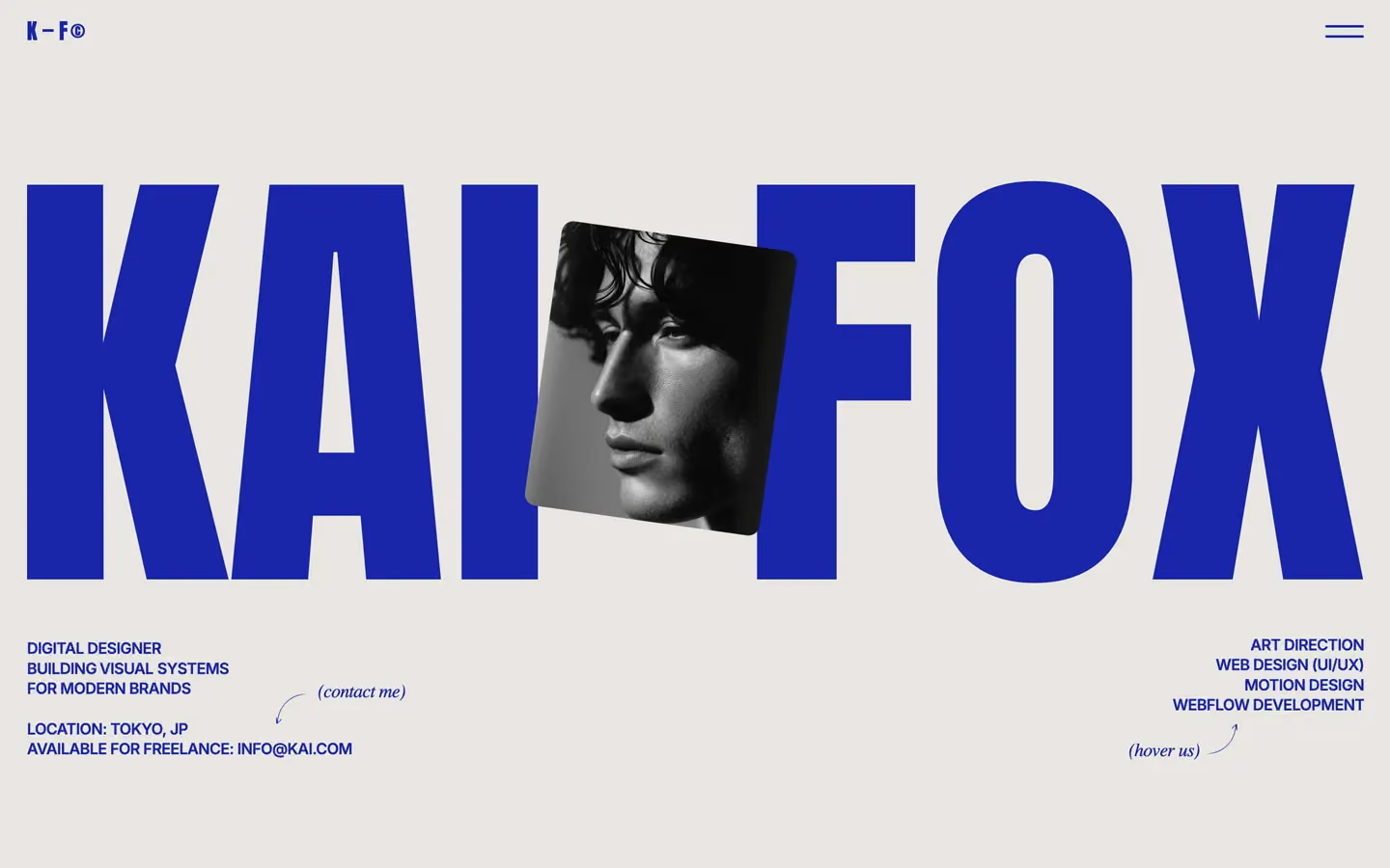
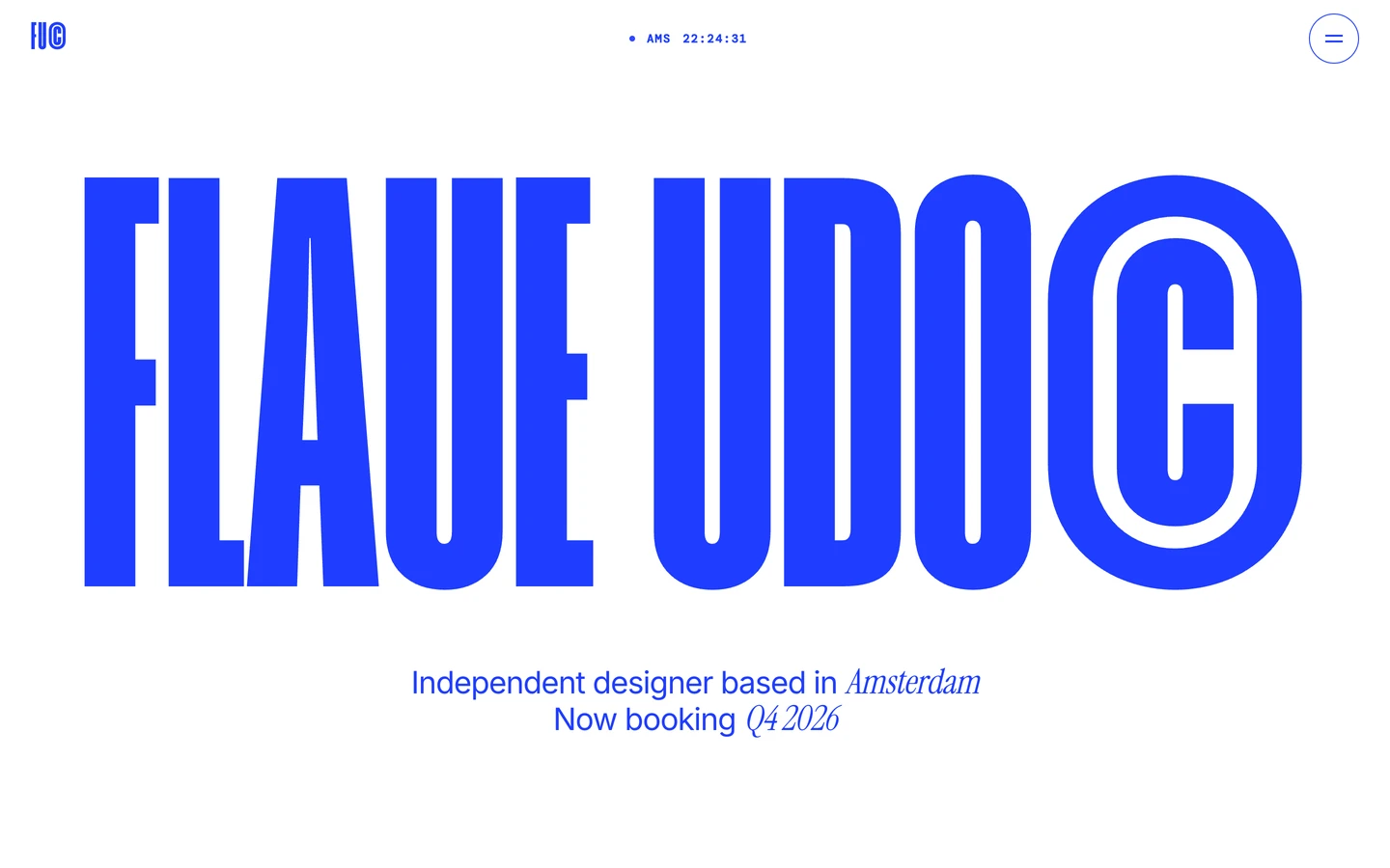
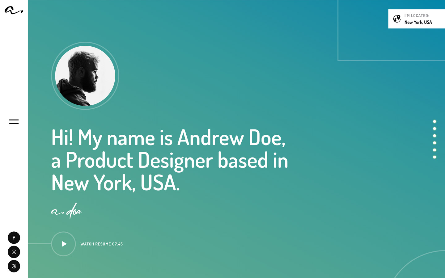
Portfolio design systems, the same colors first.

Bring any of them to your AI tool
All Access unlocks all 398 design systems, ready for Claude, ChatGPT, Gemini, Cursor, v0 and Lovable, plus 400+ templates on all 5 platforms.
Get All AccessUpgrade to All AccessHow to use the Brian Miller design system
Pick a file to see what it’s for and where it goes.
What it is
The whole design system in one markdown file, written for AI: every color, type style, spacing value, component and motion rule, plus do's, don'ts and a ready prompt.
Best for
Claude, ChatGPT, Gemini, Cursor and v0, or any other AI tool that builds pages or code.
How to use it
- Put
DESIGN.mdin your project and mention it in your request, or save it as.cursor/rules/brian.mdc - For the rule file, start it with a front-matter block that sets
alwaysApply: true, so every chat uses it - Ask: “Build a pricing page using DESIGN.md.” Cursor follows the colors, fonts, spacing and rules
- Put
DESIGN.mdin the project root - Add one line to
CLAUDE.md: “Follow DESIGN.md for all UI.” - Ask for any page or component; Claude reads the file first
- Attach
DESIGN.mdto the chat (or paste it in) - Ask: “Build a landing page in this design system.”
- Keep the file in the chat or project knowledge, so follow-up pages stay on style
What it is
Every token as data, in the W3C Design Tokens format: colors with their roles, type styles, radius, spacing, and component tokens that point at them.
Best for
Figma (Tokens Studio), Style Dictionary and other design-token tools, and build scripts.
How to use it
- In Figma, open Tokens Studio, choose Import, and pick
tokens.json - Or point Style Dictionary’s
sourceat it to generate tokens for any platform - In code, import it like any JSON file
What it is
A Tailwind CSS v4 theme: every color, font, type style, radius and spacing value becomes a Tailwind utility, like bg-canvas, text-headline-lg or rounded-md.
Best for
Tailwind v4 projects, and AI builders that write Tailwind (v0, Lovable, Bolt).
How to use it
- Save
theme.cssnext to your main CSS file - Import it after Tailwind:
@import "tailwindcss"; @import "./theme.css"; - Use the classes:
bg-canvas text-ink rounded-md p-lg
What it is
The same tokens as plain CSS variables on :root. Component values point at the color variables, so changing one color updates everything that uses it.
Best for
Any website: plain CSS, Webflow custom code, Framer, WordPress.
How to use it
- Add it to your stylesheet, or in Webflow paste it into Site settings → Custom code inside a
<style>tag - Use the variables anywhere:
color: var(--color-ink) - Change a token once and every place that uses it follows