 flowmance
Flaue Udo Design System
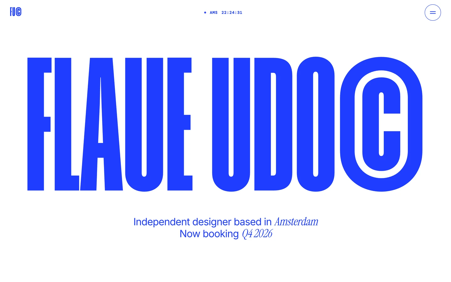
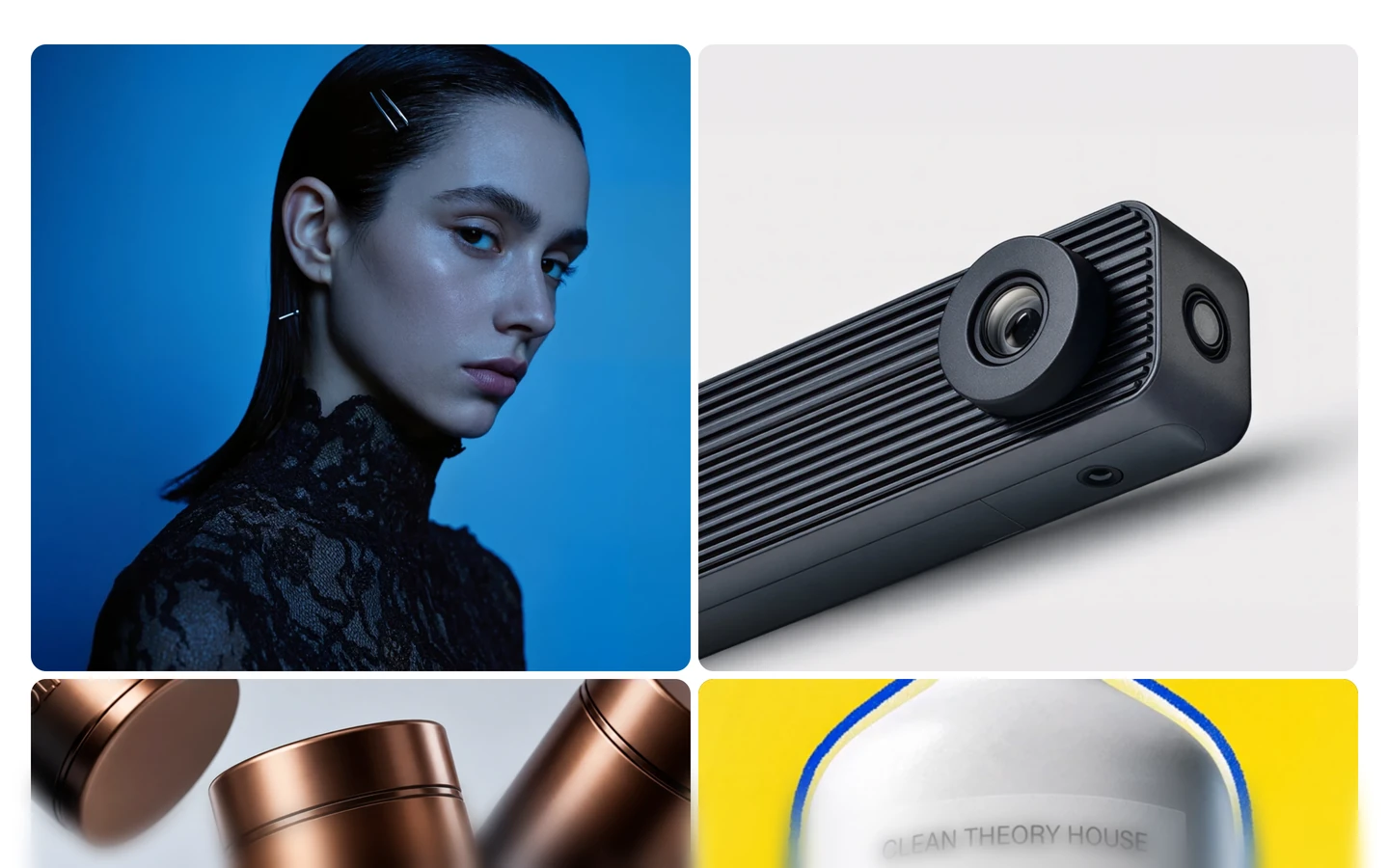
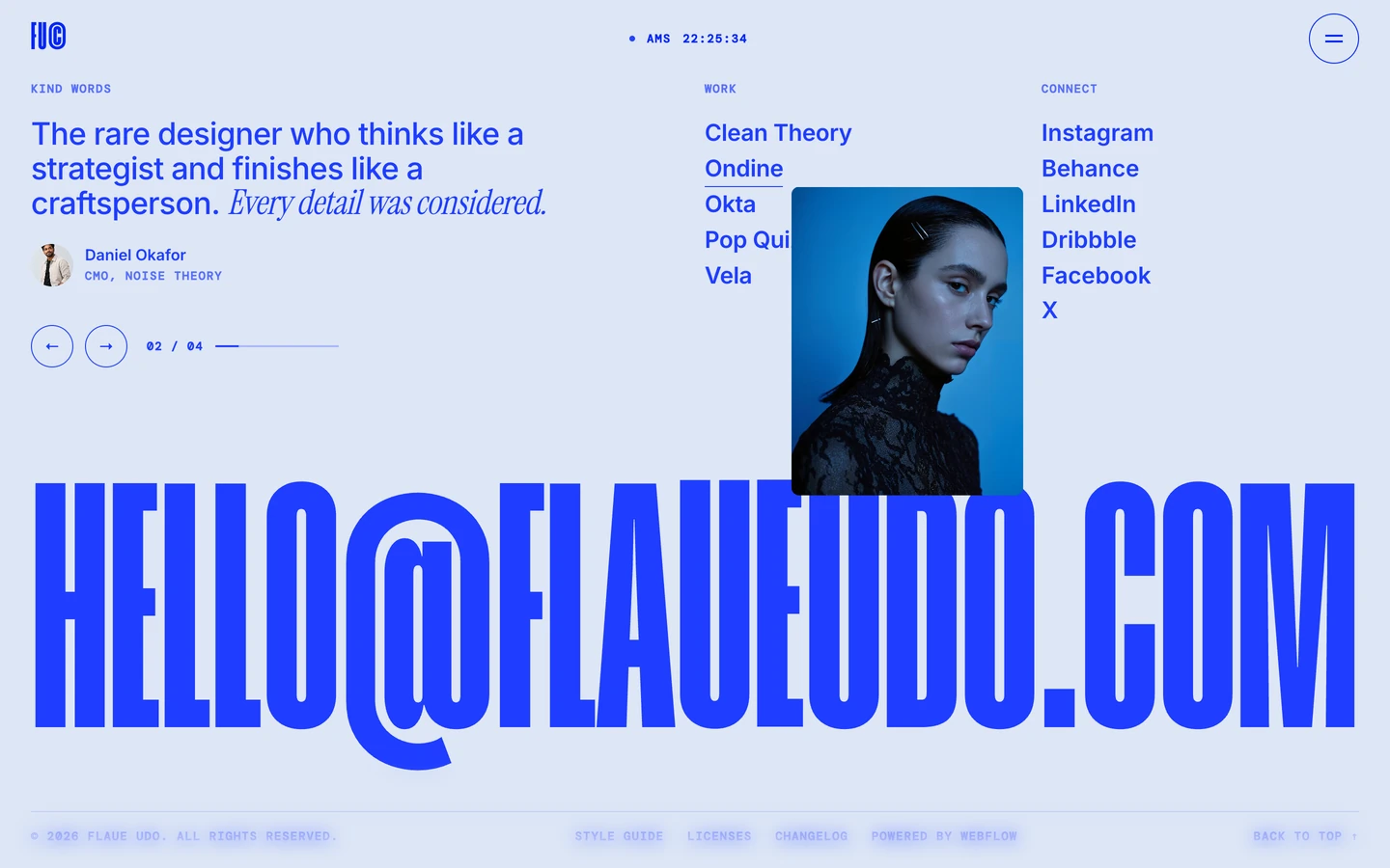
Flaue Udo is a one-person portfolio that reads like a poster printed in a single ink. Everything that is not a photo is cobalt blue #1F3DFF on white: the logo, the clock, the outlined menu button, a wordmark that fills the width of the screen, and a short centred lead. Below the hero the page is almost only pictures: a tight two-column grid of large, rounded project images that spans the width inside 32px gutters.
Four signatures make it recognisable:
- The 42vw wordmark. FLAUE UDO© is set in Humane (an ultra-condensed display face) at 604.8px on a 1440px screen, which is 42% of the viewport width, uppercase, line height 0.84. The © is part of the word, set at the same size.
- One ink, swappable. The whole UI uses one colour. A small frosted pill bottom-left holds five swatches (blue #1F3DFF, red #FF2E31, green #42D366, purple #7A2CFF, black #000000); clicking one recolours text, borders and fills with a 0.4s colour transition.
- Sans plus italic serif in one line. The lead mixes Inter 500 with Instrument Serif italic for the place and date: Independent designer based in *Amsterdam* / Now booking *Q4 2026*.
- Mono clock in the nav. The centre of the nav is a live clock in DM Mono 12px uppercase with wide tracking: • AMS 01:28:10.
Flaue Udo is light-only. There are no filled buttons.
Colors
Surfaces
#FFFFFFPage background and footer
#EEF1FFPale blue fill behind images while they load and behind small chips (16 uses)
#1F3DFFFull blue layers (menu and page transition) with white text (35 white text uses)
Ink
#1F3DFF#1F3DFFLogo, wordmark, lead, clock, labels, borders
#1F3DFFSame as ink: body text is set in the full ink, never a grey
#1F3DFF · 70%The few quieter text bits (7 uses), such as secondary meta
#FFFFFFText on inverse-canvas
#FFFFFFText set over photos
Action
#FFFFFF#E0C200A mustard yellow used 3 times as text, 3 times as a fill and once as a border
Lines & effects
#1F3DFF · 28%Soft 1px borders (7 uses)
#1F3DFFFull-ink 1px borders, such as the round menu button (14 uses)
#EEF1FF · 72%The theme-switcher pill
#FF2E31The other four swatches in the switcher
#42D366The other four swatches in the switcher
#7A2CFFThe other four swatches in the switcher
#000000The other four swatches in the switcher
Typography
Humane · display-hero · shown in Big Shoulders (fallback)
The quick brown fox jumpsFLAUE UDO© hero. 605px · 600 · 0.84
Humane · headline-xl · shown in Big Shoulders (fallback)
The quick brown fox jumps32 spans that sit in hidden layers (the menu overlay or rolling hover copies). 101px · 600 · 0.9 · 1px
Inter · title-lg
The quick brown fox jumpsHero lead Independent designer based in. 32px · 500 · 1.12 · -0.64px
Inter · body-lg
The quick brown fox jumpsProject descriptions: A cobalt-blue campaign and digital lookbook for a Paris lace…. 24px · 500 · 1.15 · -0.48px
Inter · label
The quick brown fox jumpsLinks and the menu items in Inter (1.1rem). 17.6px · 600 · 1
DM Mono · mono
The quick brown fox jumpsNav clock AMS 01:28:10, meta lines (24 uses). 12px · 600 · 1.5 · 1.2px
Spacing & shape
| Purpose | Value |
|---|---|
| Container | full width with a 32px side gutter (the images start about 32px from each edge at 1440px) |
| Section rhythm | sections have no padding (0px) |
| Breakpoints | no breakpoint data was captured |
Spacing scale
| Token | Value | Preview |
|---|---|---|
section | 0px | |
hair | 8px | |
sm | 20px |
Layout spacing
| Token | Value | Preview |
|---|---|---|
column-gap | 8px | |
gutter | 32px |
Border radius
Surfaces
How the surfaces stack, from the page background up. Hex codes and roles are in Colors above.
Motion
| Split-text reveal | Characters and lines tween in, power3.out, 0.70s. Triggered at top 98%. |
| Scroll reveal | A layer moves yPercent −25 → 0 while an overlay fades opacity 0.3 → 0, linear, 1.2s, on a top bottom → bottom top trigger |
| Image parallax | Each work image yPercent −5 → 5, linear, scrubbed top bottom → bottom top |
| Page transition | Characters yPercent → 110, expo.out 2.0s staggered; panels power2.inOut 0.95s and power2.in 0.67s |
| Cursor follower | quickTo on x and y, power3, 0.3s and 0.6s |
| Clock dot | opacity → 0.25, sine.inOut, 1.0s, repeating blink |
| Theme change | background-color 0.4s, color 0.4s, border-color 0.4s |
| Generic transform | transform 0.6s cubic-bezier(0.16, 1, 0.3, 1) |
Do’s and don’ts
- Set the name as a full-width Humane wordmark in ink #1F3DFF, uppercase, line height 0.84, about 42vw, with a © at the same size.
- Keep the page to white #FFFFFF and one ink. Let photos bring all other colour.
- Mix Inter 500 at 32px with an Instrument Serif italic word at 1.12em for the place or date in the lead.
- Lay work out in a 2-column grid with 8px seams, 32px side gutters and 16px image corners.
- Use DM Mono 12px uppercase with 1.2px tracking for time, city and counts only.
- Keep ink-subtle (#1F3DFF at 70%) for text of 16px or larger; at 12px it is too faint.
- Add filled buttons, coloured cards or a second UI colour. The CTA is the image or a text link.
- Use the theme swatches (#FF2E31, #42D366, #7A2CFF) together. Each is a whole-site alternative.
- Add shadows to images or cards. Only the floating switcher has depth.
- Use grey for body text. Body text is the full ink.
- Set Humane in lowercase, below 40px, or with negative tracking.
- Put text or captions on the work images in the resting state.
Example prompt
Any page in the Flaue Udo style
More design systems like this
Portfolio design systems, the same colors first.
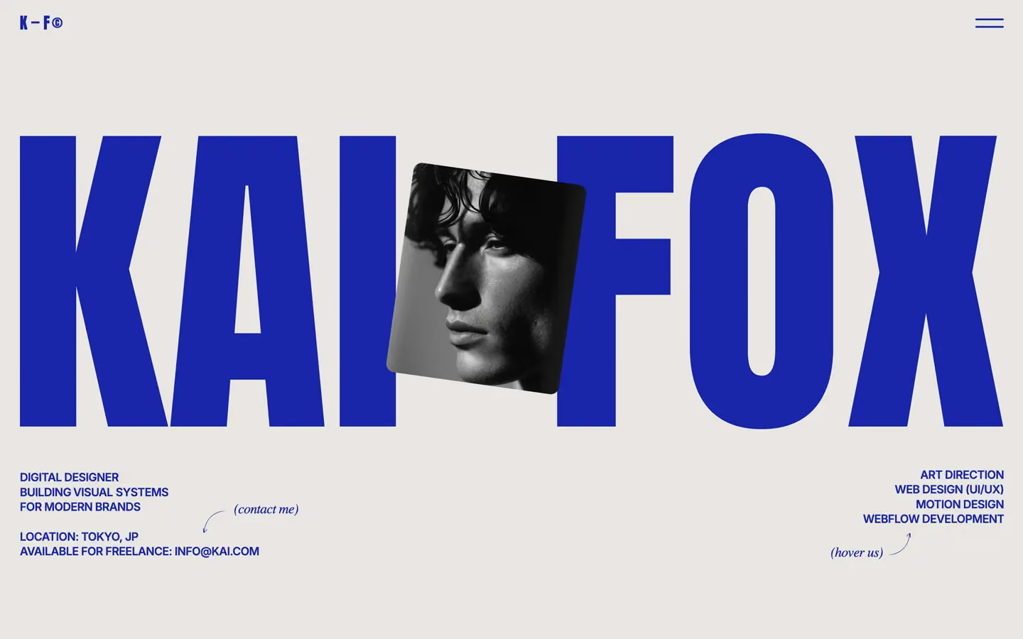


Bring any of them to your AI tool
All Access unlocks all 398 design systems, ready for Claude, ChatGPT, Gemini, Cursor, v0 and Lovable, plus 400+ templates on all 5 platforms.
Get All AccessUpgrade to All AccessHow to use the Flaue Udo design system
Pick a file to see what it’s for and where it goes.
What it is
The whole design system in one markdown file, written for AI: every color, type style, spacing value, component and motion rule, plus do's, don'ts and a ready prompt.
Best for
Claude, ChatGPT, Gemini, Cursor and v0, or any other AI tool that builds pages or code.
How to use it
- Put
DESIGN.mdin your project and mention it in your request, or save it as.cursor/rules/flaue.mdc - For the rule file, start it with a front-matter block that sets
alwaysApply: true, so every chat uses it - Ask: “Build a pricing page using DESIGN.md.” Cursor follows the colors, fonts, spacing and rules
- Put
DESIGN.mdin the project root - Add one line to
CLAUDE.md: “Follow DESIGN.md for all UI.” - Ask for any page or component; Claude reads the file first
- Attach
DESIGN.mdto the chat (or paste it in) - Ask: “Build a landing page in this design system.”
- Keep the file in the chat or project knowledge, so follow-up pages stay on style
What it is
Every token as data, in the W3C Design Tokens format: colors with their roles, type styles, radius, spacing, and component tokens that point at them.
Best for
Figma (Tokens Studio), Style Dictionary and other design-token tools, and build scripts.
How to use it
- In Figma, open Tokens Studio, choose Import, and pick
tokens.json - Or point Style Dictionary’s
sourceat it to generate tokens for any platform - In code, import it like any JSON file
What it is
A Tailwind CSS v4 theme: every color, font, type style, radius and spacing value becomes a Tailwind utility, like bg-canvas, text-headline-lg or rounded-md.
Best for
Tailwind v4 projects, and AI builders that write Tailwind (v0, Lovable, Bolt).
How to use it
- Save
theme.cssnext to your main CSS file - Import it after Tailwind:
@import "tailwindcss"; @import "./theme.css"; - Use the classes:
bg-canvas text-ink rounded-md p-lg
What it is
The same tokens as plain CSS variables on :root. Component values point at the color variables, so changing one color updates everything that uses it.
Best for
Any website: plain CSS, Webflow custom code, Framer, WordPress.
How to use it
- Add it to your stylesheet, or in Webflow paste it into Site settings → Custom code inside a
<style>tag - Use the variables anywhere:
color: var(--color-ink) - Change a token once and every place that uses it follows