 flowmance
Radius Design System
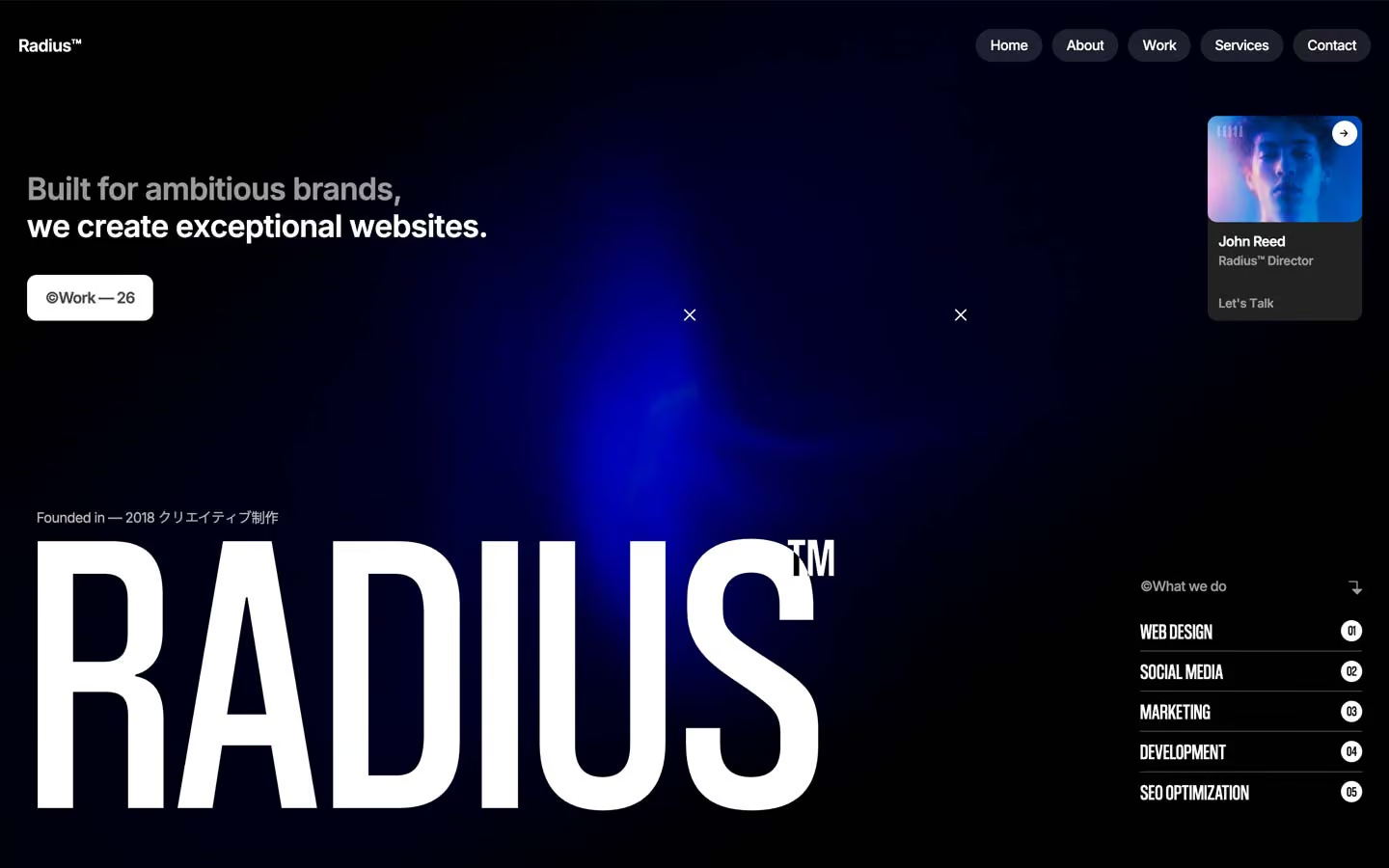
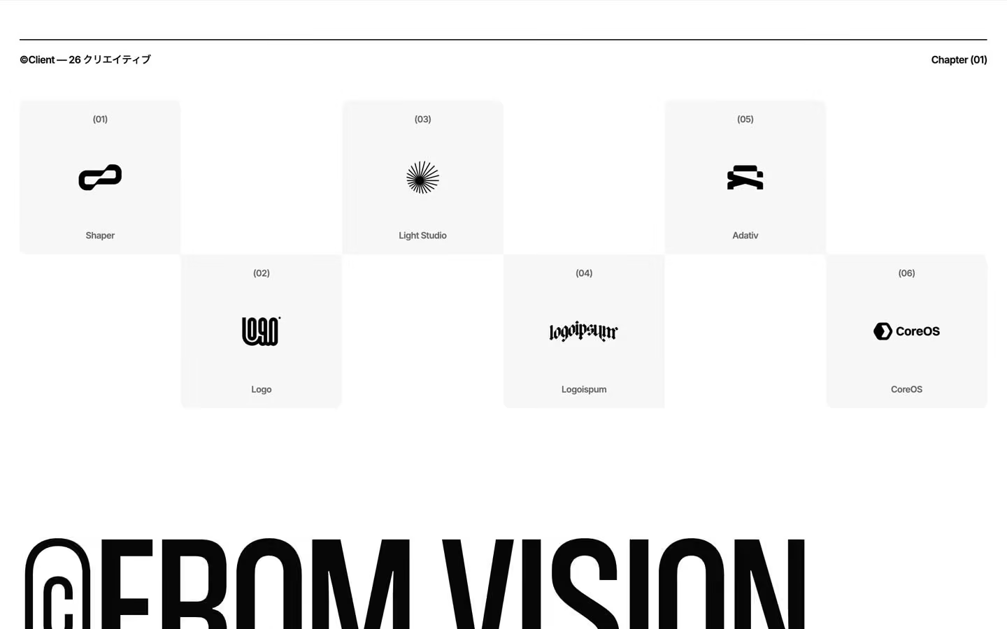
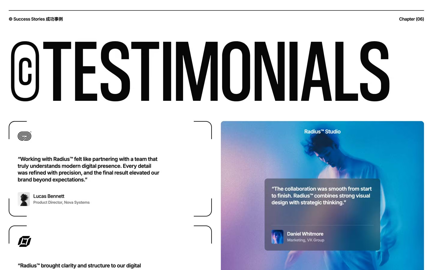
Radius is a white, editorial agency site that opens on a black screen. The hero is near-black with a soft electric-blue glow, glass pill navigation and a giant condensed RADIUS™ wordmark; below it the page turns white and runs on small, dense, semibold Inter with huge condensed uppercase section titles. It reads like a design studio's printed lookbook: lots of white, black type, numbered chapters, and only the photography and the hero glow bring colour.
Four signatures make it recognisable:
- Condensed poster titles. Section titles are Coolvetica Condensed in uppercase at 256px with line height 0.85, prefixed by a © drawn as a rounded outline badge (©RECENT WORK, ©CRAFTING DIGITAL CLARITY.). The hero wordmark goes to 416px at line height 0.75.
- Corner-bracket frames. Cards are not boxed. Four separate 2px black corner pieces (each with one 20px rounded corner) frame a card, leaving the straight edges open. The services block uses the same idea at section scale.
- Chapter headers with Japanese. Each section opens with a 1.5px black rule and a row such as ©Project デザイン制作 on the left and Chapter (04) on the right.
- Glass pills on dark. Nav links are separate translucent pills (Home, About, Work, Services, Contact) with a 10px backdrop blur.
The page is light; the hero, the intro screen and the showreel band are the dark exceptions.
Colors
Surfaces
#FFFFFFPage background for every content section
#F7F7F7Logo tiles, pricing plans (the footer-color variable)
#FFFFFFInputs and their 1px border
#E1E1E1With field: Inputs and their 1px border
#070707Intro screen, hero, showreel band
Ink
#070707Text on primary
#FFFFFFText on secondary
#070707Headlines, body, rules, links
#070707Body text is full ink
#070707 · 60%Logo-tile captions, small meta
#000000 · 16%Unlit words of the scroll-highlight text (328 split elements measured)
#FFFFFFText on inverse-canvas
#FFFFFFAction
#FFFFFFThe filled button: white with dark text, 10px radius, used on dark and photo backgrounds
#333333The circle that rises behind the label on hover
#070707Dark pill button on white (contact form Contact Us)
Lines & effects
#000000 · 55%Input placeholder text
#0707071px rules under service rows, 1.5px chapter-header rule, 3px avatar rings
#000000The 2px corner brackets around cards
#FFFFFF · 15%Rules on the dark bands
#222222The hero contact card (John Reed)
#FFFFFF · 12%Nav pills
#FFFFFF · 15%Tags over photos
#1A1A1A · 80%Quote card floating on the testimonial photo
#000000 · 30%Dark layer on work images under white titles
Typography
Coolvetica Condensed · display-hero · shown in Oswald (fallback)
The quick brown fox jumpsHero wordmark RADIUS, followed by a superscript TM. 416px · 400 · 0.75
Coolvetica Condensed · headline-cond · shown in Oswald (fallback)
The quick brown fox jumpsCondensed counters and h4 labels (--counter-title-2, 7 uses). 35px · 300 · 1.1 · 1.1px
Inter · title-lg
The quick brown fox jumpsFeature card titles (Fast Delivery). 22.4px · 600 · 1.34 · -1px
Inter · body-lg
The quick brown fox jumpsLarger intro paragraphs. 22.4px · 500 · 1.3 · -1px
Inter · label
The quick brown fox jumpsNav pills, buttons. 14.4px · 500 · 1.1 · -0.5px
Inter · logo
The quick brown fox jumpsRadius™ in the nav. 17.6px · 600 · 1.1 · -0.5px
Spacing & shape
| Purpose | Value |
|---|---|
| Container | max 1400px, centred |
| Grid | 6 columns, 16px gap for chapter headers and most two- and three-column layouts |
| Section rhythm | 150px top and bottom; the top drops to 50px at ≤479 |
| Breakpoints | 991px, 767px and 479px, plus a 1920px+ step |
Spacing scale
| Token | Value | Preview |
|---|---|---|
hair | 7px | |
xs | 10px | |
sm | 20px | |
md | 30px | |
lg | 50px | |
xl | 60px | |
2xl | 120px |
Layout spacing
| Token | Value | Preview |
|---|---|---|
column-gap | 16px | |
gutter | 29px | |
section | 150px |
Border radius
Surfaces
How the surfaces stack, from the page background up. Hex codes and roles are in Colors above.
Motion
| Text roll on hover (nav pills, buttons) | Label y 0 → −101%, copy rolls in, 400ms power1.out, staggered by character |
| Button fill | #333333 circle translateY 70% → 0; button scales 1 → 0.88 in 300ms on press |
| Headline reveal | SplitText lines y 100% → 0%, 400–450ms, staggered; larger titles 700ms power2.out |
| 3D heading flip | A front and back copy with perspective: 1000px; the back starts rotateX(−90deg) below and turns up as the front folds away |
| Scroll highlight | Split words start at #000000 at 16% and light to #070707 as they cross the viewport |
| Scrubbed scale | ScrollTrigger top bottom → bottom 100, scrub 0.8; images scale 1 → 1.2 and 1 → 0.9 |
| Pinned scene | top top → bottom 70%, scrub 0.7 |
| Fade-up | opacity 0 → 1 with y 100px → 0, 1000ms outQuart on scroll into view |
| Hover lift | scale 1 → 1.15 in 200ms outQuint, y 0 → −20px in 200ms outSine, plus a filter change |
| Cursor label | Moves to the pointer in 400ms outCubic |
| Accordion and icons | height 0 → auto in 300ms; + rotates in 200ms; badges scale 0 → 1 in 300ms |
| CSS | transition: all 0.2s on cards |
Do’s and don’ts
- Set every section title in uppercase Coolvetica Condensed at 256px, line height 0.85, with the outlined © badge.
- Open each section with the 1.5px #070707 chapter rule and Label · Chapter (0N).
- Frame cards with four 2px #000000 corner brackets (20px corner radius) instead of a full border.
- Keep body text at 14.4px, weight 600, −0.5px, in full #070707.
- Use the white button-primary (10px radius) on dark or photo backgrounds, and the #070707 pill on white.
- Keep colour in images; the UI stays #FFFFFF, #F7F7F7 and #070707.
- Use the unused variable colours (#ff5900, #ebebeb) or add any accent.
- Add drop shadows. Use blur, scrims and stacking instead.
- Set Inter in uppercase or Coolvetica in sentence case.
- Grey out paragraphs. Only meta uses ink-subtle (60%), and ink-faint (16%) is only the unlit state of scroll-highlight text.
- Round large images or give cards full borders.
- Animate hovers longer than 400ms or use bounce easing.
Example prompt
Any page in the Radius style
More design systems like this
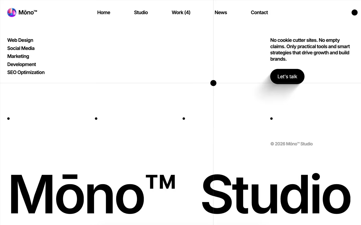
Agency design systems, the same colors first.
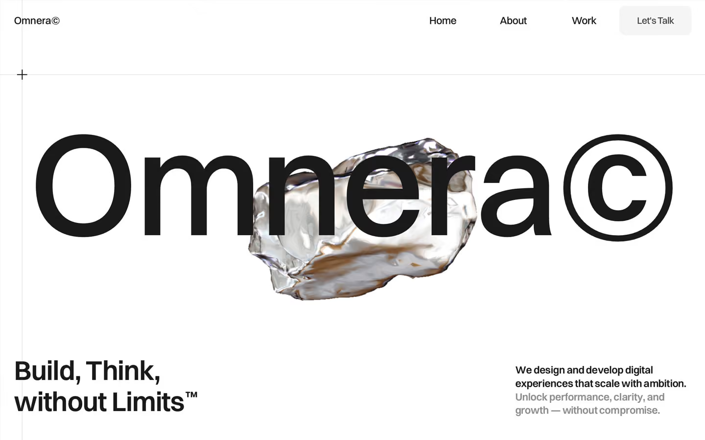
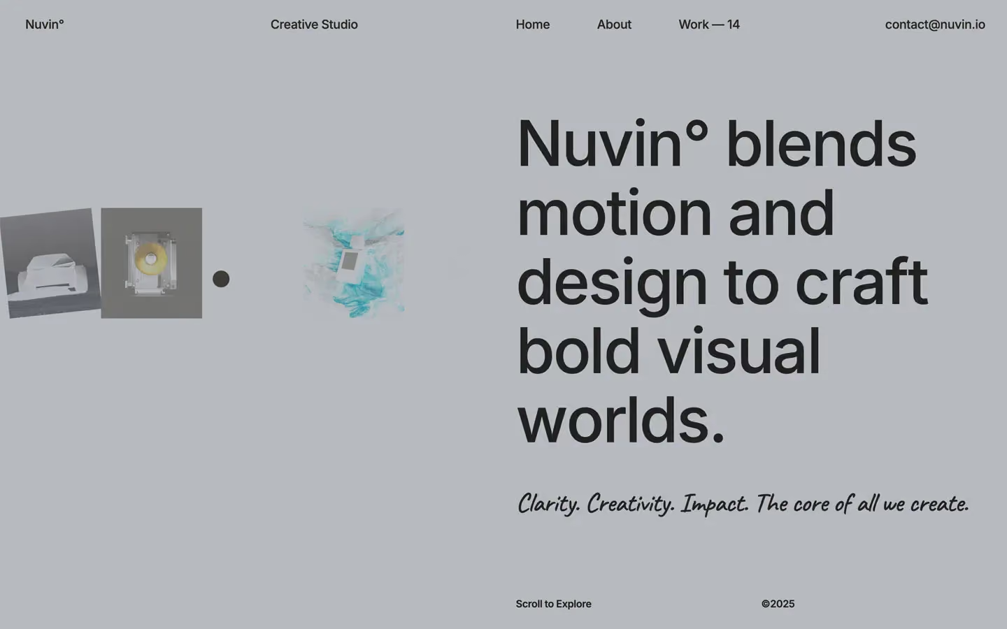

Bring any of them to your AI tool
All Access unlocks all 398 design systems, ready for Claude, ChatGPT, Gemini, Cursor, v0 and Lovable, plus 400+ templates on all 5 platforms.
Get All AccessUpgrade to All AccessHow to use the Radius design system
Pick a file to see what it’s for and where it goes.
What it is
The whole design system in one markdown file, written for AI: every color, type style, spacing value, component and motion rule, plus do's, don'ts and a ready prompt.
Best for
Claude, ChatGPT, Gemini, Cursor and v0, or any other AI tool that builds pages or code.
How to use it
- Put
DESIGN.mdin your project and mention it in your request, or save it as.cursor/rules/radius.mdc - For the rule file, start it with a front-matter block that sets
alwaysApply: true, so every chat uses it - Ask: “Build a pricing page using DESIGN.md.” Cursor follows the colors, fonts, spacing and rules
- Put
DESIGN.mdin the project root - Add one line to
CLAUDE.md: “Follow DESIGN.md for all UI.” - Ask for any page or component; Claude reads the file first
- Attach
DESIGN.mdto the chat (or paste it in) - Ask: “Build a landing page in this design system.”
- Keep the file in the chat or project knowledge, so follow-up pages stay on style
What it is
Every token as data, in the W3C Design Tokens format: colors with their roles, type styles, radius, spacing, and component tokens that point at them.
Best for
Figma (Tokens Studio), Style Dictionary and other design-token tools, and build scripts.
How to use it
- In Figma, open Tokens Studio, choose Import, and pick
tokens.json - Or point Style Dictionary’s
sourceat it to generate tokens for any platform - In code, import it like any JSON file
What it is
A Tailwind CSS v4 theme: every color, font, type style, radius and spacing value becomes a Tailwind utility, like bg-canvas, text-headline-lg or rounded-md.
Best for
Tailwind v4 projects, and AI builders that write Tailwind (v0, Lovable, Bolt).
How to use it
- Save
theme.cssnext to your main CSS file - Import it after Tailwind:
@import "tailwindcss"; @import "./theme.css"; - Use the classes:
bg-canvas text-ink rounded-md p-lg
What it is
The same tokens as plain CSS variables on :root. Component values point at the color variables, so changing one color updates everything that uses it.
Best for
Any website: plain CSS, Webflow custom code, Framer, WordPress.
How to use it
- Add it to your stylesheet, or in Webflow paste it into Site settings → Custom code inside a
<style>tag - Use the variables anywhere:
color: var(--color-ink) - Change a token once and every place that uses it follows