 flowmance
Portfolia Design System


Portfolia is a dark, single-person portfolio. It feels like a designer's showreel: a pure black page, a name set in huge wide uppercase letters, a smiling portrait cut into a yellow blob, and project rows of bright, saturated illustration and mockup images on black. Glossy, slightly blurred 3D shapes (a cube, a pyramid, a sphere, a torus, a gem) float over the layout and drift as you scroll.
Four signatures make it recognisable:
- Wide uppercase display type. Every heading uses the custom webfont face in uppercase with open +1 to +3px tracking: FRANKLIN FLORES at 144px, FEATURED WORK at 74px, project names at 48px.
- Italic Georgia counters. Small serif italics break up the sans: 1/4, 2/4 above each project title in 50% white, and a superscript /4 beside Featured Work.
- Outlined MENU pill. The header is only a stacked PORT / FOLIA logo, a thin vertical rule and a 2px white outline pill with spaced-out MENU. Everything else lives in a full-screen overlay menu.
- Floating 3D objects. Blurred glossy shapes sit on top of the grid at the edges of images and headings and move with scroll parallax.
Portfolia is a dark-only design.
Colors
Surfaces
#000000Page background, menu overlay
#212121Form fields and dark image tiles (the logo mockup tile)
#212121Input and textarea fill
#B26CF1Input border on hover and focus
#4A3AFFTextarea border on focus
Ink
#000000Text on primary
#FFFFFFHeadings, the second half of the hero lead, buttons' outlines
#FFFFFF · 60%Body copy: p and li default to #fff9
#FFFFFF · 50%Italic counters 1/4 and the /4 superscript
#FFFFFF · 40%Project tags (UI, UX, Development) and input placeholders
Action
#FFFFFFFilled pills (Download resume, submit, UP)
#FFFFFF#FFCE00Webflow variable --gold; the hero blob behind the portrait is this yellow (about)
#8338ECWebflow variable --blue-violet; matches the violet in the illustrations, not used on UI
Lines & effects
#FFFFFF · 40%The 1px rules between project rows
#FFFFFF2px outline of the MENU pill, the vertical rule beside the logo, the 3px menu underline, the blockquote's left rule
#FFFFFF · 60%1px dashed underline on .black-paragraph text
Typography
webfont · display-hero · shown in Syncopate (fallback)
The quick brown fox jumpsHero name FRANKLIN FLORES (two lines). 144px · 400 · 1.0 · 3px
webfont · headline-lg · shown in Syncopate (fallback)
The quick brown fox jumpsClosing heading Let's talk about the next big thing. 60px · 400 · 1.1 · 3px
webfont · title-sm · shown in Syncopate (fallback)
The quick brown fox jumpsAward names (The FWA Awards, awwwards). 17px · 400 · 1.12 · 1px
Georgia · label-count
The quick brown fox jumpsThe /4 superscript beside a section title. 27px · 400 · 1.1 · 3px
Satoshi · body-lg
The quick brown fox jumpsHero lead. 24px · 500 · 1.3
Satoshi · field
The quick brown fox jumpsInputs and placeholders. 16px · 500 · 1.25
Spacing & shape
| Purpose | Value |
|---|---|
| Container | max 1200px, centred |
| Section rhythm | 100px top and bottom (.section); the closing section uses 100px top and 50px bottom |
| Breakpoints | 991px, 767px and 479px (max-width), plus min-width steps at 768px and 1440px |
Spacing scale
| Token | Value | Preview |
|---|---|---|
xs | 10px | |
sm | 16px | |
md | 25px | |
lg | 30px | |
xl | 35px | |
2xl | 50px | |
3xl | 80px |
Layout spacing
| Token | Value | Preview |
|---|---|---|
nav-top | 35px | |
section-bottom-short | 50px | |
column-gap | 50px | |
section | 100px | |
hero-top | 150px |
Border radius
Surfaces
How the surfaces stack, from the page background up. Hex codes and roles are in Colors above.
Motion
| Fade in on scroll | opacity 0 → 1, 1000ms, outQuart (scroll into view) |
| Rise in | y 200px → 0, 500ms; text inside masks y 200% → 0%, 400–600ms ease |
| Small fade-up | opacity 0 → 1 with y 10px → 0, 400ms ease |
| 3D object parallax | While in view, objects move y −80px / +80px and x −80px, 500ms smoothing |
| Hover scale | scale 1 → 1.1, 100ms ease, and back to 1 on mouse out |
| Menu underline | Width grows, 300ms ease; 400ms outCubic on open |
| Menu open | Display toggles, a 500ms opacity fade, a 200ms ease rotate on the trigger |
| Nav on scroll | Moves y 0% on scroll up, 300ms ease |
| `MENU` pill hover | Letter spacing 4px → 2px, 300ms |
| Primary hover | filter: invert(80%), 300ms |
| Default transitions | 200ms |
Do’s and don’ts
- Set every heading in uppercase webfont 400 with +1 to +3px tracking, and every paragraph in Satoshi 500.
- Keep the page on canvas #000000 with ink #FFFFFF headings and ink-muted (white at 60%) body copy.
- Number projects with Georgia italic counters (1/4) in ink-subtle.
- Separate project rows with a 1px line (white at 40%) and alternate the image placement row by row.
- Use one white pill (button-primary, 40px radius, 54px tall) per screen, with an uppercase Satoshi 900 label and a chevron.
- Round images 12px and keep them untreated.
- Add colour to UI elements. #FFCE00 and #8338EC are image colours here, not button or link colours.
- Use ink-faint (white at 40%) for anything but 17px+ tags and placeholders; it is about 3.7:1 on black.
- Use lowercase or tight tracking on display headings, or set headings in Satoshi (except the overlay menu).
- Add box shadows or blur panels; depth comes from the floating 3D renders.
- Add inline nav links; the header is logo, rule and MENU only.
- Load Inter; it is declared in CSS but not used.
Example prompt
Any page in the Portfolia style
More design systems like this
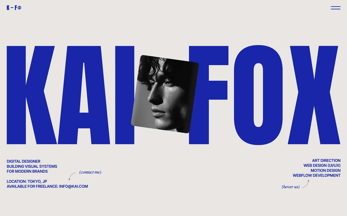
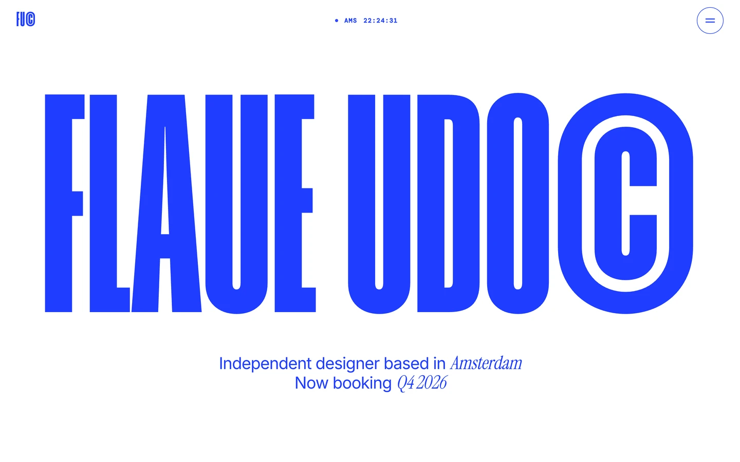
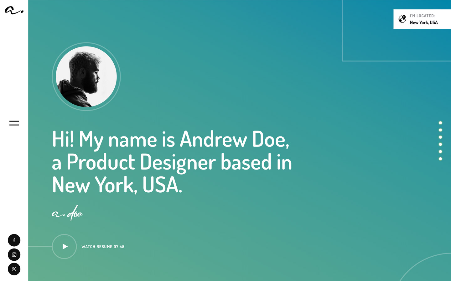
Portfolio design systems, the same colors first.

Bring any of them to your AI tool
All Access unlocks all 398 design systems, ready for Claude, ChatGPT, Gemini, Cursor, v0 and Lovable, plus 400+ templates on all 5 platforms.
Get All AccessUpgrade to All AccessHow to use the Portfolia design system
Pick a file to see what it’s for and where it goes.
What it is
The whole design system in one markdown file, written for AI: every color, type style, spacing value, component and motion rule, plus do's, don'ts and a ready prompt.
Best for
Claude, ChatGPT, Gemini, Cursor and v0, or any other AI tool that builds pages or code.
How to use it
- Put
DESIGN.mdin your project and mention it in your request, or save it as.cursor/rules/portfolia.mdc - For the rule file, start it with a front-matter block that sets
alwaysApply: true, so every chat uses it - Ask: “Build a pricing page using DESIGN.md.” Cursor follows the colors, fonts, spacing and rules
- Put
DESIGN.mdin the project root - Add one line to
CLAUDE.md: “Follow DESIGN.md for all UI.” - Ask for any page or component; Claude reads the file first
- Attach
DESIGN.mdto the chat (or paste it in) - Ask: “Build a landing page in this design system.”
- Keep the file in the chat or project knowledge, so follow-up pages stay on style
What it is
Every token as data, in the W3C Design Tokens format: colors with their roles, type styles, radius, spacing, and component tokens that point at them.
Best for
Figma (Tokens Studio), Style Dictionary and other design-token tools, and build scripts.
How to use it
- In Figma, open Tokens Studio, choose Import, and pick
tokens.json - Or point Style Dictionary’s
sourceat it to generate tokens for any platform - In code, import it like any JSON file
What it is
A Tailwind CSS v4 theme: every color, font, type style, radius and spacing value becomes a Tailwind utility, like bg-canvas, text-headline-lg or rounded-md.
Best for
Tailwind v4 projects, and AI builders that write Tailwind (v0, Lovable, Bolt).
How to use it
- Save
theme.cssnext to your main CSS file - Import it after Tailwind:
@import "tailwindcss"; @import "./theme.css"; - Use the classes:
bg-canvas text-ink rounded-md p-lg
What it is
The same tokens as plain CSS variables on :root. Component values point at the color variables, so changing one color updates everything that uses it.
Best for
Any website: plain CSS, Webflow custom code, Framer, WordPress.
How to use it
- Add it to your stylesheet, or in Webflow paste it into Site settings → Custom code inside a
<style>tag - Use the variables anywhere:
color: var(--color-ink) - Change a token once and every place that uses it follows