 flowmance
Monoform Design System
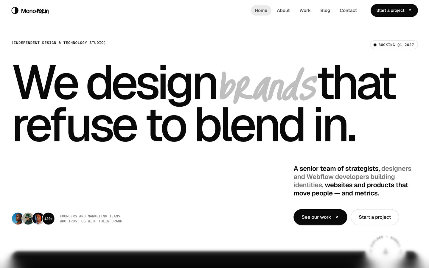
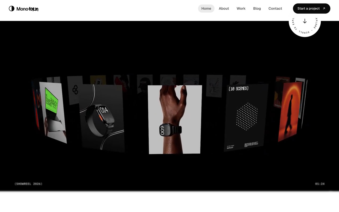
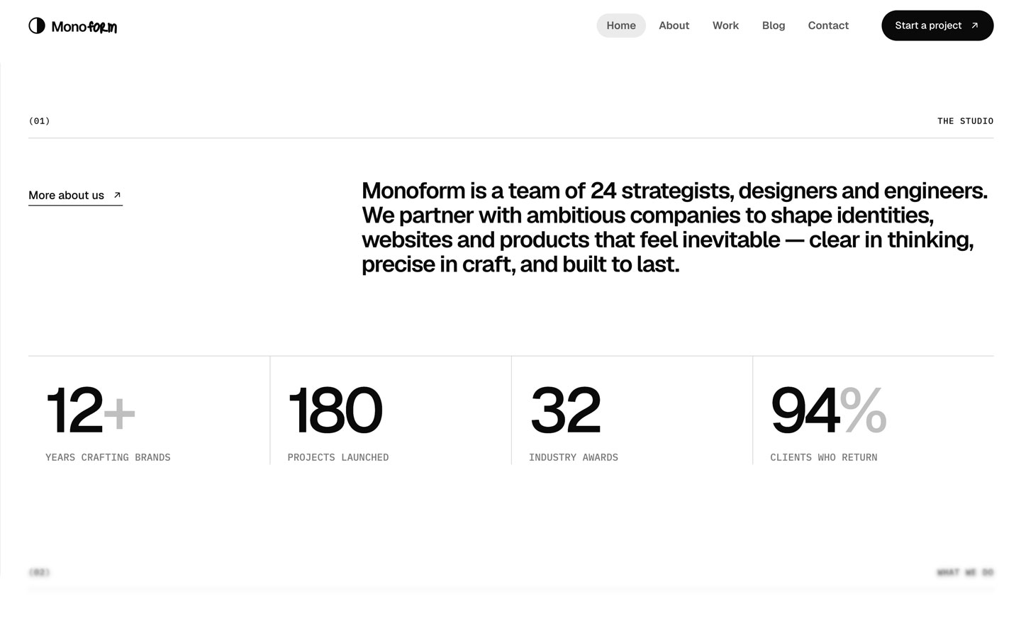
Monoform is a loud, monochrome agency site. Huge black Geist headlines with very tight tracking fill the width of a white page, and one word in each headline is swapped for a grey hand-lettered script, like a designer's note scribbled over a poster. All UI is black, white and greys; the only colour comes from the work photography, which is saturated and full-bleed inside rounded cards.
Four signatures make it recognisable:
- The scribbled word. One word per headline is set in Just Me Again Down Here (a marker script) in ink-faint grey, larger than the headline around it (192px in the 160px hero, 112px in the 64px H2s): We design brands that refuse to blend in., One senior team. The logo repeats the idea: Mono in Geist plus form in the script.
- Mono bracket labels. IBM Plex Mono uppercase sets the meta: (INDEPENDENT DESIGN & TECHNOLOGY STUDIO), section rows (02) ……… WHAT WE DO over a hairline, WEBSITE · 2026 under work.
- Black pills. Every action is a full pill: black with an ↗, or white with a grey 1px outline. The current nav item is a grey pill.
- The black process band. The page flips to black and four process steps stack as rounded cards in different tones (light grey edges behind, #262626 for step 03, near-black with a 1px ring for step 04), each pushed back and dimmed by the next, with a giant step number (03).
Colors
Surfaces
#FFFFFFPage background (outline buttons and inputs are transparent on it)
#F5F5F5Testimonial band
#EBEBEBTags, active nav pill
#0A0A0AProcess band and footer
Ink
#FFFFFFText on primary
#0A0A0AHeadlines, intro text, mono section labels
#3D3D3DService and process descriptions
#595959Body copy, nav links, tag text
#7A7A7AMono metric labels, small meta
#A3A3A3Script words, stat affixes + and %, placeholders
#FFFFFFText on inverse-canvas
Action
#0A0A0ABlack pill buttons
#0A0A0ALines & effects
#EBEBEBHairlines and dividers
#D9D9D9Outline button border, section rules, the round arrow button
#FFFFFF · 82%Navigation bar when scrolled
#262626Process cards on the black band
Typography
Geist · display-wordmark
The quick brown fox jumpsMeasured 4 times in the black footer, most likely the giant Monoform wordmark; its script half is 419px (not in the screenshots). 335px · 500 · 0.78 · -15.08px
Geist · headline-lg
The quick brown fox jumpsH2s: Four disciplines. 64px · 600 · 1.0 · -2.88px
Just Me Again Down Here · script
The quick brown fox jumpsThe scribbled word inside H2s (senior). 112px · 300 · 0.57 · -2.24px
Geist · title-lg
The quick brown fox jumpsProcess step titles (Craft every detail.), work titles. 28px · 600 · 1.1 · -0.98px
Geist · body-lg
The quick brown fox jumpsHero lead. 22px · 600 · 1.25 · -0.33px
Geist · label
The quick brown fox jumpsNav links. 15px · 600 · 1.2
Spacing & shape
| Purpose | Value |
|---|---|
| Container | 1440px max with 40px side gutters (content 40–1400px at 1440) |
| Section header | a mono row with (0N) on the left and the section name on the right, a full-width 1px rule under it, then the H2 about 60px below (estimated) |
| Section rhythm | sections have no padding of their own; space sits in inner wrappers |
| Breakpoints | Webflow defaults, 991px, 767px and 479px |
Spacing scale
| Token | Value | Preview |
|---|---|---|
hair | 1px | |
xs | 8px | |
sm | 14px | |
md | 26px | |
lg | 32px | |
xl | 48px | |
2xl | 64px |
Layout spacing
| Token | Value | Preview |
|---|---|---|
column-gap | 32px | |
gutter | 40px | |
footer-bottom | 100px |
Border radius
Surfaces
How the surfaces stack, from the page background up. Hex codes and roles are in Colors above.
Motion
| Headline reveal | SplitText lines from yPercent 115, rotation 3° to rest, expo.out, about 1.4s with stagger; also yPercent 105, about 1.85s with stagger; triggers at top 88% / top 92% |
| Fade-up | From y 60px, expo.out, 1.3s |
| Image reveal | clipPath inset(100% 0 0 0) → inset, 1.4s expo.inOut, with the image scaling 1.35 → 1 over 1.8s expo.out |
| Scrubbed words | Words of the lead and intro start at opacity 0.15 and light up with scroll |
| Stacking process cards | Previous card scale 1 → 0.92, brightness → brightness(0.7), scrubbed |
| Parallax | yPercent → −18, scrubbed |
| Magnetic buttons | x / y follow with elastic.out(1, 0.4), 0.9s |
| Cursor follower | x / y with power3 at 0.12s, 0.55s and 0.7s (layered lag) |
| Click ripple | scale 1 → 3, opacity 0.6 → 0, 1.8s expo.out |
| Rotating badge | rotation 360°, 16s linear, looping; icon spin 360° in 0.5s |
| Logo marquee | xPercent → −50, 38s linear, looping |
| Hovers | opacity 0.3s; nav colours 0.4s cubic-bezier(0.19, 1, 0.22, 1) |
Do’s and don’ts
- Set headlines in Geist 500–600 with −4.5% to −6.5% tracking, black #0A0A0A on #FFFFFF.
- Replace one word per headline with the marker script in ink-faint #A3A3A3 at about 1.75× size.
- Use IBM Plex Mono 12px uppercase for every label, and open sections with the (0N) … NAME row over a 1px rule.
- Make every button a pill: black #0A0A0A with white text and ↗, or white with a #D9D9D9 outline.
- Keep photography as the only colour, inside 16px-radius cards.
- Flip to the black inverse-canvas band for the process section, with stacking cards in per-step tones (#262626, or near-black with a 1px ring).
- Add a brand colour or tinted greys.
- Use ink-subtle #7A7A7A for running text; it is 4.29:1 on white, 3.94:1 on #F5F5F5 and 3.60:1 on #EBEBEB. Keep it for 12px+ uppercase mono labels (metric-label) on white.
- Use ink-faint #A3A3A3 below 64px; it is 2.52:1 on white and only works for the script word (112px) and big affixes.
- Use the script for more than one word, or for UI text.
- Add drop shadows or square buttons.
- Use Geist Mono or Instrument Serif; they are loaded but not part of the design.
Example prompt
Any page in the Monoform style
More design systems like this
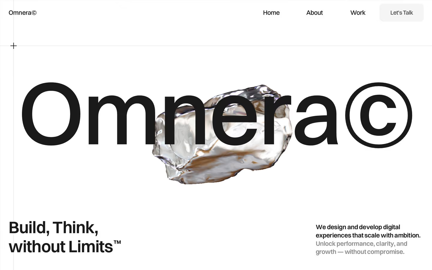
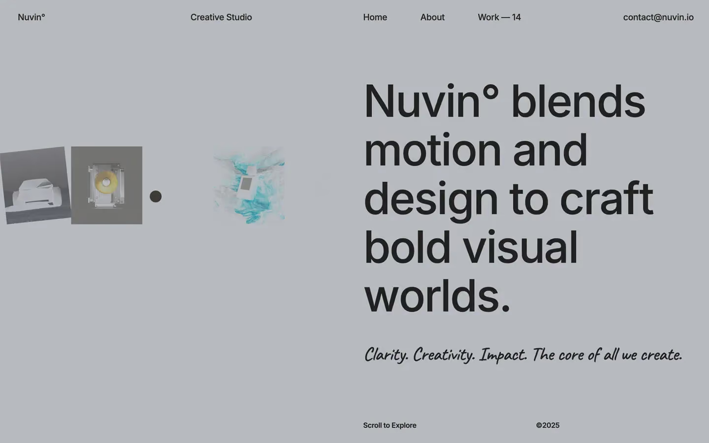
Agency design systems, the same colors first.

Bring any of them to your AI tool
All Access unlocks all 398 design systems, ready for Claude, ChatGPT, Gemini, Cursor, v0 and Lovable, plus 400+ templates on all 5 platforms.
Get All AccessUpgrade to All AccessHow to use the Monoform design system
Pick a file to see what it’s for and where it goes.
What it is
The whole design system in one markdown file, written for AI: every color, type style, spacing value, component and motion rule, plus do's, don'ts and a ready prompt.
Best for
Claude, ChatGPT, Gemini, Cursor and v0, or any other AI tool that builds pages or code.
How to use it
- Put
DESIGN.mdin your project and mention it in your request, or save it as.cursor/rules/monoform.mdc - For the rule file, start it with a front-matter block that sets
alwaysApply: true, so every chat uses it - Ask: “Build a pricing page using DESIGN.md.” Cursor follows the colors, fonts, spacing and rules
- Put
DESIGN.mdin the project root - Add one line to
CLAUDE.md: “Follow DESIGN.md for all UI.” - Ask for any page or component; Claude reads the file first
- Attach
DESIGN.mdto the chat (or paste it in) - Ask: “Build a landing page in this design system.”
- Keep the file in the chat or project knowledge, so follow-up pages stay on style
What it is
Every token as data, in the W3C Design Tokens format: colors with their roles, type styles, radius, spacing, and component tokens that point at them.
Best for
Figma (Tokens Studio), Style Dictionary and other design-token tools, and build scripts.
How to use it
- In Figma, open Tokens Studio, choose Import, and pick
tokens.json - Or point Style Dictionary’s
sourceat it to generate tokens for any platform - In code, import it like any JSON file
What it is
A Tailwind CSS v4 theme: every color, font, type style, radius and spacing value becomes a Tailwind utility, like bg-canvas, text-headline-lg or rounded-md.
Best for
Tailwind v4 projects, and AI builders that write Tailwind (v0, Lovable, Bolt).
How to use it
- Save
theme.cssnext to your main CSS file - Import it after Tailwind:
@import "tailwindcss"; @import "./theme.css"; - Use the classes:
bg-canvas text-ink rounded-md p-lg
What it is
The same tokens as plain CSS variables on :root. Component values point at the color variables, so changing one color updates everything that uses it.
Best for
Any website: plain CSS, Webflow custom code, Framer, WordPress.
How to use it
- Add it to your stylesheet, or in Webflow paste it into Site settings → Custom code inside a
<style>tag - Use the variables anywhere:
color: var(--color-ink) - Change a token once and every place that uses it follows