 flowmance
Leuven Design System


Leuven is a bright, playful agency site built from two hard contrasts: a white hero washed with a soft pink glow, and near-black content bands that slide up over it. One candy pink, #FC98B9, does all the accent work: the button, the service tags, the backgrounds of every work card and the full-screen menu. The type is Inter Tight 600 throughout, set large and plain, with no tracking tricks.
Four signatures make it recognisable:
- Two-tone lead sentences. A lead line starts in full ink and finishes in a quieter grey: In the realm of Webflow templates, Lèuven is a frontrunner, (black) championing designs that users love. (#777777); Advanced professional (white) service solutions. (white, dimmed).
- Pink everywhere, one pink. #FC98B9 fills the Get in touch button, the three service tags, the work-card backgrounds and the overlay menu. The three service tags each have a different corner: square, a full 50px pill, and a 30px 0px leaf.
- The white bar and the sticky hero. A fixed 110px nav (social icons left, the Lèuven wordmark centred, a two-line hamburger right) sits on white. The hero is position: sticky; top: 0, so the black sections scroll up and cover it.
- Glossy 3D renders on flat pink. A pink toy brick, a glass tube, a fuzzy sphere, an iridescent disc: soft-lit 3D objects floating on a flat #FC98B9 field, never photographs of people.
Colors
Surfaces
#060609Background of every content section (services, work, clients)
#090909Cart panel (with a line border)
#FFFFFFThe hero and the nav bar
Ink
#060609Text on primary
#FFFFFFHeadlines, links and labels on the dark bands
#FFFFFF · 70%Paragraphs and service lists: p is white with opacity: .7
#FFFFFF · 65%.white-paragraph (#FFFFFFA6) in smaller text blocks
#060609Hero title, lead and nav icons on white
#777777The grey second half of the hero lead
#FFFFFFAction
#FC98B9Buttons, service tags, work-card fields, the overlay menu
Lines & effects
#FFFFFF · 20%Input borders, cart borders and dividers
#FFFFFFThe 2px underline of link-underline
#0000002px borders on footer tags and menu index circles
#ECFCF4Hover fill of the full-width .button (submit and pricing)
Typography
Inter Tight · display-stat
The quick brown fox jumpsStats >601, +1,870 (.title-4, 10vw). 144px · 600 · 1.0
Inter Tight · headline-lg
The quick brown fox jumpsSection titles: Latest work (.title-2). 65px · 600 · 1.3
Inter Tight · title-lg
The quick brown fox jumpsTwo-tone lead sentences (hero, services). 30px · 600 · 1.4
Inter Tight · label-button
The quick brown fox jumpsButton labels. 19px · 600 · 1.05
Inter Tight · body-lg
The quick brown fox jumpsParagraphs and service lists (p). 18px · 500 · 1.35
Inter Tight · eyebrow
The quick brown fox jumpsFooter tags. 14px · 600 · 1.1 · 2px
Spacing & shape
| Purpose | Value |
|---|---|
| Container | .container max 1200px, centred |
| Section rhythm | content sections pad 130px top and bottom, 80px at ≤991 and 50px at ≤767 and ≤479 (.section) |
Spacing scale
| Token | Value | Preview |
|---|---|---|
xs | 8px | |
sm | 15px | |
md | 30px | |
lg | 40px | |
xl | 50px | |
2xl | 100px |
Layout spacing
| Token | Value | Preview |
|---|---|---|
section-work | 30px | |
section-compact | 40px | |
gutter | 72px | |
section | 130px | |
hero-bottom | 160px | |
hero-top | 180px |
Border radius
Surfaces
How the surfaces stack, from the page background up. Hex codes and roles are in Colors above.
Motion
| Heading reveal | Text starts at y 200% with skewY 7deg, then moves to y 0% over 1100ms outQuint while the skew returns to 0 (500ms). 8 instances. |
| Fade-up | opacity 0 → 1 with y 40px → 0, 500ms |
| Button and menu text roll | Label y 0 → −100% in 400ms inOutCubic; the copy y 100% → 0% in 300ms inOutCubic |
| Press / pop | scale 0.8 in 300ms outQuad, back to scale 1 in 300ms ease |
| Mouse parallax | The hero object drifts x ±6px, y ±6px with the cursor, 500ms |
| Nav fill | Background colour change, 300ms ease, on page scroll |
| Hover filter | A 300ms ease filter change on logos and icons; .button uses CSS transition: all .3s |
Do’s and don’ts
- Put content on canvas #060609 and keep the hero and nav on white #FFFFFF.
- Use #FC98B9 for every accent: the button, service tags, work-card fields and the overlay menu, always with #060609 text.
- Split lead sentences into a full-ink half and a muted half (title-lg, 30px/600).
- Keep work cards and images square-cornered on a flat pink field, 2 per row with a 30px gap.
- Use the 1100ms outQuint skew reveal for big headings and the 300–400ms text roll for buttons.
- Set paragraphs at ink-muted (white at 70%) on dark and #777777 for the muted half on white.
- Add a second accent colour, gradients on buttons, or shadows on cards.
- Put white text on #FC98B9 at small sizes; the work-card ticker is the only white-on-pink text, at 60px.
- Round work cards or images, or use more than the measured radii (5, 6, 8, 30 leaf, 50 pill).
- Use Hubotsans or any second family; Inter Tight 500/600 covers everything.
- Use uppercase for headlines; keep it for LEARN MORE, footer tags and stats.
- Use photography of people or offices; Leuven's images are 3D object renders.
Example prompt
Any page in the Leuven style
More design systems like this
Agency design systems, the same colors first.
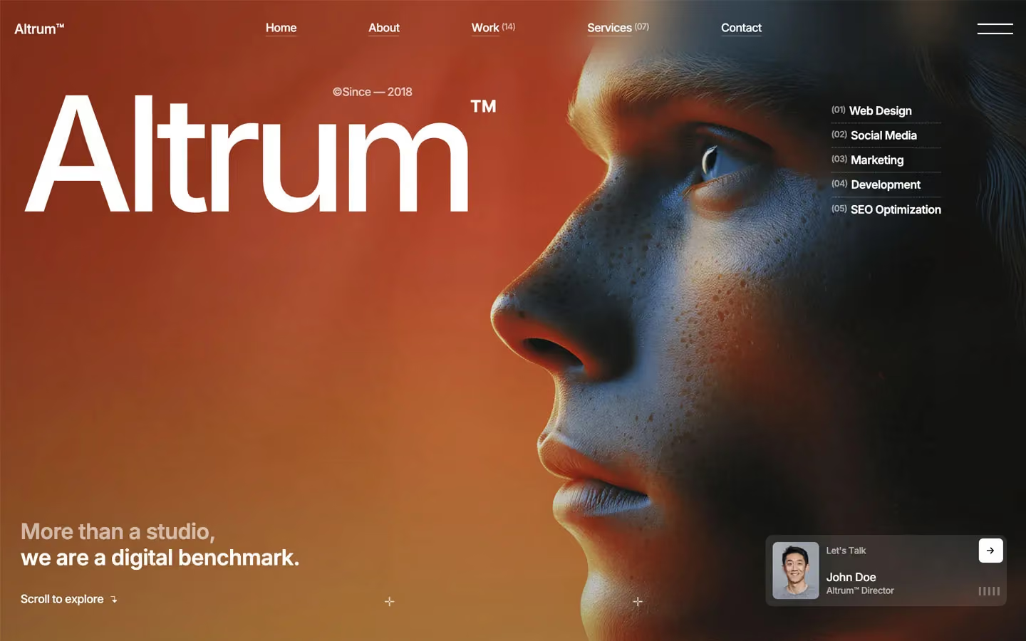
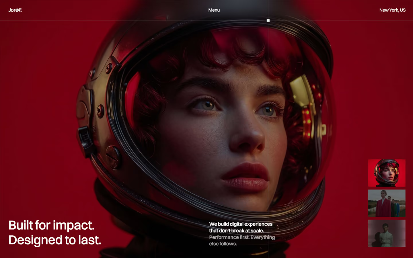


Bring any of them to your AI tool
All Access unlocks all 398 design systems, ready for Claude, ChatGPT, Gemini, Cursor, v0 and Lovable, plus 400+ templates on all 5 platforms.
Get All AccessUpgrade to All AccessHow to use the Leuven design system
Pick a file to see what it’s for and where it goes.
What it is
The whole design system in one markdown file, written for AI: every color, type style, spacing value, component and motion rule, plus do's, don'ts and a ready prompt.
Best for
Claude, ChatGPT, Gemini, Cursor and v0, or any other AI tool that builds pages or code.
How to use it
- Put
DESIGN.mdin your project and mention it in your request, or save it as.cursor/rules/leuven.mdc - For the rule file, start it with a front-matter block that sets
alwaysApply: true, so every chat uses it - Ask: “Build a pricing page using DESIGN.md.” Cursor follows the colors, fonts, spacing and rules
- Put
DESIGN.mdin the project root - Add one line to
CLAUDE.md: “Follow DESIGN.md for all UI.” - Ask for any page or component; Claude reads the file first
- Attach
DESIGN.mdto the chat (or paste it in) - Ask: “Build a landing page in this design system.”
- Keep the file in the chat or project knowledge, so follow-up pages stay on style
What it is
Every token as data, in the W3C Design Tokens format: colors with their roles, type styles, radius, spacing, and component tokens that point at them.
Best for
Figma (Tokens Studio), Style Dictionary and other design-token tools, and build scripts.
How to use it
- In Figma, open Tokens Studio, choose Import, and pick
tokens.json - Or point Style Dictionary’s
sourceat it to generate tokens for any platform - In code, import it like any JSON file
What it is
A Tailwind CSS v4 theme: every color, font, type style, radius and spacing value becomes a Tailwind utility, like bg-canvas, text-headline-lg or rounded-md.
Best for
Tailwind v4 projects, and AI builders that write Tailwind (v0, Lovable, Bolt).
How to use it
- Save
theme.cssnext to your main CSS file - Import it after Tailwind:
@import "tailwindcss"; @import "./theme.css"; - Use the classes:
bg-canvas text-ink rounded-md p-lg
What it is
The same tokens as plain CSS variables on :root. Component values point at the color variables, so changing one color updates everything that uses it.
Best for
Any website: plain CSS, Webflow custom code, Framer, WordPress.
How to use it
- Add it to your stylesheet, or in Webflow paste it into Site settings → Custom code inside a
<style>tag - Use the variables anywhere:
color: var(--color-ink) - Change a token once and every place that uses it follows