 flowmance
Altrum™ Design System
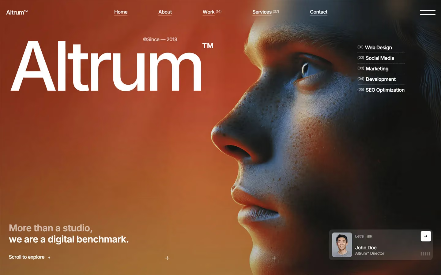
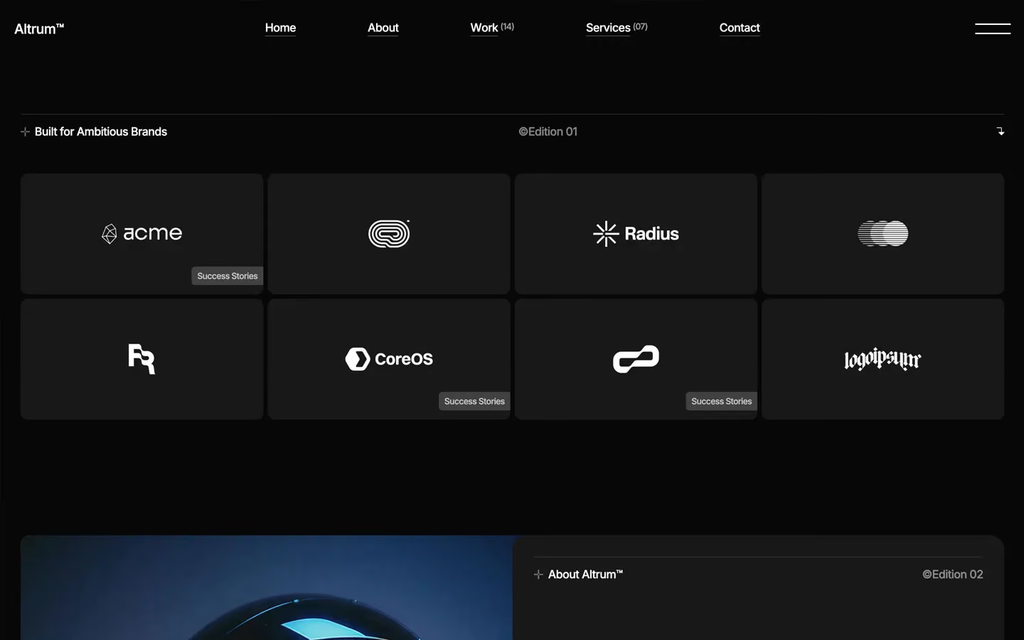

Altrum is an editorial, poster-like agency site. It feels like a printed design annual set on black: huge white Inter headlines, quiet small labels, generous empty space and full-bleed, saturated photography (cobalt blue, signal red, sky grey) that carries all the colour. The interface itself is strictly greyscale.
Three signatures make it recognisable:
- The © mark. Every big section title starts with "©" set in the same weight as the word (©Featured Works, ©Services, ©Let's Talk). Small meta labels use it too (©Edition 03, @Since — 2018).
- The edition header. Every section opens with a hairline rule and a three-part row: + Section name on the left, ©Edition 0N in the middle (muted), and an arrow or text link on the right.
- Poster type with tight tracking. Display sizes run 144–224px with line height 0.85 and letter spacing −6 to −7px. Everything else is Inter 500 at −0.5px.
Altrum is a dark-only design.
Colors
Surfaces
#070707Page background
#181818Panels, logo cards, the work and services bands, split cards
#232323A card sitting on a surface-1 panel (pricing plan)
#313131Tags, menu hairlines, the smallest raised chips
#444444Form inputs, which go darker on focus
#121212With field: Form inputs, which go darker on focus
Ink
#070707Text on primary
#FFFFFFHeadlines, labels, links
#FFFFFF · 70%Paragraphs (body copy is always 70%)
#FFFFFF · 55%Edition labels, dates, counts like (14)
#FFFFFF · 40%Metric affixes $ K +, big counts like (07)
#FFFFFF#070707Action
#EBEBEBThe only filled button: a light pill with dark text
#FFFFFF#FA242AForm error box only
Lines & effects
#FFFFFF · 15%The 1px rule above every section header
#FFFFFF · 30%Dividers inside cards
#FFFFFF · 35%1px dotted separators between service rows and pricing blocks
#333333#FFFFFF · 12%Testimonial cards floating on photos
#555555Typography
Inter · display-hero
The quick brown fox jumpsHero wordmark (Altrum), followed by a superscript ™ at about 30% of the size. 224px · 500 · 0.85 · -7px
Inter · metric-affix
The quick brown fox jumps$ before a number; K or + after it, raised to the top. 64px · 400 · 0.85 · -0.5px
Inter · headline-lg
The quick brown fox jumpsPage titles, ©Better design, simplified. 64px · 600 · 1.1 · -1px
Inter · title-lg
The quick brown fox jumpsSubheads and split-card titles. 30px · 600 · 1.1 · -0.5px
Inter · body-lg
The quick brown fox jumpsLead paragraphs and metric labels. 22px · 500 · 1.3 · -0.5px
Inter · label
The quick brown fox jumpsNav, buttons, edition headers. 16px · 500 · 1.1 · -0.5px
Spacing & shape
| Purpose | Value |
|---|---|
| Container | max 1400px, centred |
| Grid | 6 columns with a 16px gap |
| Section rhythm | 150px top and bottom on desktop, 100px on tablet, 50px on phone |
| Breakpoints | 991px (tablet), 767px (landscape phone) and 479px (phone), plus a 1920px+ step |
Spacing scale
| Token | Value | Preview |
|---|---|---|
hair | 6px | |
xs | 10px | |
sm | 20px | |
md | 30px | |
lg | 50px | |
xl | 60px | |
2xl | 120px |
Layout spacing
| Token | Value | Preview |
|---|---|---|
column-gap | 16px | |
section | 150px |
Border radius
Surfaces
How the surfaces stack, from the page background up. Hex codes and roles are in Colors above.
Motion
| Text roll on hover (buttons, nav, menu) | The label moves y 0% → −101% while a copy moves 100% → 0%. Characters are staggered, 300–400ms, power1.out going in and power1.in going out. |
| Headline reveal | SplitText into lines. Each line rises from y 100% → 0% inside an overflow-hidden mask, 500ms, power1.out, about 50ms stagger. |
| Fade-up | opacity 0 → 1, y 10px → 0, 400ms, power1.out |
| Icon pop | scale 0.6 → 1, rotation 40° → 0°, 200ms, sine.inOut |
| Work card tilt | rotation 15° → 0°, scale 0.9 → 1, scrubbed by scroll (scrub 0.7–0.8) from the card entering to it reaching 70–90% of the viewport |
| Hero image | scale 1.6 → 1 over the first screen of scroll (scrub 0.8) |
| Underline and menu line wipe | width 0% → 100%, 400ms, power1.in |
| Input focus | 400ms cubic-bezier(0.25, 0.46, 0.45, 0.94) |
Do’s and don’ts
- Start every section with the edition header (line rule, + Name, ©Edition 0N, link), then a ©Title in display-section.
- Keep all UI greyscale: canvas #070707, surface-1 #181818, ink #FFFFFF.
- Set body copy at ink-muted (white at 70%), never full white.
- Use the single button-primary pill (#EBEBEB on #070707) for the one main action in a section. Everything else is link-arrow.
- Use letter spacing −0.5px on all text, and −6 to −7px on the display sizes.
- Use dotted rules between list rows and solid hairlines above section headers.
- Add an accent or brand colour, gradients on UI, or drop shadows.
- Use pure #000000 for the background or a grey for muted text. Use white with alpha.
- Use a second typeface, uppercase labels, or weights above 600.
- Round anything beyond the scale: 10px cards, 20px split cards, 50px work images, 60px pills.
- Put ink-faint (40%) on anything under 40px. It only passes contrast at large sizes.
- Animate for longer than 500ms, or use bounce or elastic easing.
Example prompt
Any page in the Altrum style
More design systems like this
Agency design systems, the same colors first.


Bring any of them to your AI tool
All Access unlocks all 398 design systems, ready for Claude, ChatGPT, Gemini, Cursor, v0 and Lovable, plus 400+ templates on all 5 platforms.
Get All AccessUpgrade to All AccessHow to use the Altrum design system
Pick a file to see what it’s for and where it goes.
What it is
The whole design system in one markdown file, written for AI: every color, type style, spacing value, component and motion rule, plus do's, don'ts and a ready prompt.
Best for
Claude, ChatGPT, Gemini, Cursor and v0, or any other AI tool that builds pages or code.
How to use it
- Put
DESIGN.mdin your project and mention it in your request, or save it as.cursor/rules/altrum.mdc - For the rule file, start it with a front-matter block that sets
alwaysApply: true, so every chat uses it - Ask: “Build a pricing page using DESIGN.md.” Cursor follows the colors, fonts, spacing and rules
- Put
DESIGN.mdin the project root - Add one line to
CLAUDE.md: “Follow DESIGN.md for all UI.” - Ask for any page or component; Claude reads the file first
- Attach
DESIGN.mdto the chat (or paste it in) - Ask: “Build a landing page in this design system.”
- Keep the file in the chat or project knowledge, so follow-up pages stay on style
What it is
Every token as data, in the W3C Design Tokens format: colors with their roles, type styles, radius, spacing, and component tokens that point at them.
Best for
Figma (Tokens Studio), Style Dictionary and other design-token tools, and build scripts.
How to use it
- In Figma, open Tokens Studio, choose Import, and pick
tokens.json - Or point Style Dictionary’s
sourceat it to generate tokens for any platform - In code, import it like any JSON file
What it is
A Tailwind CSS v4 theme: every color, font, type style, radius and spacing value becomes a Tailwind utility, like bg-canvas, text-headline-lg or rounded-md.
Best for
Tailwind v4 projects, and AI builders that write Tailwind (v0, Lovable, Bolt).
How to use it
- Save
theme.cssnext to your main CSS file - Import it after Tailwind:
@import "tailwindcss"; @import "./theme.css"; - Use the classes:
bg-canvas text-ink rounded-md p-lg
What it is
The same tokens as plain CSS variables on :root. Component values point at the color variables, so changing one color updates everything that uses it.
Best for
Any website: plain CSS, Webflow custom code, Framer, WordPress.
How to use it
- Add it to your stylesheet, or in Webflow paste it into Site settings → Custom code inside a
<style>tag - Use the variables anywhere:
color: var(--color-ink) - Change a token once and every place that uses it follows