 flowmance
AgencQ Design System


AgencQ is a loud, poster-like creative agency site on pure black. Tall, condensed Big Shoulders Display headlines fill the screen, one word in each hero line is swapped for a looping Stalemate script, and most small text is uppercase. There are almost no boxes: calls to action are underlined text links with a ↗ arrow, images run edge to edge with square corners, and colour comes only from the photography, three small coloured service icons and one red-to-violet gradient band.
Four signatures make it recognisable:
- Condensed type plus a script word. The hero We are the creative think—tank you've been searching for. sets think—tank in Stalemate at 165px among 120px Big Shoulders Display words.
- Underlined arrow links instead of buttons. VIEW OUR WORK ↗, HIRE US TODAY ↗: uppercase 22px, with a short 1px white underline that grows on hover.
- Sticky hero, horizontal work strip. The hero is sticky at full viewport height; a 700px-tall strip of square-cornered project images slides over it and moves sideways as you scroll.
- Uppercase body copy. Every paragraph is General Sans 15px uppercase in full white, so body text reads like captions.
AgencQ is a dark-only design.
Colors
Surfaces
#000000Page and nav background (pure black)
#1A1B1FThe overlay menu circle and the filled pill button
#151619Cart button
#12141DCart panel
Ink
#FFFFFF#FFFFFFHeadlines, links, icons
#FFFFFFBody copy
#FFFFFF · 60%Footer links and paragraph links at rest (100% on hover)
#FFFFFF · 51%01–05 index numbers in the overlay menu
#8A8A8APrice tags in the shop
#FFFFFFAction
#1A1B1FThe .button pill (Send Message), lighter grey on hover
#616161With primary: The .button pill (Send Message), lighter grey on hover
#FF0000The CTA band: linear-gradient(120deg, #FF0000, #AA00FF)
#AA00FFWith accent: The CTA band: linear-gradient(120deg, #FF0000, #AA00FF)
Lines & effects
#FFFFFF1px rules beside section titles and under arrow links
#FFFFFF · 11%Cart borders
Typography
Stalemate · display-script
The quick brown fox jumpsthink—tank in the hero. 165px · 400 · 0.7
Big Shoulders Display · headline-quote
The quick brown fox jumpsThe quote "Each remarkable design is rooted in an even more compelling narrative". 70px · 400 · 1.2
Big Shoulders Display · title-service
The quick brown fox jumpsService titles MOTION DESIGN. 26px · 400 · 1.15
Big Shoulders Display · label-index
The quick brown fox jumpsMenu index numbers, at 51%. 23px · 400 · 1.2
Big Shoulders Display · body-link
The quick brown fox jumpsContact lines in the footer, at 60%. 17px · 400 · 1.41
General Sans · caption
The quick brown fox jumpsSmall meta lines. 13px · 500 · 1.4
Spacing & shape
| Purpose | Value |
|---|---|
| Container | 1200px, centred |
| Breakpoints | 991px, 767px and 479px, plus a 768px+ and a 1280px+ rule |
Spacing scale
| Token | Value | Preview |
|---|---|---|
xs | 10px | |
sm | 15px | |
md | 16px | |
lg | 30px | |
xl | 40px | |
2xl | 55px |
Layout spacing
| Token | Value | Preview |
|---|---|---|
column-gap | 55px | |
gutter | 72px | |
nav-height | 90px | |
section | 110px | |
section-photo | 120px | |
hero-y | 191px |
Border radius
Surfaces
How the surfaces stack, from the page background up. Hex codes and roles are in Colors above.
Motion
| Text reveal | From y 20%, skewX 30°, opacity 0 to y 0%, skewX 0°, opacity 1 over 400ms outCubic |
| Fade | opacity 0 → 1, 300ms easeIn |
| Link underline | Width grows over 300ms ease on hover, shrinks over 500ms on mouse out |
| Menu open | The circle scales 0 → 1 over 500ms; hamburger lines rotate over 300ms ease |
| Work strip | Moves horizontally while the section is in view (scroll-linked) |
| Hover | Button background 0.3s to #616161; footer links opacity 0.6 → 1 over 0.2s |
Do’s and don’ts
- Use pure black #000000 and full white #FFFFFF for the UI; the only grey fill is #1A1B1F (pill button, menu circle).
- Set headlines in Big Shoulders Display 400–500 at 60–120px (hero, quote and blog titles centred, section titles left-aligned with a rule), and swap one phrase for Stalemate at about 1.4× the size.
- Write paragraphs in General Sans 15px uppercase, line height 1.4, full white.
- Use the uppercase arrow link with a 1px underline as the call to action.
- Keep every image square-cornered and full-bleed.
- Use the linear-gradient(120deg, #FF0000, #AA00FF) band once per page, for the main CTA.
- Keep footer links at white 60% (ink-subtle) for 18px uppercase text only, rising to 100% on hover.
- Add filled buttons in content sections; the pill button is for forms only.
- Use the unused variable colours #B04540, #FBE6DE or #FB5607.
- Use Stalemate for more than one phrase per screen, or for body text.
- Round images or add shadows.
- Use Big Shoulders Display for paragraphs; it is for headlines and labels.
- Put uppercase on the big headlines.
Example prompt
Any page in the AgencQ style
More design systems like this
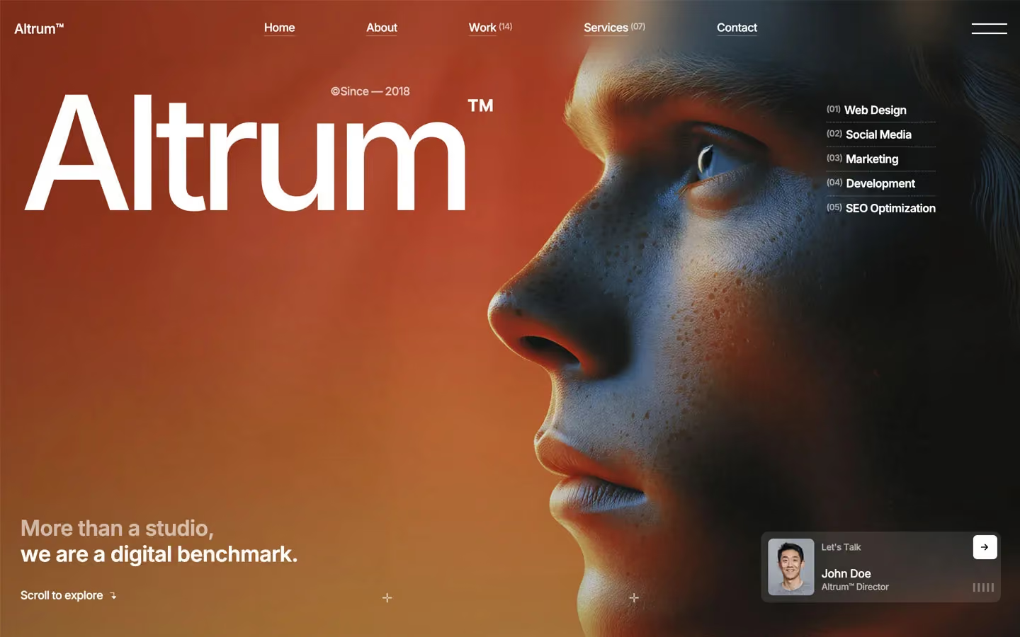
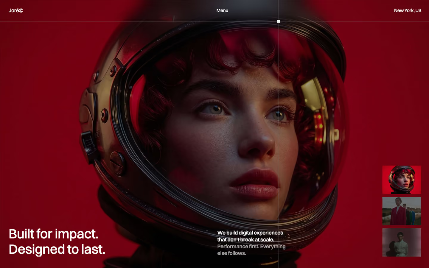
Agency design systems, the same colors first.


Bring any of them to your AI tool
All Access unlocks all 398 design systems, ready for Claude, ChatGPT, Gemini, Cursor, v0 and Lovable, plus 400+ templates on all 5 platforms.
Get All AccessUpgrade to All AccessHow to use the AgencQ design system
Pick a file to see what it’s for and where it goes.
What it is
The whole design system in one markdown file, written for AI: every color, type style, spacing value, component and motion rule, plus do's, don'ts and a ready prompt.
Best for
Claude, ChatGPT, Gemini, Cursor and v0, or any other AI tool that builds pages or code.
How to use it
- Put
DESIGN.mdin your project and mention it in your request, or save it as.cursor/rules/agencq.mdc - For the rule file, start it with a front-matter block that sets
alwaysApply: true, so every chat uses it - Ask: “Build a pricing page using DESIGN.md.” Cursor follows the colors, fonts, spacing and rules
- Put
DESIGN.mdin the project root - Add one line to
CLAUDE.md: “Follow DESIGN.md for all UI.” - Ask for any page or component; Claude reads the file first
- Attach
DESIGN.mdto the chat (or paste it in) - Ask: “Build a landing page in this design system.”
- Keep the file in the chat or project knowledge, so follow-up pages stay on style
What it is
Every token as data, in the W3C Design Tokens format: colors with their roles, type styles, radius, spacing, and component tokens that point at them.
Best for
Figma (Tokens Studio), Style Dictionary and other design-token tools, and build scripts.
How to use it
- In Figma, open Tokens Studio, choose Import, and pick
tokens.json - Or point Style Dictionary’s
sourceat it to generate tokens for any platform - In code, import it like any JSON file
What it is
A Tailwind CSS v4 theme: every color, font, type style, radius and spacing value becomes a Tailwind utility, like bg-canvas, text-headline-lg or rounded-md.
Best for
Tailwind v4 projects, and AI builders that write Tailwind (v0, Lovable, Bolt).
How to use it
- Save
theme.cssnext to your main CSS file - Import it after Tailwind:
@import "tailwindcss"; @import "./theme.css"; - Use the classes:
bg-canvas text-ink rounded-md p-lg
What it is
The same tokens as plain CSS variables on :root. Component values point at the color variables, so changing one color updates everything that uses it.
Best for
Any website: plain CSS, Webflow custom code, Framer, WordPress.
How to use it
- Add it to your stylesheet, or in Webflow paste it into Site settings → Custom code inside a
<style>tag - Use the variables anywhere:
color: var(--color-ink) - Change a token once and every place that uses it follows