 flowmance
Felix Design System
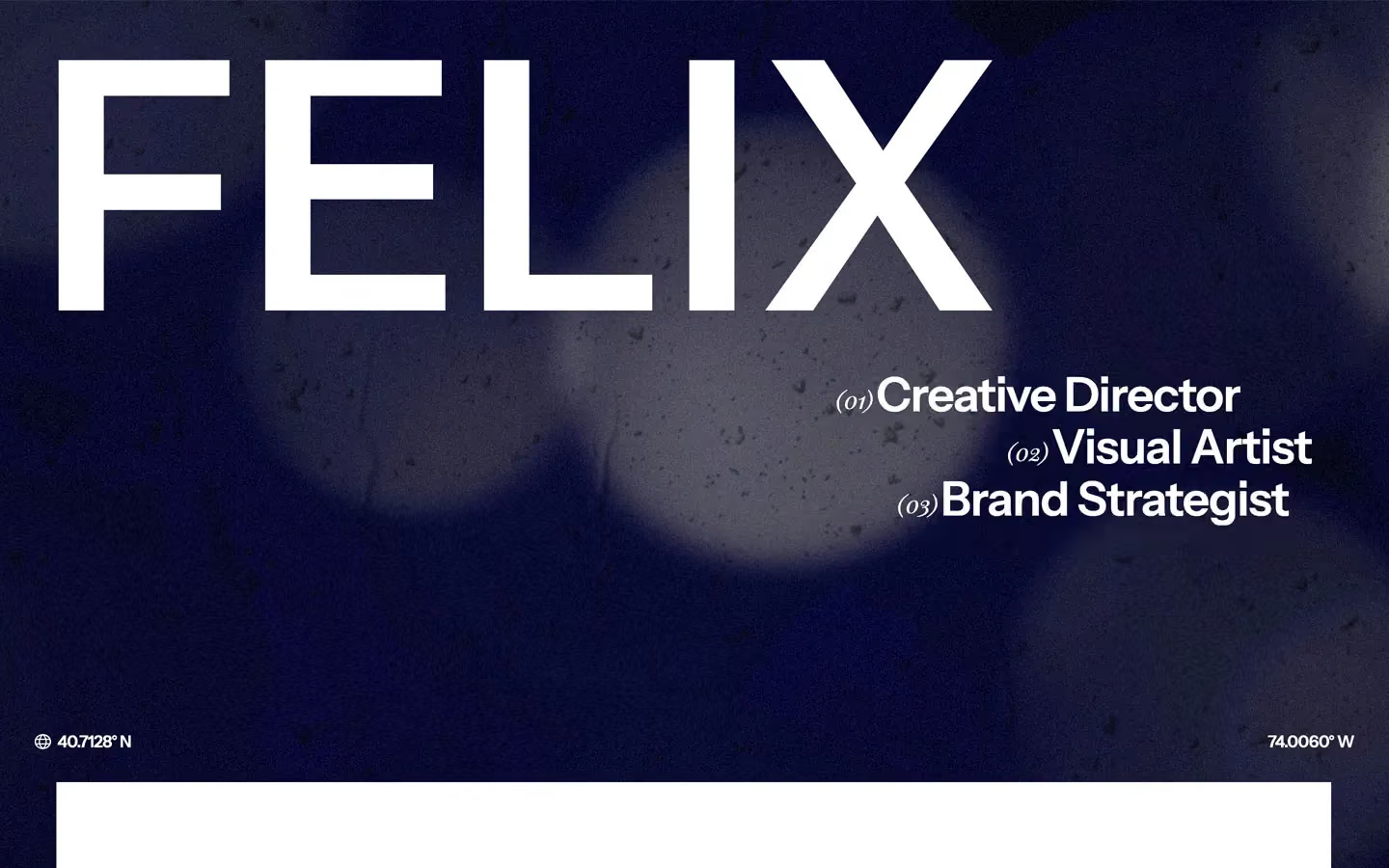
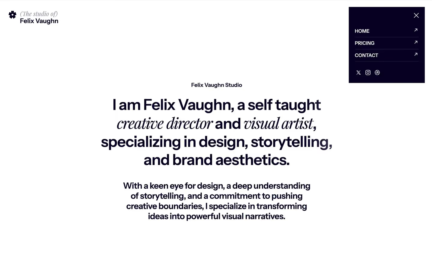
Felix is a personal portfolio for a creative director. It opens on a dark, grainy, out-of-focus navy video with FELIX in giant white capitals, then a white page slides up over it and everything turns quiet: deep navy ink, centred lists, lots of white space, and a recurring trick of setting part of a sentence in Playfair Display italic. It reads like a magazine contents page.
Four signatures make it recognisable:
- Sans with a serif italic voice. Headlines are Instrument Sans 600, but key phrases switch to Playfair Display italic in the same line (Hear what *our clients have to say* about working with us — real feedback, real results.). Indexes and years use Playfair too: (01), 2021/2025, superscript 01.
- The giant name over video. FELIX at 25vw (360px at 1440px), weight 600, line height 0.9, split into five letters, over a fixed full-screen video. Three roles step down on the right, each led by a small italic (01).
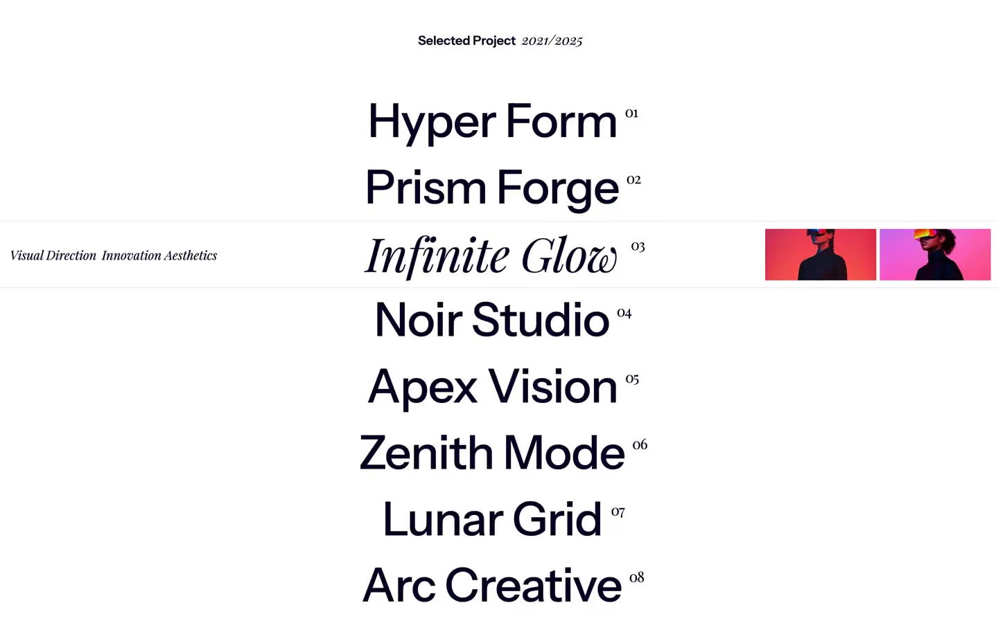
- The centred project index. Fifteen project names stacked in the centre at 67px with a small serif number at the top right (Hyper Form 01, Prism Forge 02). On hover each name rolls up and its Playfair italic twin rolls in.
- The card fan. Project images (272×304px) fanned around a pivot below the stack, rotating apart as you scroll.
Felix is a light design with a navy hero and navy footer.
Colors
Surfaces
#FFFFFFPage background for all content sections
#FFFFFFSame as canvas
#070022Footer and the open menu panel
#FFFFFFInputs
#070022 · 40%Placeholder text on field
Ink
#FFFFFFText on primary
#070022All text on white: headlines, project names, quotes (--main-color)
#070022Body text is full ink, same as ink
#070022 · 55%The company name after a testimonial author (BrightFutures)
#040126Text on secondary
#D9DAE2Text on inverse-canvas
#FFFFFFText on the hero video
Action
#2E2EFFForm submit (.button, --blue)
#070022.button:hover: the blue turns navy
#FFFFFFThe Let's Talk button on the navy footer
#5B96FEThe circle that fills the Let's Talk button on hover
Lines & effects
#000000 · 14%Menu link rules (rendered inverted, so white at 14% on navy)
#FFFFFF · 15%Rules above and below the footer nav
#000000 · 10%Hero video darkening / one image band
#000000 · 40%With overlay: Hero video darkening / one image band
Typography
Instrument Sans · display-hero
The quick brown fox jumpsFELIX (CSS 25vw), one letter per element, white. 360px · 600 · 0.9
Instrument Sans · headline-lg
The quick brown fox jumpsProject names in the index (67.2px measured). 67px · 500 · 1.3 · -1px
Instrument Sans · title-lg
The quick brown fox jumpsTestimonial quote. 32px · 600 · 1.2
Playfair Display · body-serif
The quick brown fox jumpsProject info lines (.project-info-text, 30 uses). 18px · 400 · 1.11
Instrument Sans · label
The quick brown fox jumpsCoordinates 40.7128° N, testimonial names. 17px · 600 · 1.2
Instrument Sans · eyebrow
The quick brown fox jumpsCentred section labels Testimonials, Selected Project. 18px · 600 · 1.11
Spacing & shape
| Purpose | Value |
|---|---|
| Container | .container max 1440px, centred; inner blocks are 90%, 95%, 70% or 900px wide |
| Section rhythm | .section is 150px top and bottom on white (100px at ≤767, 60px at ≤479), with z-index: 200 so it scrolls over the fixed hero |
| Breakpoints | 991px, 767px, 479px, plus 1280px, 1440px and 1920px+ steps |
Spacing scale
| Token | Value | Preview |
|---|---|---|
hair | 4px | |
sm | 16px | |
md | 25px | |
lg | 30px | |
xl | 40px | |
2xl | 100px |
Layout spacing
| Token | Value | Preview |
|---|---|---|
column-gap | 16px | |
gutter | 40px | |
section | 150px |
Border radius
Motion
| Text roll (project rows, buttons) | Copy moves to y 0% over 400ms outSine; the other copy moves to y 100%, 500ms |
| Line reveal | Text from y 130%, 400ms ease; some with skewY 8° settling over 500ms |
| Card fan | Rotate, 500ms inOutCubic, driven by scroll |
| Menu open | Size change, 500ms outExpo; menu lines rotate into a cross, 500ms |
| Rise | y 100px → 0, 500ms; y 0%, 300ms outQuart |
| Slide-in | x 30px → 0, 800ms outExpo; x −30px → 0, 500ms outQuart |
| Page load | Opacity 0 → 1 and move to 0px, 1000ms outQuart |
| Row border | border-color 250ms |
| Menu link colours | background-color and color 100ms |
| Submit hover | 300ms |
Do’s and don’ts
- Set text in #070022 on #FFFFFF, body copy included.
- Switch one phrase per headline to Playfair Display italic 400, keeping the rest Instrument Sans 600.
- Centre content sections: eyebrow, list or statement, then the next block 150px later.
- Number projects with small Playfair numerals (01) set as superscripts after the name.
- Keep images, inputs and buttons square (0px).
- Use #2E2EFF only for the main submit, turning #070022 on hover.
- Use pure #000000 for text or the dark bands; the dark colour is #070022.
- Set full sentences or body copy in Playfair; it is for phrases, numbers and meta only.
- Round the card-fan images, even though the CSS declares 32px on the card shell.
- Add grey panels, shadows or borders around content.
- Use ink-subtle (55%) for anything but the secondary half of a 17px+ label.
- Add more saturated colours; #5B96FE appears only inside the Let's Talk hover.
- Animate longer than 800ms outside the 1000ms page-load fade.
Example prompt
Any page in the Felix style
More design systems like this
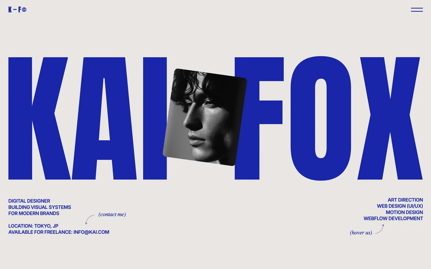
Portfolio design systems, the same colors first.

Bring any of them to your AI tool
All Access unlocks all 398 design systems, ready for Claude, ChatGPT, Gemini, Cursor, v0 and Lovable, plus 400+ templates on all 5 platforms.
Get All AccessUpgrade to All AccessHow to use the Felix design system
Pick a file to see what it’s for and where it goes.
What it is
The whole design system in one markdown file, written for AI: every color, type style, spacing value, component and motion rule, plus do's, don'ts and a ready prompt.
Best for
Claude, ChatGPT, Gemini, Cursor and v0, or any other AI tool that builds pages or code.
How to use it
- Put
DESIGN.mdin your project and mention it in your request, or save it as.cursor/rules/felix.mdc - For the rule file, start it with a front-matter block that sets
alwaysApply: true, so every chat uses it - Ask: “Build a pricing page using DESIGN.md.” Cursor follows the colors, fonts, spacing and rules
- Put
DESIGN.mdin the project root - Add one line to
CLAUDE.md: “Follow DESIGN.md for all UI.” - Ask for any page or component; Claude reads the file first
- Attach
DESIGN.mdto the chat (or paste it in) - Ask: “Build a landing page in this design system.”
- Keep the file in the chat or project knowledge, so follow-up pages stay on style
What it is
Every token as data, in the W3C Design Tokens format: colors with their roles, type styles, radius, spacing, and component tokens that point at them.
Best for
Figma (Tokens Studio), Style Dictionary and other design-token tools, and build scripts.
How to use it
- In Figma, open Tokens Studio, choose Import, and pick
tokens.json - Or point Style Dictionary’s
sourceat it to generate tokens for any platform - In code, import it like any JSON file
What it is
A Tailwind CSS v4 theme: every color, font, type style, radius and spacing value becomes a Tailwind utility, like bg-canvas, text-headline-lg or rounded-md.
Best for
Tailwind v4 projects, and AI builders that write Tailwind (v0, Lovable, Bolt).
How to use it
- Save
theme.cssnext to your main CSS file - Import it after Tailwind:
@import "tailwindcss"; @import "./theme.css"; - Use the classes:
bg-canvas text-ink rounded-md p-lg
What it is
The same tokens as plain CSS variables on :root. Component values point at the color variables, so changing one color updates everything that uses it.
Best for
Any website: plain CSS, Webflow custom code, Framer, WordPress.
How to use it
- Add it to your stylesheet, or in Webflow paste it into Site settings → Custom code inside a
<style>tag - Use the variables anywhere:
color: var(--color-ink) - Change a token once and every place that uses it follows