 flowmance
Dynamo Design System


Dynamo is a loud, poster-like agency site built from black, white and glossy 3D renders. It opens on a full-screen black hero with an iridescent glass ring and a centred white statement, then a white page slides up over it with a huge 300px rounded top edge. From there it is a clean white layout: very wide uppercase titles in Unbounded, short reading text in Inter Tight, and soft #F7F7F7 cards. All the colour comes from the 3D art (violet, magenta, cobalt, coral) and memoji avatars.
Four signatures make it recognisable:
- The overlap reveal. The hero is position: sticky and the first white section has border-radius: 300px 300px 0 0, so it rises over the black hero like a dome.
- Wide uppercase titles with a down arrow. The main sections open with a 62px Unbounded uppercase title (WHAT WE DO, WORK, WHAT THEY THINK) on the left and a thin ↓ arrow about 45px tall on the right.
- Outlined pill nav. Five uppercase nav links, each in its own 2px-outlined pill, sit top-right; they are white over the hero and turn black over white sections.
- Glossy 3D objects. Service icons and project panels use translucent violet and magenta 3D shapes (cubes, layered diamonds, pie slices) on #F7F7F7.
Colors
Surfaces
#FFFFFFPage background, the overlapping section, footer (variable --floral-white)
#F7F7F7Service, intro, testimonial and project cards
#FFFFFFInputs and their placeholder
#686868Placeholder text on field
#000000The sticky hero, tag hover
Ink
#FFFFFFText on primary
#000000Text on secondary
#000000Titles, nav on white, metric numbers, links (variable --light-blue)
#000000 · 75%Paragraphs (p { opacity: .75 })
#2C2C2C · 50%The role after a name (CEO AT WEBFLOW)
#FFFFFFText over the hero art and project images
#FFFFFFText on inverse-canvas
Action
#000000Black pill buttons (About Dynamo, Contact us)
#000000#FFFFFFThe white hero pill (Get in touch) and nav-pill hover fill
Lines & effects
#0000002px pill outlines, 2px link underlines
Typography
Inter Tight · display-metric
The quick brown fox jumpsMetric numbers >800, +1,870 (.title-4, 10vw). 144px · 600 · 1.0
Unbounded · headline-marquee
The quick brown fox jumpsWhite rotating text on project cards (.text-rotator-2). 50px · 600 · 1.2 · 1px
Inter Tight · title-lg
The quick brown fox jumpsIntro card text, Join these amazing companies. 25px · 600 · 1.3
Inter Tight · body
The quick brown fox jumpsParagraphs at 75% (16px at ≤479px). 17px · 500 · 1.3
Inter Tight · label
The quick brown fox jumpsMetric labels (WORLDWIDE CLIENTS), skill rows, input text. 15px · 600 · 1.33
Unbounded · eyebrow
The quick brown fox jumpsSmall section labels WHO WE ARE. 14px · 600 · 1.0
Spacing & shape
| Purpose | Value |
|---|---|
| Container | max 1200px, centred |
| Section rhythm | 100px top and bottom (.section { padding: 100px 5% }), 80px at ≤991px and 50px at ≤767px |
| Section header | a flex row, title left and ↓ arrow right (.big-title-flex), about 60px above the content |
| Breakpoints | 991px, 767px and 479px, plus min-width 768px and 1440px steps |
Spacing scale
| Token | Value | Preview |
|---|---|---|
xs | 7px | |
sm | 10px | |
md | 15px | |
lg | 25px | |
xl | 30px | |
2xl | 50px | |
3xl | 100px |
Layout spacing
| Token | Value | Preview |
|---|---|---|
nav-pad-x | 25px | |
nav-pad-y | 30px | |
gutter | 72px | |
hero-top | 80px | |
section | 100px |
Border radius
Surfaces
How the surfaces stack, from the page background up. Hex codes and roles are in Colors above.
Motion
| Text roll on buttons | Label y 0 → −110% (500ms easeOut), copy y 100% → 0% (500ms easeIn) inside an overflow mask |
| Reveal on scroll | Elements rise y 100% → 0% over 500ms, or scale 0 → 1 over 500ms, and fade from opacity 0 |
| Heading wipe | A black .heading-overlay block starts at translateX(-100%) and sweeps across headings (size and move, 500ms) |
| Slide-ins | x ±30px → 0, 500ms |
| Card press | scale 1 → 0.95 on hover, 300ms outSine, back to 1 over 300–500ms (outQuint) |
| Arrow turn | rotate, 400ms ease |
| Nav colour switch | Page-scroll: background colour and filter change over 500ms |
| Nav pill hover | background-color 200ms; label filter 300ms ease |
| CSS transitions | Links and titles all .3s |
Do’s and don’ts
- Set every title, nav item and button in Unbounded uppercase, and every paragraph in Inter Tight 17px sentence case at 75% black.
- Open sections with a display-section title on the left and a thin ↓ arrow on the right.
- Keep the UI black #000000, white #FFFFFF and #F7F7F7 only; let 3D renders bring the colour.
- Use 2px black outlines for nav pills, tags and footer tags.
- Start the page with a sticky black hero and a white section with a 300px rounded top that rises over it.
- Use 20px radii on cards and 40–50px pills for buttons.
- Use ink-subtle (#2C2C2C at 50%) for anything under 14px or for paragraphs; it is only about 3:1 on white. Keep it for the role after a name.
- Add a brand colour, coloured buttons, or the unused pastel variables.
- Use Oswald, or set Unbounded in sentence case.
- Add drop shadows; depth comes from the overlap and the renders.
- Use thin or grey outlines; outlines are always 2px in the text colour.
- Write long titles; Unbounded is very wide, so keep display titles to 1–3 words.
Example prompt
Any page in the Dynamo style
More design systems like this
Agency design systems, the same colors first.
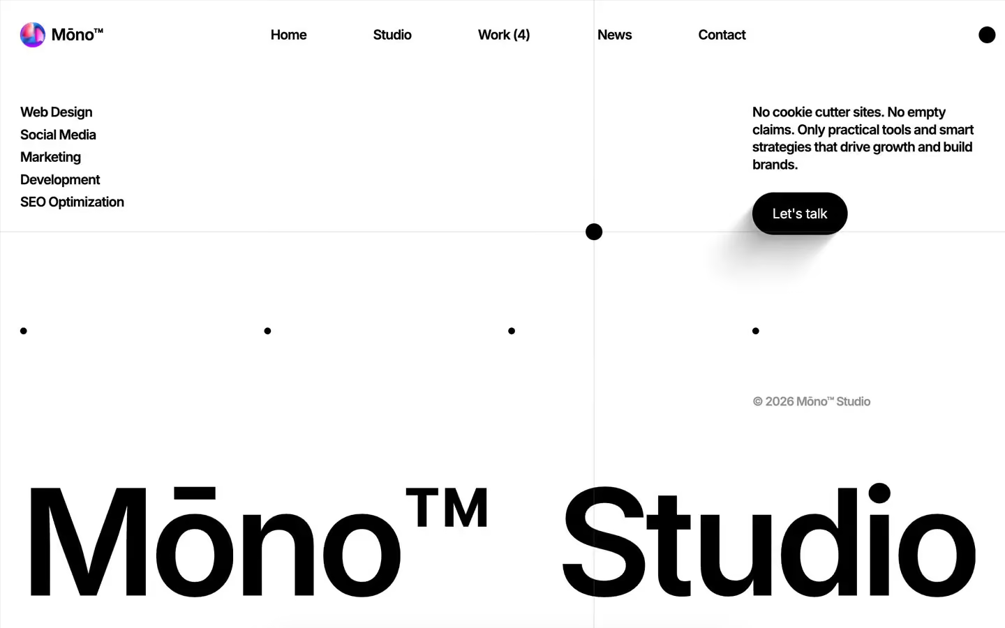
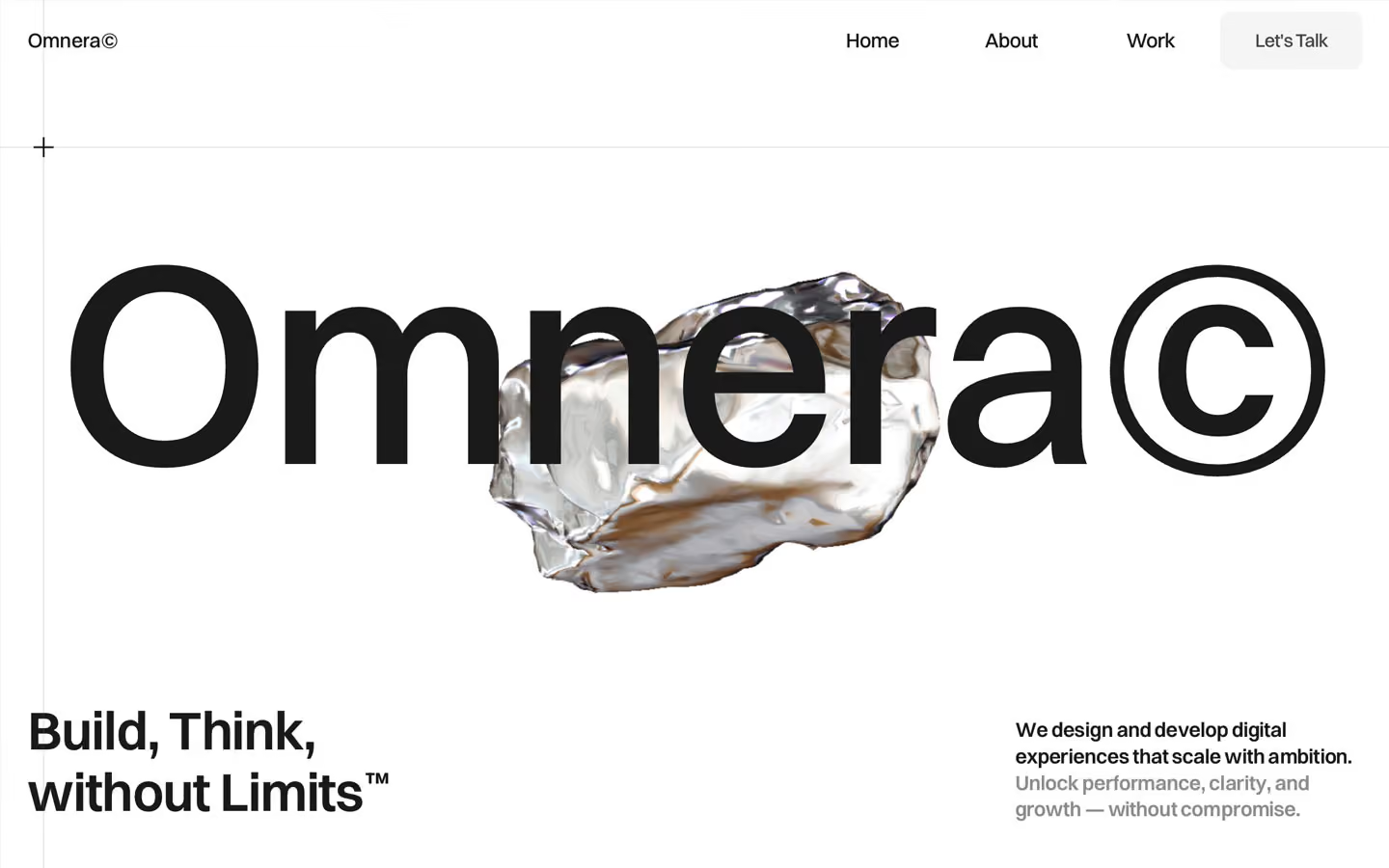
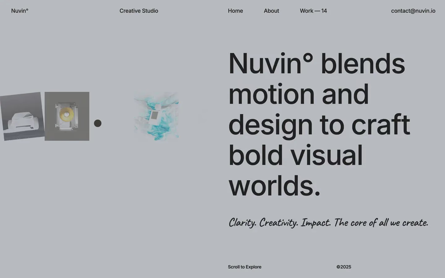

Bring any of them to your AI tool
All Access unlocks all 398 design systems, ready for Claude, ChatGPT, Gemini, Cursor, v0 and Lovable, plus 400+ templates on all 5 platforms.
Get All AccessUpgrade to All AccessHow to use the Dynamo design system
Pick a file to see what it’s for and where it goes.
What it is
The whole design system in one markdown file, written for AI: every color, type style, spacing value, component and motion rule, plus do's, don'ts and a ready prompt.
Best for
Claude, ChatGPT, Gemini, Cursor and v0, or any other AI tool that builds pages or code.
How to use it
- Put
DESIGN.mdin your project and mention it in your request, or save it as.cursor/rules/dynamo.mdc - For the rule file, start it with a front-matter block that sets
alwaysApply: true, so every chat uses it - Ask: “Build a pricing page using DESIGN.md.” Cursor follows the colors, fonts, spacing and rules
- Put
DESIGN.mdin the project root - Add one line to
CLAUDE.md: “Follow DESIGN.md for all UI.” - Ask for any page or component; Claude reads the file first
- Attach
DESIGN.mdto the chat (or paste it in) - Ask: “Build a landing page in this design system.”
- Keep the file in the chat or project knowledge, so follow-up pages stay on style
What it is
Every token as data, in the W3C Design Tokens format: colors with their roles, type styles, radius, spacing, and component tokens that point at them.
Best for
Figma (Tokens Studio), Style Dictionary and other design-token tools, and build scripts.
How to use it
- In Figma, open Tokens Studio, choose Import, and pick
tokens.json - Or point Style Dictionary’s
sourceat it to generate tokens for any platform - In code, import it like any JSON file
What it is
A Tailwind CSS v4 theme: every color, font, type style, radius and spacing value becomes a Tailwind utility, like bg-canvas, text-headline-lg or rounded-md.
Best for
Tailwind v4 projects, and AI builders that write Tailwind (v0, Lovable, Bolt).
How to use it
- Save
theme.cssnext to your main CSS file - Import it after Tailwind:
@import "tailwindcss"; @import "./theme.css"; - Use the classes:
bg-canvas text-ink rounded-md p-lg
What it is
The same tokens as plain CSS variables on :root. Component values point at the color variables, so changing one color updates everything that uses it.
Best for
Any website: plain CSS, Webflow custom code, Framer, WordPress.
How to use it
- Add it to your stylesheet, or in Webflow paste it into Site settings → Custom code inside a
<style>tag - Use the variables anywhere:
color: var(--color-ink) - Change a token once and every place that uses it follows