 flowmance
ConsultHQ Design System
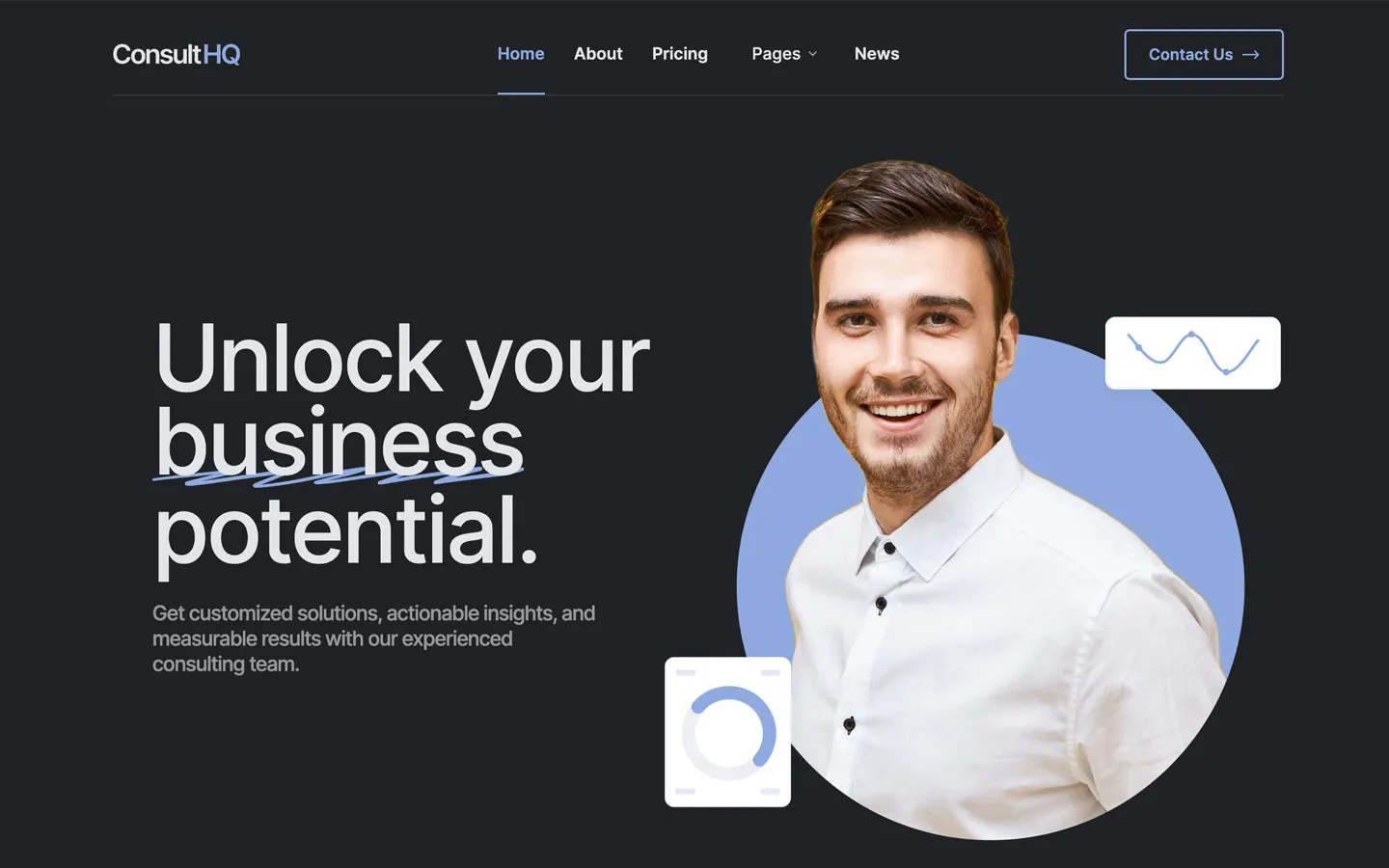
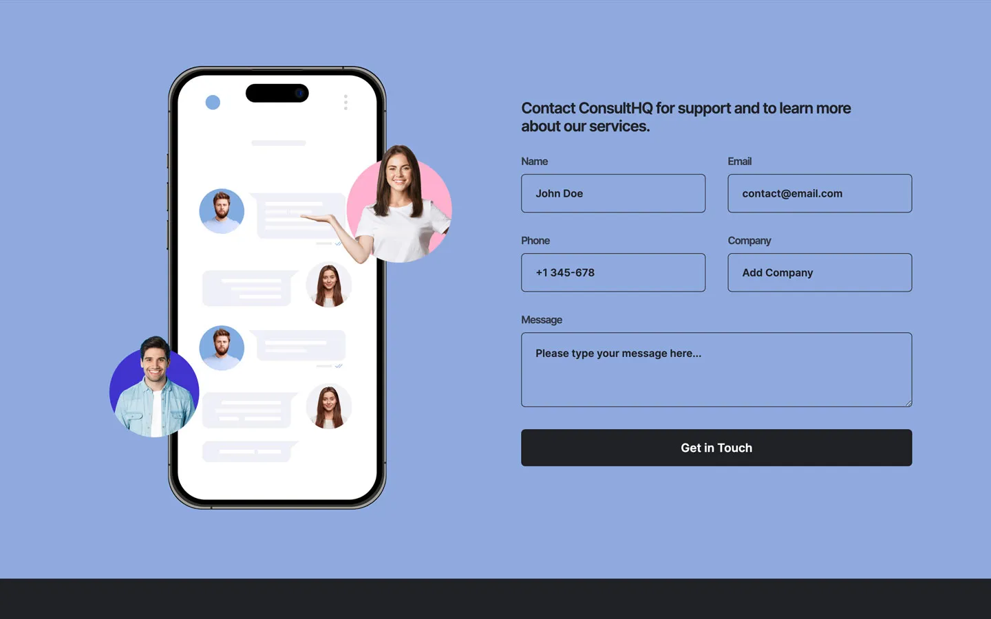
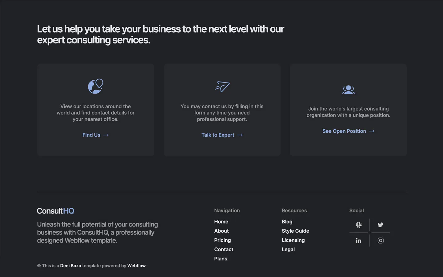
ConsultHQ is a quiet, professional consulting site on a dark charcoal page. It feels like a modern finance or advisory firm: soft pale-grey type rather than pure white, generous space, small 5px-cornered buttons, and one muted cornflower blue (#8FAADF) that does all the highlighting. Imagery is friendly business portraits, mostly cut out and set on circles (blue in the hero, pink in the contact band).
Four signatures make it recognisable:
- Cornflower on charcoal. #8FAADF is the only colour on #202125: the HQ in the logo, the active nav link, filled Learn More buttons, FAQ toggles, the closing clause of the about statement and CEO quote, the blue CTA strip and the full-width contact band.
- Blue-ending statements. The 42px about statement and the CEO quote finish their last clause in blue (plain section titles stay #E4E5E9): …helping the financial, then fiscal and legal needs of different companies. in #8FAADF.
- Hero scribble. In Unlock your business potential. the word business carries a hand-drawn blue zig-zag underline, next to a cut-out portrait on a blue circle with small white UI cards (a wave chart, a donut) floating at its edges.
- Hairline logo wall. Client logos sit in full-bleed 200px-tall cells drawn only with 1px #333438 lines.
ConsultHQ is dark-only; a separate light version exists as its own template.
Colors
Surfaces
#202125Page background (CSS var --black)
#26272BTestimonial cards (CSS var --black-2)
#26272B · 75%Service cards, a barely raised step on the canvas
#8FAADFThe blue contact band and CTA strip; dark text on blue
Ink
#FFFFFFText on primary
#8FAADFText on secondary
#E4E5E9Headlines, nav links, card titles, footer links (CSS var --gainsboro)
#FFFFFFEmphasis words, role names (Founder), text on the blue CTA strip
#E4E5E9 · 70%FAQ questions
#E4E5E9 · 60%Paragraphs and the hero lead (base p)
#E4E5E9 · 50%List items (base li)
#202125Text on inverse-canvas
#202125 · 83%Form labels and secondary text on the blue band
#FFFFFFAction
#8FAADFFilled Learn More buttons and FAQ toggles (CSS var --cornflower-blue)
#8FAADF#202125Outline buttons: 2px #8FAADF border, transparent fill
#8FAADFHighlighted clauses, active nav underline, logo HQ, icons
#8F8F8FFooter column titles and footer link hover
Lines & effects
#E4E5E9 · 59%Nav link hover
#333438Logo-wall hairlines, form borders, FAQ dividers
#48494CMinor 1px borders
#E4E5E9 · 24%Footer top border and social-grid dividers
#E4E5E9 · 15%The 1px rule under the nav
Typography
Inter · display-hero
The quick brown fox jumpsHero h1 Unlock your business potential. 95px · 500 · 0.9 · -3px
Inter · headline-lg
The quick brown fox jumpsSection titles, the about statement, the CEO quote, the FAQ title. 42px · 600 · 1.1 · -2px
Inter · title-lg
The quick brown fox jumpsBlog card titles (.blog-title-main). 30px · 600 · 1.2 · -1px
Inter · body-lg
The quick brown fox jumpsHero lead in 60%. 21px · 500 · 1.24 · -1px
Inter · label-lg
The quick brown fox jumpsNav links, form submit. 17px · 600 · 1.18
Inter · eyebrow
The quick brown fox jumpsSmall kickers: A word from our CEO. 15px · 600 · 1.1 · -1px
Spacing & shape
| Purpose | Value |
|---|---|
| Container | .container max-width 1200px, centred |
| Section rhythm | padding: 100px 5% top and bottom |
| Breakpoints | 991px, 767px, 479px, plus min-width steps at 768, 1440 and 1920px |
Spacing scale
| Token | Value | Preview |
|---|---|---|
hair | 5px | |
xs | 10px | |
sm | 15px | |
md | 25px | |
lg | 30px | |
xl | 50px | |
2xl | 70px | |
3xl | 100px |
Layout spacing
| Token | Value | Preview |
|---|---|---|
hero-bottom | 50px | |
section-cta | 65px | |
section | 100px | |
hero-top | 150px |
Border radius
Surfaces
How the surfaces stack, from the page background up. Hex codes and roles are in Colors above.
Motion
| Buttons | background-color .2s cubic-bezier(.645, .045, .355, 1) |
| Submit | Fills #8FAADF, text to #202125 on hover |
| Nav links | Opacity to 59%, .3s |
| Footer links | Colour to #8F8F8F, transition: all .3s |
| Blog image | transition: all .3s, shadow 0 24px 48px -12px #1018282E on hover |
| FAQ, testimonials | Webflow accordion and slider |
Do’s and don’ts
- Use #202125 as the page and #E4E5E9 for text, with paragraphs at 60% (#E4E5E999).
- Use #8FAADF as the only accent: buttons, the active nav underline, icons and the last clause of big statements.
- Keep buttons small-cornered (5px), 52px tall, padding 14px 23px, with a → after the label.
- Set headlines in Inter 600 with −2px tracking at 42px and −3px on the 95px hero.
- Draw grids with 1px #333438 hairlines instead of filled tiles.
- Flip to dark text (#202125) on the #8FAADF contact band.
- Use thin or small white text on #8FAADF, or #8FAADF text on white. They are the template's real button, toggle and CTA-strip colours but measure about 2.3:1, so keep those labels at 16px weight 600 or larger (the strip title at 24px) and never set paragraphs that way.
- Use ink-subtle (50%) for paragraphs; it measures about 4.2:1 and is only for 15px semibold list items.
- Use pure white for body text or headlines; #FFFFFF is reserved for emphasis words.
- Round buttons into pills or cards beyond 15px.
- Add heavy shadows or glows; the only shadows are 5% under floating UI cards and the blog hover.
- Add a second accent colour or gradients.
Example prompt
Any page in the ConsultHQ style
More design systems like this
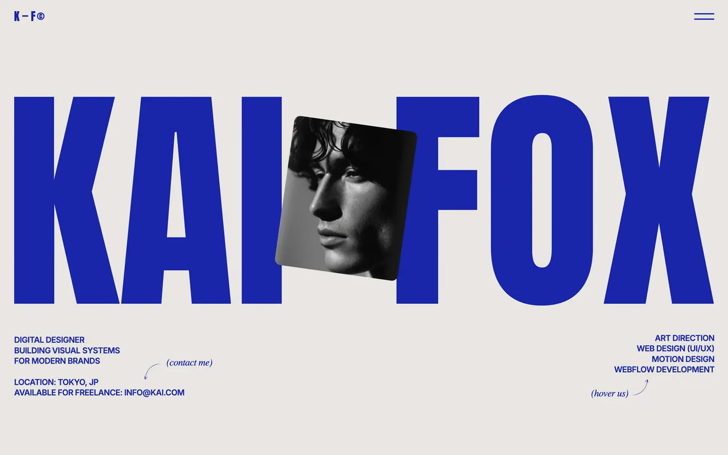
Finance design systems, the same colors first.


Bring any of them to your AI tool
All Access unlocks all 398 design systems, ready for Claude, ChatGPT, Gemini, Cursor, v0 and Lovable, plus 400+ templates on all 5 platforms.
Get All AccessUpgrade to All AccessHow to use the ConsultHQ design system
Pick a file to see what it’s for and where it goes.
What it is
The whole design system in one markdown file, written for AI: every color, type style, spacing value, component and motion rule, plus do's, don'ts and a ready prompt.
Best for
Claude, ChatGPT, Gemini, Cursor and v0, or any other AI tool that builds pages or code.
How to use it
- Put
DESIGN.mdin your project and mention it in your request, or save it as.cursor/rules/consulthq.mdc - For the rule file, start it with a front-matter block that sets
alwaysApply: true, so every chat uses it - Ask: “Build a pricing page using DESIGN.md.” Cursor follows the colors, fonts, spacing and rules
- Put
DESIGN.mdin the project root - Add one line to
CLAUDE.md: “Follow DESIGN.md for all UI.” - Ask for any page or component; Claude reads the file first
- Attach
DESIGN.mdto the chat (or paste it in) - Ask: “Build a landing page in this design system.”
- Keep the file in the chat or project knowledge, so follow-up pages stay on style
What it is
Every token as data, in the W3C Design Tokens format: colors with their roles, type styles, radius, spacing, and component tokens that point at them.
Best for
Figma (Tokens Studio), Style Dictionary and other design-token tools, and build scripts.
How to use it
- In Figma, open Tokens Studio, choose Import, and pick
tokens.json - Or point Style Dictionary’s
sourceat it to generate tokens for any platform - In code, import it like any JSON file
What it is
A Tailwind CSS v4 theme: every color, font, type style, radius and spacing value becomes a Tailwind utility, like bg-canvas, text-headline-lg or rounded-md.
Best for
Tailwind v4 projects, and AI builders that write Tailwind (v0, Lovable, Bolt).
How to use it
- Save
theme.cssnext to your main CSS file - Import it after Tailwind:
@import "tailwindcss"; @import "./theme.css"; - Use the classes:
bg-canvas text-ink rounded-md p-lg
What it is
The same tokens as plain CSS variables on :root. Component values point at the color variables, so changing one color updates everything that uses it.
Best for
Any website: plain CSS, Webflow custom code, Framer, WordPress.
How to use it
- Add it to your stylesheet, or in Webflow paste it into Site settings → Custom code inside a
<style>tag - Use the variables anywhere:
color: var(--color-ink) - Change a token once and every place that uses it follows