 flowmance
Centrix Design System


Centrix is a stark, poster-like agency site. It feels like a typographic manifesto: a flat light-grey page, warm near-black type, and every word in uppercase General Sans, from 13px labels up to a 100px quotation that fills the first screen. There are no colour accents, no filled buttons and no shadows. Colour arrives only through large, saturated photographs in a horizontal gallery, during which the page turns dark.
Four signatures make it recognisable:
- Everything uppercase. Headings, paragraphs, nav, labels and form fields are all text-transform: uppercase with 0 tracking. Only the button adds 1px tracking.
- The manifesto quote. The hero is a 3-line quotation at 7vw (about 101px at 1440px), weight 600, line height 1.1, with a hand-drawn grey squiggle under one word and an attribution row (——— JOKUBAS MALONE, CENTRIX FOUNDER) below right.
- Underlined stacked nav. Nav links are stacked vertically in two short columns (HOME / ABOUT / WORK / CONTACT and email / phone), each with a 1px #C5C5C5 underline that darkens to #262523 on hover and for the current page.
- Dark gallery band. After a giant centred WORK, a row of tall photographs scrolls sideways and the page background switches to #262523; the nav flips to light text.
Colors
Surfaces
#ECECECPage background (--white-smoke-2)
#FFFFFFFooter band, cart panel
#81818B · 50%1px bottom border on contact inputs
#262523The dark gallery band and the light nav over it
Ink
#262523Text on primary
#FFFFFFText on primary-hover
#262523All headings, nav, paragraphs (--black-3)
#000000The 2px button border and the close icon
#262523Body copy is full ink; there is no lighter paragraph grey
#757575Role text after a name (CENTRIX FOUNDER), footer links, list items (--grey-2)
#ECECECText on inverse-canvas
#FFFFFFAction
#ECECECThe outline button: no fill, canvas shows through
#262523Button hover: fills ink, text turns white
Lines & effects
#C5C5C51px nav-link underlines
#B3B3B3The short rule before the hero attribution
Typography
General Sans · display-quote
The quick brown fox jumpsHero quote and the giant WORK (.title-1, font-size: 7vw). 101px · 600 · 1.1
General Sans · headline-lg
The quick brown fox jumpsIT'S ALL ABOUT THE TEAM, PEOPLE., A VARIETY OF HIGH-END SERVICES., WE'D LOVE TO HEAR FROM YOU. 40px · 600 · 1.2
General Sans · blockquote
The quick brown fox jumpsBlockquotes with a 2px #757575 left rule. 31px · 400 · 1.23
General Sans · title-price
The quick brown fox jumpsPrice tags (shop pages). 24px · 600 · 1.88
General Sans · field
The quick brown fox jumpsContact input text and placeholders. 18px · 400 · 1.4
General Sans · body-lg
The quick brown fox jumpsParagraphs (p base). 16px · 500 · 1.4
Spacing & shape
| Purpose | Value |
|---|---|
| Container | max 1200px, centred; a 1100px medium-container for the footer |
| Breakpoints | 991px, 767px and 479px, plus a min-width: 768px set |
Spacing scale
| Token | Value | Preview |
|---|---|---|
xs | 3px | |
sm | 6px | |
md | 15px | |
lg | 20px | |
xl | 30px | |
2xl | 40px | |
3xl | 50px | |
4xl | 100px |
Layout spacing
| Token | Value | Preview |
|---|---|---|
nav-padding | 35px | |
section-side | 72px | |
section | 120px |
Border radius
Surfaces
How the surfaces stack, from the page background up. Hex codes and roles are in Colors above.
Motion
| Page load | Elements fade opacity 0 → 1 over 1000ms outQuart |
| Mouse parallax | Elements follow the cursor: x/y ±80px on large layers, ±10px and ±5px on small ones, 500ms |
| Horizontal gallery | The image track moves sideways while the section is scrolled through; the background changes colour over 300ms ease |
| Nav link hover | Underline colour #C5C5C5 → #262523, transition: all 0.2s |
| Button hover | Fill and text colour over 0.3s |
| Hover filter | A filter change on images over 300ms ease |
Do’s and don’ts
- Set every piece of text in uppercase General Sans with 0 tracking (1px only on the button).
- Keep the page #ECECEC and all text #262523, including paragraphs.
- Use 7vw / 600 / line height 1.1 for the one or two biggest statements per page, and 40px / 600 for section titles.
- Underline nav and inline links with a 1px #C5C5C5 rule that darkens to #262523 on hover.
- Use the outline button (2px #000000 border, 10px radius, padding 20px 40px) that fills #262523 on hover.
- Let photography bring all the colour, and switch the background to #262523 behind the gallery.
- Add filled buttons, accent colours or the unused CSS blues, purple and tomato.
- Add shadows, gradients or rounded images.
- Use mixed case or a second typeface.
- Use #757575 for paragraphs; keep it for role text and links at 13px+ (3.9:1 on #ECECEC).
- Put text over photographs.
- Fill the middle of the type scale; keep the jump from 21px to 40px to 101px.
Example prompt
Any page in the Centrix style
More design systems like this
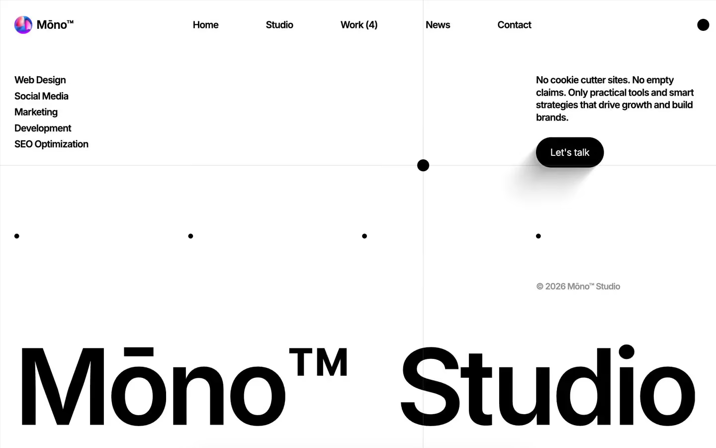
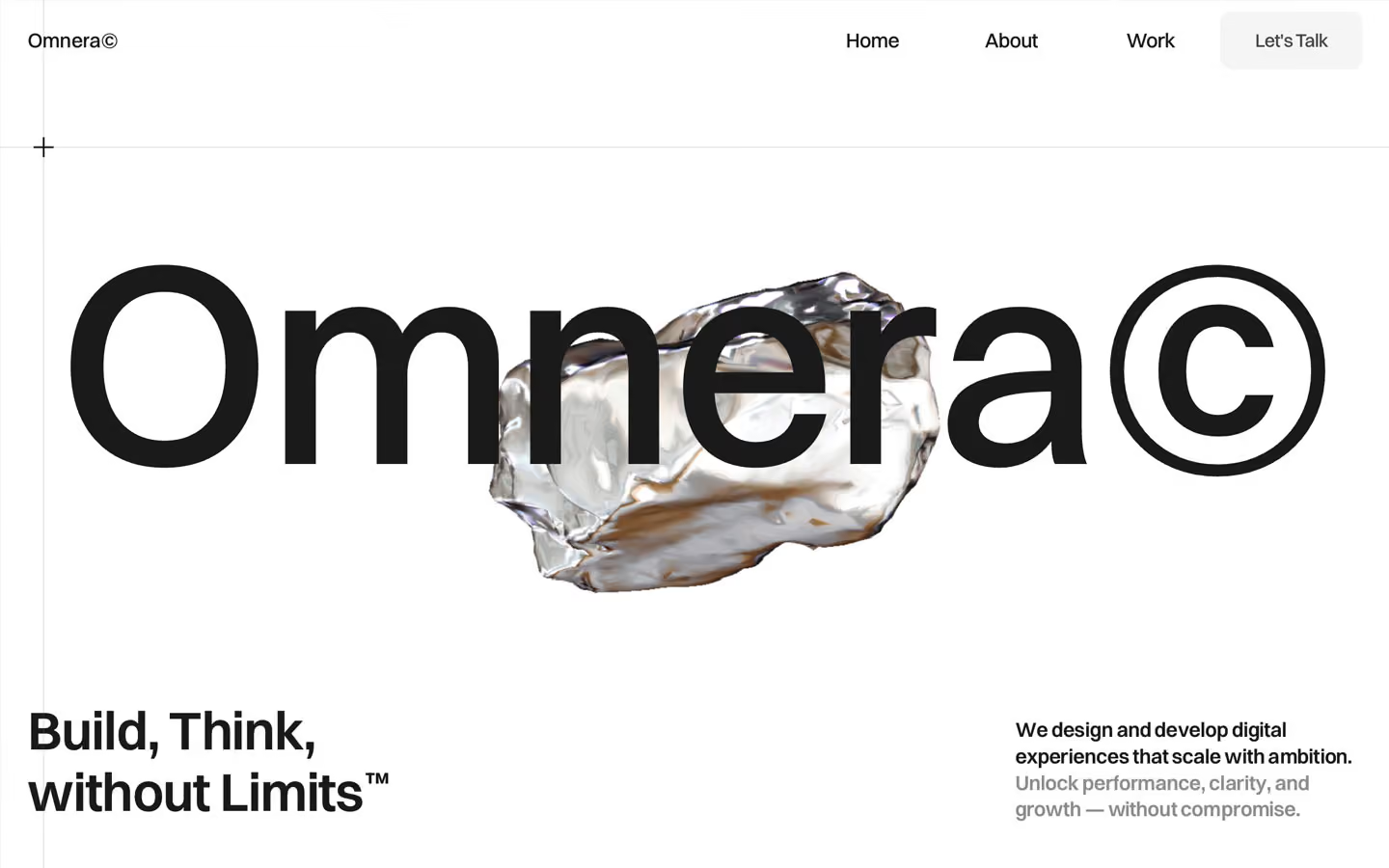
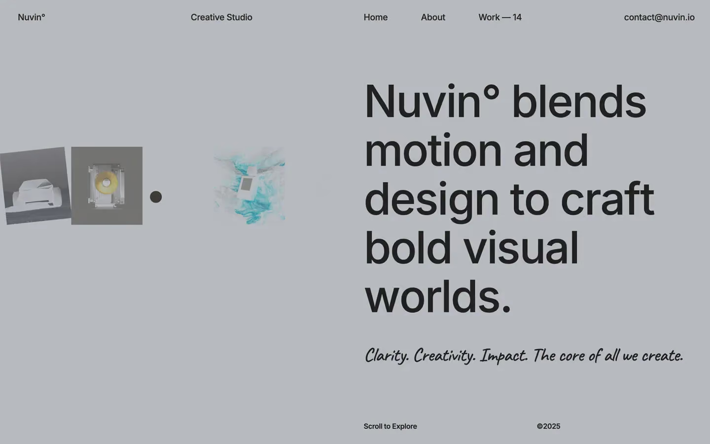
Agency design systems, the same colors first.

Bring any of them to your AI tool
All Access unlocks all 398 design systems, ready for Claude, ChatGPT, Gemini, Cursor, v0 and Lovable, plus 400+ templates on all 5 platforms.
Get All AccessUpgrade to All AccessHow to use the Centrix design system
Pick a file to see what it’s for and where it goes.
What it is
The whole design system in one markdown file, written for AI: every color, type style, spacing value, component and motion rule, plus do's, don'ts and a ready prompt.
Best for
Claude, ChatGPT, Gemini, Cursor and v0, or any other AI tool that builds pages or code.
How to use it
- Put
DESIGN.mdin your project and mention it in your request, or save it as.cursor/rules/centrix.mdc - For the rule file, start it with a front-matter block that sets
alwaysApply: true, so every chat uses it - Ask: “Build a pricing page using DESIGN.md.” Cursor follows the colors, fonts, spacing and rules
- Put
DESIGN.mdin the project root - Add one line to
CLAUDE.md: “Follow DESIGN.md for all UI.” - Ask for any page or component; Claude reads the file first
- Attach
DESIGN.mdto the chat (or paste it in) - Ask: “Build a landing page in this design system.”
- Keep the file in the chat or project knowledge, so follow-up pages stay on style
What it is
Every token as data, in the W3C Design Tokens format: colors with their roles, type styles, radius, spacing, and component tokens that point at them.
Best for
Figma (Tokens Studio), Style Dictionary and other design-token tools, and build scripts.
How to use it
- In Figma, open Tokens Studio, choose Import, and pick
tokens.json - Or point Style Dictionary’s
sourceat it to generate tokens for any platform - In code, import it like any JSON file
What it is
A Tailwind CSS v4 theme: every color, font, type style, radius and spacing value becomes a Tailwind utility, like bg-canvas, text-headline-lg or rounded-md.
Best for
Tailwind v4 projects, and AI builders that write Tailwind (v0, Lovable, Bolt).
How to use it
- Save
theme.cssnext to your main CSS file - Import it after Tailwind:
@import "tailwindcss"; @import "./theme.css"; - Use the classes:
bg-canvas text-ink rounded-md p-lg
What it is
The same tokens as plain CSS variables on :root. Component values point at the color variables, so changing one color updates everything that uses it.
Best for
Any website: plain CSS, Webflow custom code, Framer, WordPress.
How to use it
- Add it to your stylesheet, or in Webflow paste it into Site settings → Custom code inside a
<style>tag - Use the variables anywhere:
color: var(--color-ink) - Change a token once and every place that uses it follows