 flowmance
Brand Design System


Brand is a minimal, gallery-like branding-agency site. It feels cool and quiet: everything is set in uppercase in one geometric variable font (Aspekta), on alternating white and near-black #151414 bands, with lots of empty space and product photography doing the talking. There are no filled buttons, no colour accents and no rounded cards.
Four signatures make it recognisable:
- All caps at every size. Headlines, paragraphs, labels and list items are uppercase (WE ARE AN ACCLAIMED AGENCY FOR BRANDING AND WEB SOLUTIONS.). Only the nav links stay in sentence case (Home, About, Work).
- Huge light numbers. Fun facts use 140px weight-400 numbers with a symbol prefix (+740, >47), staggered across the page, each with a small grey uppercase label beside it.
- Line links, not buttons. Calls to action are 15px semibold text with a 1px line under it that redraws on hover. Skill bars are 2px black lines whose length shows the percentage (BRANDING 41%).
- Arch and square photos. Most photos are square-cornered; two images per page get a 200px arch top (200px 200px 0 0).
Colors
Surfaces
#FFFFFFLight sections
#F0F0F0Service cards
#151414Hero base, Selected Works, FAQ and footer bands
Ink
#151414Text on primary
#151414Headlines, numbers, nav on white
#111314Paragraphs
#151414 · 35%Metric labels (WORK COMPLETED, CLIENTS)
#000000Skill rows and client logos
#FFFFFFText on dark bands and photos
#FFFFFF · 50%List items and footer lists on dark
#FFFFFF · 90%Meta text on dark cards
#FFFFFFAction
#FFFFFFThere are no filled buttons; primary is the canvas colour
Lines & effects
#151414 · 31%Blockquote left rule
#151414Skill bars; the 1px link line and the 2px title line on dark
#FFFFFFSkill bars; the 1px link line and the 2px title line on dark
#000000 · 45%Bottom gradient on hero and blog images (transparent → 45% black)
#FFFFFF · 40%The round View cursor over project images
Typography
Aspekta · display-metric · shown in Inter (fallback)
The quick brown fox jumps+740, >47. 140px · 400 · 1
Aspekta · headline-md · shown in Inter (fallback)
The quick brown fox jumpsSection titles (SELECTED WORKS, LEADING DESIGN AGENCY SERVICES) and the about intro. 32px · 500 · 1.2
Aspekta · title-work · shown in Inter (fallback)
The quick brown fox jumpsProject names on the dark work band. 27px · 500 · 1
Aspekta · label-nav · shown in Inter (fallback)
The quick brown fox jumpsNav links. 20px · 400 · 1.2
Aspekta · body · shown in Inter (fallback)
The quick brown fox jumpsParagraphs. 16px · 500 · 1.4
Aspekta · eyebrow · shown in Inter (fallback)
The quick brown fox jumpsSmall section labels (OUR CLIENTS, FUN FACTS). 16px · 600 · 1.4
Spacing & shape
| Purpose | Value |
|---|---|
| Container | max 1200px, centred |
| Breakpoints | 991px, 767px and 479px (Webflow defaults) |
Spacing scale
| Token | Value | Preview |
|---|---|---|
xs | 10px | |
sm | 20px | |
md | 25px | |
lg | 40px | |
xl | 50px | |
2xl | 100px |
Layout spacing
| Token | Value | Preview |
|---|---|---|
footer-top | 40px | |
gutter | 72px | |
section | 100px | |
hero-bottom | 140px |
Border radius
Surfaces
How the surfaces stack, from the page background up. Hex codes and roles are in Colors above.
Motion
| Nav on scroll | Background and text colour change, 400ms ease |
| Text roll (nav, line links) | Label moves y 0% → −100% to a duplicate, 300ms ease |
| Line draw | Width grows 300–500ms ease (link lines, project title lines, skill bars) |
| Fade-up on scroll | opacity 0 → 1 and y 20–40px → 0, 1000ms outQuart |
| Project cursor | scale 0 → 1 in 600ms outExpo, back to 0 in 400ms outExpo |
| Image hover | Filter change, 500ms |
| Icon hover | scale 1 → 1.1, 100ms ease |
| Footer icons | opacity → 0.7 on hover |
Do’s and don’ts
- Set all text in Aspekta and uppercase, except nav links.
- Alternate white #FFFFFF and #151414 bands; nothing else gets a background except #F0F0F0 service cards.
- Use line links (15px 600 text over a 1px line) instead of filled buttons.
- Put big numbers at 140px weight 400 with a + or > prefix and a small grey label beside them.
- Keep photos square-cornered, with at most two 200px arch-topped images per page.
- Give labels at 14–15px 1px tracking.
- Add colour accents, even though the Webflow variables include blue, tomato and pink.
- Add shadows, borders or rounded cards.
- Use filled or pill buttons for regular calls to action; only the form submit is a filled block.
- Use ink-subtle (35%) below 16px or for paragraphs; keep it for labels next to 140px numbers.
- Use weights above 600 or set the display sizes in bold.
- Animate longer than 1000ms or use bounce easing.
Example prompt
Any page in the Brand style
More design systems like this
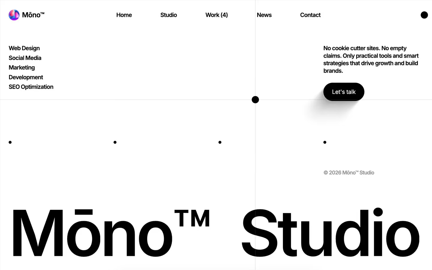
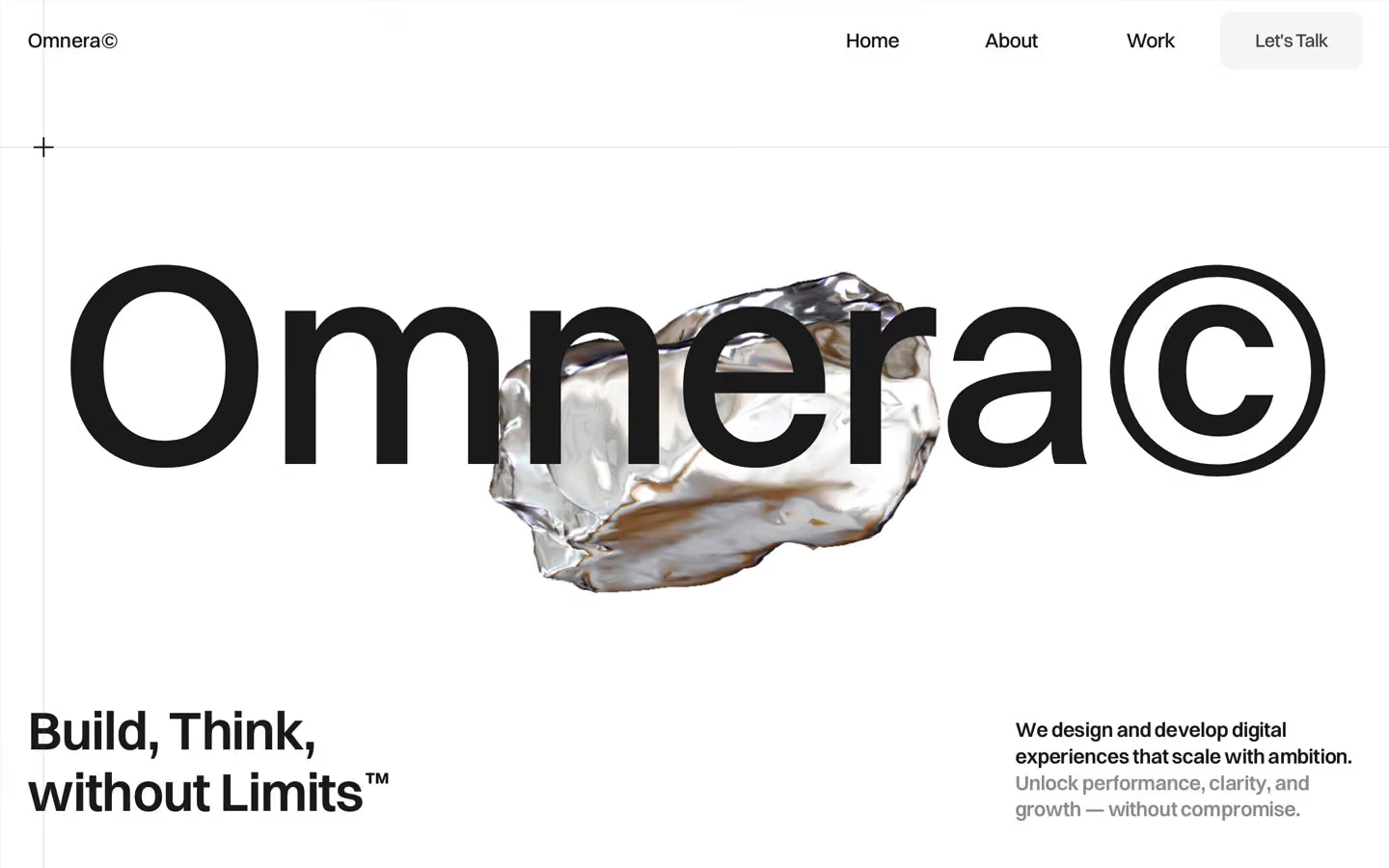
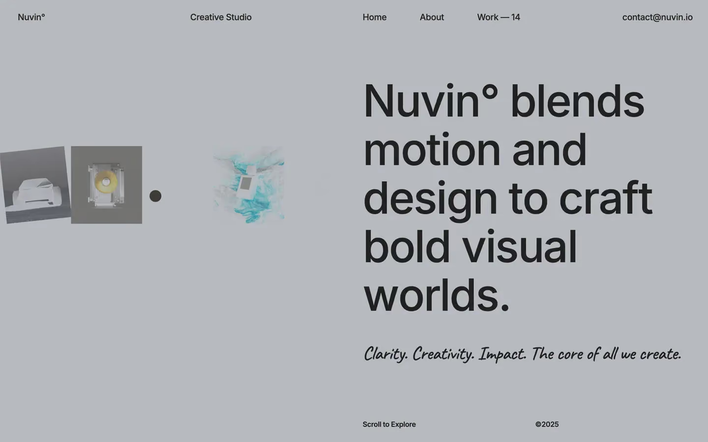
Agency design systems, the same colors first.

Bring any of them to your AI tool
All Access unlocks all 398 design systems, ready for Claude, ChatGPT, Gemini, Cursor, v0 and Lovable, plus 400+ templates on all 5 platforms.
Get All AccessUpgrade to All AccessHow to use the Brand design system
Pick a file to see what it’s for and where it goes.
What it is
The whole design system in one markdown file, written for AI: every color, type style, spacing value, component and motion rule, plus do's, don'ts and a ready prompt.
Best for
Claude, ChatGPT, Gemini, Cursor and v0, or any other AI tool that builds pages or code.
How to use it
- Put
DESIGN.mdin your project and mention it in your request, or save it as.cursor/rules/brand.mdc - For the rule file, start it with a front-matter block that sets
alwaysApply: true, so every chat uses it - Ask: “Build a pricing page using DESIGN.md.” Cursor follows the colors, fonts, spacing and rules
- Put
DESIGN.mdin the project root - Add one line to
CLAUDE.md: “Follow DESIGN.md for all UI.” - Ask for any page or component; Claude reads the file first
- Attach
DESIGN.mdto the chat (or paste it in) - Ask: “Build a landing page in this design system.”
- Keep the file in the chat or project knowledge, so follow-up pages stay on style
What it is
Every token as data, in the W3C Design Tokens format: colors with their roles, type styles, radius, spacing, and component tokens that point at them.
Best for
Figma (Tokens Studio), Style Dictionary and other design-token tools, and build scripts.
How to use it
- In Figma, open Tokens Studio, choose Import, and pick
tokens.json - Or point Style Dictionary’s
sourceat it to generate tokens for any platform - In code, import it like any JSON file
What it is
A Tailwind CSS v4 theme: every color, font, type style, radius and spacing value becomes a Tailwind utility, like bg-canvas, text-headline-lg or rounded-md.
Best for
Tailwind v4 projects, and AI builders that write Tailwind (v0, Lovable, Bolt).
How to use it
- Save
theme.cssnext to your main CSS file - Import it after Tailwind:
@import "tailwindcss"; @import "./theme.css"; - Use the classes:
bg-canvas text-ink rounded-md p-lg
What it is
The same tokens as plain CSS variables on :root. Component values point at the color variables, so changing one color updates everything that uses it.
Best for
Any website: plain CSS, Webflow custom code, Framer, WordPress.
How to use it
- Add it to your stylesheet, or in Webflow paste it into Site settings → Custom code inside a
<style>tag - Use the variables anywhere:
color: var(--color-ink) - Change a token once and every place that uses it follows