 flowmance
Boomerang Design System


Boomerang is a bright, gallery-like photography portfolio. The UI is black and white, set in Mulish capitals, and stays thin and quiet so the saturated work photos (lemon yellow, sneaker colours, cobalt blue, body paint) do all the talking. Big type is used like a layout device: the hero name spans the width in two lines split by hairline rules, and the services read as huge single lines that alternate left and right. It ends on a black band and a black footer.
Signatures:
- The ruled two-line hero. BOOMERANG on the left and PORTFOLIO on the right, each line at 10vw (144px at 1440) weight 600, each with a 1px black-60% rule under it, over a near-white fashion photo. A GET IN TOUCH WITH US outline pill sits at the right end of the first line and four small circular social icons at the left of the second.
- Alternating service lines. A CREATIVE MIND, TECHNICAL PHOTOGRAPHY, ATTENTION TO DETAIL, TEAM WORKING at 90px weight 500, each on its own row above a thin rule, alternating left-aligned and right-aligned.
- Everything in capitals. Nav, labels, paragraphs, quotes, names and buttons are uppercase Mulish, with small positive tracking (0.2–1px) on labels.
- Hairline UI, colourful photos. Cards are white with a 1px black-10% border and 6px radius; images are full-colour, square-cornered and large.
Colors
Surfaces
#FFFFFFPage background
#FFFFFFSame as canvas: testimonial cards are white, set apart only by their border
#000000The closing band and the footer
#999999Input placeholder
Ink
#FFFFFFText on primary
#000000Text on secondary
#000000Headlines, nav, labels
#000000Paragraphs and quotes
#000000 · 60%Current nav link, the outline pill, hero social icons (opacity: .6)
#292525 · 60%Testimonial roles (CEO - VISION)
#FFFFFFText on inverse-canvas
Action
#000000Black pill buttons (.button, SUBMIT NOW)
#000000 · 60%Button hover (background-color: #0009)
#FFFFFFThe white pill WORK WITH US on the black band
Lines & effects
#000000 · 10%Testimonial card borders
#000000 · 60%Hero rules, service rules, the looping-text borders, section-label rules
#FFFFFF · 60%Footer field borders and the copyright rule
Typography
Mulish · display-hero
The quick brown fox jumpsBOOMERANG / PORTFOLIO (.hero-title, 10vw). 144px · 600 · 1.0
Mulish · headline-lg
The quick brown fox jumpsA PICTURE IS WORTH A THOUSAND WORDS on the black band. 60px · 600 · 1.2
Mulish · title-lg
The quick brown fox jumpsBlog titles. 24px · 700 · 1.2 · 0.25px
Mulish · body
The quick brown fox jumpsParagraphs and testimonial quotes. 18px · 400 · 1.33
Mulish · label-button
The quick brown fox jumpsPill button labels. 18px · 600 · 1.0
Mulish · caption
The quick brown fox jumpsCopyright line. 14px · 400 · 1.0 · 0.25px
Spacing & shape
| Purpose | Value |
|---|---|
| Container | max-width: 1600px, inside sections padded 100px 3% (43px sides at 1440px) |
| Breakpoints | 991px, 767px, 479px, plus min-width 768px and 1920px |
Spacing scale
| Token | Value | Preview |
|---|---|---|
xs | 10px | |
sm | 20px | |
md | 30px | |
lg | 40px | |
xl | 60px | |
2xl | 100px |
Layout spacing
| Token | Value | Preview |
|---|---|---|
gutter | 43px | |
nav-height | 99px | |
section | 100px |
Border radius
Motion
| Scroll reveal | Elements start at opacity 0 offset 100px (from left, right or below) and settle to opacity 1, x/y 0px in 1000ms outQuart |
| Image filter | A filter transition of 600ms ease on nine hover targets |
| Link hover | transition: all .3s; nav border appears, footer links and blog titles fade to 0.6 |
| Outline pill and icons | Opacity 0.6 → 1, 300ms |
| Button hover | Background black → black 60%, 300ms |
| Inputs | transition: all .4s |
| Looping text | Moves with page scroll (page-scroll interactions) |
Do’s and don’ts
- Keep the UI black #000000 on white #FFFFFF, with greys made from black at 60% or 10%.
- Set all text in Mulish capitals: 14px weight 700 nav, 18px weight 400 body.
- Run the hero and service titles across the full width at 10vw and 90px, each with a 1px black-60% rule below.
- Alternate service lines left and right.
- Use black 60px-radius pill buttons that fade to 60% on hover, and the 50px outline pill for secondary actions.
- Let large square-cornered colour photos carry the page.
- Add a brand colour, gradients or shadows to the UI.
- Use ink-faint (#292525 at 60%) for anything but small role lines under a name; it sits just under 4.5:1 on white, so keep it at 16px and never use it for paragraphs.
- Round images, or use radii outside 6px, 50px, 60px and circles.
- Set labels in sentence case or drop the small tracking.
- Use thicker or darker rules than 1px black at 60%.
- Put coloured overlays on the photography.
Example prompt
Any page in the Boomerang style
More design systems like this
Agency design systems, the same colors first.
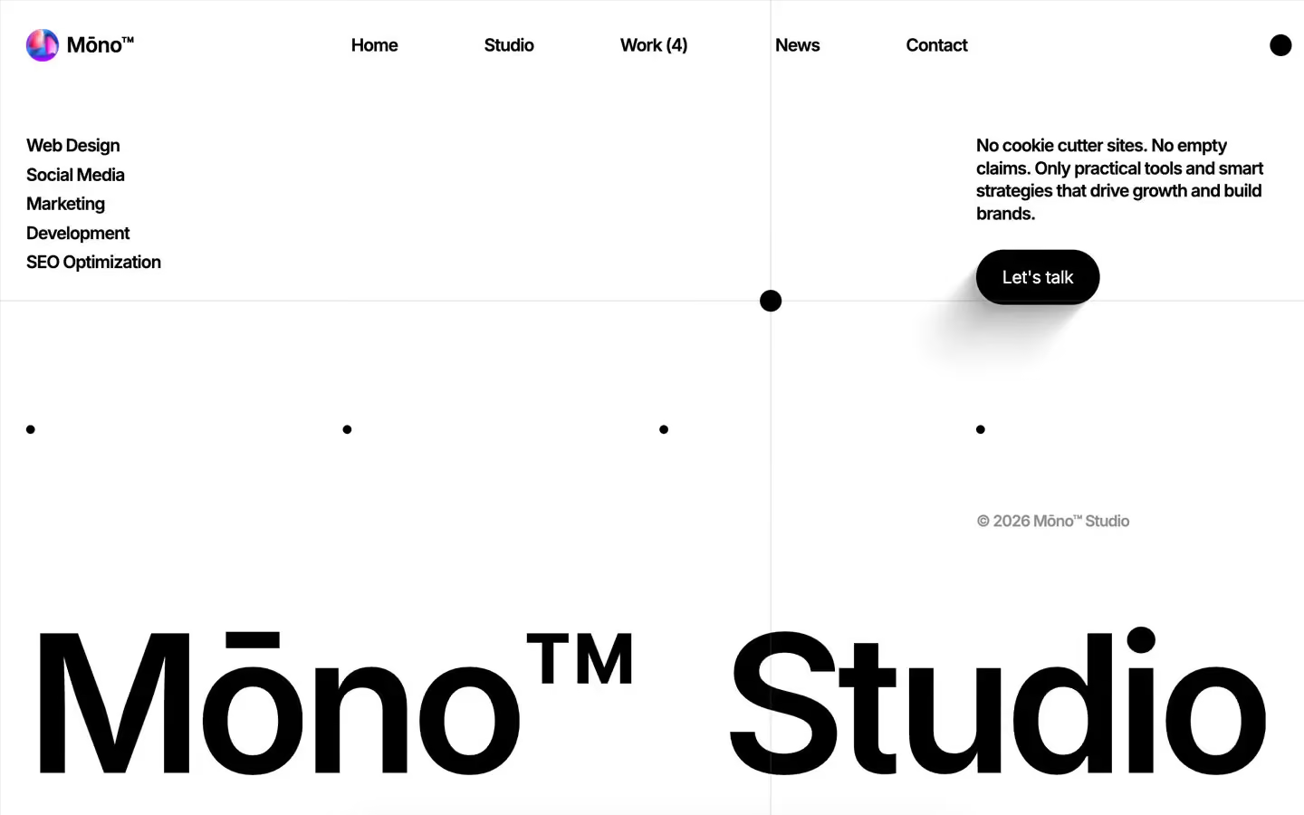
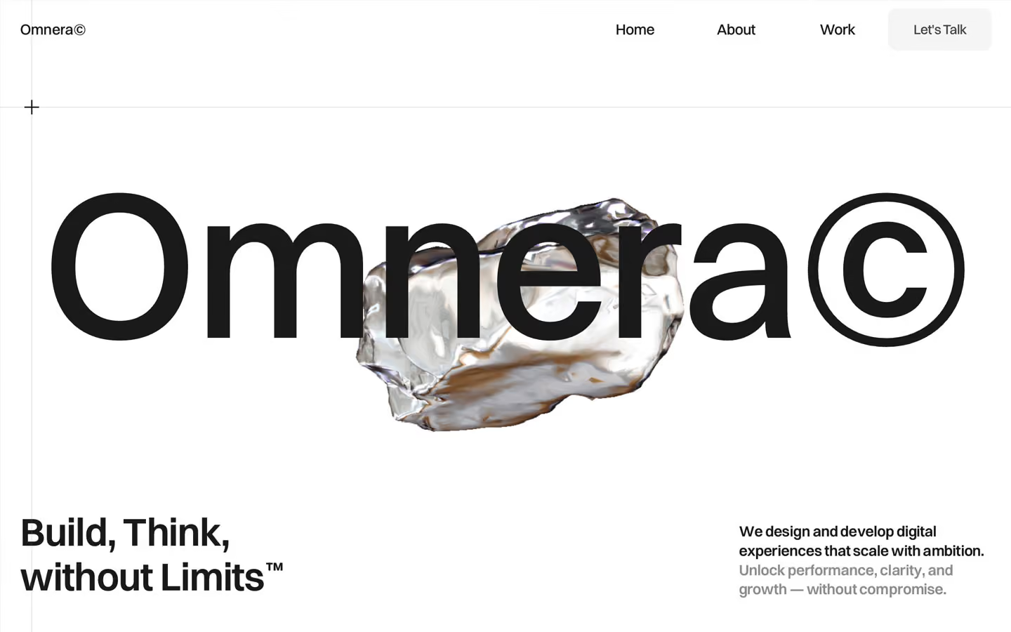
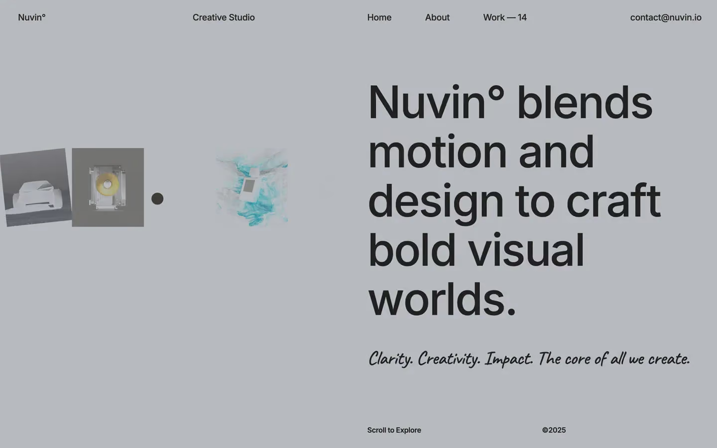

Bring any of them to your AI tool
All Access unlocks all 398 design systems, ready for Claude, ChatGPT, Gemini, Cursor, v0 and Lovable, plus 400+ templates on all 5 platforms.
Get All AccessUpgrade to All AccessHow to use the Boomerang design system
Pick a file to see what it’s for and where it goes.
What it is
The whole design system in one markdown file, written for AI: every color, type style, spacing value, component and motion rule, plus do's, don'ts and a ready prompt.
Best for
Claude, ChatGPT, Gemini, Cursor and v0, or any other AI tool that builds pages or code.
How to use it
- Put
DESIGN.mdin your project and mention it in your request, or save it as.cursor/rules/boomerang.mdc - For the rule file, start it with a front-matter block that sets
alwaysApply: true, so every chat uses it - Ask: “Build a pricing page using DESIGN.md.” Cursor follows the colors, fonts, spacing and rules
- Put
DESIGN.mdin the project root - Add one line to
CLAUDE.md: “Follow DESIGN.md for all UI.” - Ask for any page or component; Claude reads the file first
- Attach
DESIGN.mdto the chat (or paste it in) - Ask: “Build a landing page in this design system.”
- Keep the file in the chat or project knowledge, so follow-up pages stay on style
What it is
Every token as data, in the W3C Design Tokens format: colors with their roles, type styles, radius, spacing, and component tokens that point at them.
Best for
Figma (Tokens Studio), Style Dictionary and other design-token tools, and build scripts.
How to use it
- In Figma, open Tokens Studio, choose Import, and pick
tokens.json - Or point Style Dictionary’s
sourceat it to generate tokens for any platform - In code, import it like any JSON file
What it is
A Tailwind CSS v4 theme: every color, font, type style, radius and spacing value becomes a Tailwind utility, like bg-canvas, text-headline-lg or rounded-md.
Best for
Tailwind v4 projects, and AI builders that write Tailwind (v0, Lovable, Bolt).
How to use it
- Save
theme.cssnext to your main CSS file - Import it after Tailwind:
@import "tailwindcss"; @import "./theme.css"; - Use the classes:
bg-canvas text-ink rounded-md p-lg
What it is
The same tokens as plain CSS variables on :root. Component values point at the color variables, so changing one color updates everything that uses it.
Best for
Any website: plain CSS, Webflow custom code, Framer, WordPress.
How to use it
- Add it to your stylesheet, or in Webflow paste it into Site settings → Custom code inside a
<style>tag - Use the variables anywhere:
color: var(--color-ink) - Change a token once and every place that uses it follows