 flowmance
Agenct Design System


Agenct is a loud, typographic agency site in grey, black and white. It feels like a moving billboard: every word is uppercase Inter Tight, the hero and statements run from 115px up to 216px, and long sentences slide sideways across the screen as you scroll. The page sits on a cool mid-grey (#B7BABE) instead of white, and white is used as a shape: circles, a tilted ribbon and the full-screen menu.
Four signatures make it recognisable:
- All caps on grey. The body itself is set to text-transform: uppercase, so every heading, paragraph, list and button is in capitals, in black #000000 on #B7BABE.
- The scrolling statement over a white circle. DEVELOPING MEANINGFUL BRANDS AND CREATING EXTRAORDINARY EXPERIENCES runs on one line at 216px (15vw), sliding horizontally across a large white circle (about 690px) centred on the screen.
- The tilted WORK ribbon. A full-width white band, scale(1.2) rotate(−6deg), with a soft shadow, repeating WORK · WORK · WORK at 79px; a fainter band crosses behind it at the opposite angle.
- White circle markers. The statement disc, the service icons and the 150px project buttons are white circles; everything else is square.
Agenct is a single-mode design on grey.
Colors
Surfaces
#B7BABEPage background (--gray-dark on body)
#FFFFFFCircles, the WORK ribbon, the full-screen menu, buttons
Ink
#000000Text on primary
#FFFFFFText on primary-hover
#000000All text except the white project titles: headings, paragraphs, lists, links
#000000Same as ink: body copy is full black
#525252Input placeholders (--dim-grey); secondary numbers use black at 50% opacity (.text-gray)
#FFFFFFProject titles on images
Action
#FFFFFFThe white block button (.button, form submit)
#000000Button hover: it inverts to black with white text
Lines & effects
#1F1F1F · 29%1px rule under underlined links (.link-underline); the service list rules render solid black
#181818 · 20%Measured on six elements, the same count as the project cards; a scrim under the white titles
#090909Ecommerce cart drawer only
#FFFFFF · 20%Ecommerce cart drawer only
Typography
Inter Tight · display-statement
The quick brown fox jumpsThe one-line scrolling statement (15vw, nowrap). 216px · 500 · 1.2
Inter Tight · headline-md
The quick brown fox jumpsProject titles on images, white. 32px · 500 · 1.2
Inter Tight · title-lg
The quick brown fox jumpsSection titles (WE BUILD EXPERIENCES). 22px · 600 · 1.3
Inter Tight · body-lg
The quick brown fox jumpsLead paragraphs, blog titles. 19px · 600 · 1.3
Inter Tight · label
The quick brown fox jumpsTags, underlined links, skill rows. 16px · 600 · 1.1
Inter Tight · caption
The quick brown fox jumpsSmall meta. 15px · 500 · 1.4
Spacing & shape
| Purpose | Value |
|---|---|
| Container | max 1400px, centred; side padding 5% (72px at 1440px) |
| Section rhythm | 100px top and bottom (.section, .section-work; .section is 80px at ≤991 and 50px at ≤767 and ≤479), 120px for about, 130px for the overflow (marquee) section, 150px for the CTA (75px on the home CTA, for-cta) |
| Breakpoints | 991px, 767px, 479px, plus a 1280px+ step |
Spacing scale
| Token | Value | Preview |
|---|---|---|
xs | 6px | |
sm | 10px | |
md | 15px | |
lg | 20px | |
xl | 30px | |
2xl | 50px |
Layout spacing
| Token | Value | Preview |
|---|---|---|
column-gap | 50px | |
section-side | 72px | |
section | 100px | |
section-about | 120px | |
section-wide | 130px | |
section-cta | 150px |
Border radius
Surfaces
How the surfaces stack, from the page background up. Hex codes and roles are in Colors above.
Motion
| Headline reveal | Lines rise y 110–130% → 0% and unskew 7deg → 0deg, 1100ms outQuint, inside overflow-hidden wrappers |
| Fade | opacity 0 → 1, 500ms; page load 1000ms outQuart |
| Scrolling statement and ribbon | While scrolling in view moves the long text sideways with scroll |
| Size change | Size, 500ms (ease or linear): skill bars and the statement circle |
| Small moves | y 30px → 0 and x ±30px on scroll; y −6px lift on hover, 500ms |
| Mouse parallax | Mouse move shifts layers ±10px or ±30px |
| Icon hover | Rotate, 200ms outSine, and y → 0px 200ms outSine |
| Button hover | Colour inversion, transition: all .3s |
Do’s and don’ts
- Keep the page on #B7BABE and set all text in black #000000, uppercase Inter Tight.
- Use white #FFFFFF only as shapes: circles, the tilted ribbon, the menu and the block button.
- Set display type in viewport units so headlines fill the width (5.5vw for ribbons, 15vw for statements).
- Reveal headlines with the skew-and-rise effect (7deg → 0, 1100ms outQuint).
- Keep buttons and images square (0px) and reserve rounding for full circles.
- Separate service list items with thin solid black rules; keep 1px #1F1F1F4A for .link-underline.
- Add a colour accent; the yellow and pastel variables are unused.
- Use grey text for paragraphs. Keep ink-subtle #525252 (4.0:1 on #B7BABE) for placeholders and 16px+ meta only.
- Put white text directly on the grey canvas (1.95:1); white text belongs on images only.
- Use rounded corners between 0 and full; there are none.
- Mix in Switzer or another typeface.
- Use more than one box shadow; the ribbon's 1px 10px 15px #0000001A is the only one (plus the project titles' text shadow).
Example prompt
Any page in the Agenct style
More design systems like this
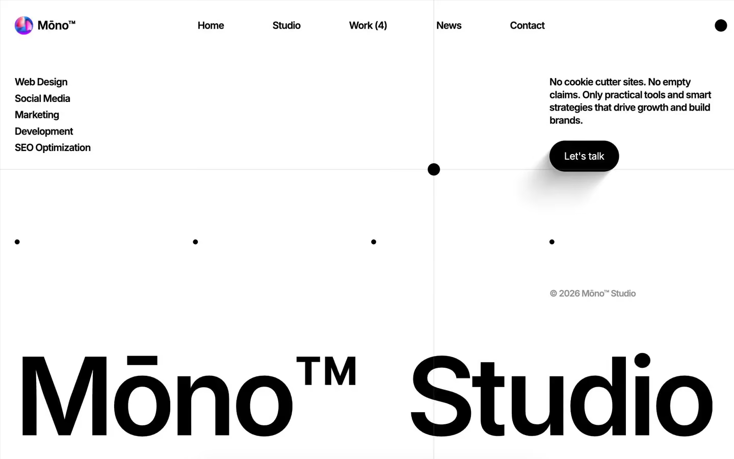
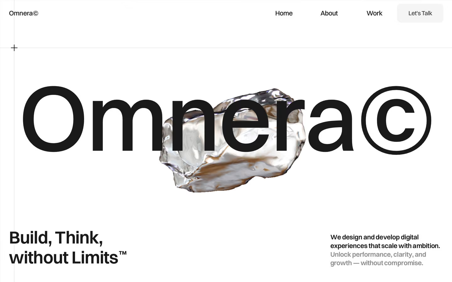
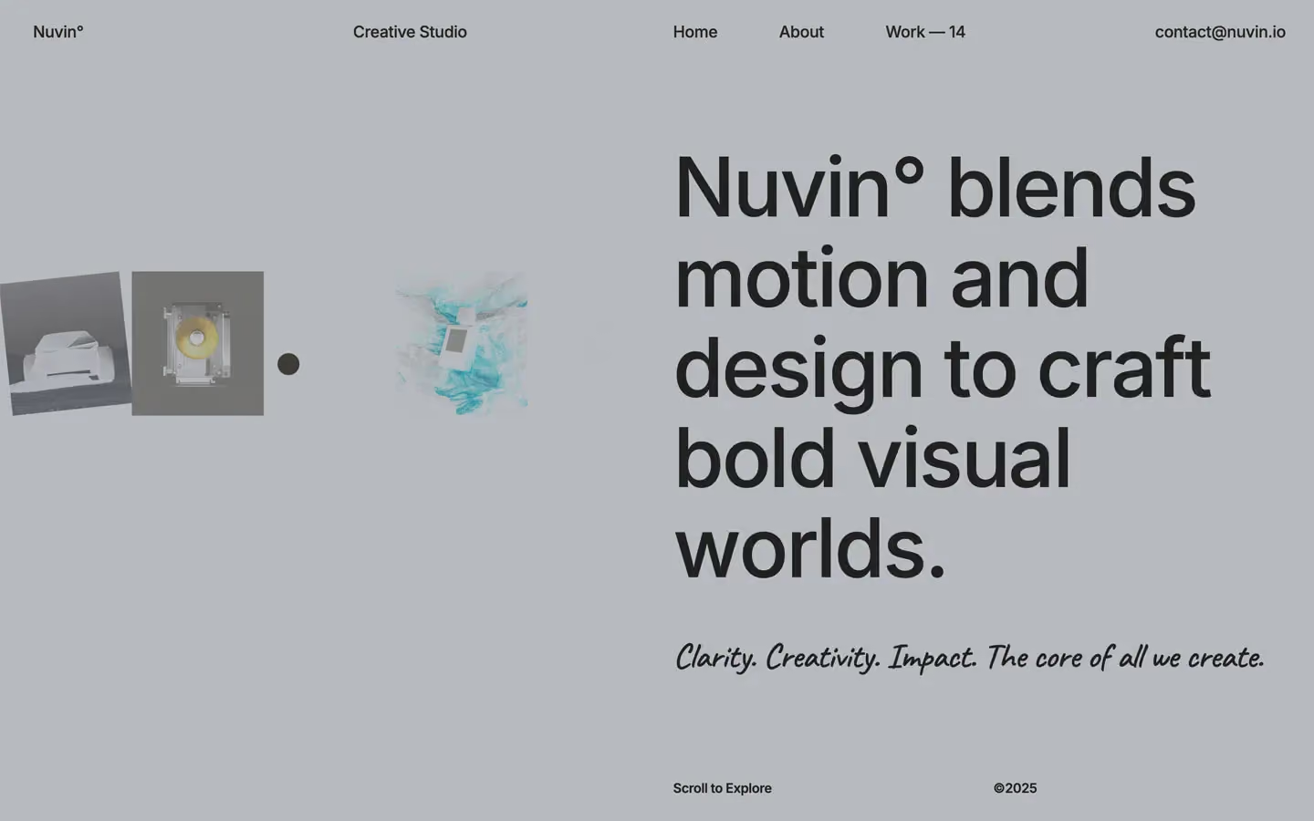
Agency design systems, the same colors first.

Bring any of them to your AI tool
All Access unlocks all 398 design systems, ready for Claude, ChatGPT, Gemini, Cursor, v0 and Lovable, plus 400+ templates on all 5 platforms.
Get All AccessUpgrade to All AccessHow to use the Agenct design system
Pick a file to see what it’s for and where it goes.
What it is
The whole design system in one markdown file, written for AI: every color, type style, spacing value, component and motion rule, plus do's, don'ts and a ready prompt.
Best for
Claude, ChatGPT, Gemini, Cursor and v0, or any other AI tool that builds pages or code.
How to use it
- Put
DESIGN.mdin your project and mention it in your request, or save it as.cursor/rules/agenct.mdc - For the rule file, start it with a front-matter block that sets
alwaysApply: true, so every chat uses it - Ask: “Build a pricing page using DESIGN.md.” Cursor follows the colors, fonts, spacing and rules
- Put
DESIGN.mdin the project root - Add one line to
CLAUDE.md: “Follow DESIGN.md for all UI.” - Ask for any page or component; Claude reads the file first
- Attach
DESIGN.mdto the chat (or paste it in) - Ask: “Build a landing page in this design system.”
- Keep the file in the chat or project knowledge, so follow-up pages stay on style
What it is
Every token as data, in the W3C Design Tokens format: colors with their roles, type styles, radius, spacing, and component tokens that point at them.
Best for
Figma (Tokens Studio), Style Dictionary and other design-token tools, and build scripts.
How to use it
- In Figma, open Tokens Studio, choose Import, and pick
tokens.json - Or point Style Dictionary’s
sourceat it to generate tokens for any platform - In code, import it like any JSON file
What it is
A Tailwind CSS v4 theme: every color, font, type style, radius and spacing value becomes a Tailwind utility, like bg-canvas, text-headline-lg or rounded-md.
Best for
Tailwind v4 projects, and AI builders that write Tailwind (v0, Lovable, Bolt).
How to use it
- Save
theme.cssnext to your main CSS file - Import it after Tailwind:
@import "tailwindcss"; @import "./theme.css"; - Use the classes:
bg-canvas text-ink rounded-md p-lg
What it is
The same tokens as plain CSS variables on :root. Component values point at the color variables, so changing one color updates everything that uses it.
Best for
Any website: plain CSS, Webflow custom code, Framer, WordPress.
How to use it
- Add it to your stylesheet, or in Webflow paste it into Site settings → Custom code inside a
<style>tag - Use the variables anywhere:
color: var(--color-ink) - Change a token once and every place that uses it follows