Avoid common Webflow template mistakes: choosing by aesthetics, keeping demo structure, ignoring CMS, adding too many overrides, inheriting motion, and skipping production QA.

A Webflow template saves time only when the team understands what should be reused and what should change. Most template problems are not caused by the template itself; they come from choosing the wrong starting point or customizing it without a clear system.
A strong hero can hide a poor fit underneath. Before committing, inspect the pages, CMS Collections, project or article templates, navigation, forms, and mobile behavior.
Choose the foundation whose structure is closest to the brief, not the demo with the most dramatic first screen.
Templates are designed to demonstrate possibilities, so they often include more sections and page types than one project needs. Remove content that does not support the buyer journey.
A shorter site with a clear purpose is better than a complete copy of the demo with filler text.
Brand differentiation also comes from content hierarchy, image direction, page order, spacing, CMS fields, interaction style, and the way proof is presented.
The finished site should inherit useful engineering from the template, not its identity.
Map the existing Collections and fields before deleting anything. Then compare that structure with the real content model and simplify it deliberately.
Rename unclear fields, remove demo-only data, and add what the client actually needs to maintain.
Webflow starts from a desktop base breakpoint. Before adding tablet or mobile overrides, ask whether the base layout can be made more fluid with Grid, Flexbox, max-widths, or better content constraints.
Fewer overrides usually create a more maintainable project.
Keep motion that supports feedback, hierarchy, or storytelling. Remove animation that does not match the brand or adds unnecessary performance cost.
Pay particular attention to hover-dependent interactions and heavy scroll effects on touch devices.
Real images, video, analytics, chat, consent tools, and marketing integrations change page weight. Test the finished site after production assets and scripts are installed.
The template should reduce repetitive production work, not replace project thinking. Audit the structure first, customize the system rather than isolated screens, and finish with real-content QA.
For current starting points, browse Flowmance Webflow templates.




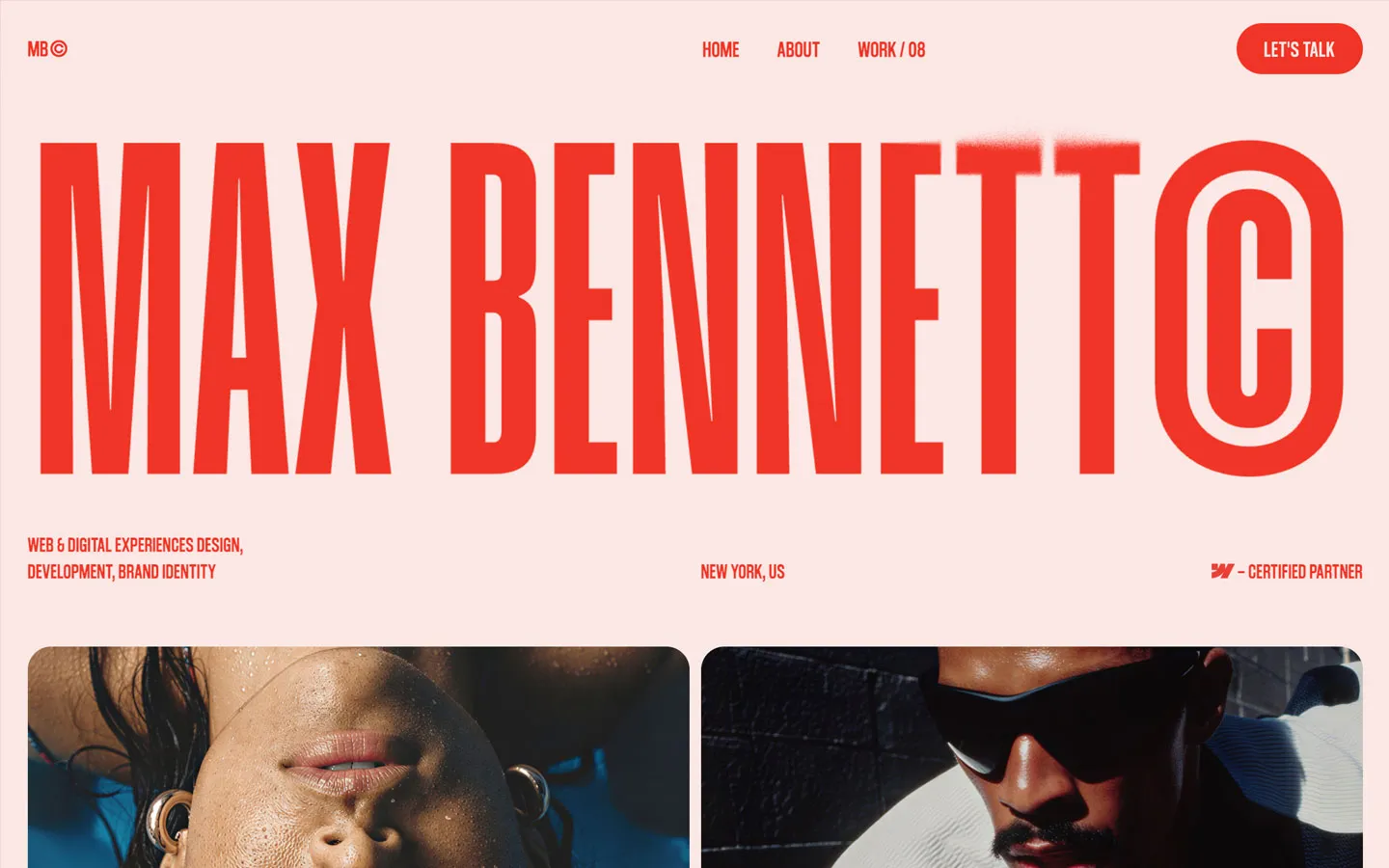


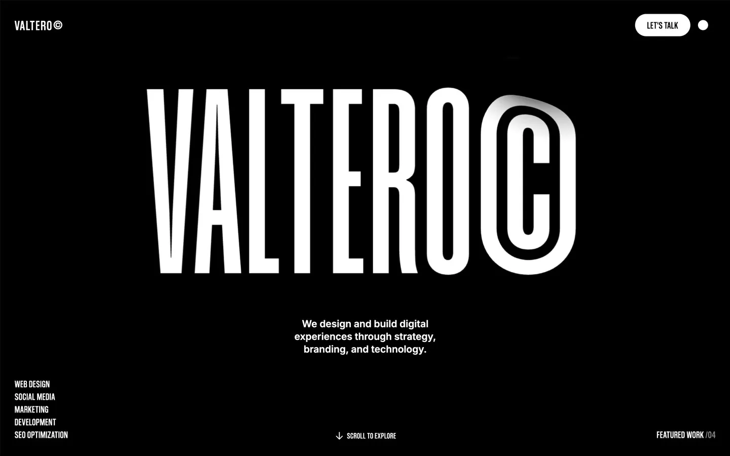



Don’t miss out on our superb, customizable templates designed to enhance your web design experience. We constantly add new templates and components.

Explore stunning Webflow, Framer, HTML5, Next.js and Figma templates designed to spark your next big idea.


*Rest assured that your data is safe with us, and you'll only hear from us 1 time per month.