Avoid eight common Webflow mistakes: poor structure, one-off classes, excessive breakpoint fixes, weak CMS models, unnecessary motion, heavy assets, accessibility gaps, and rushed QA.
Most Webflow problems become expensive because small structural shortcuts are repeated across the whole site. Fix the system early and later pages become faster to build, easier to maintain, and safer to hand off.
Set typography, colors, spacing, containers, button patterns, and recurring layout rules before polishing every screen. Without a shared system, similar sections drift apart quickly.
Use reusable classes and variables where visual rules genuinely repeat. A project filled with near-identical one-off styles is difficult to change globally and hard for another designer to understand.
Webflow begins from a desktop base breakpoint. Build a flexible base with Grid, Flexbox, max-widths, and sensible content constraints before creating many tablet and mobile exceptions.
Model projects, articles, jobs, services, authors, or other repeated content first. Clear fields and relationships make the visual template easier to build and the site easier to maintain.
Motion should support hierarchy, feedback, or storytelling. Excessive interactions increase testing and performance cost and can create accessibility problems.
Large images, video, chat, analytics, consent tools, embeds, and marketing scripts can change the experience dramatically. Measure the final live pages, not only the clean build.
Heading hierarchy, semantic controls, labels, alt text, keyboard focus, contrast, and reduced-motion behavior are easier to build correctly than retrofit later.
Test navigation, forms, CMS empty states, metadata, redirects, links, mobile layouts, image crops, interactions, and analytics. Use at least one real phone and one normal laptop, not only the Designer canvas.
For deeper guidance, see the Webflow Tips for 2026 guide.




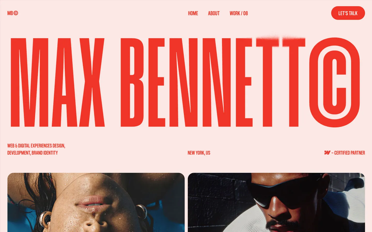


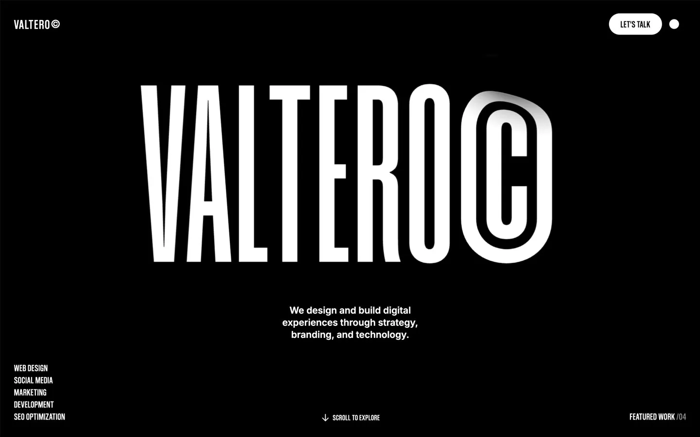
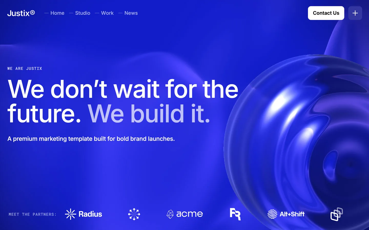


Don’t miss out on our superb, customizable templates designed to enhance your web design experience. We constantly add new templates and components.

Explore stunning Webflow, Framer, HTML5, Next.js and Figma templates designed to spark your next big idea.


*Rest assured that your data is safe with us, and you'll only hear from us 1 time per month.