Avoid five common logo mistakes: overcomplication, weak small-size performance, trend dependence, poor typography, and ignoring real-world applications.
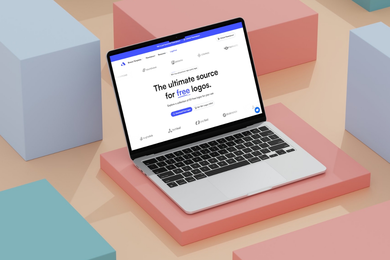
A strong logo is usually simple enough to recognize, flexible enough to use, and specific enough to belong to one brand. Most logo problems come from trying to make the mark do too much.
Too many shapes, colors, effects, or ideas can make a logo difficult to recognize at small sizes. Start with the simplest version that still carries the intended character.
Test it in black and white. If the basic form is unclear without gradients or shadows, the geometry may need more work.
A logo can look impressive on a large mockup and fail in a favicon, navigation bar, social avatar, or invoice. Check the mark at the smallest realistic size early in the process.
Prepare a simplified icon or compact lockup when the full version contains details that cannot survive reduction.
Trends can provide useful references, but copying a popular visual treatment often makes several unrelated brands look interchangeable. Use current aesthetics selectively and keep the underlying form distinctive.
The wordmark is often seen more frequently than the symbol. Letter spacing, weight, case, and typeface choice should support the same personality as the mark.
Do not pair a carefully drawn symbol with the first default font that happens to fit beside it.
Test light and dark backgrounds, web navigation, social icons, presentations, print, and any industry-specific application. A logo system should include versions that remain legible across those environments.
A ready-made logo can still be a useful starting point when these principles are respected. The quality comes from the final system and how consistently it is applied, not from how many decorative changes are added.


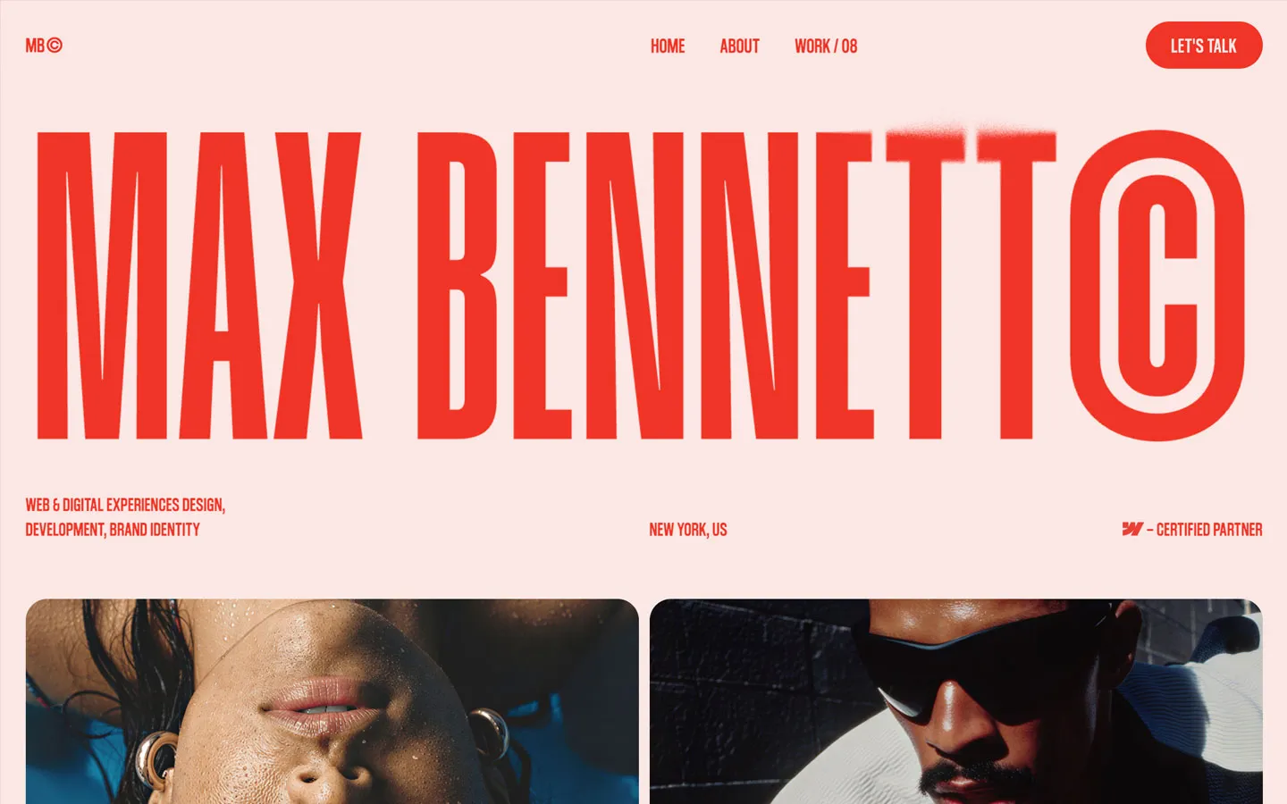


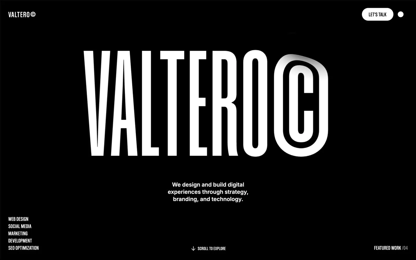
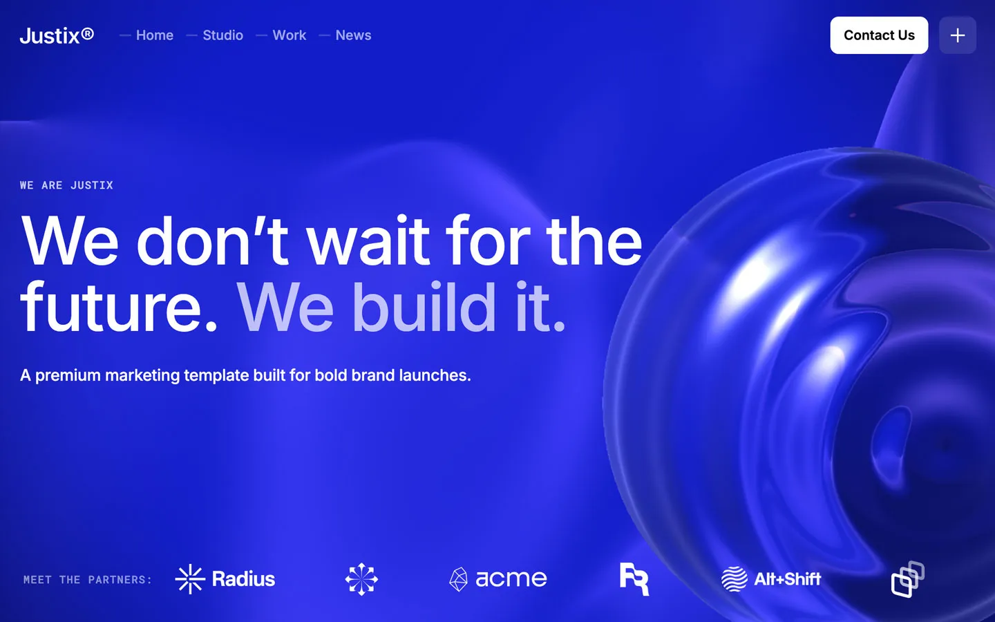


Don’t miss out on our superb, customizable templates designed to enhance your web design experience. We constantly add new templates and components.

Explore stunning Webflow, Framer, HTML5, Next.js and Figma templates designed to spark your next big idea.


*Rest assured that your data is safe with us, and you'll only hear from us 1 time per month.