 flowmance
Vitae Design System


Vitae is a tidy, old-school online CV. It reads like a printed résumé laid on a grey desk: a handwritten-style R.Smith logo centred at the top, a narrow sidebar card on the left, and one long white sheet on the right with numbered sections. The type is small, uppercase and spaced out; the only colour comes from three skill-bar colours that also mark the timeline.
Four signatures make it recognisable:
- Two cards on grey. A 300px sidebar (portrait with a signature scrawled across it, a dark #252525 icon menu, social circles, credits) and a 620px white content sheet, 20px apart in a 940px column on #EFEFEF. The sheet floats on a very wide, soft shadow.
- Numbered, underlined section labels. 01. ABOUT ME, 02. PROFESSIONAL SKILLS, 03. EDUCATION: 14px/600 uppercase with 1px tracking, sitting on a 2px #C7C7C7 underline that is only as wide as the text.
- Three-colour skill bars. Design skills in amber #EEAC02, code skills in teal #3CB5B5, soft skills in crimson #E53B51. Each bar is a 10px-radius track with a 1px tinted border and a solid fill.
- Timeline tabs. Dates (2010 - 2011) run vertically on small coloured tabs that stick out from the left edge of the sheet: teal for education, crimson for work.
Colors
Surfaces
#EFEFEFPage background
#FFFFFFSidebar and content cards, inputs
#252525Sidebar menu block
#FFFFFFInk
#FFFFFFText on primary
#FFFFFFText on secondary
#333333Default text and section labels
#111111The about headline
#515157Timeline names and roles, skill labels, links (the most used text colour)
#919191Paragraphs (p, weight 300) and the Vitae by credit
#888888Small secondary labels
#FFFFFFActive and resting menu links
#929292Active and resting menu links
Action
#E53B51Download my CV button, soft-skill bars, work timeline tabs
#3CB5B5Button hover; code-skill bars and education tabs
#272727Send Message submit
#3CB5B5Button hover; code-skill bars and education tabs
#A8E9E91px borders of the matching bar tracks
Lines & effects
#E1E1E1Dividers between timeline rows, input borders
#C7C7C72px underline of section labels
#BBBBBB1px ring of the social circles
#EEAC02Design-skill bars
#F0BF231px borders of the matching bar tracks
#F3D8DB1px borders of the matching bar tracks
#FFFFFF · 6%Dividers between menu links
#222222 · 40%Image hover overlay on portfolio items
#999999Input placeholder
Typography
Poppins · headline-about
The quick brown fox jumpsMY NAME IS ROBERT SMITH. 37px · 500 · 1.22 · 1px
Poppins · title-row
The quick brown fox jumpsTimeline names and roles (University of Cambridge, Developer). 15px · 500 · 1.33
Poppins · eyebrow
The quick brown fox jumpsNumbered section labels (01. 14px · 600 · 2.14 · 1px
Poppins · body
The quick brown fox jumpsParagraphs in #919191. 14px · 300 · 1.71
Poppins · input
The quick brown fox jumpsForm fields. 13px · 400 · 1.54
Poppins · label-nav
The quick brown fox jumpsSidebar menu (ABOUT ME, PORTFOLIO). 12px · 600 · 1.67 · 2px
Spacing & shape
| Purpose | Value |
|---|---|
| Container | 940px, centred: a 300px sidebar, a 20px gap, a 620px content sheet |
| Breakpoints | 991px, 767px and 479px |
Spacing scale
| Token | Value | Preview |
|---|---|---|
xs | 5px | |
sm | 15px | |
md | 20px | |
lg | 30px | |
xl | 80px |
Layout spacing
| Token | Value | Preview |
|---|---|---|
column-gap | 20px | |
card-padding | 30px | |
page-top | 80px |
Border radius
Surfaces
How the surfaces stack, from the page background up. Hex codes and roles are in Colors above.
Motion
| Menu link hover | color #929292 → #FFFFFF, transition: color .4s |
| Background hovers | background-color .4s on social circles and menu items |
| Button hover | Fill #E53B51 → #3CB5B5, transition: all .2s |
| Small toggles | background-color .1s, color .1s |
| Overlay | opacity .4s on the portfolio image overlay |
Do’s and don’ts
- Keep the two-card layout: a 300px sidebar and a 620px white sheet, 20px apart, on #EFEFEF.
- Number every section label (05. My services) and underline it with 2px #C7C7C7 to the text width.
- Use the three accents as a code: amber #EEAC02, teal #3CB5B5, crimson #E53B51, each with its tinted 1px track border.
- Keep labels uppercase with 1–2px tracking and running text in sentence case.
- Put the only shadow (0 0 100px 1px #00000026) on the content sheet.
- Keep timeline dates on vertical tabs outside the sheet's left edge.
- Use accent colours for text or headings.
- Use ink-subtle #919191 for anything smaller than 14px; it is light on white and only works for 300-weight paragraphs at 14px with 24px line height.
- Put white text on #E53B51 below 11px uppercase with 1px tracking; the crimson button contrast is tight, so keep labels uppercase and spaced.
- Round the cards or the portrait; only bars (10px), buttons and inputs (6px) and circles are rounded.
- Add a second shadow, gradients or blur.
- Use Playfair Display for more than the ampersand.
- Set long text in white on teal #3CB5B5 (contrast about 2.5:1). It is the template's real tab and hover colour, so keep it to the short rotated dates and the brief button hover.
Example prompt
Any page in the Vitae style
More design systems like this
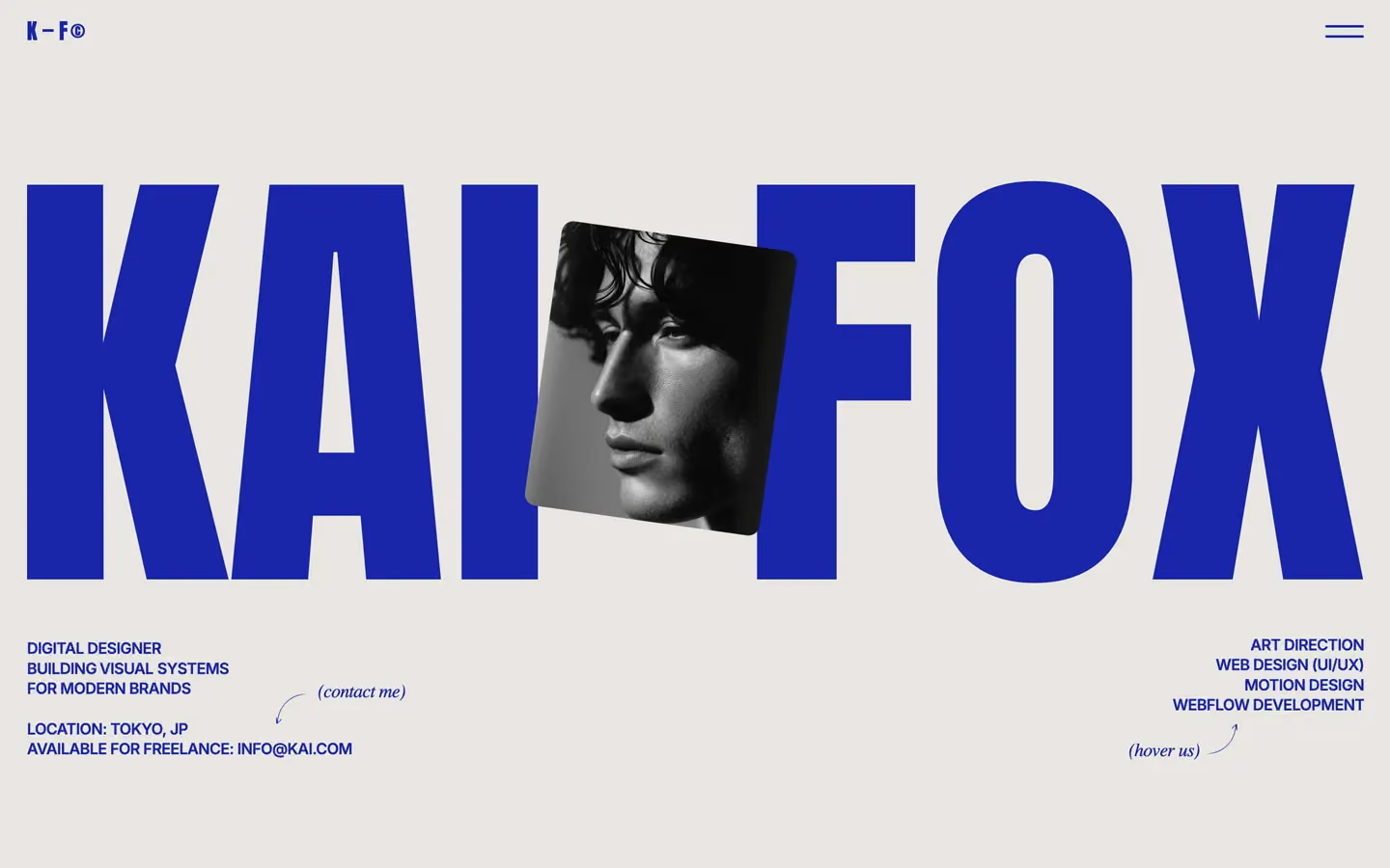
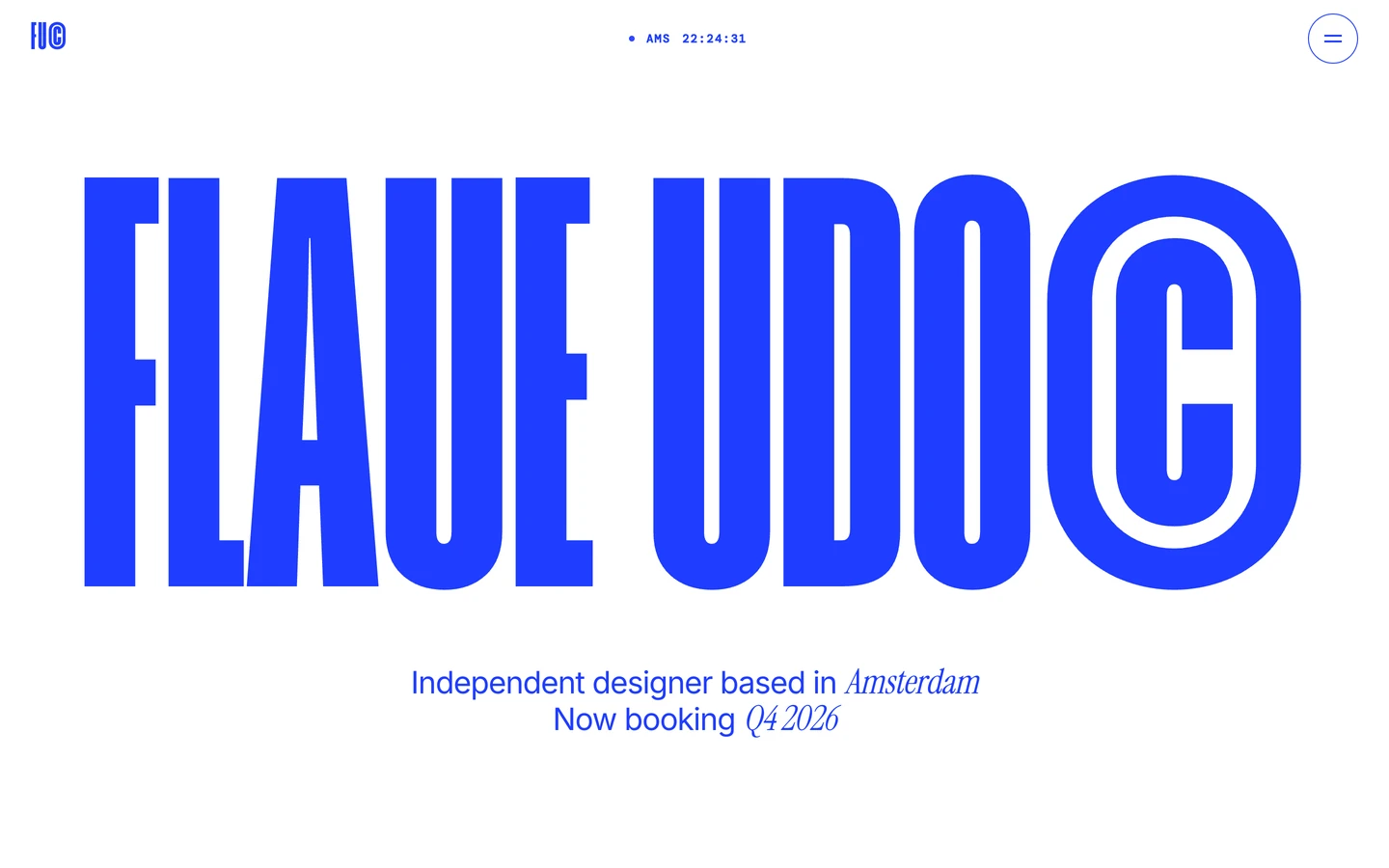
Portfolio design systems, the same colors first.


Bring any of them to your AI tool
All Access unlocks all 398 design systems, ready for Claude, ChatGPT, Gemini, Cursor, v0 and Lovable, plus 400+ templates on all 5 platforms.
Get All AccessUpgrade to All AccessHow to use the Vitae design system
Pick a file to see what it’s for and where it goes.
What it is
The whole design system in one markdown file, written for AI: every color, type style, spacing value, component and motion rule, plus do's, don'ts and a ready prompt.
Best for
Claude, ChatGPT, Gemini, Cursor and v0, or any other AI tool that builds pages or code.
How to use it
- Put
DESIGN.mdin your project and mention it in your request, or save it as.cursor/rules/vitae.mdc - For the rule file, start it with a front-matter block that sets
alwaysApply: true, so every chat uses it - Ask: “Build a pricing page using DESIGN.md.” Cursor follows the colors, fonts, spacing and rules
- Put
DESIGN.mdin the project root - Add one line to
CLAUDE.md: “Follow DESIGN.md for all UI.” - Ask for any page or component; Claude reads the file first
- Attach
DESIGN.mdto the chat (or paste it in) - Ask: “Build a landing page in this design system.”
- Keep the file in the chat or project knowledge, so follow-up pages stay on style
What it is
Every token as data, in the W3C Design Tokens format: colors with their roles, type styles, radius, spacing, and component tokens that point at them.
Best for
Figma (Tokens Studio), Style Dictionary and other design-token tools, and build scripts.
How to use it
- In Figma, open Tokens Studio, choose Import, and pick
tokens.json - Or point Style Dictionary’s
sourceat it to generate tokens for any platform - In code, import it like any JSON file
What it is
A Tailwind CSS v4 theme: every color, font, type style, radius and spacing value becomes a Tailwind utility, like bg-canvas, text-headline-lg or rounded-md.
Best for
Tailwind v4 projects, and AI builders that write Tailwind (v0, Lovable, Bolt).
How to use it
- Save
theme.cssnext to your main CSS file - Import it after Tailwind:
@import "tailwindcss"; @import "./theme.css"; - Use the classes:
bg-canvas text-ink rounded-md p-lg
What it is
The same tokens as plain CSS variables on :root. Component values point at the color variables, so changing one color updates everything that uses it.
Best for
Any website: plain CSS, Webflow custom code, Framer, WordPress.
How to use it
- Add it to your stylesheet, or in Webflow paste it into Site settings → Custom code inside a
<style>tag - Use the variables anywhere:
color: var(--color-ink) - Change a token once and every place that uses it follows