 flowmance
Skye Basu Design System


Skye Basu is a loud, poster-like personal portfolio for a digital designer. It opens on a black stage lit by a single spotlight, with the words DIGITAL DESIGNER in wide Unbounded capitals and a neon-yellow ticker pill near the bottom. After that the page turns white, and big full-width project images stack on top of each other as you scroll. Every word on the site is uppercase.
Four signatures make it recognisable:
- Spotlight hero. A black hero with a photographic ceiling light and a soft cone of light, and DIGITAL / DESIGNER (scrolling the hero rolls it up to SKYE / BASU) in 128px Unbounded 600 with 3px tracking.
- Yellow ticker pill. A 440px #FFFF00 pill with 50px corners scrolls AVAILABLE FOR FREELANCE WORLDWIDE —— GET IN TOUCH —— in 13px black bold capitals.
- Stacked project deck. Project images sit in sticky full-width frames; each next one slides over the last and is a little wider, so the top edges of earlier projects show as thin coloured strips above it.
- All caps, two families. Unbounded (wide, geometric) for display, nav and titles; Inter Tight for reading text, also uppercase.
Colors
Surfaces
#FFFFFFPage background after the hero
#F5F5F5Grey button variant (cart, buy now); fills #222222 with white text on hover
#000000Hero, footer, nav over the hero
Ink
#FFFFFFText on primary
#FFFFFF#000000Titles, about statements, nav over white sections
#222222Grey-button labels and the grey button's hover fill
#888A8BParagraphs, experience meta (WEBFLOW AT 2010-2014), blog row rules
#222222 · 45%Date pills on blog rows
#000000Text on accent
#FFFFFF#FFFFFFText on inverse-canvas
#FFFFFF · 50%Footer fine print
Action
#000000The black .button.color pill (add-to-cart and pricing buttons)
#000000No colour change on hover: .button.color overrides the base hover
#FFFF00Ticker pill, the MORE ABOUT ME AND SERVICES pill button and the project hover circle
Lines & effects
#888A8B#FFFFFF · 40%1px underline under nav links
Typography
Unbounded · display-hero
The quick brown fox jumpsDIGITAL DESIGNER, SKYE BASU. 128px · 600 · 1.1 · 3px
Unbounded · headline-lg
The quick brown fox jumpsFEATURED WORK, EXPERIENCE, LATEST INSIGHT. 50px · 600 · 1.1
Inter Tight · title-project
The quick brown fox jumpsProject names over images (PORTO, KAKA), white with a soft shadow, shown on hover. 50px · 500 · 1
Inter Tight · body-lg
The quick brown fox jumpsParagraphs, grey. 17px · 500 · 1.3
Inter Tight · label-link
The quick brown fox jumpsMORE ABOUT ME AND SERVICES on the yellow pill. 18px · 700 · 1
Inter Tight · eyebrow
The quick brown fox jumpsTicker text. 13px · 700 · 1.4 · 1px
Spacing & shape
| Purpose | Value |
|---|---|
| Container | max 1200px, centred, with 5% side padding (72px at 1440) |
| Breakpoints | 991px, 767px, 479px |
Spacing scale
| Token | Value | Preview |
|---|---|---|
xs | 7px | |
sm | 16px | |
md | 30px | |
lg | 50px |
Layout spacing
| Token | Value | Preview |
|---|---|---|
nav-padding | 30px | |
gutter | 72px | |
section | 120px | |
section-works-top | 130px |
Border radius
Surfaces
How the surfaces stack, from the page background up. Hex codes and roles are in Colors above.
Motion
| Hero word swap | Scroll-linked: as the hero scrolls, each .hero-title moves y 0 → −100% inside its 150px mask, so SKYE / BASU replaces DIGITAL / DESIGNER |
| Ticker | The yellow pill's text moves x 0 → −100% over 25000ms, linear, then restarts |
| Project deck | Scroll-linked: each sticky frame scales 1 → 0.6, 0.65, 0.7, 0.75 or 0.8 (in order) as the next one slides over it |
| Project hover | Circle scale 0 → 1, 500ms swingFromTo, opacity 500ms inOutCirc; image scale 1 → 1.2, 500ms inOutCirc; title y 120% → 0 with skewY 7° → 0°, 500ms outSine; overlay fades in over 400ms ease |
| Hover parallax | Inside a project the circle shifts ±30px, the image ∓30px and the content ±10px with the mouse (500ms smoothing) |
| Nav colour | Filter change, 300ms ease, when the nav crosses white sections |
| Nav underline | all 0.2s, border colour 40% → 100% white |
| Page loader | The logo-and-spinner loader fades to opacity 0 over 300ms ease on page load |
Do’s and don’ts
- Set everything uppercase: Unbounded for display, nav and titles; Inter Tight for paragraphs and meta.
- Open on a black #000000 stage with one white display line and one #FFFF00 pill.
- Show work as full-width, square-cornered images at 1.6:1 that stack while scrolling.
- Use 1px underlines (white at 40%, solid on hover) for nav links.
- Keep pills for small things only: the ticker (50px radius), dates (30px), buttons (100px).
- Number sections 01, 02 in 17px Inter Tight 600.
- Use #888A8B grey for text under 17px or for anything important; it is only 3.5:1 on white. Keep it for paragraphs and meta at 14px+ and set key lines in #000000.
- Use the 45% date-pill grey for anything but dates.
- Put yellow text on white, or add the unused green and orange variables.
- Round project images or add shadows to cards.
- Mix in lowercase headings or a third typeface.
- Run more than one ticker or cursor circle per view.
Example prompt
Any page in the Skye Basu style
More design systems like this
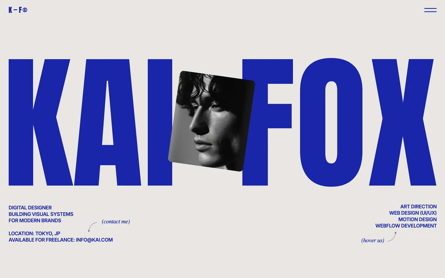
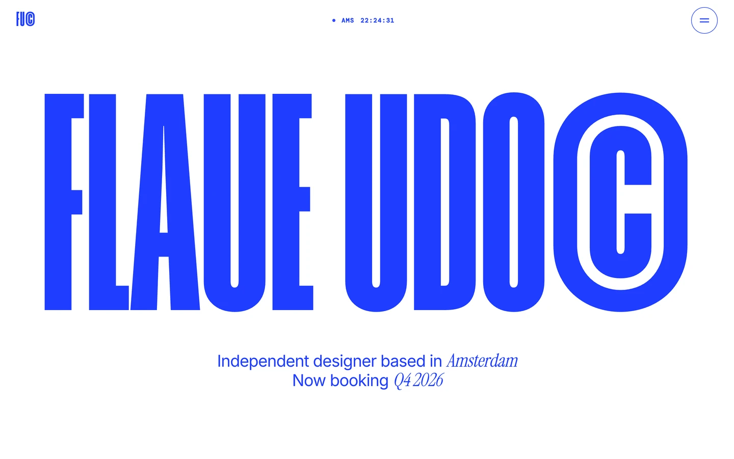
Portfolio design systems, the same colors first.


Bring any of them to your AI tool
All Access unlocks all 398 design systems, ready for Claude, ChatGPT, Gemini, Cursor, v0 and Lovable, plus 400+ templates on all 5 platforms.
Get All AccessUpgrade to All AccessHow to use the Skye Basu design system
Pick a file to see what it’s for and where it goes.
What it is
The whole design system in one markdown file, written for AI: every color, type style, spacing value, component and motion rule, plus do's, don'ts and a ready prompt.
Best for
Claude, ChatGPT, Gemini, Cursor and v0, or any other AI tool that builds pages or code.
How to use it
- Put
DESIGN.mdin your project and mention it in your request, or save it as.cursor/rules/skye.mdc - For the rule file, start it with a front-matter block that sets
alwaysApply: true, so every chat uses it - Ask: “Build a pricing page using DESIGN.md.” Cursor follows the colors, fonts, spacing and rules
- Put
DESIGN.mdin the project root - Add one line to
CLAUDE.md: “Follow DESIGN.md for all UI.” - Ask for any page or component; Claude reads the file first
- Attach
DESIGN.mdto the chat (or paste it in) - Ask: “Build a landing page in this design system.”
- Keep the file in the chat or project knowledge, so follow-up pages stay on style
What it is
Every token as data, in the W3C Design Tokens format: colors with their roles, type styles, radius, spacing, and component tokens that point at them.
Best for
Figma (Tokens Studio), Style Dictionary and other design-token tools, and build scripts.
How to use it
- In Figma, open Tokens Studio, choose Import, and pick
tokens.json - Or point Style Dictionary’s
sourceat it to generate tokens for any platform - In code, import it like any JSON file
What it is
A Tailwind CSS v4 theme: every color, font, type style, radius and spacing value becomes a Tailwind utility, like bg-canvas, text-headline-lg or rounded-md.
Best for
Tailwind v4 projects, and AI builders that write Tailwind (v0, Lovable, Bolt).
How to use it
- Save
theme.cssnext to your main CSS file - Import it after Tailwind:
@import "tailwindcss"; @import "./theme.css"; - Use the classes:
bg-canvas text-ink rounded-md p-lg
What it is
The same tokens as plain CSS variables on :root. Component values point at the color variables, so changing one color updates everything that uses it.
Best for
Any website: plain CSS, Webflow custom code, Framer, WordPress.
How to use it
- Add it to your stylesheet, or in Webflow paste it into Site settings → Custom code inside a
<style>tag - Use the variables anywhere:
color: var(--color-ink) - Change a token once and every place that uses it follows