 flowmance
That Studio Design System
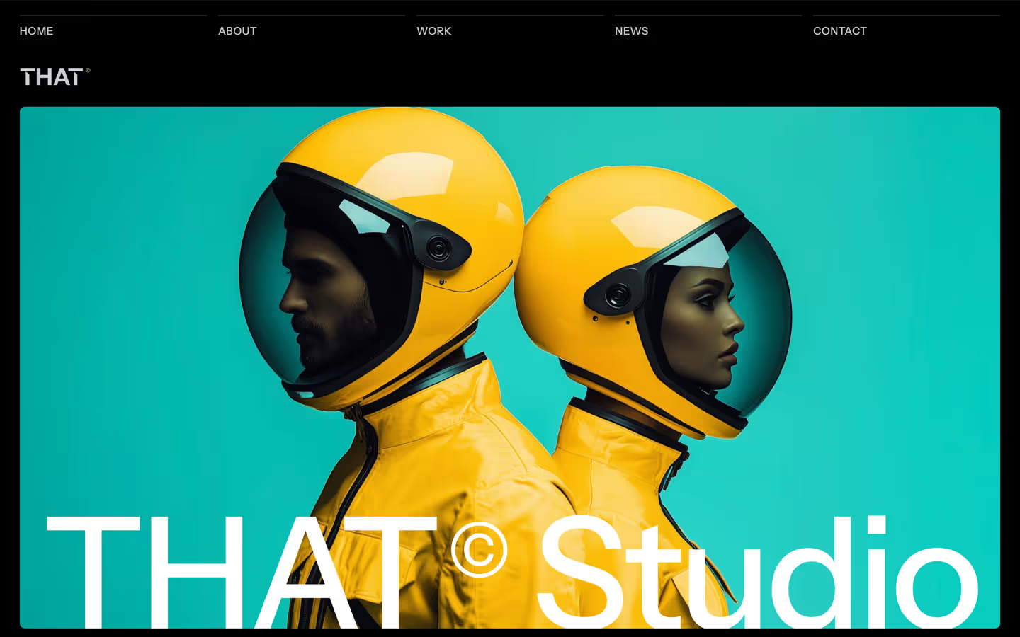


That Studio is a calm, high-contrast agency template. It pairs a pure black canvas with soft lavender-grey type (#D9DAE2 and #F1F3F8 instead of white), a large but light 500-weight headline, and pale #F1F3F8 bands that rise over the black with very large rounded top corners. Photography supplies the colour: yellow spacesuits, teal backdrops, green and pink brand mockups. The published preview opens on an Intro page that indexes the demos (Home One–Three, About, Work One–Three, Blog One–Three); the system below covers that page and what its thumbnails show of the others.
Four signatures make it recognisable:
- The hairline column nav. Five equal columns across the top (HOME, ABOUT, WORK, NEWS, CONTACT), each an uppercase 15px label sitting under its own 1px hairline. On hover a white line fills the hairline. The THAT® logo sits on its own row below.
- Rounded-top light bands. Light sections start with a 7vw (101px at 1440) radius on both top corners, so the pale band reads like a sheet pulled up over the black.
- Soft, not white, type on black. Headlines and body are #D9DAE2, links #F1F3F8. Nothing on the dark canvas is pure white.
- Label-left grids. Each group on a light band has a 20px semibold title in a narrow left column (Main Demo, Work Demo) and content in a wide right column, with full-width hairlines between groups.
The design alternates dark and light bands; it has no dark/light switch.
Colors
Surfaces
#000000Page background, hero, footer, menu dropdown (--main-color)
#474754The dark grey-violet that grows inside the black button on hover; the only raised dark tone
#F1F3F8Light bands and their text
#F1F3F8Footer subscribe field (with a paper-plane icon)
Ink
#F1F3F8Text on primary
#000000Text on secondary
#F1F3F8Links, logo, footer links (--second-color)
#D9DAE2Body text and the hero headline (--body-text-color)
#000000Text on inverse-canvas
#FFFFFFAction
#000000.button-primary: the black button used on light bands
#474754Circle overlay that fills the black button on hover
#D9DAE2The light submit button measured on the intro page (68px tall)
Lines & effects
#080425.button-subscribe:hover
#CECAD4 · 30%The 1px hairline above each nav column
#FFFFFF · 20%Footer rules (under the CTA row) and link underlines
#CECAD4 · 26%Border of the menu dropdown
#FFFFFF · 50%0.5px ring around the round arrow icon
#FFFFFFDemo cards on the light band
#E1E1E1 · 90%1px border around demo cards
#D9DAE2Full-width rule between groups on the light band
#DFDBE62px left rule on blog blockquotes (--third-color)
Typography
Instrument Sans · display-hero
The quick brown fox jumpsEmpower your business growth with That. 101px · 500 · 1.1 · -2px
Instrument Sans · headline-lg
The quick brown fox jumpsFooter CTA We've got everything you need for standout design. 69px · 500 · 1.1 · -0.5px
Instrument Sans · title-lg
The quick brown fox jumpsFooter link labels (.button-first-line). 24px · 400 · 1
Instrument Sans · body-lg
The quick brown fox jumpsHero lead A sleek, modern template designed for every kind of agency website. 23px · 500 · 1.2
Instrument Sans · label-button
The quick brown fox jumpsButton labels (the black .button-primary is 16px). 17px · 600 · 1.18
Instrument Sans · caption
The quick brown fox jumpsCheckbox label at 80%. 15px · 400 · 1.4
Spacing & shape
| Purpose | Value |
|---|---|
| Container | full width (max-width: 100%), with 3% side padding on sections (about 43px at 1440) and 2% on the nav |
| Section rhythm | 150px top and bottom padding with 3% sides |
| Breakpoints | 991px, 767px, 479px (Webflow defaults), plus min-width 768px and 1280px steps |
Spacing scale
| Token | Value | Preview |
|---|---|---|
xs | 3px | |
sm | 10px | |
md | 15px | |
lg | 16px | |
xl | 30px | |
2xl | 50px | |
3xl | 70px |
Layout spacing
| Token | Value | Preview |
|---|---|---|
column-gap | 16px | |
side | 43px | |
section | 150px | |
section-intro-bottom | 200px |
Border radius
Surfaces
How the surfaces stack, from the page background up. Hex codes and roles are in Colors above.
Motion
| Fade and rise on scroll | opacity 0 → 1 and y 20% → 0%, 500ms; some rises outQuint |
| Scale in | scale 0.8 → 1, 500ms, with an opacity fade |
| Nav hairline fill | Overlay size change, 500ms; 300ms outSine for smaller ones |
| Button text roll | y 0 → −100%, 500ms outQuint, with the #474754 overlay shown |
| Text colour change | 500ms outQuint |
| Icon rotate | 600ms outExpo (the −45° arrow straightening), plus 500ms rotations on scroll |
| Slide in | x 30px → 0, 800ms outExpo; x −30px → 0, 500ms outQuart |
| Quick fades | opacity, 300ms ease |
| Buttons | transition: 0.3s / all .3s |
Do’s and don’ts
- Use #000000 for dark bands and #F1F3F8 for light bands, and alternate them.
- Set type on black in #D9DAE2 (ink-muted) or #F1F3F8 (ink), never pure white.
- Open each light band with 7vw (101px) rounded top corners and square bottom corners.
- Put the nav in five equal columns, each an uppercase 15px label (0.5px tracking) under a 1px #CECAD4 30% hairline.
- Keep large type at weight 400–500 with 0 to −2px tracking (−2px on the hero, −0.5px on the footer CTA).
- Use a narrow left column for group titles and a wide right column for content.
- Add shadows, blur or gradients. Layering comes from bands and borders.
- Add an accent colour to the UI. Yellow and teal belong to the photography.
- Use big radii anywhere except the band tops (101px) and the menu panel (30px). Cards stay at 6px, buttons at 7–8px.
- Use weight 700 for headlines, or uppercase outside the nav.
- Put the hero lead under the headline; it sits in the right-hand columns, aligned to the last line.
- Use the declared #D8DFE0 divider variable; it is not on the page.
Example prompt
Any page in the That Studio style
More design systems like this
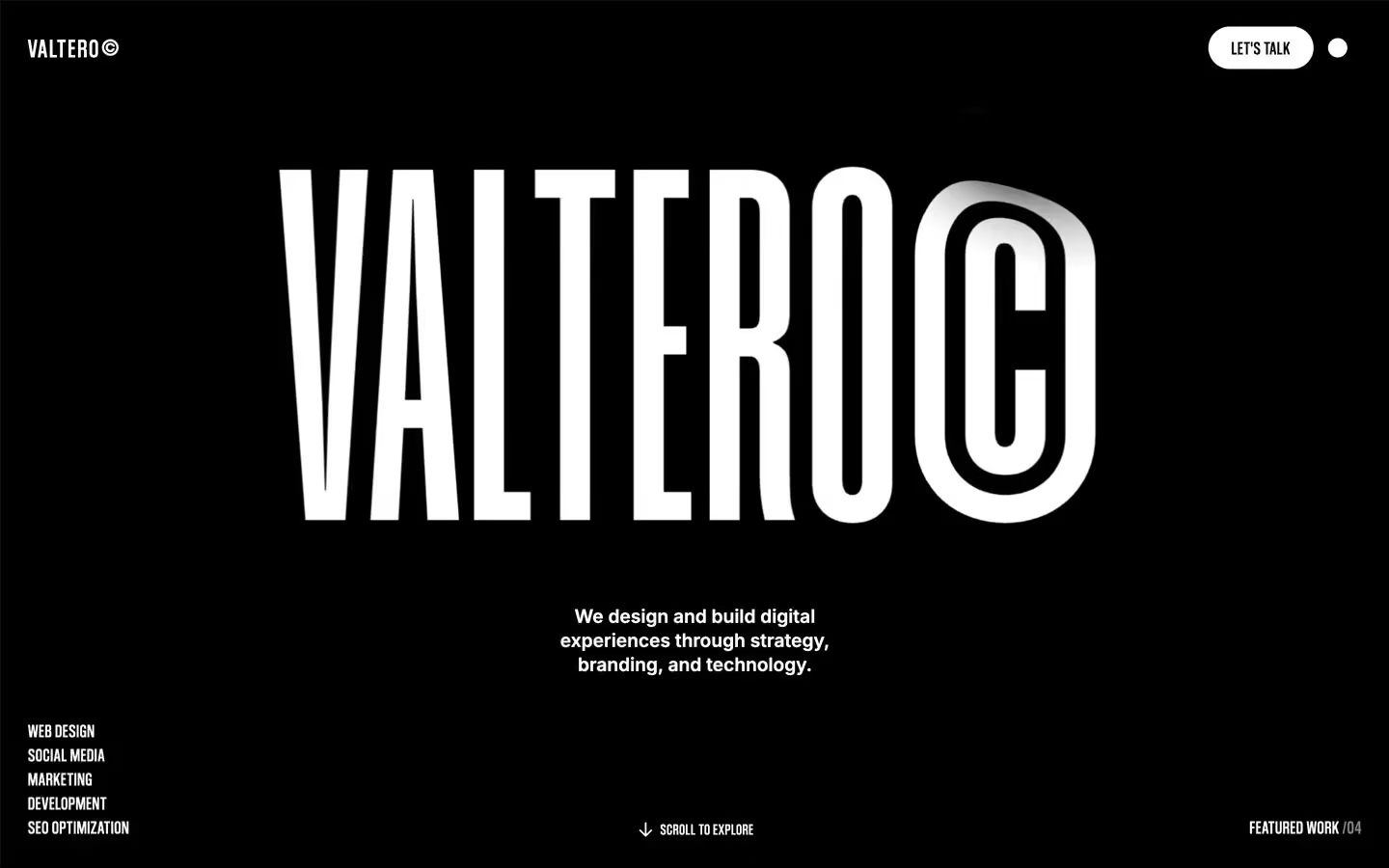
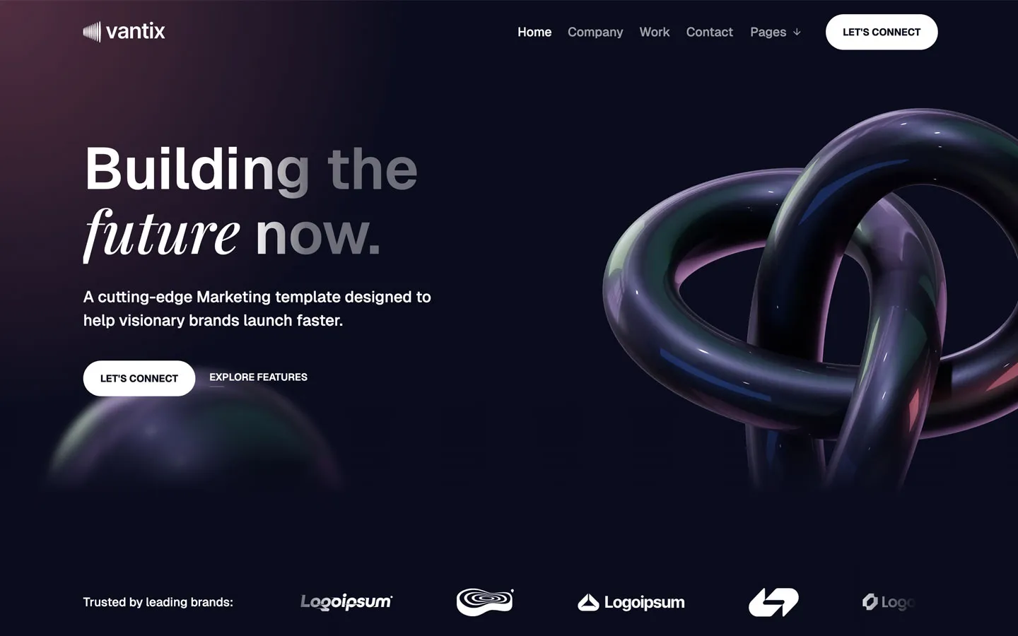
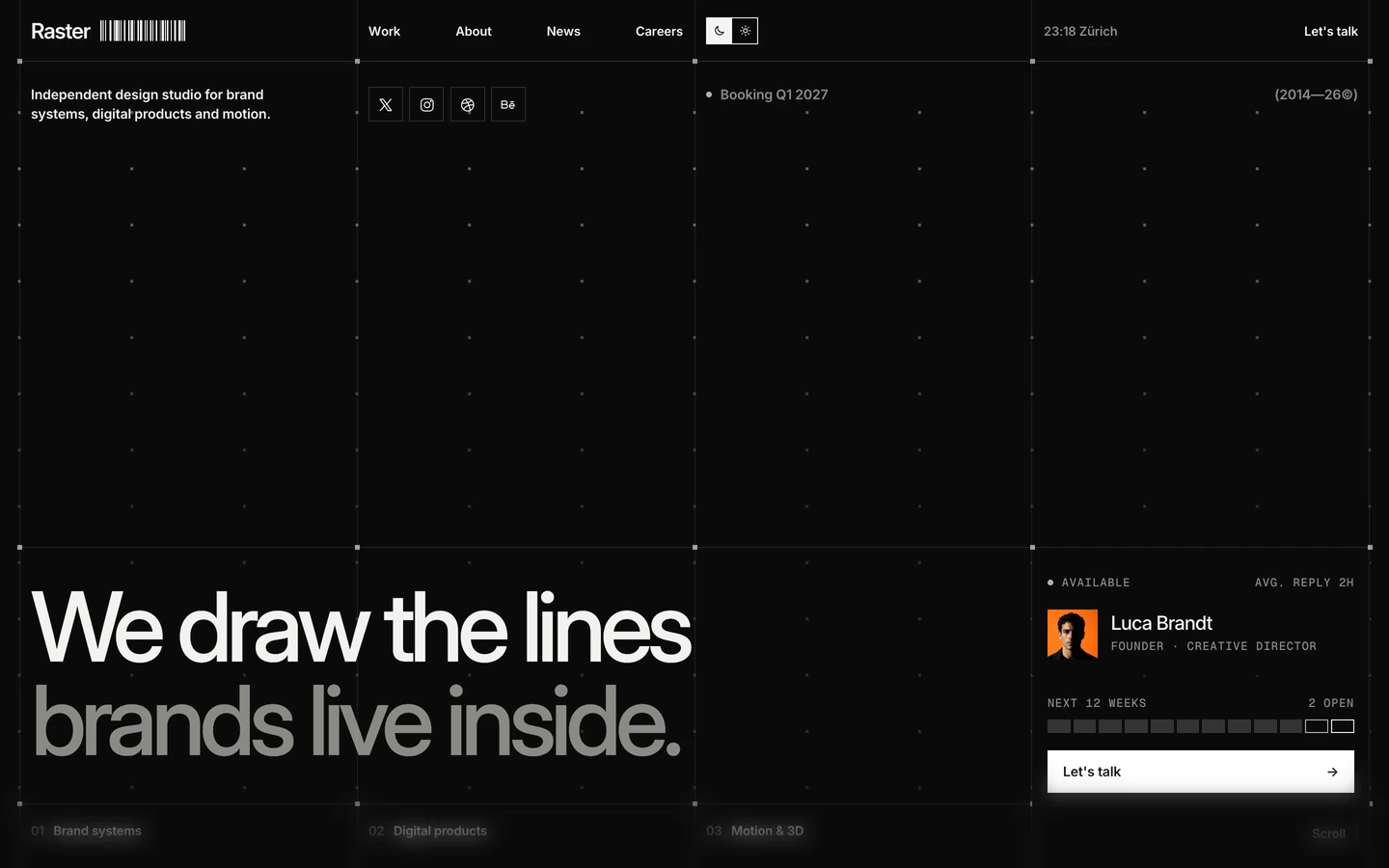
Agency design systems, the same colors first.

Bring any of them to your AI tool
All Access unlocks all 398 design systems, ready for Claude, ChatGPT, Gemini, Cursor, v0 and Lovable, plus 400+ templates on all 5 platforms.
Get All AccessUpgrade to All AccessHow to use the That Studio design system
Pick a file to see what it’s for and where it goes.
What it is
The whole design system in one markdown file, written for AI: every color, type style, spacing value, component and motion rule, plus do's, don'ts and a ready prompt.
Best for
Claude, ChatGPT, Gemini, Cursor and v0, or any other AI tool that builds pages or code.
How to use it
- Put
DESIGN.mdin your project and mention it in your request, or save it as.cursor/rules/that.mdc - For the rule file, start it with a front-matter block that sets
alwaysApply: true, so every chat uses it - Ask: “Build a pricing page using DESIGN.md.” Cursor follows the colors, fonts, spacing and rules
- Put
DESIGN.mdin the project root - Add one line to
CLAUDE.md: “Follow DESIGN.md for all UI.” - Ask for any page or component; Claude reads the file first
- Attach
DESIGN.mdto the chat (or paste it in) - Ask: “Build a landing page in this design system.”
- Keep the file in the chat or project knowledge, so follow-up pages stay on style
What it is
Every token as data, in the W3C Design Tokens format: colors with their roles, type styles, radius, spacing, and component tokens that point at them.
Best for
Figma (Tokens Studio), Style Dictionary and other design-token tools, and build scripts.
How to use it
- In Figma, open Tokens Studio, choose Import, and pick
tokens.json - Or point Style Dictionary’s
sourceat it to generate tokens for any platform - In code, import it like any JSON file
What it is
A Tailwind CSS v4 theme: every color, font, type style, radius and spacing value becomes a Tailwind utility, like bg-canvas, text-headline-lg or rounded-md.
Best for
Tailwind v4 projects, and AI builders that write Tailwind (v0, Lovable, Bolt).
How to use it
- Save
theme.cssnext to your main CSS file - Import it after Tailwind:
@import "tailwindcss"; @import "./theme.css"; - Use the classes:
bg-canvas text-ink rounded-md p-lg
What it is
The same tokens as plain CSS variables on :root. Component values point at the color variables, so changing one color updates everything that uses it.
Best for
Any website: plain CSS, Webflow custom code, Framer, WordPress.
How to use it
- Add it to your stylesheet, or in Webflow paste it into Site settings → Custom code inside a
<style>tag - Use the variables anywhere:
color: var(--color-ink) - Change a token once and every place that uses it follows