 flowmance
Vantix Design System
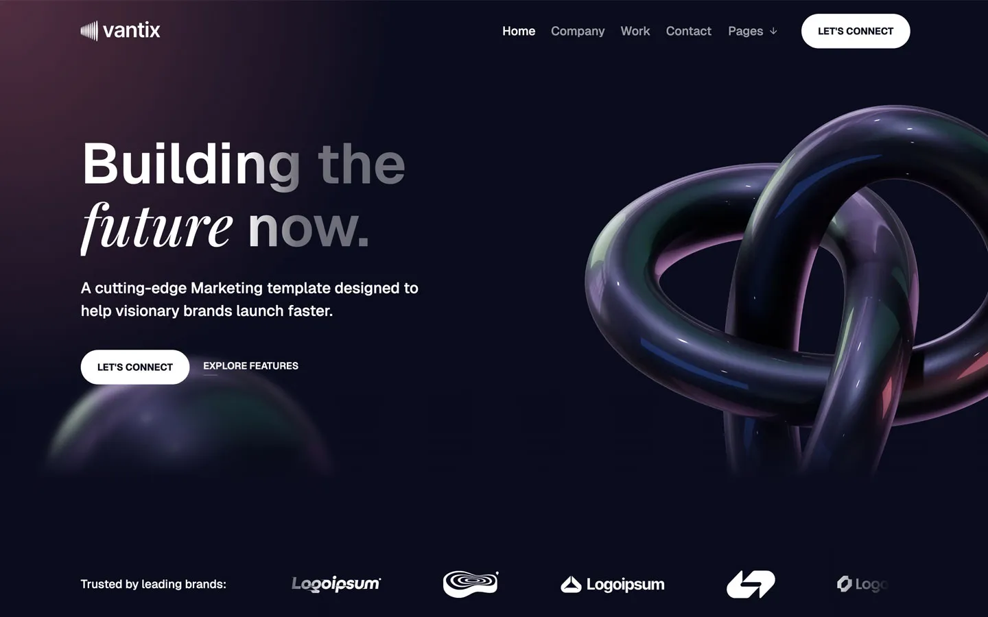

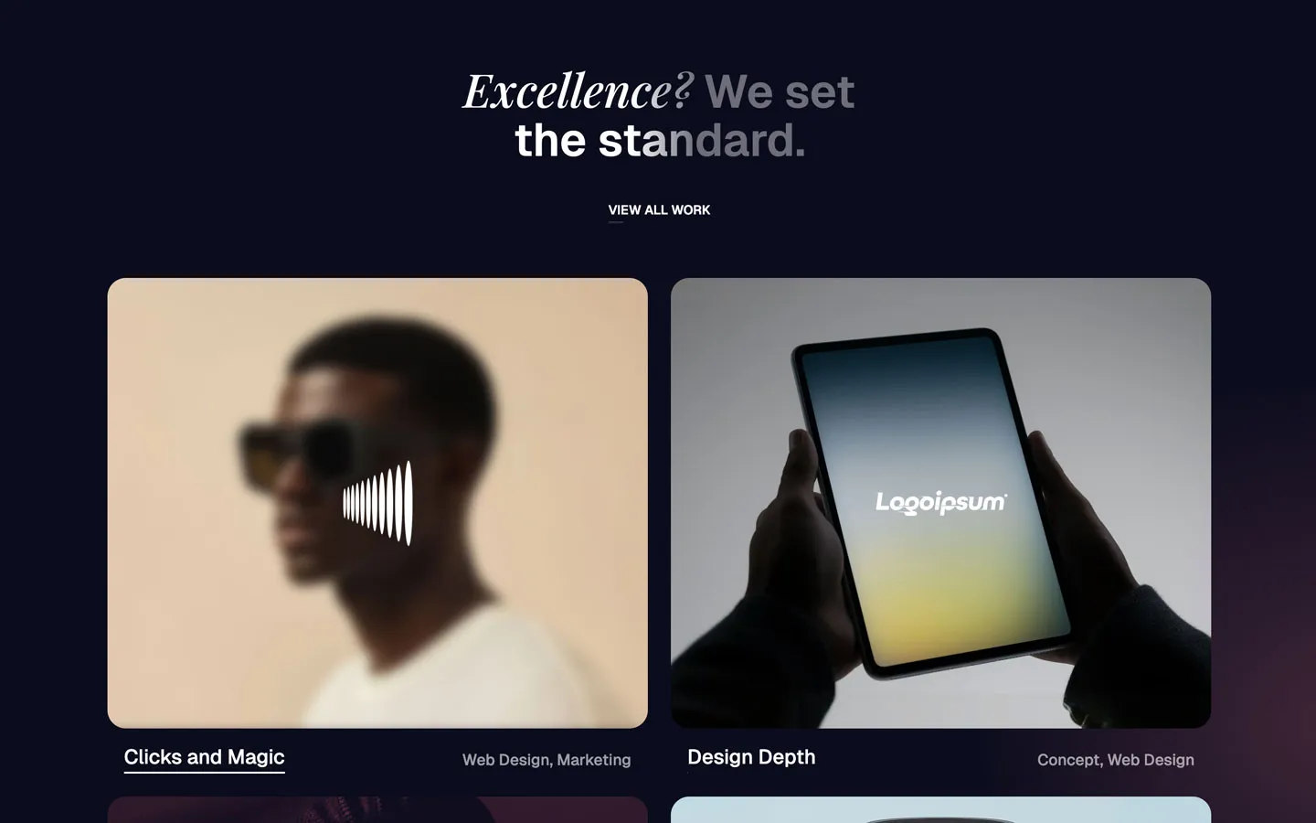
Vantix is a dark, moody marketing site for an agency or growth studio. The page is midnight navy (#0C0C1D), lit by soft wine-red glows in the corners, with glossy 3D objects (an iridescent knot, a translucent bubble) that pick up the same violet, green and pink reflections. Type is white Geist at weight 600 with an elegant Playfair Display italic dropped into most headlines. It feels premium, cinematic and quiet.
Four signatures make it recognisable:
- Fading headline with an italic turn. Headlines are white Geist 600 whose last words fade to grey (a horizontal white-to-40% gradient), and one phrase switches to Playfair Display italic: Building the / future now., Next-gen features to / solve problems., Customer reviews.
- Wine glow on navy. Radial glows of #995263 at 50% sit in the corners of sections and cards (69 uses), fading out by 47%. There are no flat colour fills.
- White uppercase pill buttons. LET'S CONNECT in Geist 14px 700 uppercase on a white 40px-radius pill, paired with an uppercase text link that has a short underline (EXPLORE FEATURES, LEARN MORE).
- Big soft cards. 25px radius on cards and images, with gradient hairline edges that are brightest at the top and vanish at the bottom.
Vantix is a dark-only design.
Colors
Surfaces
#0C0C1DPage background, button text, the 5px avatar rings (the nav itself is transparent)
#16162BTestimonial card, review cards (32 uses)
#FFFFFF · 16%Input borders
#FFFFFFThe white icon tiles (about 70px) on feature cards
Ink
#0C0C1DText on primary
#FFFFFFHeadlines, titles, active nav link, button labels on dark
#FFFFFF · 70%Card paragraphs and secondary text (opacity: .7, 36 uses)
#FFFFFF · 60%Inactive nav links, small meta (opacity: .6, 18 uses)
#999999Work card categories (Web Design, Marketing)
#FFFFFF#0C0C1DText on inverse-canvas
Action
#FFFFFFThe pill buttons and the submit button
#FFFFFFLines & effects
#FFFFFF · 15%Hairline borders
#FFFFFF · 60%Input placeholders
#FFFFFF · 30%Logo chips floating on photos
#995263 · 50%Radial corner glows on sections and cards
#995263 · 6%The top of the card gradient (linear-gradient(0deg, #0C0C1D, #9952630F))
Typography
Geist · display-metric
The quick brown fox jumps4 large figures in the Our achievements section (not visible in the screenshots). 102px · 500 · 1.05
Geist · headline-xl
The quick brown fox jumpsLarger section titles (2 uses; one has a Playfair word). 58px · 600 · 1.05
Geist · title-quote
The quick brown fox jumpsFeatured testimonial quote, with a Playfair italic tail at the same size. 29px · 500 · 1.2
Geist · body-lg
The quick brown fox jumpsHero lead. 22px · 500 · 1.5
Geist · caption
The quick brown fox jumpsInput text. 15px · 500 · 1.4
Geist · label-nav
The quick brown fox jumpsNav links. 17.6px · 500 · 1.14
Spacing & shape
| Purpose | Value |
|---|---|
| Container | max 1200px, centred (11 uses); one 1180px variant |
| Section rhythm | 120px top and bottom with 5% side padding (72px at 1440) |
| Section headers | either centred (features) or split, with the title left and an avatar stack and rating right (Customer reviews) |
| Breakpoints | Webflow defaults, 991px, 767px and 479px |
Spacing scale
| Token | Value | Preview |
|---|---|---|
xs | 10px | |
sm | 20px | |
md | 25px | |
lg | 40px | |
xl | 70px | |
2xl | 120px | |
3xl | 150px |
Layout spacing
| Token | Value | Preview |
|---|---|---|
column-gap | 25px | |
section-xs | 40px | |
section-sm | 60px | |
section-side | 72px | |
nav-height | 90px | |
section | 120px |
Border radius
Surfaces
How the surfaces stack, from the page background up. Hex codes and roles are in Colors above.
Motion
| Scroll-in fade | opacity 0 → 1, 1000–1250ms outQuart |
| Parallax | Elements drift y 100px → −100px or 7% → −7% while in view (while scrolling in view, 500ms smoothing) |
| Link underline grow | width change, 300ms ease; some at 200ms or 500ms |
| Arrow nudge on card hover | x 3px, y −3px, 300ms ease, back to 0 on mouse-out |
| Arrow slide | x 0 → 6px, 500ms outQuint |
| Button hover | 300ms ease background-colour and scale actions; border and filter actions at 300ms on cards |
| Dim siblings | opacity → 0.24 over 500ms on hover groups |
| Cursor-following | Mouse move interactions (glows and objects follow the pointer) |
| CSS transitions | 0.3s on links and dropdowns |
Do’s and don’ts
- Use #0C0C1D for the page and #16162B for raised panels, with white text.
- Put a Playfair Display italic phrase in most headlines and fade the end with linear-gradient(90deg, #FFFFFF 44%, #FFFFFF66 58%).
- Use white pill buttons (40px radius, 50px tall) with 14px 700 uppercase #0C0C1D text, one per section.
- Use 25px corners on cards and images.
- Light cards with the #995263 radial glow and a gradient hairline edge instead of shadows.
- Set paragraphs at white 70% and nav links at 60%.
- Use the wine #995263 as a solid fill, border or text colour.
- Add box shadows or flat bright accent colours.
- Use Playfair upright or for body text; it is italic and inside headlines, quotes and names only.
- Add letter spacing; every style is set at normal.
- Use small radii on cards (under 20px) or square buttons.
- Animate longer than 1250ms or with bounce; motion is soft fades, short underlines and small arrow nudges.
Example prompt
Any page in the Vantix style
More design systems like this
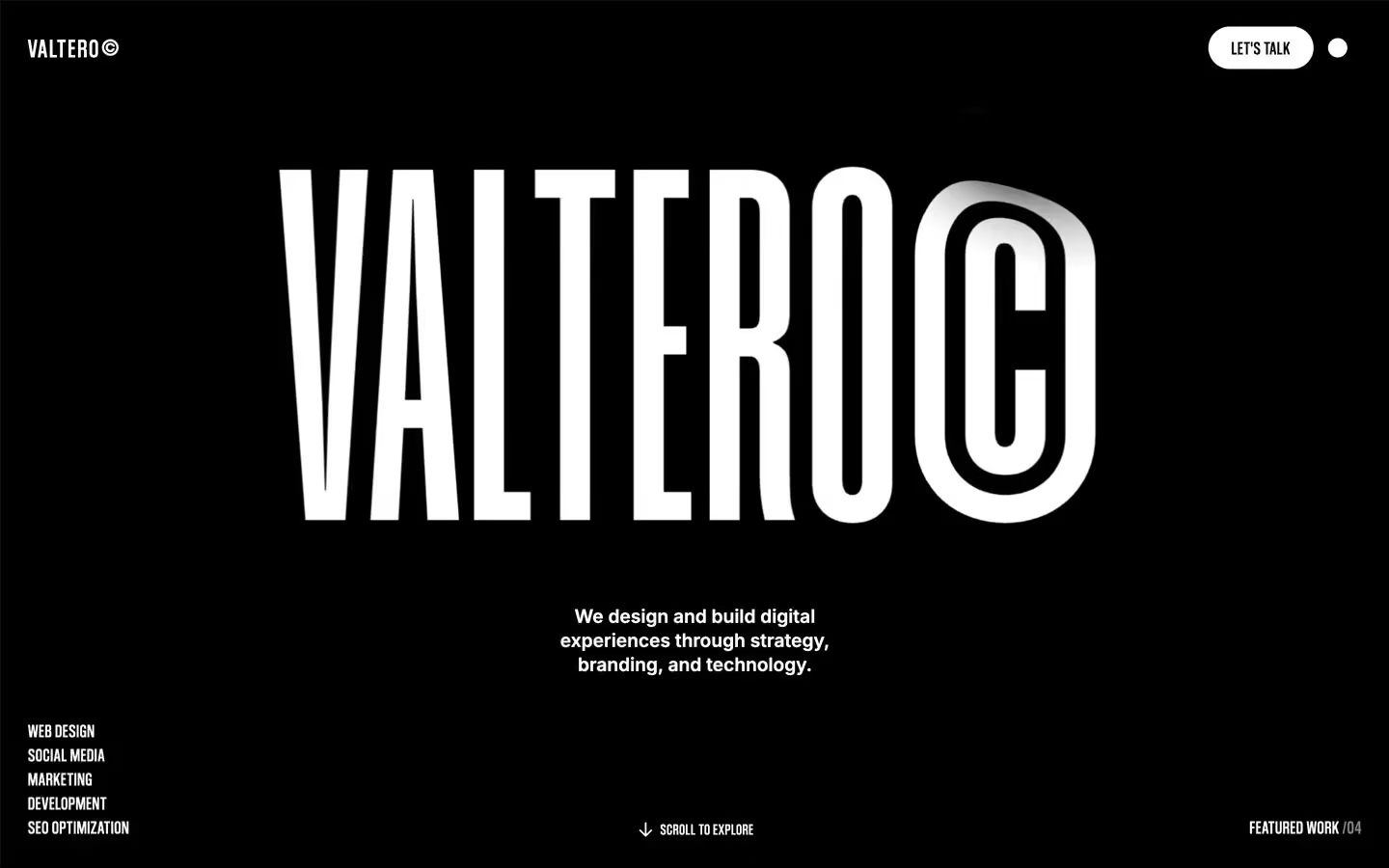
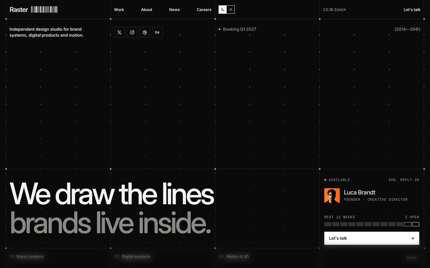
Agency design systems, the same colors first.


Bring any of them to your AI tool
All Access unlocks all 398 design systems, ready for Claude, ChatGPT, Gemini, Cursor, v0 and Lovable, plus 400+ templates on all 5 platforms.
Get All AccessUpgrade to All AccessHow to use the Vantix design system
Pick a file to see what it’s for and where it goes.
What it is
The whole design system in one markdown file, written for AI: every color, type style, spacing value, component and motion rule, plus do's, don'ts and a ready prompt.
Best for
Claude, ChatGPT, Gemini, Cursor and v0, or any other AI tool that builds pages or code.
How to use it
- Put
DESIGN.mdin your project and mention it in your request, or save it as.cursor/rules/vantix.mdc - For the rule file, start it with a front-matter block that sets
alwaysApply: true, so every chat uses it - Ask: “Build a pricing page using DESIGN.md.” Cursor follows the colors, fonts, spacing and rules
- Put
DESIGN.mdin the project root - Add one line to
CLAUDE.md: “Follow DESIGN.md for all UI.” - Ask for any page or component; Claude reads the file first
- Attach
DESIGN.mdto the chat (or paste it in) - Ask: “Build a landing page in this design system.”
- Keep the file in the chat or project knowledge, so follow-up pages stay on style
What it is
Every token as data, in the W3C Design Tokens format: colors with their roles, type styles, radius, spacing, and component tokens that point at them.
Best for
Figma (Tokens Studio), Style Dictionary and other design-token tools, and build scripts.
How to use it
- In Figma, open Tokens Studio, choose Import, and pick
tokens.json - Or point Style Dictionary’s
sourceat it to generate tokens for any platform - In code, import it like any JSON file
What it is
A Tailwind CSS v4 theme: every color, font, type style, radius and spacing value becomes a Tailwind utility, like bg-canvas, text-headline-lg or rounded-md.
Best for
Tailwind v4 projects, and AI builders that write Tailwind (v0, Lovable, Bolt).
How to use it
- Save
theme.cssnext to your main CSS file - Import it after Tailwind:
@import "tailwindcss"; @import "./theme.css"; - Use the classes:
bg-canvas text-ink rounded-md p-lg
What it is
The same tokens as plain CSS variables on :root. Component values point at the color variables, so changing one color updates everything that uses it.
Best for
Any website: plain CSS, Webflow custom code, Framer, WordPress.
How to use it
- Add it to your stylesheet, or in Webflow paste it into Site settings → Custom code inside a
<style>tag - Use the variables anywhere:
color: var(--color-ink) - Change a token once and every place that uses it follows