 flowmance
Raster Design System
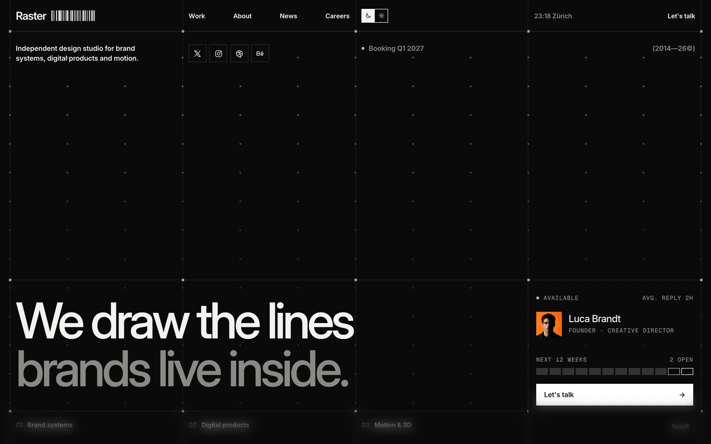
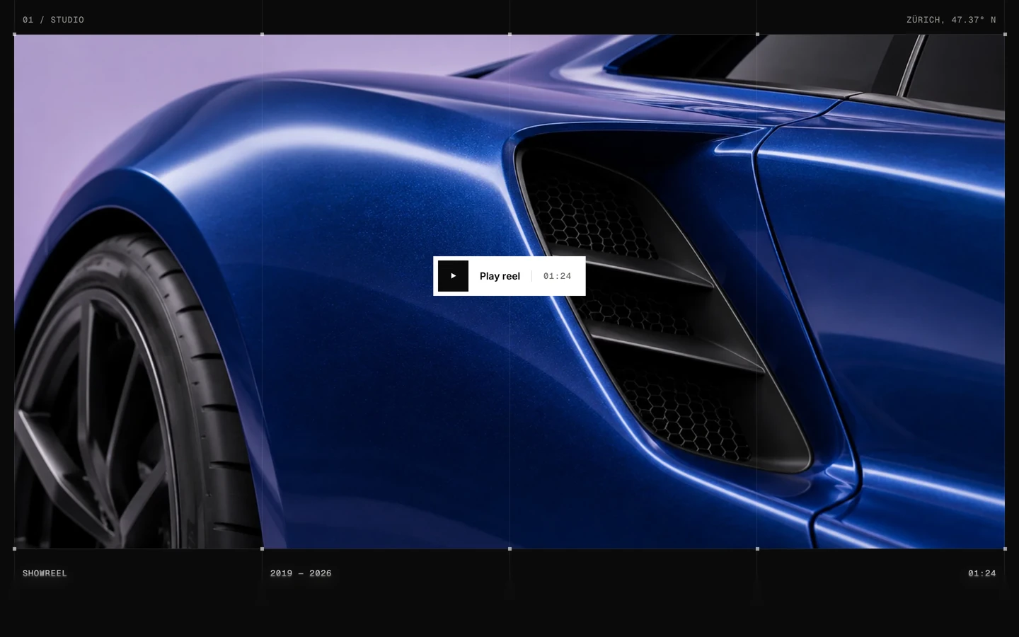
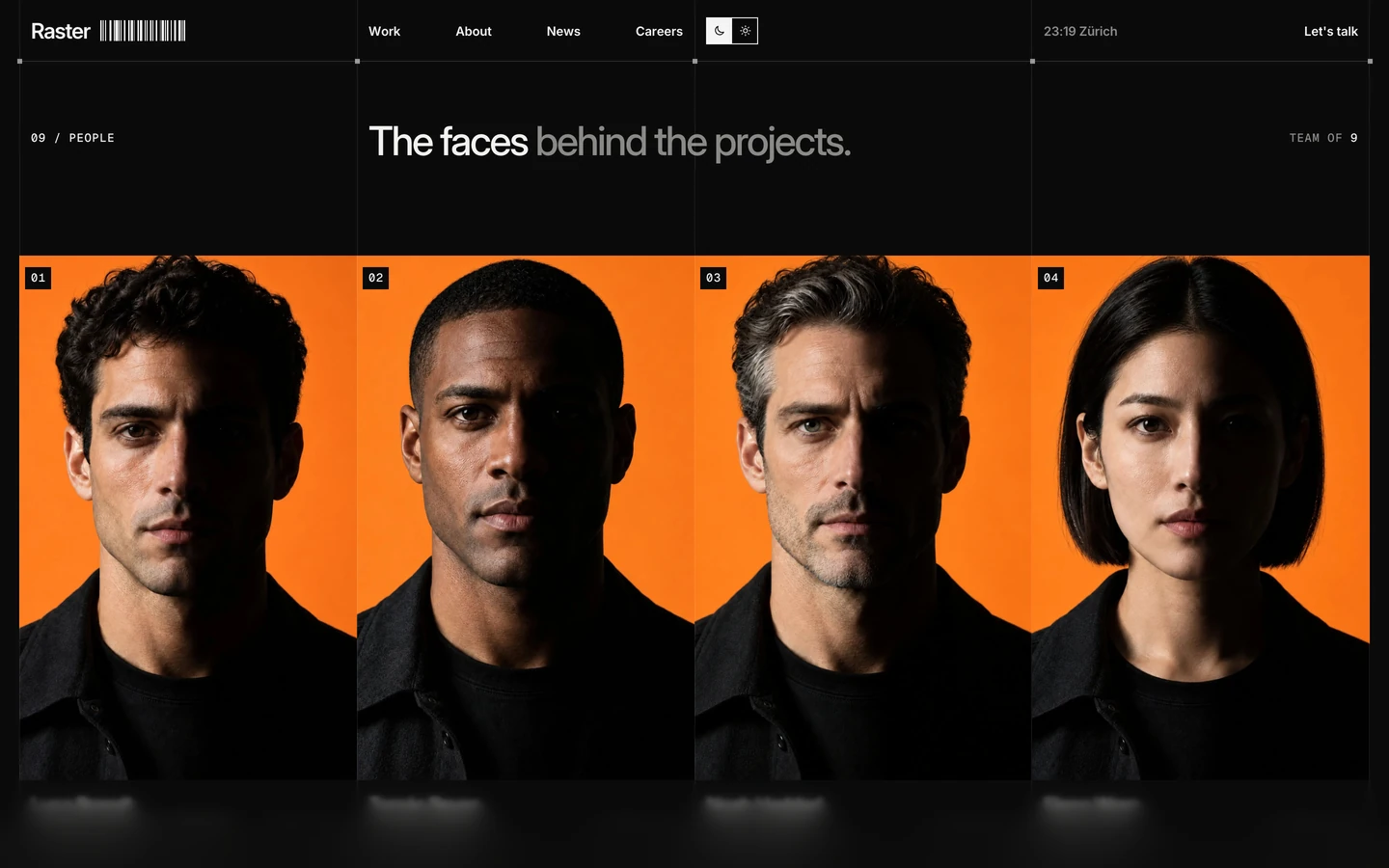
Raster is a dark design-studio template built like a technical drawing. The whole page sits on a visible grid: four columns of 1px white-10% rules that run from the navigation to the footer, with a small square marker at every place a horizontal rule crosses a vertical one. Type is quiet and precise: Inter at medium weight with tight negative tracking, and Geist Mono uppercase for every piece of meta information. Colour is almost absent; the only warm notes come from the photography inside page previews.
The published preview opens on an overview page ("Every page, on one grid.") that lists the template's 25 pages as cards. The system below is measured from that page, and the card thumbnails show the same grid, type and blur on the three home pages.
Four signatures make it recognisable:
- The visible grid. Column rules at 1px line (#FFFFFF1A) divide the page into four 350px columns, and every intersection carries a 5px line-strong (#FFFFFF99) square marker. Cards, labels and images snap to these cells; only the headlines span across a rule (the H1 over columns 1–2, section titles over columns 2–3).
- Two-tone headlines. Each title is one short sentence where the first words are ink (#F2F2F0) and the rest are ink-subtle (#8A8A86): Every page, on one grid., Three ways in., Projects and a template.
- Mono meta rows. Geist Mono 12px uppercase with 0.72px tracking labels everything: RASTER / OVERVIEW, ● BOOKING Q1 2027, ZÜRICH · 01:27, EST. 2014, 01 / HOMES, 03 PAGES.
- Progressive bottom blur. A fixed band at the bottom of the viewport stacks four backdrop blurs (0.3, 1.3, 2.8 and 5px, saturate 1.2) over a gradient to #0B0B0B at 70%, so content dissolves as it scrolls out.
Raster is measured in its dark theme. The navigation carries a moon/sun toggle, so a light theme exists.
Colors
Surfaces
#0B0B0BPage background and footer
#191918Stat cards, page cards and spec panels (the TIP card sits on the canvas, the GSAP card is inverse)
#F2F2F0The one light stat card (GSAP) and its panel below
Ink
#FFFFFFText on primary
#0B0B0BText on secondary
#F2F2F0Headlines, card titles, the bright half of two-tone titles
#FFFFFFNavigation links, logo, form submit
#A6A6A2Lead paragraphs, card descriptions, the clock
#8A8A86Mono meta labels, the grey half of two-tone titles, placeholders
#0B0B0BText on inverse-canvas
#0B0B0B · 75%Body text on the light card
#0B0B0B · 60%Mono label on the light card
Action
#0B0B0BSet to the canvas: the template has no filled button
#0B0B0B#FFFFFFThe square arrow tile inside buttons and the active theme-toggle square
Lines & effects
#FFFFFF · 10%Column and row rules, card edges, tag and button outlines
#FFFFFF · 60%The 5px square grid markers
#FFFFFF · 7%Faint fills on small controls
#0B0B0B · 70%Bottom gradient under the progressive blur
Typography
Inter · display-wordmark
The quick brown fox jumpsThe giant Raster wordmark in the footer, one span per letter (6 uses; below the screenshots). 587px · 500 · 0.76 · -44px
Inter · headline
The quick brown fox jumpsSection titles (H2). 42px · 500 · 1.04 · -1.87px
Inter · title-lg
The quick brown fox jumpsLarger statement lines (6 uses, lower on the page). 28px · 500 · 1.45 · -1.26px
Inter · body-lg
The quick brown fox jumpsLeads, stat captions, tip text. 18px · 500 · 1.45 · -0.54px
Inter · label
The quick brown fox jumpsNavigation links, Let's talk, clock. 13px · 600 · 1.45 · -0.14px
Geist Mono · mono
The quick brown fox jumpsEvery meta label, tag, index and button label. 12px · 500 · 1.4 · 0.72px
Spacing & shape
| Purpose | Value |
|---|---|
| Grid | 12 columns underneath (22 grids measured), shown as four 350px visible columns |
| Section rhythm | each section opens with 172.8px (12vw) of empty ruled space above its header |
| Section header | column 1 holds 0N / NAME in mono, columns 2–3 hold the two-tone headline, column 4 holds 0N PAGES right-aligned |
| Breakpoints | Webflow defaults (991, 767, 479) |
Spacing scale
| Token | Value | Preview |
|---|---|---|
hair | 1px | |
xs | 6.4px | |
sm | 12.8px | |
md | 24px |
Layout spacing
| Token | Value | Preview |
|---|---|---|
marker | 5px | |
gutter | 20px | |
meta-row | 52px | |
nav | 64px | |
section | 172.8px |
Border radius
Surfaces
How the surfaces stack, from the page background up. Hex codes and roles are in Colors above.
Motion
| Line draw | clipPath: inset(-4px 100% -4px -4px) → inset(-4px), 1.6s, rsInOut: rules and outlines draw in left to right |
| Panel wipe | clipPath: inset(0 0 100% 0) → inset, 0.8s, rsInOut |
| Headline reveal | SplitText lines from yPercent 60 or 130 to 0, 1.2s staggered, expo.out; one set from yPercent 100, 1.35s, linear |
| Fade-up | y 30 → 0, 1.31–1.52s staggered, expo.out |
| Menu icon | Lines to y ±3, rotation ±45°, 0.5s, rsInOut |
| Blink | opacity → 0.25, 0.8s and 1.2s, sine.inOut (the status dot) |
| Cursor follow | x/y quickTo, 0.45s, power3 |
| Marquee | xPercent 0 → −50, 30s, linear |
| Button hover | transform 0.4s, padding 0.5s, cubic-bezier(0.16, 1, 0.3, 1) |
Do’s and don’ts
- Draw the grid: 1px #FFFFFF1A column rules through every section and 5px #FFFFFF99 squares where rules cross.
- Split each title into an ink (#F2F2F0) half and an ink-subtle (#8A8A86) half.
- Put every label, index, tag and button label in Geist Mono 12px uppercase with +0.72px tracking.
- Keep cards on surface-1 #191918, square, with about 24px padding and the index plus ↗ at the top.
- Use the outlined mono button with a white 31px ↗ tile for calls to action.
- Leave 172.8px (12vw) of empty ruled space before each section header.
- Round anything. The radius scale is 0px, plus circles for status dots only.
- Add drop shadows or glows. Lines are 1px insets; depth is #0B0B0B to #191918.
- Use bold Inter for headlines (they are 500), or uppercase Inter.
- Add an accent colour. Warm colour comes only from photos.
- Use more than one inverse #F2F2F0 cell in a row.
- Invent light-theme colours; only the dark theme is measured.
Example prompt
Any page in the Raster style
More design systems like this
Agency design systems, the same colors first.


Bring any of them to your AI tool
All Access unlocks all 398 design systems, ready for Claude, ChatGPT, Gemini, Cursor, v0 and Lovable, plus 400+ templates on all 5 platforms.
Get All AccessUpgrade to All AccessHow to use the Raster design system
Pick a file to see what it’s for and where it goes.
What it is
The whole design system in one markdown file, written for AI: every color, type style, spacing value, component and motion rule, plus do's, don'ts and a ready prompt.
Best for
Claude, ChatGPT, Gemini, Cursor and v0, or any other AI tool that builds pages or code.
How to use it
- Put
DESIGN.mdin your project and mention it in your request, or save it as.cursor/rules/raster.mdc - For the rule file, start it with a front-matter block that sets
alwaysApply: true, so every chat uses it - Ask: “Build a pricing page using DESIGN.md.” Cursor follows the colors, fonts, spacing and rules
- Put
DESIGN.mdin the project root - Add one line to
CLAUDE.md: “Follow DESIGN.md for all UI.” - Ask for any page or component; Claude reads the file first
- Attach
DESIGN.mdto the chat (or paste it in) - Ask: “Build a landing page in this design system.”
- Keep the file in the chat or project knowledge, so follow-up pages stay on style
What it is
Every token as data, in the W3C Design Tokens format: colors with their roles, type styles, radius, spacing, and component tokens that point at them.
Best for
Figma (Tokens Studio), Style Dictionary and other design-token tools, and build scripts.
How to use it
- In Figma, open Tokens Studio, choose Import, and pick
tokens.json - Or point Style Dictionary’s
sourceat it to generate tokens for any platform - In code, import it like any JSON file
What it is
A Tailwind CSS v4 theme: every color, font, type style, radius and spacing value becomes a Tailwind utility, like bg-canvas, text-headline-lg or rounded-md.
Best for
Tailwind v4 projects, and AI builders that write Tailwind (v0, Lovable, Bolt).
How to use it
- Save
theme.cssnext to your main CSS file - Import it after Tailwind:
@import "tailwindcss"; @import "./theme.css"; - Use the classes:
bg-canvas text-ink rounded-md p-lg
What it is
The same tokens as plain CSS variables on :root. Component values point at the color variables, so changing one color updates everything that uses it.
Best for
Any website: plain CSS, Webflow custom code, Framer, WordPress.
How to use it
- Add it to your stylesheet, or in Webflow paste it into Site settings → Custom code inside a
<style>tag - Use the variables anywhere:
color: var(--color-ink) - Change a token once and every place that uses it follows