 flowmance
Valtero Design System
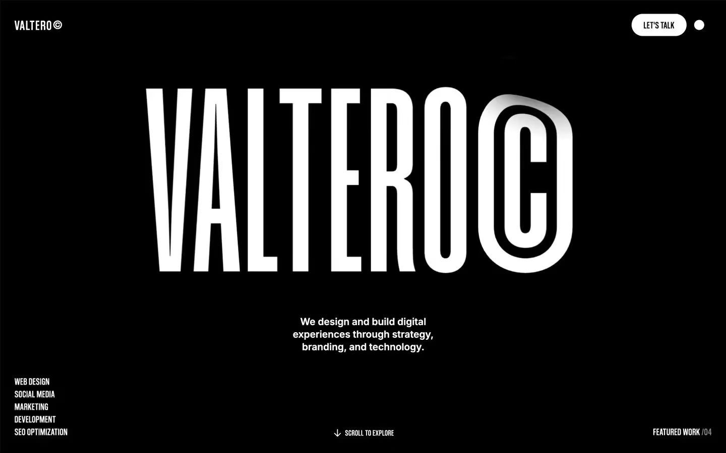
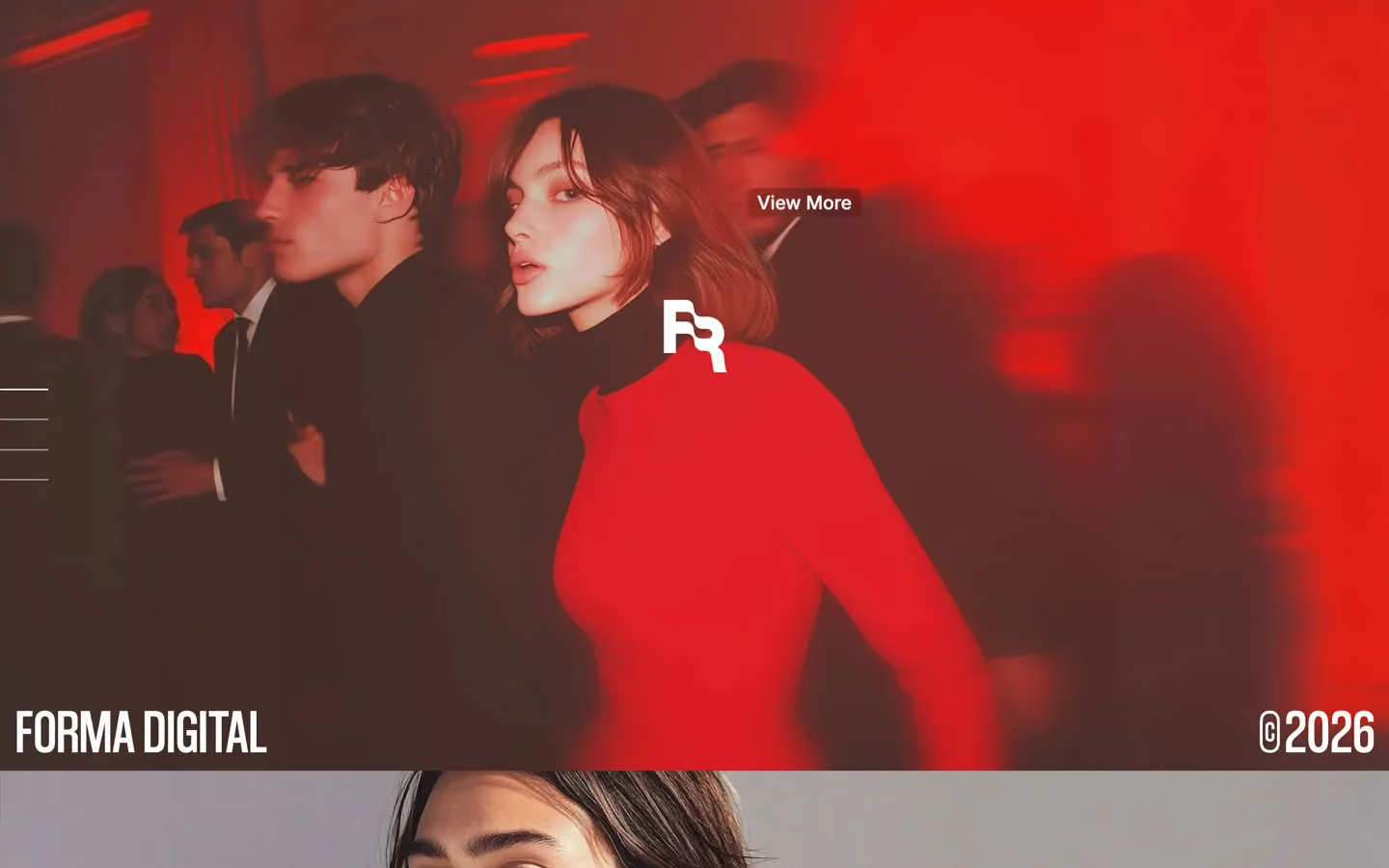
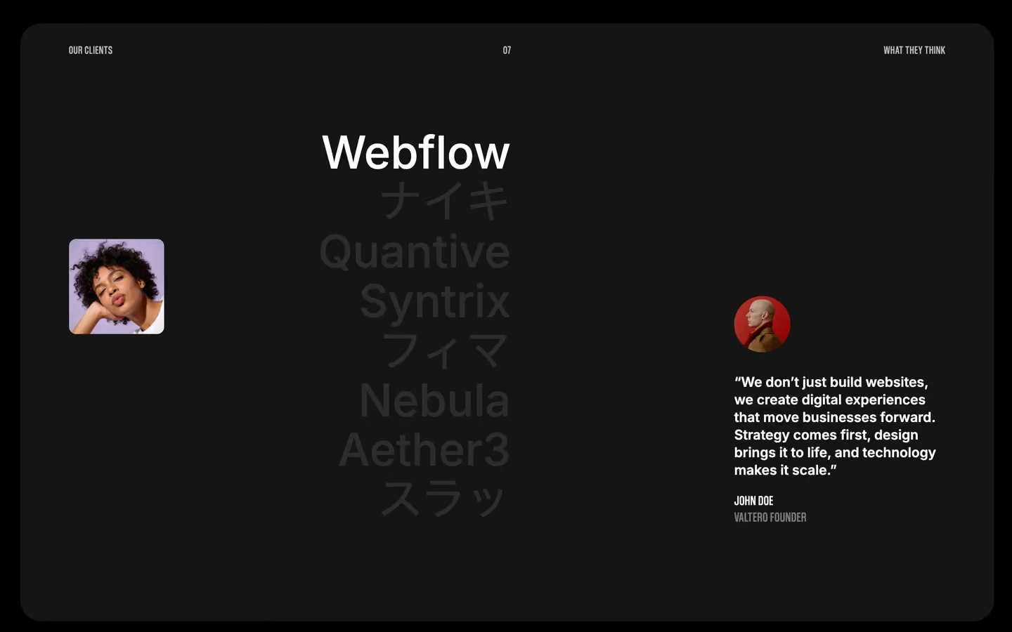
Valtero is a loud, black, all-caps agency site. It feels like a gig poster: a pure #000000 page, a giant warped white wordmark in the hero, then condensed Coolvetica capitals at 120–259px that fill the width, broken up by edge-to-edge project photos. Text blocks are short, centred and set in Inter semibold, so the page reads as huge words and small statements with nothing in between.
Four signatures make it recognisable:
- The warped hero wordmark. VALTERO© sits centred at about 840px wide, its letters bent like a fun-house mirror with a soft grey glow behind the middle. It is a Unicorn Studio WebGL scene (unicornStudio is loaded), not live text.
- The © everywhere. The brand is Valtero©, project captions end in ©2025, and titles carry it: PRICING ©26. The © is drawn as a tall stadium-shaped outline that matches the condensed caps.
- Condensed caps at two extremes. Coolvetica Condensed is either enormous (section titles at 144px, a scrolling service word at 259px; 120px character-split runs also appear) or small uppercase labels at 16–19px with +0.5 to +0.7px tracking. Inter only appears as semibold statements and body text.
- Pills and a dot. The only filled control is a white pill (LET'S TALK, VIEW ALL WORKS, GET STARTED). The menu opens from a single 20px white dot top right.
Valtero is a dark-only design.
Colors
Surfaces
#000000Page background and every content section (video bands are #222222)
#151515Sticky process cards; the pricing band measures one step off at #171717
#222222Video bands and the full-screen menu behind its photo
#333333Small raised chips such as the pricing check boxes
#444444Form inputs, which go darker on focus
#121212With field: Form inputs, which go darker on focus
Ink
#000000Text on primary
#FFFFFF#FFFFFFHeadlines, labels, statements, links
#FFFFFF · 70%Paragraph text (the CSS sets p { opacity: .7 }; label classes such as .top-text reset it to full white), plan descriptions, What's included:
#FFFFFF · 50%Placeholders, the /04 in FEATURED WORK /04, idle menu links
#FFFFFFAction
#FFFFFFThe white pill button
#2B2B2BThe dark fill that slides up inside the pill on hover
Lines & effects
#FFFFFF · 10%Input borders, the 2px base line under big footer links, pricing dividers
#FFFFFF · 15%The rule under each sticky service row
#2020201px borders of the client-logo grid
#171717 · 69%Testimonial cards
#333333 · 55%The arrow chip on project images
Typography
Coolvetica Condensed · display-marquee · shown in Oswald (fallback)
The quick brown fox jumpsThe scrolling service words • WEB DESIGN • SOCIAL MEDIA • MARKETING. 259px · 500 · 0.85 · 1px
Coolvetica Condensed · headline-lg · shown in Oswald (fallback)
The quick brown fox jumpsProject titles on photos BOLD MOVES ©2025, prices $2,000. 64px · 400 · 0.85 · 0.4px
Inter · title-lg
The quick brown fox jumpsPlan names Starter, Growth, service and about titles. 27px · 600 · 1.3
Inter · body
The quick brown fox jumpsParagraphs at 70%. 16px · 500 · 1.3 · -0.2px
Inter · caption
The quick brown fox jumpsDates, data text, inputs, /project. 14px · 500 · 1.3 · -0.2px
Coolvetica Condensed · label · shown in Oswald (fallback)
The quick brown fox jumpsPill buttons. 19px · 500 · 1.1 · 0.6px
Spacing & shape
| Purpose | Value |
|---|---|
| Container | max 1400px, centred, width: 100% |
| Section rhythm | .section pads 5% top and bottom (72px at 1440) |
| Breakpoints | 991px, 767px and 479px, plus a 1920px+ step |
Spacing scale
| Token | Value | Preview |
|---|---|---|
xs | 10px | |
sm | 20px | |
md | 30px | |
lg | 50px | |
xl | 60px | |
2xl | 100px | |
3xl | 120px |
Layout spacing
| Token | Value | Preview |
|---|---|---|
grid-gap | 16px | |
gutter | 29px | |
grid-gap-wide | 50px | |
section | 72px | |
section-wide | 101px | |
section-double | 144px | |
section-scroll | 150px |
Border radius
Surfaces
How the surfaces stack, from the page background up. Hex codes and roles are in Colors above.
Motion
| Smooth scroll | Lenis on the whole page |
| Hero wordmark | Unicorn Studio WebGL distortion |
| Split text roll | SplitText characters move y 0 → −100%, back.out(1.7), staggered across 6.5s in total |
| Scroll scenes | ScrollTrigger from top 90% to bottom top, scrub 0.8; a second scene from top bottom to bottom top |
| Fade and rise in | opacity 0 → 1 and y 20px or 20% → 0, 500ms |
| Skew-in reveal | skewX 30° → 0 with y → 0% and opacity, 400ms outCubic; a second variant uses skewY −7° → 0, 200ms outSine |
| Slow fade | Opacity to 1 over 1000ms outQuart |
| Rotate | 500ms, or 600ms outExpo for icons |
| Button hover | Dark fill translateY 100% → 0, label rolls y → 0%, 300ms ease |
| Hover dim | Opacity to 0.6, 300ms easeIn; menu links 0.5 → 0.8 |
| Line wipe | Width grows, 300ms ease or 500ms |
| Input focus | 400ms cubic-bezier(0.25, 0.46, 0.45, 0.94) |
| Menu close button | scale 0 → 1 on open |
Do’s and don’ts
- Keep the page pure #000000 and put text in #FFFFFF; body paragraphs at 70% (#FFFFFFB3).
- Set every display line, label and button in Coolvetica Condensed uppercase with +0.5 to +0.7px tracking, statements in Inter 600 and body text in Inter 500.
- Use the white pill (#FFFFFF, black text, 44px tall, 50em radius) for actions, with the #2B2B2B slide-up fill on hover.
- Add the © mark to the brand name, project years and section titles (PRICING ©26).
- Run photos edge to edge with square corners, captioned in 64px condensed caps on the image.
- Use #151515 to #222222 surfaces and backdrop blur (20–40px) for cards, never borders alone.
- Add an accent colour, gradients on UI, or coloured overlays on photos.
- Set Inter in uppercase or Coolvetica in sentence case.
- Round photos, or use radii outside the scale (7, 10, 20, 30px and pills).
- Use #FFFFFF80 (ink-subtle) for paragraphs; keep it for placeholders and counts like /04.
- Fill the space between display titles with long copy; keep statements to 2–3 centred lines.
- Use the loaded but unused Humane font, or rebuild the hero wordmark as flat text without its warp.
Example prompt
Any page in the Valtero style
More design systems like this
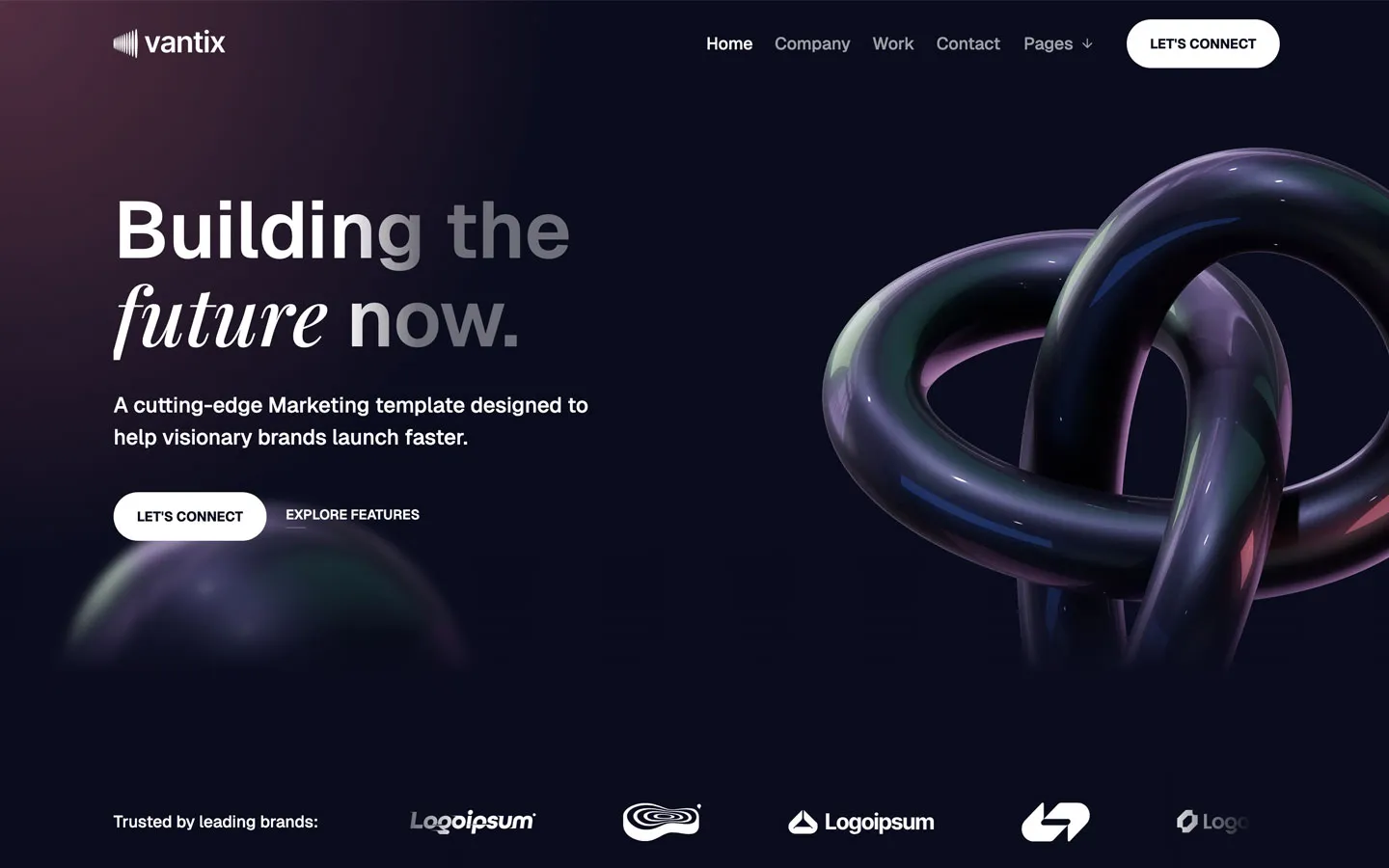
Agency design systems, the same colors first.


Bring any of them to your AI tool
All Access unlocks all 398 design systems, ready for Claude, ChatGPT, Gemini, Cursor, v0 and Lovable, plus 400+ templates on all 5 platforms.
Get All AccessUpgrade to All AccessHow to use the Valtero design system
Pick a file to see what it’s for and where it goes.
What it is
The whole design system in one markdown file, written for AI: every color, type style, spacing value, component and motion rule, plus do's, don'ts and a ready prompt.
Best for
Claude, ChatGPT, Gemini, Cursor and v0, or any other AI tool that builds pages or code.
How to use it
- Put
DESIGN.mdin your project and mention it in your request, or save it as.cursor/rules/valtero.mdc - For the rule file, start it with a front-matter block that sets
alwaysApply: true, so every chat uses it - Ask: “Build a pricing page using DESIGN.md.” Cursor follows the colors, fonts, spacing and rules
- Put
DESIGN.mdin the project root - Add one line to
CLAUDE.md: “Follow DESIGN.md for all UI.” - Ask for any page or component; Claude reads the file first
- Attach
DESIGN.mdto the chat (or paste it in) - Ask: “Build a landing page in this design system.”
- Keep the file in the chat or project knowledge, so follow-up pages stay on style
What it is
Every token as data, in the W3C Design Tokens format: colors with their roles, type styles, radius, spacing, and component tokens that point at them.
Best for
Figma (Tokens Studio), Style Dictionary and other design-token tools, and build scripts.
How to use it
- In Figma, open Tokens Studio, choose Import, and pick
tokens.json - Or point Style Dictionary’s
sourceat it to generate tokens for any platform - In code, import it like any JSON file
What it is
A Tailwind CSS v4 theme: every color, font, type style, radius and spacing value becomes a Tailwind utility, like bg-canvas, text-headline-lg or rounded-md.
Best for
Tailwind v4 projects, and AI builders that write Tailwind (v0, Lovable, Bolt).
How to use it
- Save
theme.cssnext to your main CSS file - Import it after Tailwind:
@import "tailwindcss"; @import "./theme.css"; - Use the classes:
bg-canvas text-ink rounded-md p-lg
What it is
The same tokens as plain CSS variables on :root. Component values point at the color variables, so changing one color updates everything that uses it.
Best for
Any website: plain CSS, Webflow custom code, Framer, WordPress.
How to use it
- Add it to your stylesheet, or in Webflow paste it into Site settings → Custom code inside a
<style>tag - Use the variables anywhere:
color: var(--color-ink) - Change a token once and every place that uses it follows