 flowmance
Tandem Design System
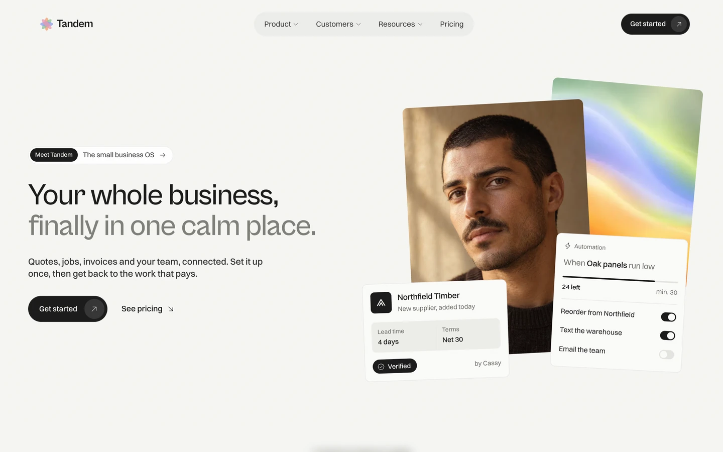
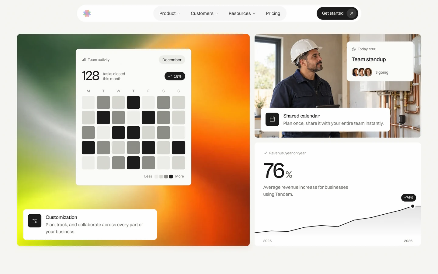
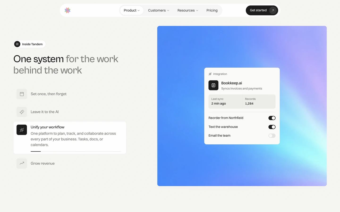
Tandem is a calm, light SaaS template for small-business software. It feels warm and unhurried: an off-white canvas (#F6F6F3) under a fine film grain, large Cabinet Grotesk headlines at weight 500, plain Switzer body copy, and near-black pills for the main actions. Product UI is shown as small, crisp white cards floating over soft, blurred aurora gradients and warm portraits, so the page reads like a lifestyle brand rather than a dashboard.
Four signatures make it recognisable:
- Two-tone headlines. The first phrase is ink (#191919) and the rest is ink-faint (#7E7E78): Your whole business, / finally in one calm place., One system for the work behind the work, Pick a plan, change it anytime.
- Pill button with an arrow chip. A #191919 pill, 52px tall, with the label on the left and a 40px round chip (white at 16%) holding ↗ on the right, 6px from the edge.
- Floating UI cards on aurora panels. White cards (Invoice #1042, Revenue $48,200, Automation) sit on large blurred gradient panels in peach, coral, teal, lime and orange, often slightly rotated in the hero.
- Eyebrow pills. Most sections open with a small white pill holding a dark round icon and a label: Inside Tandem, Pricing options. The hero version pairs a dark Meet Tandem pill with The small business OS →.
Colors
Surfaces
#F6F6F3Page background, also the text colour on dark buttons
#FBFBF9Floating UI cards (invoice, revenue, automation)
#FFFFFFActive feature card, bento cards, eyebrow pills, active nav tab, inputs
#EEEEEAIcon tiles, nav-tab track, table rows inside UI cards, plan-card panels, billing toggle
#FFFFFF#191919Featured plan card, dark icon tiles, Verified and +24% badges
Ink
#F6F6F3Text on primary
#191919Text on secondary
#191919Headlines, labels, links, the bright half of titles
#353535Body text (the page default)
#6B6B65Secondary text: feature descriptions, captions, footer headings, placeholders
#7E7E78The grey half of two-tone titles
#F6F6F3Text on inverse-canvas
Action
#191919Main pill buttons, submit
#191919#F6F6F3The light pill, used once on a dark surface
Lines & effects
#E4E4DFBar and heatmap steps in product UI, light to dark
#D6D6D0Bar and heatmap steps in product UI, light to dark
#8B8B85Bar and heatmap steps in product UI, light to dark
#191919 · 8%1px borders and inset outlines on cards and pills
#FFFFFF · 45%The scrolled navigation bar (about)
#FFFFFF · 16%The round arrow chip inside a dark button
#F6F6F3 · 12%Fills and lines on dark cards
Typography
Cabinet Grotesk · display-stat
The quick brown fox jumpsBig numbers in the stats section (6 uses). 88px · 500 · 0.9 · -3.52px
Cabinet Grotesk · headline
The quick brown fox jumpsSection titles (H2). 44px · 500 · 1.08 · -1.1px
Cabinet Grotesk · title-lg
The quick brown fox jumpsCard headings. 22px · 500 · 1.2 · -0.44px
Switzer · body-xl
The quick brown fox jumpsFAQ questions, testimonial lines. 20px · 500 · 1.55 · -0.4px
Switzer · label
The quick brown fox jumpsButtons, nav tabs. 15px · 500 · 1.25
Switzer · caption
The quick brown fox jumpsUI captions, eyebrow pills, badges. 13px · 400 · 1.55
Spacing & shape
| Purpose | Value |
|---|---|
| Container | 1328px (11 uses) with 56px side padding at 1440px; one narrower 1080px container for centred text |
| Section rhythm | 160–180px top and bottom |
| Breakpoints | Webflow defaults (991, 767, 479); stack columns at 767px |
Spacing scale
| Token | Value | Preview |
|---|---|---|
hair | 1px | |
xs | 6px | |
sm | 8px | |
md | 14px | |
lg | 16px | |
xl | 22px | |
2xl | 56px |
Layout spacing
| Token | Value | Preview |
|---|---|---|
gutter | 56px | |
section-sm | 96px | |
section | 160px | |
section-lg | 180px |
Border radius
Surfaces
How the surfaces stack, from the page background up. Hex codes and roles are in Colors above.
Motion
| Button and tab hover | transform 0.5–0.55s cubic-bezier(0.32, 0.72, 0, 1); colour and background 0.25–0.4s cubic-bezier(0.16, 1, 0.3, 1) |
| Hover tilt | rotation and scale quickTo, 0.8s power3.out |
| Manifesto words | Words start at opacity 0.12 and light to 1 as the section scrolls (scrubbed) |
| Pinned features | Panel pinned top top → bottom top, scrubbed; UI card swap uses clipPath → inset, scale 1.25, y 120, rotation −4° out and y −80 in, 0.36–0.45s power2.inOut |
| Hero cards drop | y −90 / −160 / −230 → 0, 1s power1.out |
| Parallax | yPercent −6 to −36, scrubbed (scrub 1.4 and 0.6) |
| Pop in | scale 0.4 → 1, 0.9s back.out(1.6); icons rotation −90 → 0, 1.8s staggered |
| Settle | rotation → 0, 0.9s expo.out; staggered scale-in 1.64s expo.out |
| Logo marquee | xPercent 0 → −50, 40s linear, looping |
| Logo spin | rotation 360, 80s linear |
Do’s and don’ts
- Split titles into a #191919 phrase and a #7E7E78 phrase, in Cabinet Grotesk 500 with negative tracking.
- Use the #191919 pill with a round ↗ chip for every main action, 52px tall.
- Open sections with a white eyebrow pill (dark circle icon + 13px label).
- Show product as white #FBFBF9 cards with 10px radius floating on blurred gradient panels.
- Keep body text in Switzer at line height 1.55, #353535, with no tracking.
- Outline cards with 1px #191919 at 8% instead of shadows.
- Use colour in UI elements; gradients belong only in image panels.
- Use #7E7E78 below 40px. Small grey text is #6B6B65.
- Add drop shadows or heavy borders.
- Use Cabinet Grotesk at 700 or in uppercase.
- Square off buttons or tags; they are always pills.
- Fill whole sections with #191919; dark is for buttons, badges, tiles and one featured card.
Example prompt
Any page in the Tandem style
More design systems like this
SaaS design systems, the same colors first.
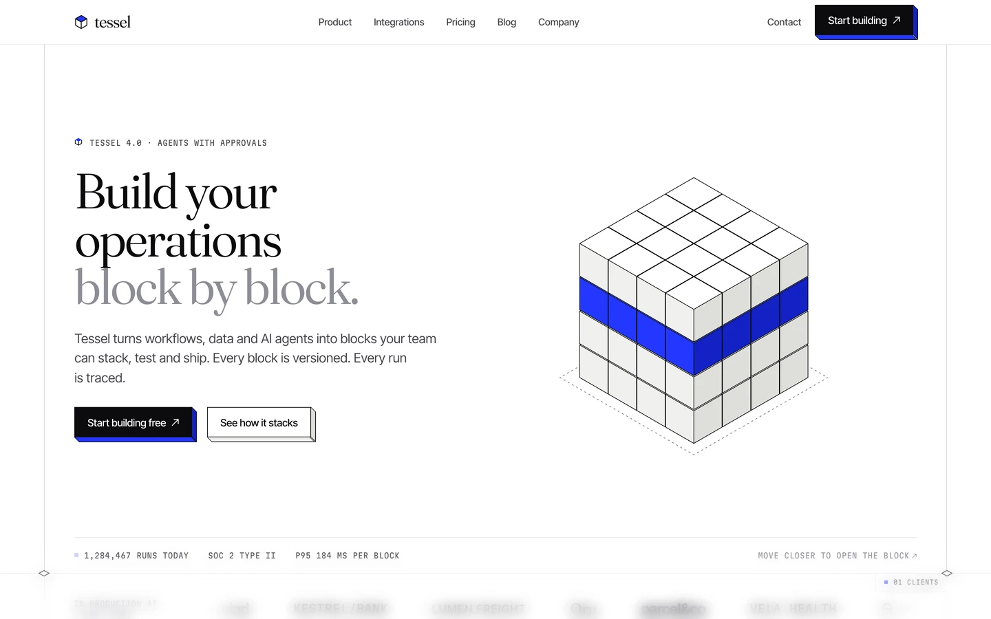


Bring any of them to your AI tool
All Access unlocks all 398 design systems, ready for Claude, ChatGPT, Gemini, Cursor, v0 and Lovable, plus 400+ templates on all 5 platforms.
Get All AccessUpgrade to All AccessHow to use the Tandem design system
Pick a file to see what it’s for and where it goes.
What it is
The whole design system in one markdown file, written for AI: every color, type style, spacing value, component and motion rule, plus do's, don'ts and a ready prompt.
Best for
Claude, ChatGPT, Gemini, Cursor and v0, or any other AI tool that builds pages or code.
How to use it
- Put
DESIGN.mdin your project and mention it in your request, or save it as.cursor/rules/tandem.mdc - For the rule file, start it with a front-matter block that sets
alwaysApply: true, so every chat uses it - Ask: “Build a pricing page using DESIGN.md.” Cursor follows the colors, fonts, spacing and rules
- Put
DESIGN.mdin the project root - Add one line to
CLAUDE.md: “Follow DESIGN.md for all UI.” - Ask for any page or component; Claude reads the file first
- Attach
DESIGN.mdto the chat (or paste it in) - Ask: “Build a landing page in this design system.”
- Keep the file in the chat or project knowledge, so follow-up pages stay on style
What it is
Every token as data, in the W3C Design Tokens format: colors with their roles, type styles, radius, spacing, and component tokens that point at them.
Best for
Figma (Tokens Studio), Style Dictionary and other design-token tools, and build scripts.
How to use it
- In Figma, open Tokens Studio, choose Import, and pick
tokens.json - Or point Style Dictionary’s
sourceat it to generate tokens for any platform - In code, import it like any JSON file
What it is
A Tailwind CSS v4 theme: every color, font, type style, radius and spacing value becomes a Tailwind utility, like bg-canvas, text-headline-lg or rounded-md.
Best for
Tailwind v4 projects, and AI builders that write Tailwind (v0, Lovable, Bolt).
How to use it
- Save
theme.cssnext to your main CSS file - Import it after Tailwind:
@import "tailwindcss"; @import "./theme.css"; - Use the classes:
bg-canvas text-ink rounded-md p-lg
What it is
The same tokens as plain CSS variables on :root. Component values point at the color variables, so changing one color updates everything that uses it.
Best for
Any website: plain CSS, Webflow custom code, Framer, WordPress.
How to use it
- Add it to your stylesheet, or in Webflow paste it into Site settings → Custom code inside a
<style>tag - Use the variables anywhere:
color: var(--color-ink) - Change a token once and every place that uses it follows