 flowmance
Juno Design System
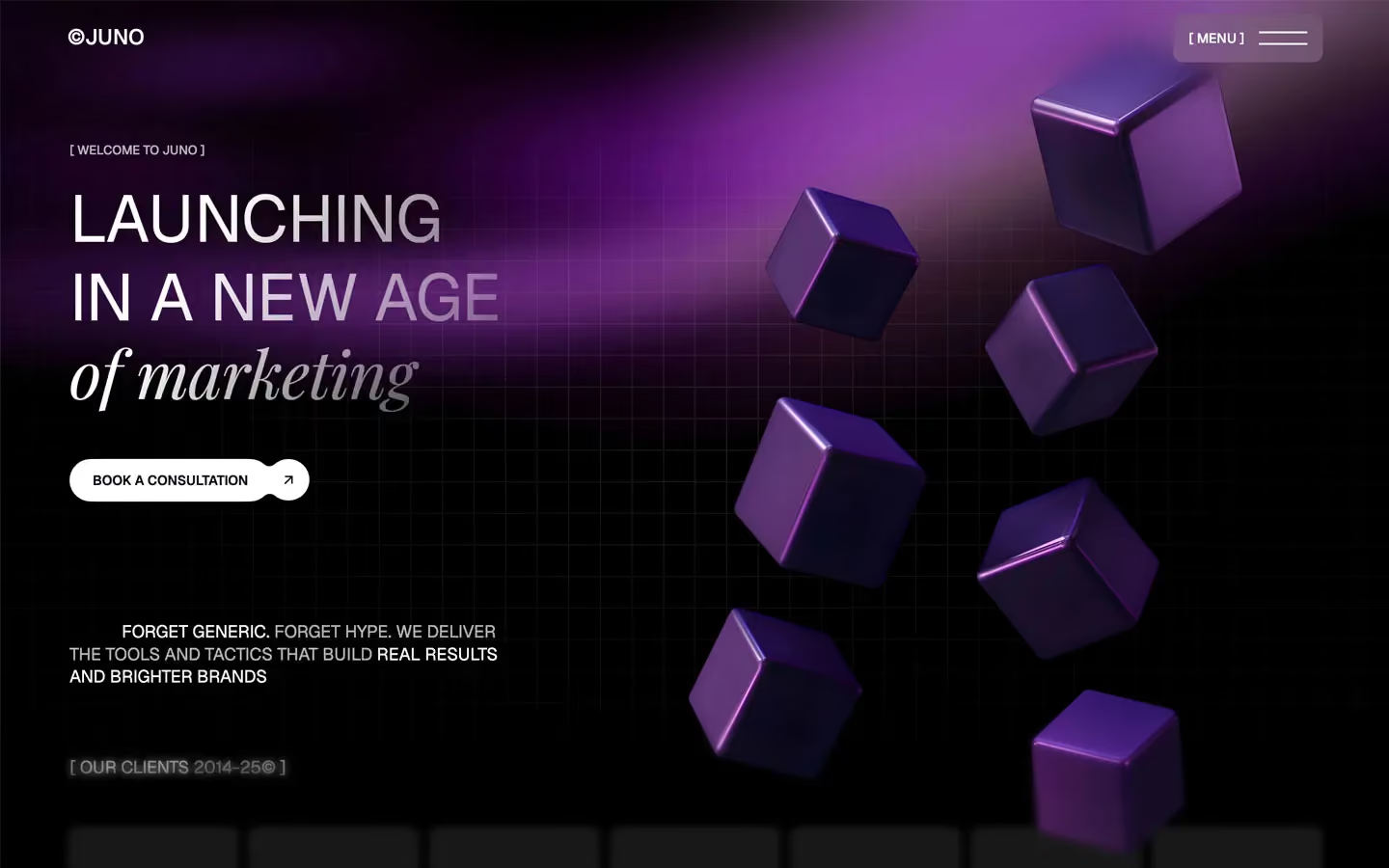
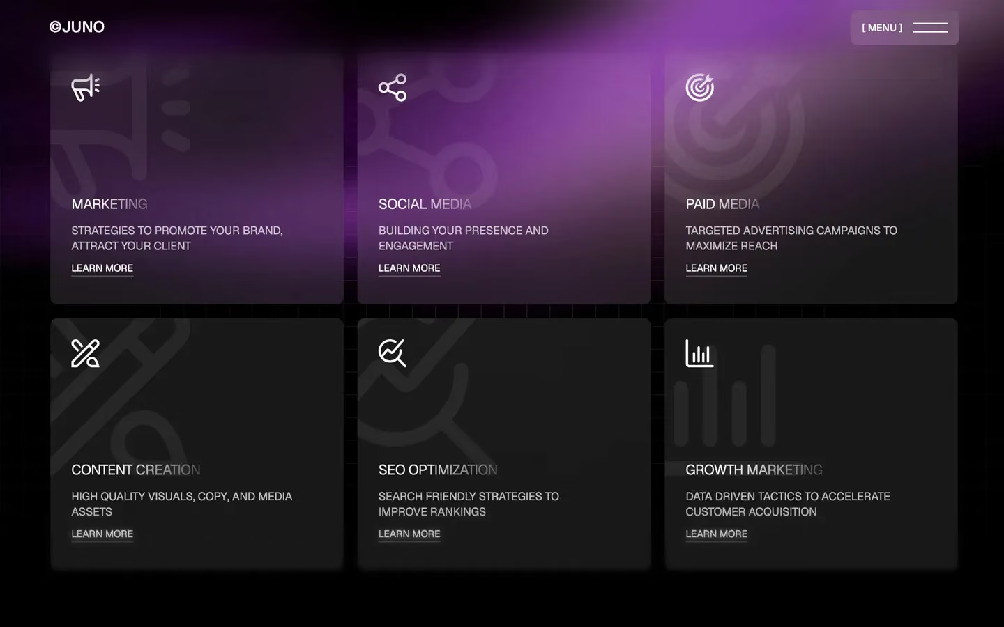
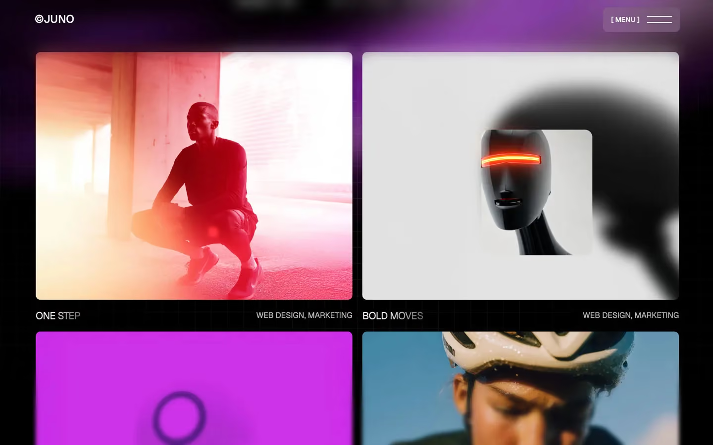
Juno is a dark, glossy marketing-agency site. The page is a near-black violet with a soft purple aurora sweeping across a faint square grid, and floating purple 3D cubes in the hero. Headlines are uppercase Geist at regular weight with a white-to-grey gradient fill, broken by a lowercase Playfair Display italic phrase. Content sits on frosted glass cards with small 9.6px corners.
Four signatures make it recognisable:
- Gradient-filled uppercase headlines. Titles and card titles fade from solid white to grey across the line (LAUNCHING / IN A NEW AGE, MARKETING, STUDIO FOCUS): linear-gradient(124deg, #FFF 30%, white 20–50% 95%) clipped to the text.
- The italic turn. A lowercase Playfair Display italic phrase closes the headline at the same size: of marketing.
- Bracketed labels. Small uppercase labels are wrapped in square brackets: [ WELCOME TO JUNO ], [ MENU ], [ Our Clients 2014-25© ], [ Built with love, used with trust ]. The logo is ©JUNO.
- The gooey pill. The main button is a white pill plus a separate white arrow circle, merged by an SVG goo filter, so the two shapes join with a liquid neck and stretch apart on hover.
Juno is a dark-only design.
Colors
Surfaces
#0B0516Page background (near-black violet)
#F8F8F3 · 10%Service cards, testimonial cards, logo tiles, the [ MENU ] box
#F8F8F3 · 10%Ink
#0B0516Text on primary
#FFFFFFHeadlines, card titles, the start of gradient text
#FFFFFF · 70%Paragraphs, labels, work categories
#FFFFFF · 60%Placeholder in the newsletter field
#FFFFFF · 20%The end stop of headline gradients; never on its own
#FFFFFF#000000Text on the form submit button
Action
#FFFFFFThe gooey pill button and arrow circle
#FFFFFF#C001FCThe violet in the CSS variables (named --blue); use only for glows like the aurora
Lines & effects
#FFFFFF · 50%1px border on contact inputs
#F8F8F3 · 10%Same fill as surface-1; it is always frosted, never flat
#000000 · 30%Darkening layers on images and the cube scene
#000000 · 60%With scrim: Darkening layers on images and the cube scene
#0B0516 · 5%The full-screen menu
Typography
Geist · display-xl
The quick brown fox jumpsThe largest statement lines further down the page; the menu links (76px, line height 0.9) are close to this. 80px · 400 · 1.2 · -0.4px
Geist · headline-lg
The quick brown fox jumpsClosing CTA title LEAD THE FUTURE FORWARD. 50px · 400 · 1.2 · -0.4px
Geist · title-md
The quick brown fox jumpsTestimonial quotes. 32px · 400 · 1.3
Geist · logo
The quick brown fox jumps©JUNO. 22px · 500 · 0.91
Geist · body-lg
The quick brown fox jumpsLead paragraphs (Forget generic. 20px · 400 · 1.3
Geist · caption
The quick brown fox jumpsTestimonial name and role (ALEX MORGAN, CTO AT PATH SYSTEMS). 15px · 400 · 1.4
Spacing & shape
| Purpose | Value |
|---|---|
| Container | max 1300px, centred, with 5% side padding (72px at 1440) |
| Section rhythm | 150px top and bottom, 100px at ≤991, 60px at ≤767 (from the variables) |
| Breakpoints | 991, 767 and 479px |
Spacing scale
| Token | Value | Preview |
|---|---|---|
hair | 5px | |
xs | 10px | |
sm | 15px | |
md | 20px | |
lg | 30px | |
xl | 40px | |
2xl | 50px | |
3xl | 100px |
Layout spacing
| Token | Value | Preview |
|---|---|---|
column-gap | 20px | |
footer-bottom | 30px | |
hero-top | 45px | |
footer-top | 60px | |
page-x | 72px | |
section | 150px | |
hero-bottom | 190px |
Border radius
Motion
| Elastic rise in view | Start opacity 0, y 100px; then y 0 and opacity 1, both 1400ms inOutElastic (six blocks) |
| Text roll and menu links | y 110% → 0%, 400ms outCubic or 500ms outExpo |
| Gooey button hover | 0.9s cubic-bezier(0.135, 0.9, 0.15, 1) on the pill and circle |
| Menu open | Height grows, 1000ms outExpo; lines rotate 400–600ms inOutQuint |
| Icon spins | Rotate 500ms outElastic, 400ms outBack, 600ms outExpo, 900ms cubic-bezier(0.135, 0.9, 0.15, 1) |
| Accordion and sizes | 300ms ease; 200ms inOutQuint |
| Blur in | filter 300–400ms ease (the clients label sharpens) |
| Fades | opacity 300ms ease |
| Cubes | Follow the mouse (mouse-move interaction) |
Do’s and don’ts
- Use #0B0516 behind everything, with the purple aurora and faint grid showing through transparent sections.
- Set headlines in uppercase Geist 400 with the 124° white-to-20% gradient fill, and end key titles with a lowercase Playfair italic phrase at the same size.
- Wrap small labels in brackets: [ LABEL ], 13px/500 uppercase at 70%.
- Put content on frosted cards (#F8F8F3 at 10% + 40px blur) with a 9.6px radius.
- Use the white gooey pill (48px radius) plus arrow circle for the main action.
- Keep paragraphs at white 70% and 18px, line height 1.4.
- Fill buttons, cards or text with purple; the violet lives in imagery and glows.
- Use bold headline weights; headlines are 400.
- Use ink-faint (white 20%) as a text colour; it is only a gradient end stop.
- Add shadows or solid grey cards; depth is blur and glow.
- Round cards past 9.6px or use pills anywhere except the main button.
- Use Playfair for whole sentences, or in uppercase.
Example prompt
Any page in the Juno style
More design systems like this
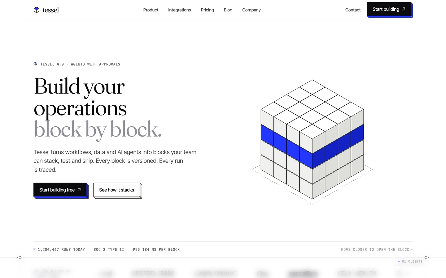
SaaS design systems, the same colors first.


Bring any of them to your AI tool
All Access unlocks all 398 design systems, ready for Claude, ChatGPT, Gemini, Cursor, v0 and Lovable, plus 400+ templates on all 5 platforms.
Get All AccessUpgrade to All AccessHow to use the Juno design system
Pick a file to see what it’s for and where it goes.
What it is
The whole design system in one markdown file, written for AI: every color, type style, spacing value, component and motion rule, plus do's, don'ts and a ready prompt.
Best for
Claude, ChatGPT, Gemini, Cursor and v0, or any other AI tool that builds pages or code.
How to use it
- Put
DESIGN.mdin your project and mention it in your request, or save it as.cursor/rules/juno.mdc - For the rule file, start it with a front-matter block that sets
alwaysApply: true, so every chat uses it - Ask: “Build a pricing page using DESIGN.md.” Cursor follows the colors, fonts, spacing and rules
- Put
DESIGN.mdin the project root - Add one line to
CLAUDE.md: “Follow DESIGN.md for all UI.” - Ask for any page or component; Claude reads the file first
- Attach
DESIGN.mdto the chat (or paste it in) - Ask: “Build a landing page in this design system.”
- Keep the file in the chat or project knowledge, so follow-up pages stay on style
What it is
Every token as data, in the W3C Design Tokens format: colors with their roles, type styles, radius, spacing, and component tokens that point at them.
Best for
Figma (Tokens Studio), Style Dictionary and other design-token tools, and build scripts.
How to use it
- In Figma, open Tokens Studio, choose Import, and pick
tokens.json - Or point Style Dictionary’s
sourceat it to generate tokens for any platform - In code, import it like any JSON file
What it is
A Tailwind CSS v4 theme: every color, font, type style, radius and spacing value becomes a Tailwind utility, like bg-canvas, text-headline-lg or rounded-md.
Best for
Tailwind v4 projects, and AI builders that write Tailwind (v0, Lovable, Bolt).
How to use it
- Save
theme.cssnext to your main CSS file - Import it after Tailwind:
@import "tailwindcss"; @import "./theme.css"; - Use the classes:
bg-canvas text-ink rounded-md p-lg
What it is
The same tokens as plain CSS variables on :root. Component values point at the color variables, so changing one color updates everything that uses it.
Best for
Any website: plain CSS, Webflow custom code, Framer, WordPress.
How to use it
- Add it to your stylesheet, or in Webflow paste it into Site settings → Custom code inside a
<style>tag - Use the variables anywhere:
color: var(--color-ink) - Change a token once and every place that uses it follows