 flowmance
Savory Design System


Savory is a calm, upscale restaurant site. The whole page is one deep slate navy, and the type is a soft, muted gold: a big rounded Hauora headline, then Inter Tight for everything else. Photography of plated food, chefs and dining rooms sits inside tall pill-shaped frames, so the page feels like a set of arched windows.
Four signatures make it recognisable:
- Pill frames. Every portrait photo is cropped by a 250px radius into a tall capsule. The hero has one capsule centred behind the headline; the next section staggers three capsules side by side, the middle one dropped lower.
- Gold on navy. #BAAF8C gold for headings and buttons, #ECE4CA cream for menu links and form text, white for body copy, all on #292F3B. Nothing else.
- The giant tagline. Dine with us, and let Savory turn moments into timeless memories. scrolls sideways at 120px uppercase, its edges fading into the navy.
- Faded sentence tails. Leads and quotes start in white and finish at 40% opacity: come to meet us and enjoy a / great food experience.
Savory is dark only.
Colors
Surfaces
#292F3BPage background everywhere, including the footer
#292F3BSame as canvas: the overlay menu background
Ink
#FFFFFFText on primary
#292F3BNavy text on the gold submit button and index circles
#FFFFFFBody copy, leads, the chef name
#FFFFFFBody text is full white (same as ink)
#FFFFFF · 40%The faded second half of leads and quotes, the chef's title (opacity: 0.4)
#FFFFFFAction
#BAAF8CThe gold pill button
#ECE4CAGold pill hover
#BAAF8CThe hero headline, section labels, hours titles, the marquee, copyright, menu index circles
#ECE4CAMenu row links, form labels, input text and borders, links
Lines & effects
#5C59501px rules between menu rows and around the footer
#ECE4CA1px input borders and the top rule of the menu list
#C7C3CF2px outline of the small pill dividers in the marquee
Typography
Hauora · display-hero · shown in Inter (fallback)
The quick brown fox jumpsSAVOR LIFE'S / FINEST MOMENTS, in accent. 130px · 500 · 1.1
Inter Tight · headline-md
The quick brown fox jumpsMenu rows (Breakfast, Lunch and Dinner, Wine List, The Club) in accent-light. 30px · 400 · 1
Inter Tight · body-xl
The quick brown fox jumpsLeads, the chef quote, hours days, the address. 26px · 500 · 1.4
Inter Tight · title
The quick brown fox jumpsChef name and title. 19px · 500 · 1.4
Inter Tight · label
The quick brown fox jumpsPill button text. 18px · 500 · 1.11
Inter Tight · eyebrow
The quick brown fox jumpsSection labels MENU, THE CHEF, RESERVATION in accent. 17px · 600 · 1.2 · 2px
Spacing & shape
| Purpose | Value |
|---|---|
| Container | 1200px max, centred; sections pad 5% left and right (72px at 1440) |
| Section rhythm | 130px top and bottom (.section), 80px at ≤991 and 50px at ≤767 |
| Breakpoints | 991, 767 and 479px |
Spacing scale
| Token | Value | Preview |
|---|---|---|
xs | 10px | |
sm | 15px | |
md | 20px | |
lg | 40px | |
xl | 80px |
Layout spacing
| Token | Value | Preview |
|---|---|---|
gutter | 72px | |
footer-top | 90px | |
section | 130px | |
section-text | 150px |
Border radius
Motion
| Headline reveal | Lines move y 100% → 0% over 1100ms outQuint, with a skew 7deg → 0deg over 500ms |
| Button hover | Label slides up and out (about 500ms), arrow y 200% → 0%, 500ms; background to cream |
| Overlay menu open | Panel y -100% → 0%, 300–400ms inOutCubic; links roll in |
| Overlay link hover | Gold word y 0 → -100%, cream copy 100% → 0%, 300ms ease |
| Hamburger | Lines rotate, 200ms outSine |
| Photo grow | Image wrapper size change, 300ms ease / 500ms on scroll into view |
| Cursor parallax | Small ±6px shifts on mouse move, 500ms |
| Menu row arrow | Background position 92% → 100%, transition: all 0.2s |
| Fades | opacity → 0 400–500ms on exit; scale 0.8 300ms outQuad on click |
Do’s and don’ts
- Keep every section on canvas #292F3B; there are no light bands.
- Set headings in gold #BAAF8C and running text in white.
- Crop portrait photos into capsules with a 250px radius.
- Use the gold pill (primary, 40px radius, 74px tall) for reservations and bookings.
- Finish leads and quotes with a 40% white tail.
- Separate list rows with 1px #5C5950 rules.
- Put small text on the gold button; white on #BAAF8C is low contrast (and lower still on the #ECE4CA hover), so keep button labels at 18px or larger, weight 500+.
- Use ink-subtle (white at 40%) below 19px or for whole paragraphs; keep it for the faded end of 19–26px lines.
- Add shadows, cards or a lighter surface.
- Use Hauora for anything but the hero headline.
- Use square-cornered portrait photos.
- Add a bright accent colour; gold and cream are the only warm tones.
Example prompt
Any page in the Savory style
More design systems like this
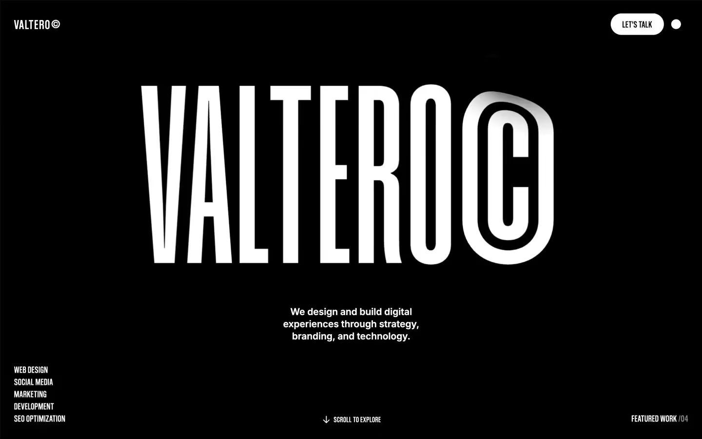
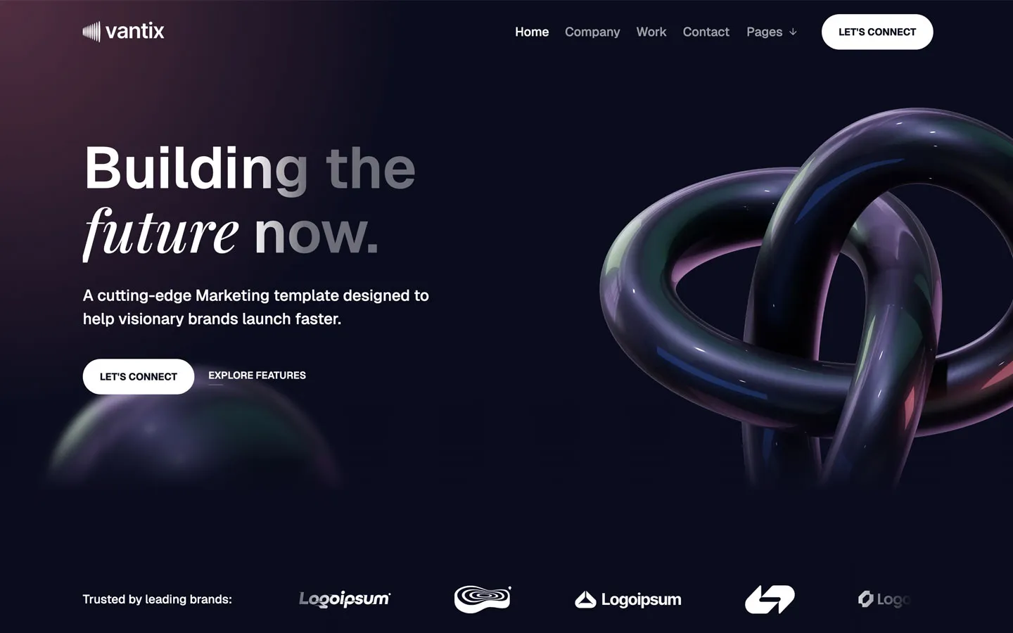
Restaurant design systems, the same colors first.


Bring any of them to your AI tool
All Access unlocks all 398 design systems, ready for Claude, ChatGPT, Gemini, Cursor, v0 and Lovable, plus 400+ templates on all 5 platforms.
Get All AccessUpgrade to All AccessHow to use the Savory design system
Pick a file to see what it’s for and where it goes.
What it is
The whole design system in one markdown file, written for AI: every color, type style, spacing value, component and motion rule, plus do's, don'ts and a ready prompt.
Best for
Claude, ChatGPT, Gemini, Cursor and v0, or any other AI tool that builds pages or code.
How to use it
- Put
DESIGN.mdin your project and mention it in your request, or save it as.cursor/rules/savory.mdc - For the rule file, start it with a front-matter block that sets
alwaysApply: true, so every chat uses it - Ask: “Build a pricing page using DESIGN.md.” Cursor follows the colors, fonts, spacing and rules
- Put
DESIGN.mdin the project root - Add one line to
CLAUDE.md: “Follow DESIGN.md for all UI.” - Ask for any page or component; Claude reads the file first
- Attach
DESIGN.mdto the chat (or paste it in) - Ask: “Build a landing page in this design system.”
- Keep the file in the chat or project knowledge, so follow-up pages stay on style
What it is
Every token as data, in the W3C Design Tokens format: colors with their roles, type styles, radius, spacing, and component tokens that point at them.
Best for
Figma (Tokens Studio), Style Dictionary and other design-token tools, and build scripts.
How to use it
- In Figma, open Tokens Studio, choose Import, and pick
tokens.json - Or point Style Dictionary’s
sourceat it to generate tokens for any platform - In code, import it like any JSON file
What it is
A Tailwind CSS v4 theme: every color, font, type style, radius and spacing value becomes a Tailwind utility, like bg-canvas, text-headline-lg or rounded-md.
Best for
Tailwind v4 projects, and AI builders that write Tailwind (v0, Lovable, Bolt).
How to use it
- Save
theme.cssnext to your main CSS file - Import it after Tailwind:
@import "tailwindcss"; @import "./theme.css"; - Use the classes:
bg-canvas text-ink rounded-md p-lg
What it is
The same tokens as plain CSS variables on :root. Component values point at the color variables, so changing one color updates everything that uses it.
Best for
Any website: plain CSS, Webflow custom code, Framer, WordPress.
How to use it
- Add it to your stylesheet, or in Webflow paste it into Site settings → Custom code inside a
<style>tag - Use the variables anywhere:
color: var(--color-ink) - Change a token once and every place that uses it follows