 flowmance
Qwery Design System


Qwery is a calm, dark agency site. A deep navy canvas carries big, bold DM Sans headlines, plain rectangular photos with almost no rounding, and a warm stone grey that appears in only a few places: full-width bands, the works panel, small icon squares and the nav underline. The layout is conventional and symmetric: centred section titles, 3- and 4-column grids, a 1140px container.
Four signatures make it recognisable:
- The stone-grey accent. #949189 is the only colour in the interface. It fills the "Amazing Works" panel and the full-width CTA and newsletter bands, colours the & in the hero headline, the 2px nav underline and the 36px social squares.
- The two-tone hero headline. A 61px bold statement in white, with the ampersand set in the grey accent: Qwery is a digital product agency that focuses on strategy & design.
- Navy steps, not shadows. Sections alternate between canvas #12141D and surface-1 #20222E. There are no drop shadows anywhere.
- A device mockup that bridges two sections. The testimonial band has 260px of bottom padding so a dark tablet mockup of the site itself overlaps into the next section.
Qwery is a dark-only design.
Colors
Surfaces
#12141DPage background, nav background (--black)
#20222ETestimonial and blog bands, the announcement bar (--black-2)
#FFFFFFWhite form fields with navy text; placeholder #999999
#20222EText on field
#999999Ink
#FFFFFFText on primary
#FFFFFFHeadlines, nav, names, links
#FFFFFF · 80%Paragraphs (base p colour)
#FFFFFF · 67%Team roles and testimonial names
#FFFFFF · 50%Section subtitles, blog tags, footer column titles
#FFFFFFText on accent
#FFFFFFAction
#B4B1A8The filled button
#858178Button hover background
#949189Works panel, CTA and newsletter bands, social squares, nav underline, form labels, the hero & (--grey)
#858176Project caption block and slider arrows (--grey-2)
Lines & effects
#FFFFFF · 7%Nav bottom border
#FFFFFF · 18%Input borders
Typography
DM Sans · display-hero
The quick brown fox jumpsHero statement and the CTA band title Let's do something amazing. 61px · 700 · 0.98
DM Sans · headline-lg
The quick brown fox jumpsCentred section titles (Amazing Works, Testimonials, Key Features, Blog). 45px · 700 · 1.07
DM Sans · title-lg
The quick brown fox jumpsBlog card titles. 27px · 700 · 1.19
DM Sans · body-quote
The quick brown fox jumpsTestimonial quote, max 60% wide. 28px · 400 · 1.14
DM Sans · label
The quick brown fox jumpsTeam and testimonial names. 17px · 500 · 1.41
DM Sans · eyebrow
The quick brown fox jumpsForm field labels in accent. 11px · 700 · 1.82 · 2px
Spacing & shape
| Purpose | Value |
|---|---|
| Container | max 1140px, centred |
| Section rhythm | 100px top and bottom |
| Breakpoints | 991px (team and blog go to 2 columns; contact, newsletter and project grids to 1; the title row stacks), 767px (services to 2 columns, blog to 1), 479px (services, hero and team to 1 column; sections 60px top and bottom) |
Spacing scale
| Token | Value | Preview |
|---|---|---|
xs | 10px | |
sm | 16px | |
md | 30px | |
lg | 40px | |
xl | 50px | |
2xl | 100px |
Layout spacing
| Token | Value | Preview |
|---|---|---|
section-band | 50px | |
footer-top | 70px | |
nav-height | 80px | |
section | 100px | |
section-overlap | 260px |
Border radius
Surfaces
How the surfaces stack, from the page background up. Hex codes and roles are in Colors above.
Motion
| Scroll-in reveal | opacity 0 → 1 and move to x 0, y 0, 1000ms outQuart, on scroll into view |
| Nav underline | The 2px line changes size on hover, 300ms ease |
| Dropdown open | Caret rotates, 300ms ease; list fades with opacity 200–400ms ease |
| Small nudges | Move y ±6px, 300ms ease on hover, 500ms on scroll |
| Button hover | Background colour, 200ms (transition: all .2s) |
| Blog title hover | Opacity to 0.53, 300ms |
| Dropdown link hover | Opacity 0.65 → 1 |
| Back-to-top | Shown or hidden on page scroll up / down |
Do’s and don’ts
- Use canvas #12141D for the page and alternate with surface-1 #20222E bands.
- Use the accent #949189 for full-width CTA bands, the works panel, social squares and the nav underline.
- Set headlines in DM Sans 700 with normal tracking, and centre section titles with a 20px subtitle.
- Keep corners at 3–5px; keep large photos square-cornered.
- Set paragraphs in white at 80% (ink-muted), 17px, line height 1.41.
- Use white form fields with #20222E text and 11px uppercase grey labels.
- Add the unused aquamarine, tomato or sky-blue variables, gradients, glows or drop shadows.
- Use the declared Butler or Caveat fonts.
- Put small text on the grey: white on #949189 or #B4B1A8 only passes at large sizes. Keep button labels bold uppercase 13px+ and band text at 26px+ bold.
- Round cards beyond 5px or use pill buttons.
- Use the grey accent for paragraph text on navy; keep it for surfaces, the hero & and form labels.
- Animate longer than 1000ms or add bounce.
Example prompt
Any page in the Qwery style
More design systems like this
Agency design systems, the same colors first.
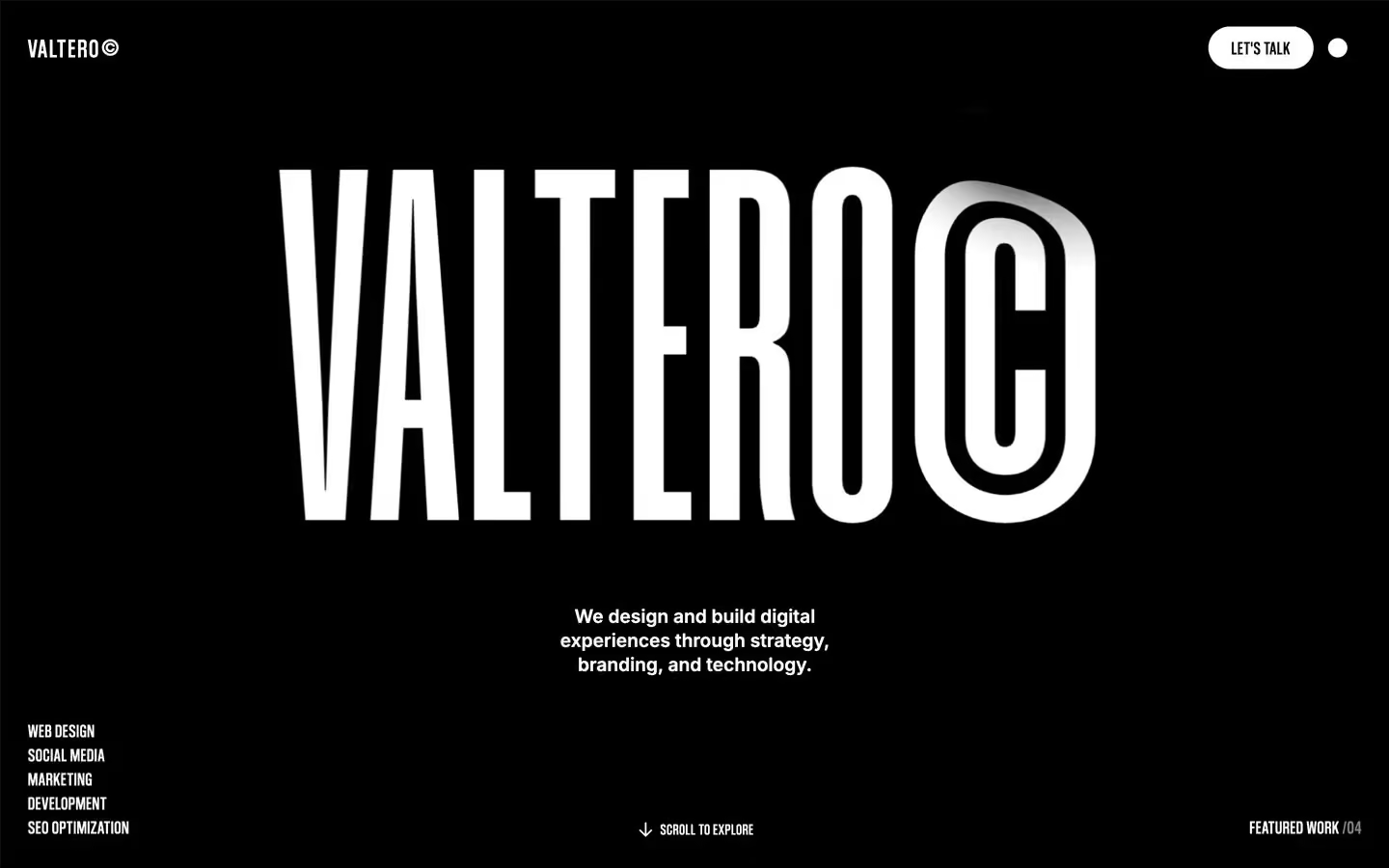
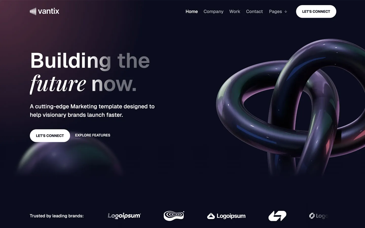
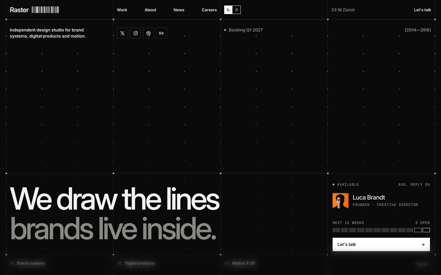

Bring any of them to your AI tool
All Access unlocks all 398 design systems, ready for Claude, ChatGPT, Gemini, Cursor, v0 and Lovable, plus 400+ templates on all 5 platforms.
Get All AccessUpgrade to All AccessHow to use the Qwery design system
Pick a file to see what it’s for and where it goes.
What it is
The whole design system in one markdown file, written for AI: every color, type style, spacing value, component and motion rule, plus do's, don'ts and a ready prompt.
Best for
Claude, ChatGPT, Gemini, Cursor and v0, or any other AI tool that builds pages or code.
How to use it
- Put
DESIGN.mdin your project and mention it in your request, or save it as.cursor/rules/qwery.mdc - For the rule file, start it with a front-matter block that sets
alwaysApply: true, so every chat uses it - Ask: “Build a pricing page using DESIGN.md.” Cursor follows the colors, fonts, spacing and rules
- Put
DESIGN.mdin the project root - Add one line to
CLAUDE.md: “Follow DESIGN.md for all UI.” - Ask for any page or component; Claude reads the file first
- Attach
DESIGN.mdto the chat (or paste it in) - Ask: “Build a landing page in this design system.”
- Keep the file in the chat or project knowledge, so follow-up pages stay on style
What it is
Every token as data, in the W3C Design Tokens format: colors with their roles, type styles, radius, spacing, and component tokens that point at them.
Best for
Figma (Tokens Studio), Style Dictionary and other design-token tools, and build scripts.
How to use it
- In Figma, open Tokens Studio, choose Import, and pick
tokens.json - Or point Style Dictionary’s
sourceat it to generate tokens for any platform - In code, import it like any JSON file
What it is
A Tailwind CSS v4 theme: every color, font, type style, radius and spacing value becomes a Tailwind utility, like bg-canvas, text-headline-lg or rounded-md.
Best for
Tailwind v4 projects, and AI builders that write Tailwind (v0, Lovable, Bolt).
How to use it
- Save
theme.cssnext to your main CSS file - Import it after Tailwind:
@import "tailwindcss"; @import "./theme.css"; - Use the classes:
bg-canvas text-ink rounded-md p-lg
What it is
The same tokens as plain CSS variables on :root. Component values point at the color variables, so changing one color updates everything that uses it.
Best for
Any website: plain CSS, Webflow custom code, Framer, WordPress.
How to use it
- Add it to your stylesheet, or in Webflow paste it into Site settings → Custom code inside a
<style>tag - Use the variables anywhere:
color: var(--color-ink) - Change a token once and every place that uses it follows