 flowmance
Oxpin Design System


Oxpin is a dark, minimal creative-studio template. The page is a blue-black field (#12141D) framed like a viewer: a fixed 85px header with a hairline under it, and an 85px rail down the left edge with a hairline beside it and social icons at the bottom. Inside that frame everything is centred and calm, set in one font at one weight, General Sans 500. Colour is almost absent; the only accent is a pure red (#FF0000) for the button, quote rules and hover states.
Four signatures make it recognisable:
- The hairline frame. A 1px white-10% line runs the full width under the 85px header and the full height beside the 85px left rail. The rail holds Twitter, Instagram, GitHub and Dribbble icons stacked at the bottom.
- Two-tone headlines. Headlines split into a dimmed part and a white part: Meet at 40% above Oxpin in white, Oxpin™ / Branding / Agency, Transform forward / thinking ideas., We specialize in / problem solving. The dim words carry the setup, the white words the point.
- One weight, large sizes. Everything is General Sans 500 with normal tracking, from the 150px hero down to 14px. Hierarchy comes from size and opacity only.
- Charcoal cards with centred captions. #191C27 cards with a 5px radius, an inset 1.6:1 screenshot and a centred 20px caption at 50% white (Home 1, Work 3, Blog 3).
Colors
Surfaces
#12141D--black: page, footer, menu overlay; the header and rail have no fill and show it through
#191C27--black-2: preview and content cards
#222635--black-3: a raised step on a card
Ink
#FFFFFFText on primary
#FFFFFFHeadlines, section titles, the white half of two-tone lines
#FFFFFF · 40%Paragraphs (p default), the hero subline, the dim half of two-tone headlines (the live hero dims Meet with opacity 0.4, which looks the same)
#FFFFFF · 50%Card captions, input text and placeholders
#FFFFFF · 30%Footer links
#FFFFFF · 70%Inline text links; .lighter-text is 65%
#FFFFFF · 80%The Menu toggle
#FFFFFFAction
#FF0000Contact Us, Send Message
#1D2030Button background on hover; text stays white
#FF0000--red: footer link hover, 2px blockquote rule, small tags and play buttons in the layouts
Lines & effects
#FFFFFF · 10%Header and rail hairlines
Typography
General Sans · display-hero
The quick brown fox jumpsMeet / Oxpin on the home hero. 150px · 500 · 1
General Sans · headline-lg
The quick brown fox jumps.title-5 large page titles. 60px · 500 · 1.1
General Sans · title-lg
The quick brown fox jumpsSection titles: Homepage, Work, Blog, Company. 28px · 500 · 1.3
General Sans · body-lg
The quick brown fox jumpsHero subline at 40%. 21px · 500 · 1.3
General Sans · label-link
The quick brown fox jumpsFooter links at 30%. 18px · 500 · 1.11
General Sans · micro
The quick brown fox jumpsBody default. 14px · 500 · 1.43
Spacing & shape
| Purpose | Value |
|---|---|
| Container | max 1100px, centred, a flex column with centred items |
| Section rhythm | .section is 110px top and bottom with 5% sides, 80px at ≤991 and 60px at ≤479 |
| Section title | title-lg, left-aligned with the grid, about 50px above the cards |
| Breakpoints | 991px, 767px and 479px, plus min-width: 768px rules |
Spacing scale
| Token | Value | Preview |
|---|---|---|
xs | 10px | |
sm | 15px | |
md | 20px | |
lg | 30px | |
xl | 50px | |
2xl | 70px |
Layout spacing
| Token | Value | Preview |
|---|---|---|
gutter | 72px | |
rail | 85px | |
header | 85px | |
hero-top | 90px | |
section | 110px |
Border radius
Surfaces
How the surfaces stack, from the page background up. Hex codes and roles are in Colors above.
Motion
| Fade-up reveal | opacity 0 → 1 and y 30px → 0, 500ms outExpo, on scroll into view |
| Page-load fade | opacity 0 → 1, 1000ms outQuart |
| Scroll parallax | Elements move y ±50px to ±100px while in view (scroll-linked) |
| Mouse drift | Small x/y ±5px and y 10px moves following the cursor, 500ms |
| Menu open | Size and opacity changes, 300–500ms ease; menu link backgrounds appear on hover |
| Pop-in | scale 0 → 1, 500ms |
| Button hover | background-color to #1D2030, 300ms |
| Link hover | Colour to red, or underline |
Do’s and don’ts
- Frame the page with a fixed 85px header and an 85px left rail, each edged by a 1px #FFFFFF1A hairline.
- Use General Sans 500 for everything and get hierarchy from size and white alpha.
- Split headlines into a 40% part and a white part.
- Put content on #191C27 cards with a 5px radius and square-cornered images.
- Use the red #FF0000 button (4px radius, 50px tall) for the single main action, going to #1D2030 on hover.
- Turn footer links red on hover.
- Use other weights, uppercase type or letter spacing.
- Add colours besides red, or use red for large backgrounds.
- Put small text in ink-faint (30%, about 2.7:1) or ink-muted (40%, about 3.8:1) and expect it to read. Keep 30% for 18px footer links only, and keep 40% body text at 18px or larger.
- Put text smaller than 17px on the red button; white on #FF0000 is about 4:1, so keep labels at 17px weight 500 or larger.
- Round images or use radii above 5px on cards.
- Copy the blue Explore More Templates band; it is vendor promotion.
Example prompt
Any page in the Oxpin style
More design systems like this
Agency design systems, the same colors first.
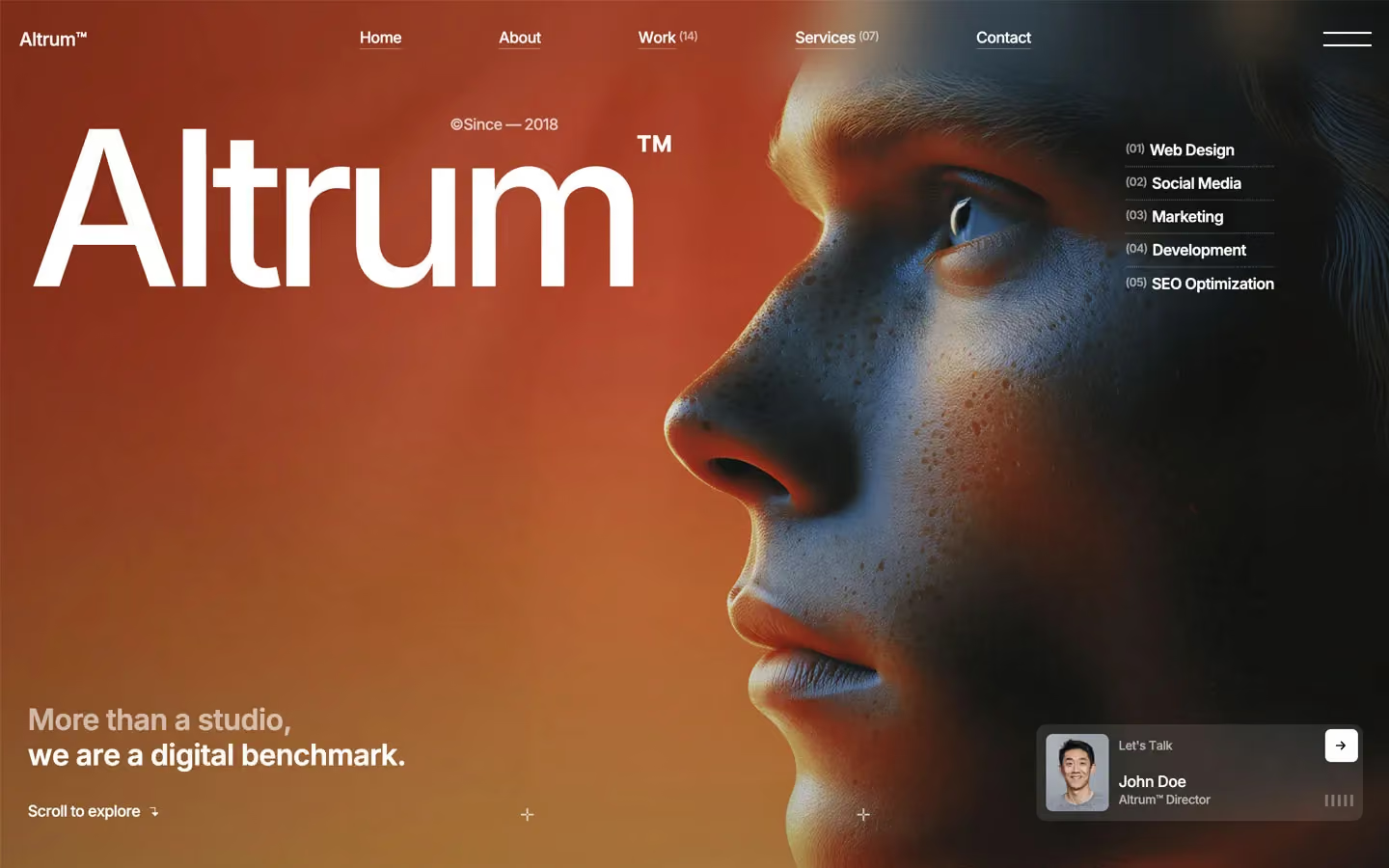
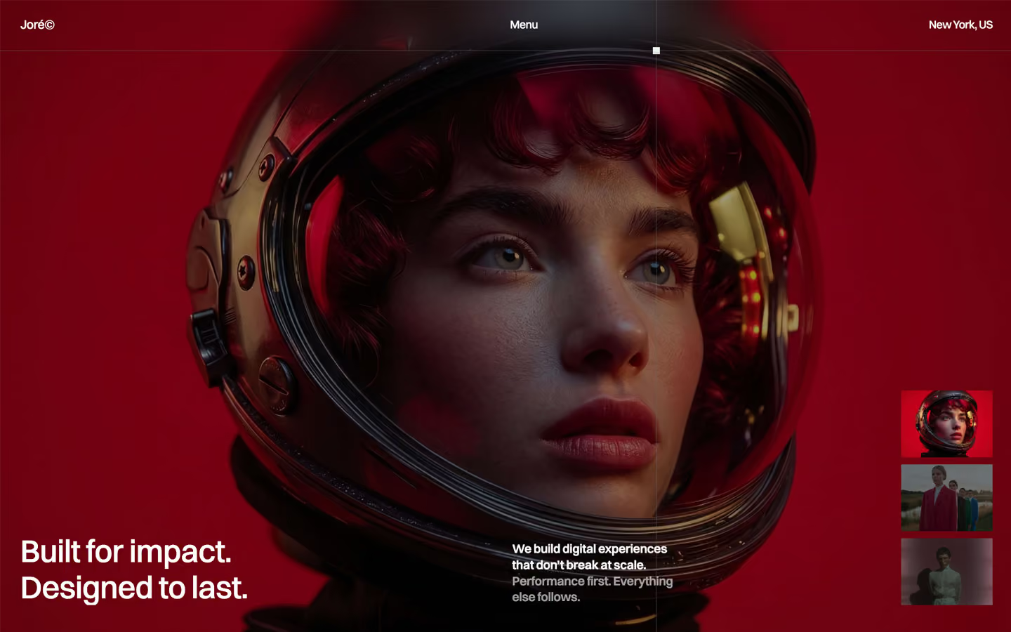


Bring any of them to your AI tool
All Access unlocks all 398 design systems, ready for Claude, ChatGPT, Gemini, Cursor, v0 and Lovable, plus 400+ templates on all 5 platforms.
Get All AccessUpgrade to All AccessHow to use the Oxpin design system
Pick a file to see what it’s for and where it goes.
What it is
The whole design system in one markdown file, written for AI: every color, type style, spacing value, component and motion rule, plus do's, don'ts and a ready prompt.
Best for
Claude, ChatGPT, Gemini, Cursor and v0, or any other AI tool that builds pages or code.
How to use it
- Put
DESIGN.mdin your project and mention it in your request, or save it as.cursor/rules/oxpin.mdc - For the rule file, start it with a front-matter block that sets
alwaysApply: true, so every chat uses it - Ask: “Build a pricing page using DESIGN.md.” Cursor follows the colors, fonts, spacing and rules
- Put
DESIGN.mdin the project root - Add one line to
CLAUDE.md: “Follow DESIGN.md for all UI.” - Ask for any page or component; Claude reads the file first
- Attach
DESIGN.mdto the chat (or paste it in) - Ask: “Build a landing page in this design system.”
- Keep the file in the chat or project knowledge, so follow-up pages stay on style
What it is
Every token as data, in the W3C Design Tokens format: colors with their roles, type styles, radius, spacing, and component tokens that point at them.
Best for
Figma (Tokens Studio), Style Dictionary and other design-token tools, and build scripts.
How to use it
- In Figma, open Tokens Studio, choose Import, and pick
tokens.json - Or point Style Dictionary’s
sourceat it to generate tokens for any platform - In code, import it like any JSON file
What it is
A Tailwind CSS v4 theme: every color, font, type style, radius and spacing value becomes a Tailwind utility, like bg-canvas, text-headline-lg or rounded-md.
Best for
Tailwind v4 projects, and AI builders that write Tailwind (v0, Lovable, Bolt).
How to use it
- Save
theme.cssnext to your main CSS file - Import it after Tailwind:
@import "tailwindcss"; @import "./theme.css"; - Use the classes:
bg-canvas text-ink rounded-md p-lg
What it is
The same tokens as plain CSS variables on :root. Component values point at the color variables, so changing one color updates everything that uses it.
Best for
Any website: plain CSS, Webflow custom code, Framer, WordPress.
How to use it
- Add it to your stylesheet, or in Webflow paste it into Site settings → Custom code inside a
<style>tag - Use the variables anywhere:
color: var(--color-ink) - Change a token once and every place that uses it follows