 flowmance
Oplift Design System


Oplift is a dark, confident creative-agency site. It sits on pure black, with #181818 bands: white Onest in weight 600 with a slight −0.3px tracking, generous 120px section spacing, and big saturated imagery (abstract fluid renders, bright product shots) that carries all the colour. Layouts are mostly centred and symmetrical, with a few deliberate offsets.
Four signatures make it recognisable:
- The shrinking wordmark. A huge white wordmark (about 330px wide) sits centred at the top of the hero and shrinks to about 100px in the fixed nav as you scroll. The nav has no background, so content passes under it.
- Split hero with a manifesto. The left half is a full-bleed abstract render (red, violet, magenta waves); the right half is a quoted statement in 50px weight 600 ("Design, in our view, is the driving force behind business success.") above a 140px white circle button (Work with us).
- Three-part nav. Left: tagline A creative agency based in Helsinki at 70%, the email and Cart [0] stacked. Centre: the wordmark. Right: four links; their 2px white underline is not visible at rest in the screenshots.
- Staggered centred work grid. Two columns of square images (500px), the right column dropped about 140px, each with a centred title-lg name and a muted category below.
Oplift is a dark-only design.
Colors
Surfaces
#000000Page background (variable --black)
#181818The team-skills band, the CTA band, input fields (variable --black-2); the skills band also uses linear-gradient(68deg, #000, #181818)
#181818Inputs
#999999Placeholder text on field
Ink
#000000Text on primary
#FFFFFFHeadlines, nav, names, active rows
#FFFFFF · 70%Paragraphs (p { opacity: .7 }), inactive award rows, categories, the nav tagline
#8F8F8FRoles (Webflow Founder), footer link hover (variable --grey)
#747474List items (li, variable --dim-grey)
#FFFFFFAction
#FFFFFFPill buttons, the circle button, tags, the UP button
#181818Pill-button hover fill, with white text
Lines & effects
#181818 · 81%Testimonial cards
#FFFFFF2px nav underlines, skill bars, the 1px award rule and circle-button border
#FFFFFF · 40%Inactive slider dots
Typography
Onest · headline-xl
The quick brown fox jumpsSection titles: Selected work, What they think, Our team skills. 64px · 600 · 1.2 · -0.3px
Onest · display-metric
The quick brown fox jumpsFun-fact numbers (four columns). 53px · 600 · 0.94 · -0.3px
Onest · title-lg
The quick brown fox jumpsWork titles (Ivor Application); blog titles use line height 1.2. 27px · 600 · 1.5 · -0.3px
Onest · body-xl
The quick brown fox jumpsAbout lead (We believe that the human dimensions…) at 70%. 26px · 500 · 1.3 · -0.3px
Onest · label
The quick brown fox jumpsPill buttons, testimonial names. 19px · 600 · 1.4 · -0.3px
Onest · caption
The quick brown fox jumpsBody default, small meta. 14px · 400 · 1.43 · -0.3px
Spacing & shape
| Purpose | Value |
|---|---|
| Container | max 1200px, centred |
| Section rhythm | 120px top and bottom (.section { padding: 120px 5% }), 60px at ≤991px; the CTA band uses 100px (70px at ≤991px) |
| Breakpoints | 991px, 767px and 479px, plus min-width 768px and 1440px steps |
Spacing scale
| Token | Value | Preview |
|---|---|---|
xs | 5px | |
sm | 15px | |
md | 20px | |
lg | 30px | |
xl | 50px | |
2xl | 60px | |
3xl | 100px |
Layout spacing
| Token | Value | Preview |
|---|---|---|
nav-pad | 30px | |
gutter | 72px | |
section-cta | 100px | |
section | 120px | |
circle-button | 140px | |
hero-top | 220px |
Border radius
Surfaces
How the surfaces stack, from the page background up. Hex codes and roles are in Colors above.
Motion
| Fade in | opacity 0 → 1, 1000ms outQuart |
| Slide in | From x ±80px or y ±80px to 0, 500ms, settling with 1000ms outQuart |
| Text rise | y 110% → 0%, 500ms ease, inside an overflow mask |
| Scroll parallax | Work images drift y ±100px while in view |
| Wordmark shrink | Logo size change, 500ms, on page scroll |
| Skill bars | Width grows to the percentage, 500ms ease |
| Hover pop | scale 1 → 1.1, 100ms ease, and back |
| Buttons and links | all .2s; slider transform .5s |
Do’s and don’ts
- Keep the canvas pure #000000, with #181818 for bands and fields only.
- Set all text in Onest with −0.3px tracking: 600 for headings and labels, 500 for paragraphs.
- Use white #FFFFFF at 70% for secondary text instead of greys.
- Use white pills (40px radius, 57px tall) and the 140px circle button for actions; nothing else is filled.
- Keep photos square-cornered and full colour.
- Centre most section titles (Our team skills is left-aligned in its band) and work captions; offset the second work column downward.
- Use ink-subtle (#8F8F8F) or ink-faint (#747474) for paragraphs; keep them for roles, list items and hover states at 17px+.
- Add an accent colour, coloured buttons or gradients beyond the one 68° black-to-#181818 band.
- Add drop shadows; use the frosted 81% #181818 card when something must float.
- Round images or use radii outside the set (3, 9, 20, 40px and circles).
- Give the nav a background bar; it floats on the page.
- Use Inter Tight or Melodrama, even though the CSS mentions them.
Example prompt
Any page in the Oplift style
More design systems like this
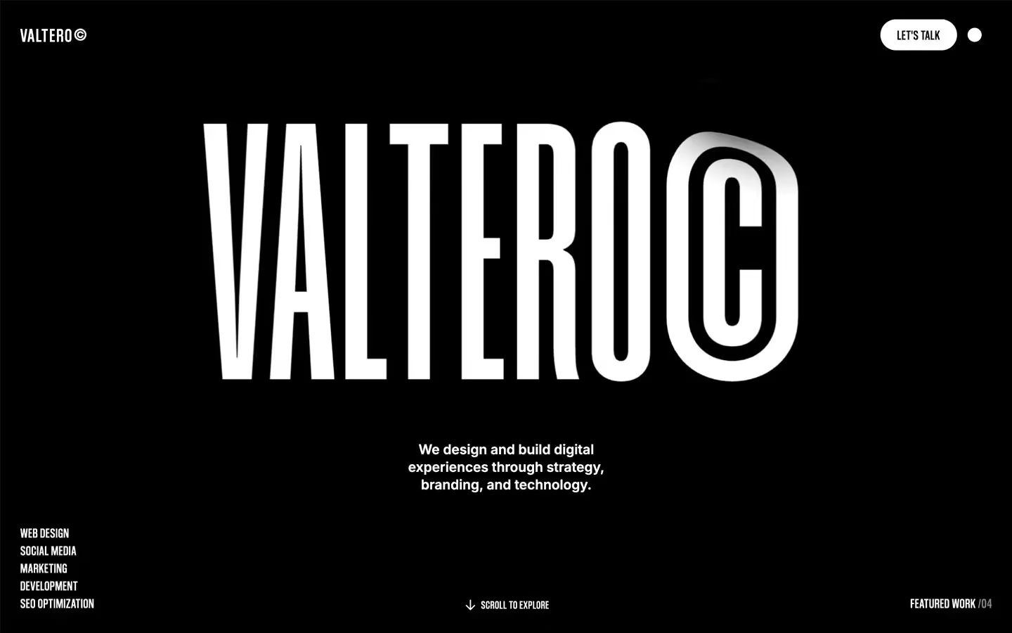
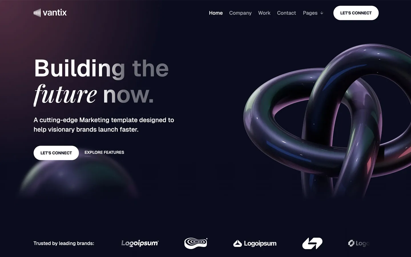
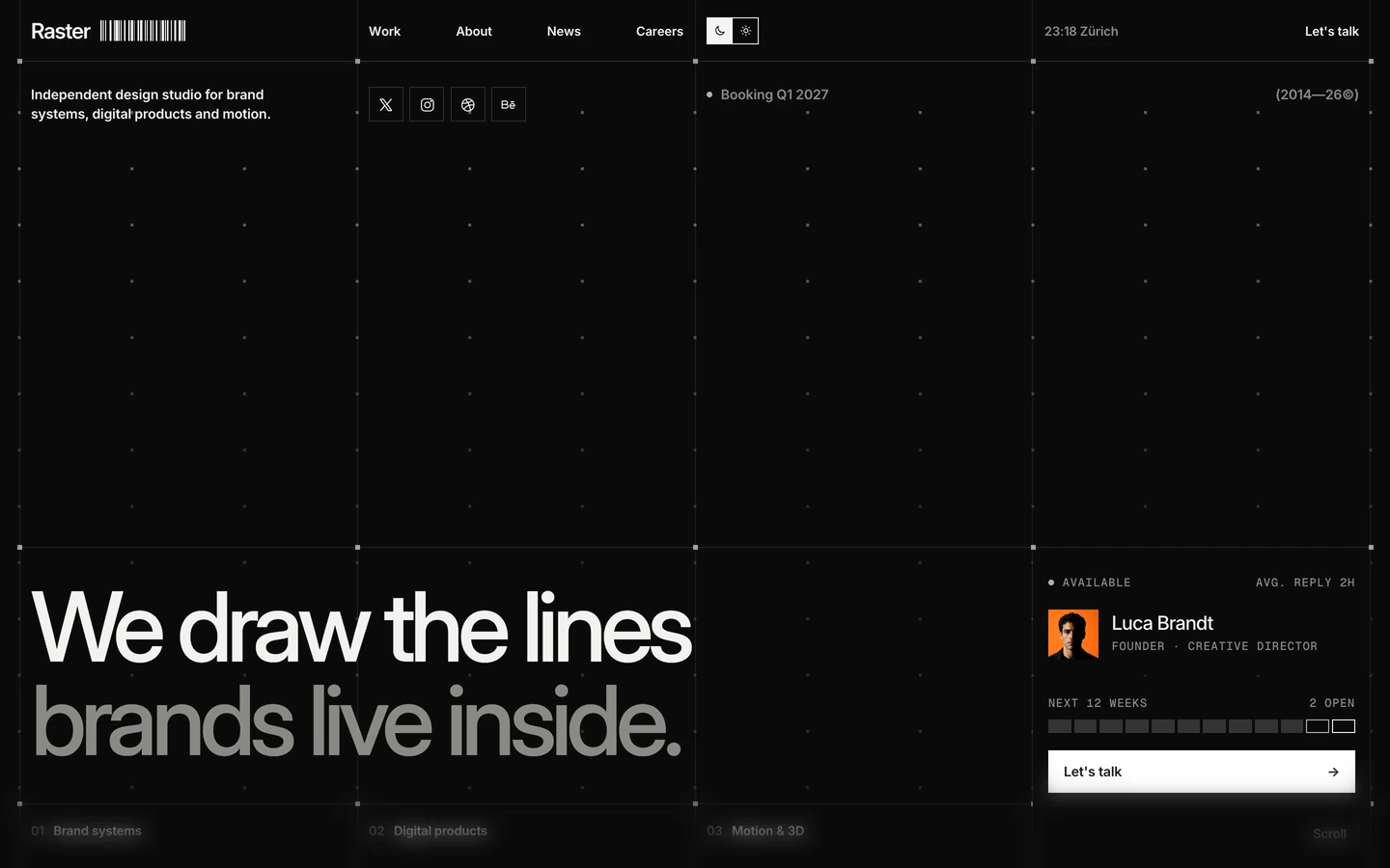
Agency design systems, the same colors first.

Bring any of them to your AI tool
All Access unlocks all 398 design systems, ready for Claude, ChatGPT, Gemini, Cursor, v0 and Lovable, plus 400+ templates on all 5 platforms.
Get All AccessUpgrade to All AccessHow to use the Oplift design system
Pick a file to see what it’s for and where it goes.
What it is
The whole design system in one markdown file, written for AI: every color, type style, spacing value, component and motion rule, plus do's, don'ts and a ready prompt.
Best for
Claude, ChatGPT, Gemini, Cursor and v0, or any other AI tool that builds pages or code.
How to use it
- Put
DESIGN.mdin your project and mention it in your request, or save it as.cursor/rules/oplift.mdc - For the rule file, start it with a front-matter block that sets
alwaysApply: true, so every chat uses it - Ask: “Build a pricing page using DESIGN.md.” Cursor follows the colors, fonts, spacing and rules
- Put
DESIGN.mdin the project root - Add one line to
CLAUDE.md: “Follow DESIGN.md for all UI.” - Ask for any page or component; Claude reads the file first
- Attach
DESIGN.mdto the chat (or paste it in) - Ask: “Build a landing page in this design system.”
- Keep the file in the chat or project knowledge, so follow-up pages stay on style
What it is
Every token as data, in the W3C Design Tokens format: colors with their roles, type styles, radius, spacing, and component tokens that point at them.
Best for
Figma (Tokens Studio), Style Dictionary and other design-token tools, and build scripts.
How to use it
- In Figma, open Tokens Studio, choose Import, and pick
tokens.json - Or point Style Dictionary’s
sourceat it to generate tokens for any platform - In code, import it like any JSON file
What it is
A Tailwind CSS v4 theme: every color, font, type style, radius and spacing value becomes a Tailwind utility, like bg-canvas, text-headline-lg or rounded-md.
Best for
Tailwind v4 projects, and AI builders that write Tailwind (v0, Lovable, Bolt).
How to use it
- Save
theme.cssnext to your main CSS file - Import it after Tailwind:
@import "tailwindcss"; @import "./theme.css"; - Use the classes:
bg-canvas text-ink rounded-md p-lg
What it is
The same tokens as plain CSS variables on :root. Component values point at the color variables, so changing one color updates everything that uses it.
Best for
Any website: plain CSS, Webflow custom code, Framer, WordPress.
How to use it
- Add it to your stylesheet, or in Webflow paste it into Site settings → Custom code inside a
<style>tag - Use the variables anywhere:
color: var(--color-ink) - Change a token once and every place that uses it follows