 flowmance
Montoia Design System

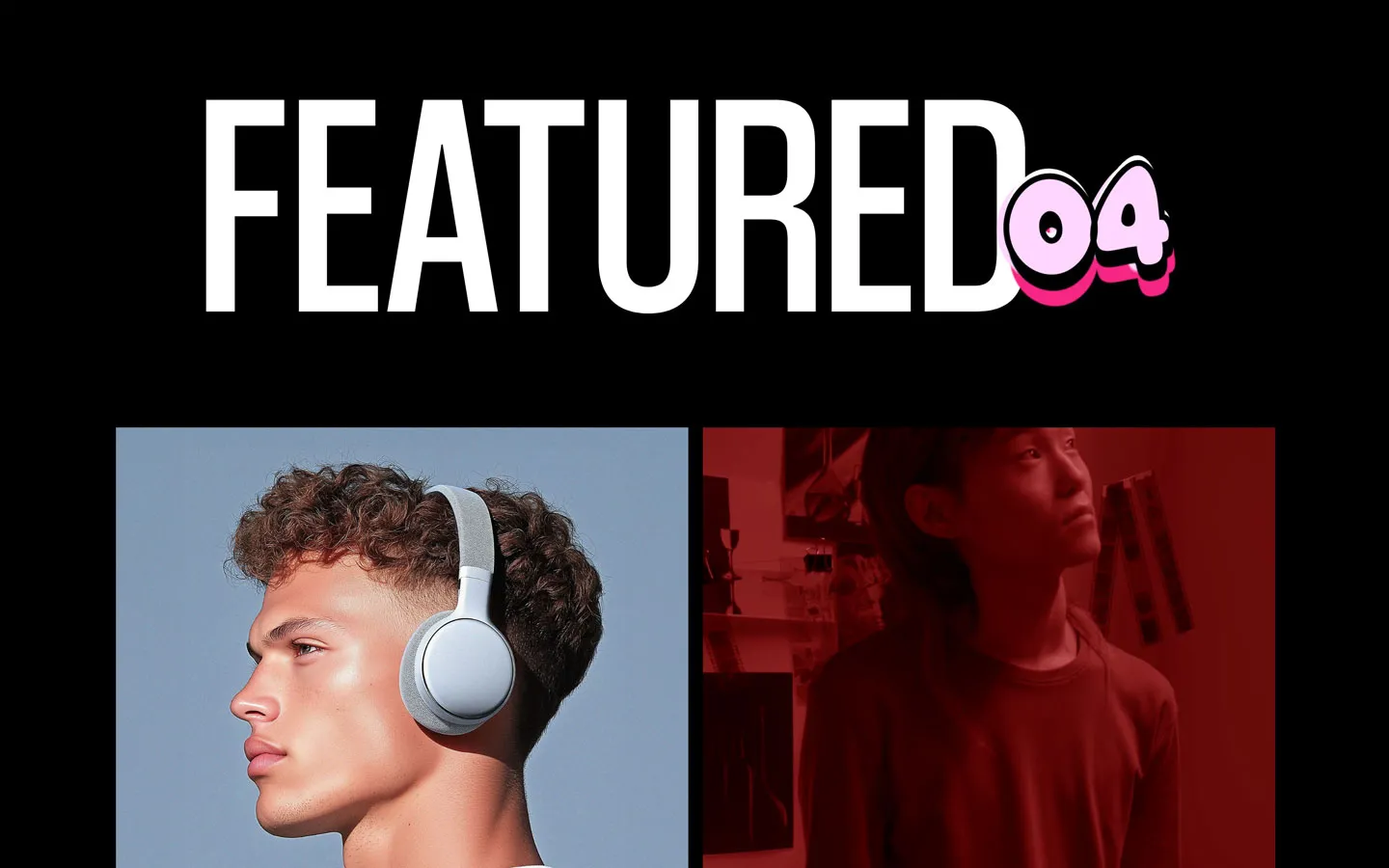
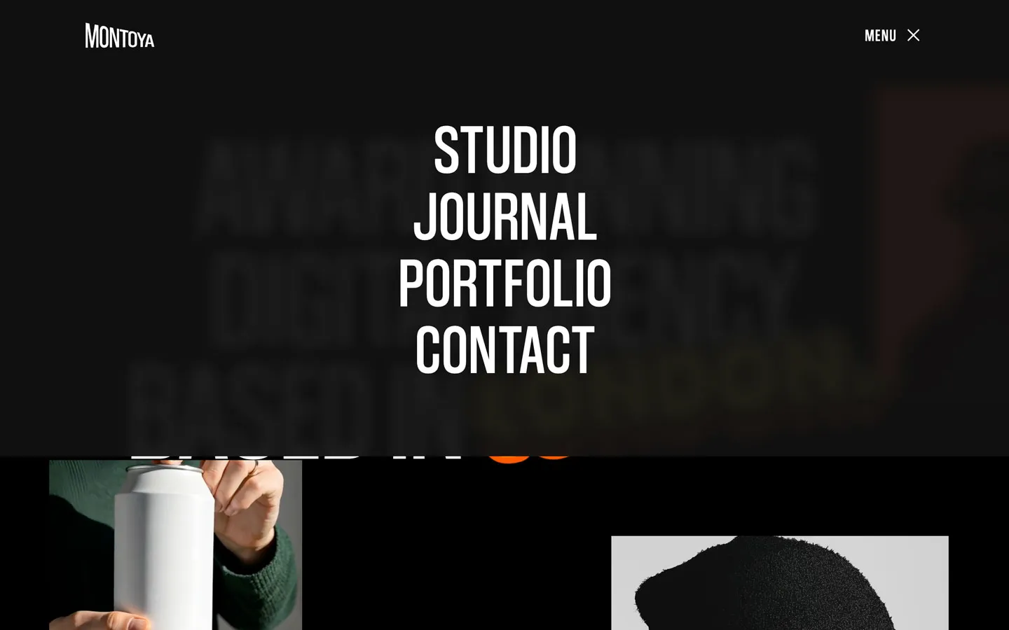
Montoia is a loud, poster-style agency site on pure black. Everything shouts in tall, narrow uppercase Coolvetica Condensed, set at 140–200px with line height 0.8 so the lines almost touch. Photos float around the hero at odd positions and sizes, and one word, LONDON., is a bubbly yellow cartoon sticker. Body text is a calm Instrument Sans. The mix of poster type, playful sticker and fashion photography makes it feel like a streetwear lookbook. The brand name shown in the template itself is Montoya (logo, quotes); the product is sold as Montoia.
Four signatures make it recognisable:
- Towering condensed uppercase. Coolvetica Condensed at 200px (hero) and 140px (section titles), weight 400, line height 0.8, all caps, centred.
- The sticker word. One word in Super Easy, a puffy display face, in yellow #FFEA00 with stacked orange copies behind it, tilted and overlapping the headline (LONDON.).
- Floating photo collage. Square-cornered images scattered around the hero, partly off-canvas and moving slightly with the cursor.
- Dark pill labels. Content sections open with a small #181818 pill (WHAT WE DO, TESTIMONIALS, CLIENTS) above the giant title.
Montoia is a dark-only design.
Colors
Surfaces
#000000Page background (CSS var --black)
#181818Service cards, eyebrow pills, round buttons, button hover (--black-2)
#FFFFFF · 40%Input borders
Ink
#000000Text on primary
#FFFFFFText on primary-hover
#FFFFFFHeadlines, labels, links
#FFFFFF · 85%Paragraphs (p colour #FFFFFFD9)
#FFFFFF · 70%List items (li), on inner pages
#FFFFFF · 60%Small meta like Lead Designer, Flowmance
#000000#FFFFFFAction
#FFFFFFPill buttons
#181818Button hover (measured :hover)
#FFEA00The sticker word only (--yellow)
#FF8800Variables for the orange layers behind the sticker
#FF5900Variables for the orange layers behind the sticker
#E60004Cart remove button
Lines & effects
#111111 · 94%Full-screen menu
#FFFFFF · 50%Input placeholders
#2424241px borders around testimonial author blocks (9 uses)
#FFFFFF · 25%Footer divider (0.5px)
#FFFFFF · 36%1px underline under menu links
Typography
Coolvetica Condensed · display-hero · shown in Oswald (fallback)
The quick brown fox jumpsHero h1 AWARD WINNING DIGITAL AGENCY BASED IN (.title-1). 200px · 400 · 0.8
Coolvetica Condensed · headline-xl · shown in Oswald (fallback)
The quick brown fox jumpsSection titles (PREMIUM SERVICES TAILORED TO YOUR NEEDS). 140px · 400 · 0.8
Coolvetica Condensed · title-lg · shown in Oswald (fallback)
The quick brown fox jumpsService card titles (.high-title). 34px · 400 · 1.0 · 1px
Coolvetica Condensed · label-menu · shown in Oswald (fallback)
The quick brown fox jumpsMENU + trigger. 24px · 400 · 1.1 · 2px
Coolvetica Condensed · eyebrow · shown in Oswald (fallback)
The quick brown fox jumpsPill labels (.small-text). 18px · 400 · 1.1 · 1px
Instrument Sans · body
The quick brown fox jumpsParagraphs at 85%. 18px · 500 · 1.3
Spacing & shape
| Purpose | Value |
|---|---|
| Container | .container max 1200px, centred; some blocks use 90% width |
| Section rhythm | .section is 120px top and bottom with 5% sides (72px at 1440), 80px at ≤991 and 60px at ≤479 |
| Section header | a centred eyebrow pill, then a centred 2-line display title about 50px below |
| Breakpoints | 991px, 767px and 479px (479px has the most rules), plus a min-width: 768px set |
Spacing scale
| Token | Value | Preview |
|---|---|---|
xs | 10px | |
sm | 15px | |
md | 16px | |
lg | 30px | |
xl | 50px | |
2xl | 120px |
Layout spacing
| Token | Value | Preview |
|---|---|---|
column-gap | 15px | |
section-side | 72px | |
section | 120px | |
hero-top | 180px | |
section-first | 240px |
Border radius
Surfaces
How the surfaces stack, from the page background up. Hex codes and roles are in Colors above.
Motion
| Text roll (links, menu, footer) | Label inside an overflow mask moves y 0 → 110% over 500ms, the copy comes back → 0% over 400ms outCubic |
| Button hover | CSS transition: all .3s, white to #181818 and black to white text |
| Menu open | Overlay height 0 → full, size 500ms ease; + rotates over 300ms ease |
| Underline | width change, 300–400ms (ease, outCubic) |
| Image reveal | scale 1.3 → 1, 500ms |
| Scroll-in | opacity 0 → 1 and move to 0px, 1000ms outQuart |
| Parallax | y −100px while scrolling in view |
| Cursor drift | Mouse move interactions move hero photos by x ±10px and y ±5–10px |
| Nav on scroll | Scroll up / down show and hide the nav |
Do’s and don’ts
- Set every heading, label and button in Coolvetica Condensed 400 uppercase, with line height 0.8 at display sizes.
- Keep the page pure black #000000 with #181818 for cards and pills.
- Open content sections with a #181818 pill (30px radius, padding 12px 20px) above a centred display title.
- Keep cards and images square (0px radius); round only buttons, pills and inputs.
- Use one Super Easy sticker word in #FFEA00 per page, overlapping a headline.
- Set paragraphs in Instrument Sans 18px 500 at white 85%.
- Use yellow #FFEA00 or the oranges for buttons, links or backgrounds.
- Set Coolvetica in lower case or use it for long paragraphs.
- Add shadows, gradients on UI, or rounded cards.
- Use the declared but unloaded Coolvetica cuts (Compressed, Crammed, Italic).
- Shrink display titles below about 100px on desktop; the scale contrast with 18px body text is the style.
- Use more than one sticker word in a view; it stops being a surprise.
Example prompt
Any page in the Montoia style
More design systems like this
Agency design systems, the same colors first.


Bring any of them to your AI tool
All Access unlocks all 398 design systems, ready for Claude, ChatGPT, Gemini, Cursor, v0 and Lovable, plus 400+ templates on all 5 platforms.
Get All AccessUpgrade to All AccessHow to use the Montoia design system
Pick a file to see what it’s for and where it goes.
What it is
The whole design system in one markdown file, written for AI: every color, type style, spacing value, component and motion rule, plus do's, don'ts and a ready prompt.
Best for
Claude, ChatGPT, Gemini, Cursor and v0, or any other AI tool that builds pages or code.
How to use it
- Put
DESIGN.mdin your project and mention it in your request, or save it as.cursor/rules/montoia.mdc - For the rule file, start it with a front-matter block that sets
alwaysApply: true, so every chat uses it - Ask: “Build a pricing page using DESIGN.md.” Cursor follows the colors, fonts, spacing and rules
- Put
DESIGN.mdin the project root - Add one line to
CLAUDE.md: “Follow DESIGN.md for all UI.” - Ask for any page or component; Claude reads the file first
- Attach
DESIGN.mdto the chat (or paste it in) - Ask: “Build a landing page in this design system.”
- Keep the file in the chat or project knowledge, so follow-up pages stay on style
What it is
Every token as data, in the W3C Design Tokens format: colors with their roles, type styles, radius, spacing, and component tokens that point at them.
Best for
Figma (Tokens Studio), Style Dictionary and other design-token tools, and build scripts.
How to use it
- In Figma, open Tokens Studio, choose Import, and pick
tokens.json - Or point Style Dictionary’s
sourceat it to generate tokens for any platform - In code, import it like any JSON file
What it is
A Tailwind CSS v4 theme: every color, font, type style, radius and spacing value becomes a Tailwind utility, like bg-canvas, text-headline-lg or rounded-md.
Best for
Tailwind v4 projects, and AI builders that write Tailwind (v0, Lovable, Bolt).
How to use it
- Save
theme.cssnext to your main CSS file - Import it after Tailwind:
@import "tailwindcss"; @import "./theme.css"; - Use the classes:
bg-canvas text-ink rounded-md p-lg
What it is
The same tokens as plain CSS variables on :root. Component values point at the color variables, so changing one color updates everything that uses it.
Best for
Any website: plain CSS, Webflow custom code, Framer, WordPress.
How to use it
- Add it to your stylesheet, or in Webflow paste it into Site settings → Custom code inside a
<style>tag - Use the variables anywhere:
color: var(--color-ink) - Change a token once and every place that uses it follows