 flowmance
Meteor Design System


Meteor is a dark product-marketing site that feels like a polished SaaS launch page. Everything sits on pure black, type is Inter Tight semibold at every size, and a single royal blue (#3C5CCF) marks every action and most small headings. Photography and 3D renders in rounded 20px frames carry the colour; the interface stays black, near-black and white.
Signatures that make it recognisable:
- Two-tone statements. Big sentences start in white and finish in grey: the hero lead Use Meteor's interactive design tools. is white and It's ton of customization options… runs on at 70%; the centred quote "If you think good design is expensive, is white and the second half is greyed out.
- Blue small print. Eyebrows above headings (Crafted with love, What we do, Let's make some magic together) and *Join over 7,000 satisfied customers. are set in 17px blue; the one exception is the grey Tesitmonials eyebrow above What they us.
- Small, square-ish buttons. The main button is a 56px tall blue block with only a 6px radius and a text arrow: Try for free ->. Only the subscribe button becomes a 50px pill.
- Candy gradients. Four tag colours (green #3CCF91, violet #5032C1, pink #FF6996, orange #FBB348) appear as blog category chips and as 45° gradients on the stat cards, the only place the UI leaves greyscale besides blue.
Meteor is a dark-only design.
Colors
Surfaces
#000000Page background (--black)
#111111Alternating section gray bands (work, contact)
#171717Testimonial cards, the subscribe input, the Top button
#222222Contact inputs, secondary button, dropdown hover
#222222Contact inputs / the rounded subscribe input
#171717With field: Contact inputs / the rounded subscribe input
#FFFFFFThe small white New clients 1,479 card on the hero photo
Ink
#FFFFFFText on primary
#FFFFFF#FFFFFFHeadlines, names, the first half of two-tone sentences
#FFFFFF · 70%Paragraphs (p default), nav links, the greyed half of statements
#FFFFFF · 50%Small meta: testimonial roles, placeholders, type-text
#747474Form field labels only
#FFFFFFAction
#3C5CCFMain buttons, project tags, top-text pills, eyebrows (accent)
#222222Fill of .button on hover
#222222The dark button Free trial available ->
#3C5CCFLines & effects
#3CCF91Blog category chips and stat-card gradients
#5032C1Blog category chips and stat-card gradients
#FF6996Blog category chips and stat-card gradients
#FBB348Blog category chips and stat-card gradients
Typography
Inter Tight · display-hero
The quick brown fox jumpsHero h1 Develop rapid websites in minutes. 64px · 600 · 1.2
Inter Tight · headline-quote
The quick brown fox jumpsCentred quote, white then grey. 48px · 600 · 1.2
Inter Tight · title-lg
The quick brown fox jumpsBlog card titles (fade to 60% on hover). 27px · 600 · 1.2
Inter Tight · body-lg
The quick brown fox jumpsHero lead, two-tone. 24px · 600 · 1.4
Inter Tight · label-nav
The quick brown fox jumpsNav links. 18px · 600 · 1.11
Inter Tight · eyebrow
The quick brown fox jumpsSmall headings above section titles. 17px · 600 · 1.3
Spacing & shape
| Purpose | Value |
|---|---|
| Container | max 1200px, centred |
| Section rhythm | 120px top and bottom on every band (60px at ≤991); the footer uses 60px 5% 30px |
| Breakpoints | 991px, 767px and 479px, plus min-width: 768px and 1440px steps |
Spacing scale
| Token | Value | Preview |
|---|---|---|
xs | 5px | |
sm | 10px | |
md | 15px | |
lg | 20px | |
xl | 25px | |
2xl | 30px | |
3xl | 60px | |
4xl | 100px |
Layout spacing
| Token | Value | Preview |
|---|---|---|
section | 120px | |
grid-wide | 130px |
Border radius
Surfaces
How the surfaces stack, from the page background up. Hex codes and roles are in Colors above.
Motion
| Nav text roll | The label moves y 0% → −100% while a copy rises 100% → 0%, 300ms ease, inside a 20px overflow-hidden box |
| Nav underline | 2px white line, size change 300ms ease on hover, back on mouse-out |
| Slide-in on scroll | x ±80px or y ±80px → 0, 500ms, with opacity; used on the split blocks and cards |
| Text rise | y 110% → 0%, 500ms ease, line by line inside a mask |
| Heading wipe | A black heading-overlay block starts at translate(-100%) and sweeps across the heading (500ms to x 0%, then 400ms ease to x 200%) |
| Page load fade | opacity 0 → 1, 1000ms outQuart |
| Icon hover pop | scale 1 → 1.1, 100ms ease, and back |
| Chevron / icon rotate | 200–300ms ease |
| Buttons | transition: all .2s (fill to #222222) |
| Blog title / tag hover | Opacity to 60% (300ms) / 76% |
Do’s and don’ts
- Keep the page on #000000 and alternate bands with #111111.
- Use #3C5CCF for every primary action and for eyebrows (the template has one grey exception); nothing else is blue.
- Set paragraphs at white 70% (#FFFFFFB3) in 19px/600, and meta at 50%.
- Write big statements two-tone: the first clause in ink, the rest in ink-muted.
- Use 6px radius on buttons and 20px on cards and images.
- End button labels with ->.
- Use the tag colours (#3CCF91, #5032C1, #FF6996, #FBB348) for buttons or text; they belong on chips and gradient stat cards.
- Add borders, divider lines or heavy shadows.
- Use weights below 500 or above 700, or add letter spacing to body text.
- Put blue #3C5CCF text below 17px semibold; it is only 3.6:1 on black.
- Use #747474 (ink-faint) for anything but 15px+ semibold form labels; it is just under 4.5:1 on black.
- Round buttons into pills, except the subscribe button inside its pill input.
Example prompt
Any page in the Meteor style
More design systems like this
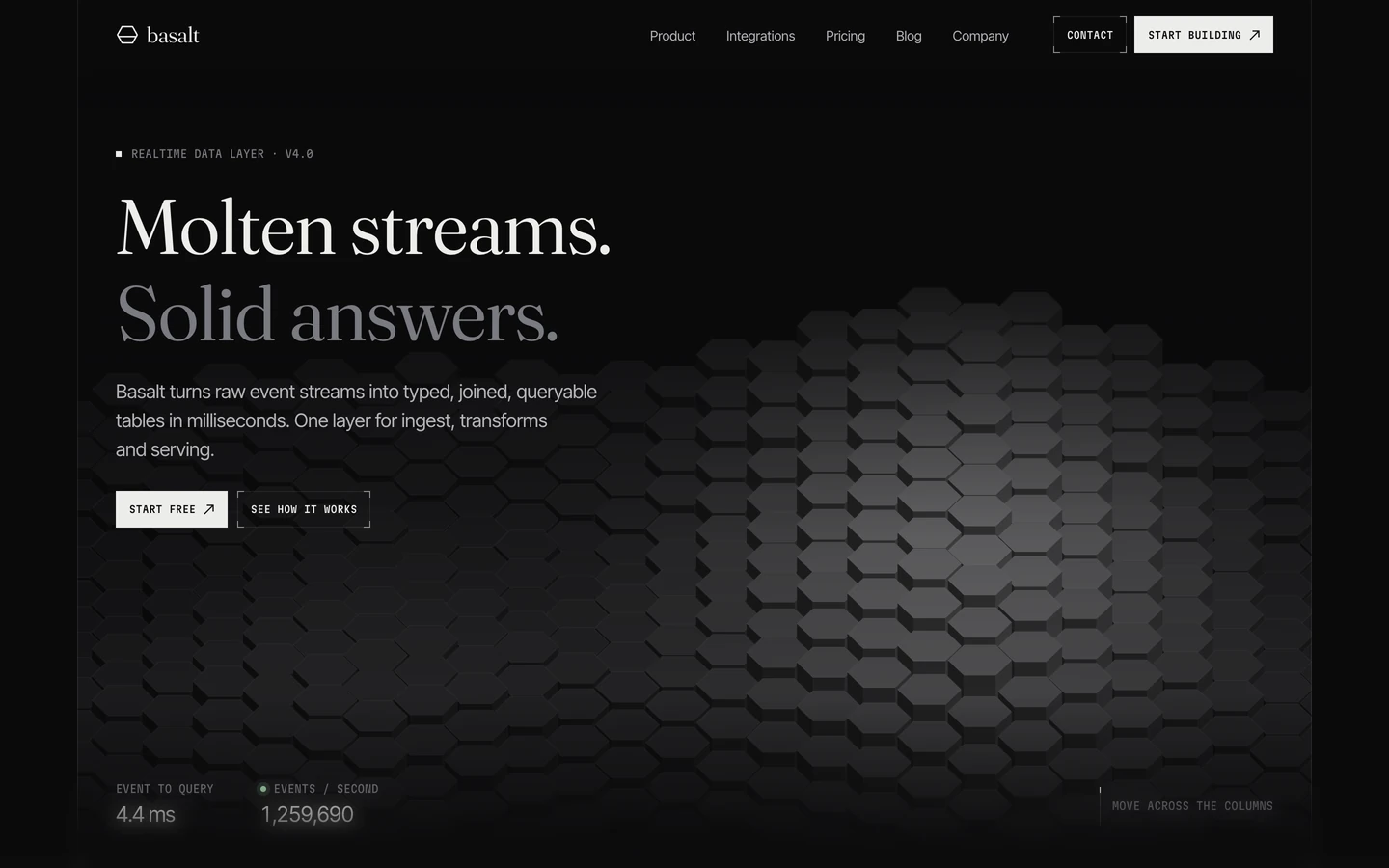
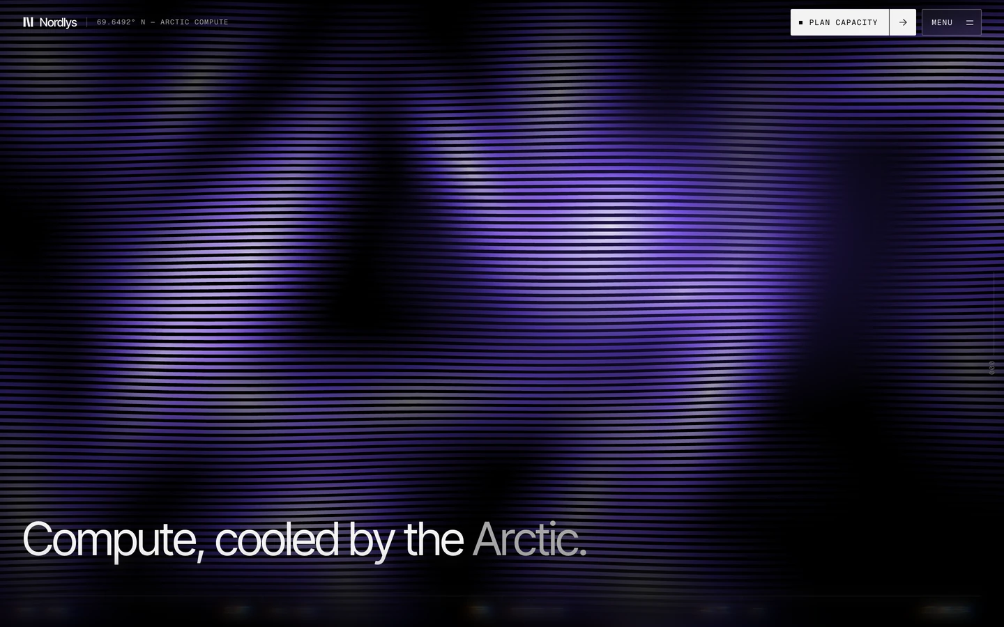
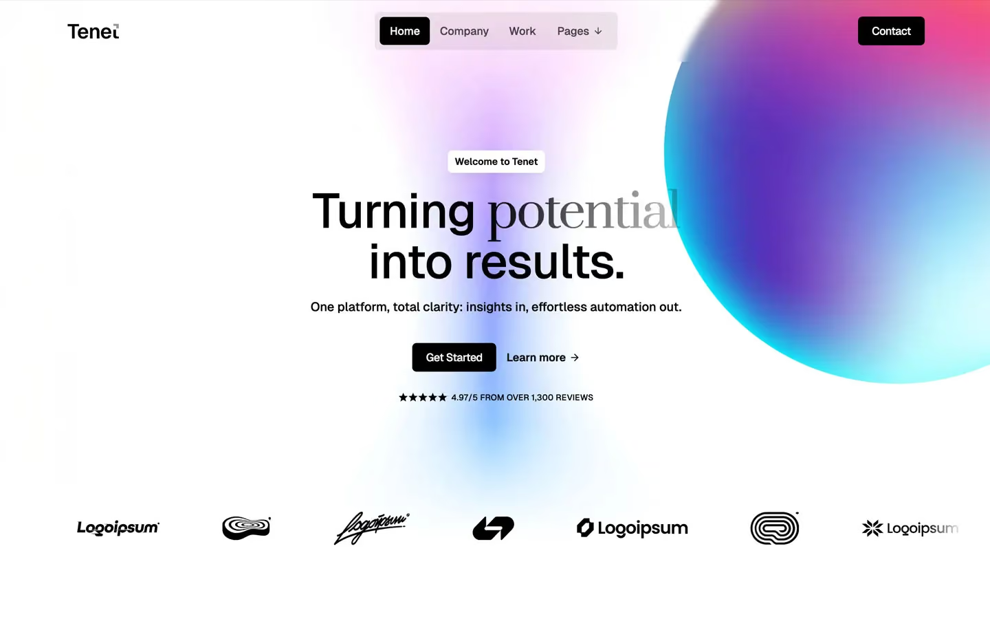
Tech design systems, the same colors first.

Bring any of them to your AI tool
All Access unlocks all 398 design systems, ready for Claude, ChatGPT, Gemini, Cursor, v0 and Lovable, plus 400+ templates on all 5 platforms.
Get All AccessUpgrade to All AccessHow to use the Meteor design system
Pick a file to see what it’s for and where it goes.
What it is
The whole design system in one markdown file, written for AI: every color, type style, spacing value, component and motion rule, plus do's, don'ts and a ready prompt.
Best for
Claude, ChatGPT, Gemini, Cursor and v0, or any other AI tool that builds pages or code.
How to use it
- Put
DESIGN.mdin your project and mention it in your request, or save it as.cursor/rules/meteor.mdc - For the rule file, start it with a front-matter block that sets
alwaysApply: true, so every chat uses it - Ask: “Build a pricing page using DESIGN.md.” Cursor follows the colors, fonts, spacing and rules
- Put
DESIGN.mdin the project root - Add one line to
CLAUDE.md: “Follow DESIGN.md for all UI.” - Ask for any page or component; Claude reads the file first
- Attach
DESIGN.mdto the chat (or paste it in) - Ask: “Build a landing page in this design system.”
- Keep the file in the chat or project knowledge, so follow-up pages stay on style
What it is
Every token as data, in the W3C Design Tokens format: colors with their roles, type styles, radius, spacing, and component tokens that point at them.
Best for
Figma (Tokens Studio), Style Dictionary and other design-token tools, and build scripts.
How to use it
- In Figma, open Tokens Studio, choose Import, and pick
tokens.json - Or point Style Dictionary’s
sourceat it to generate tokens for any platform - In code, import it like any JSON file
What it is
A Tailwind CSS v4 theme: every color, font, type style, radius and spacing value becomes a Tailwind utility, like bg-canvas, text-headline-lg or rounded-md.
Best for
Tailwind v4 projects, and AI builders that write Tailwind (v0, Lovable, Bolt).
How to use it
- Save
theme.cssnext to your main CSS file - Import it after Tailwind:
@import "tailwindcss"; @import "./theme.css"; - Use the classes:
bg-canvas text-ink rounded-md p-lg
What it is
The same tokens as plain CSS variables on :root. Component values point at the color variables, so changing one color updates everything that uses it.
Best for
Any website: plain CSS, Webflow custom code, Framer, WordPress.
How to use it
- Add it to your stylesheet, or in Webflow paste it into Site settings → Custom code inside a
<style>tag - Use the variables anywhere:
color: var(--color-ink) - Change a token once and every place that uses it follows