 flowmance
Basalt Design System
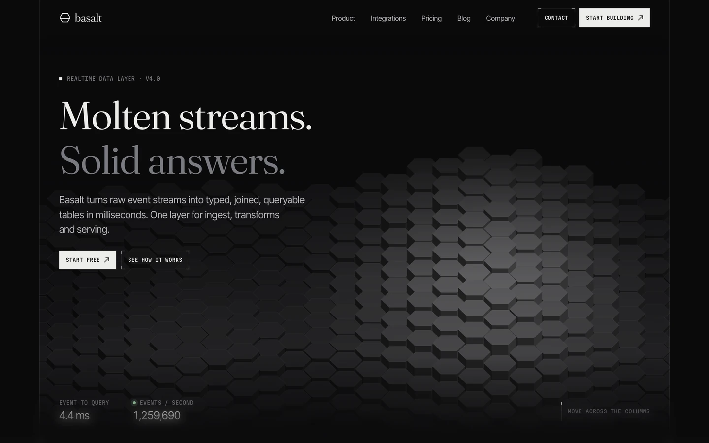
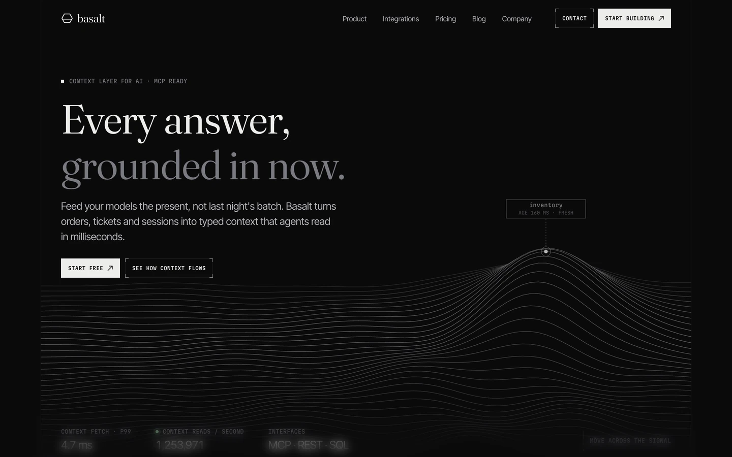
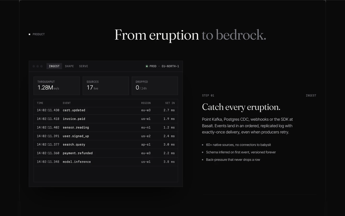
Basalt is a dark, precise template for data and developer-tool companies. It feels like a well-designed terminal crossed with a print journal: near-black canvas (#0A0A0B), light serif headlines in Fraunces, tiny monospace labels in uppercase, and every edge drawn with a faint hairline. There is no colour and no rounding; the only tint is a mint status dot.
Four signatures make it recognisable:
- Two-tone serif headlines. Fraunces at weight 360 with slight negative tracking. The first clause is ink, the second is grey ink-subtle: Six homes. / One system.; Realtime data, / one command away.
- Corner brackets. Cards and the outline button are framed by a 1px hairline ring plus small L-shaped brackets at each corner in a brighter line (line-strong), like crop marks.
- Mono everything small. Eyebrows (PAGES, MARKETING, HOME 03), buttons (START BUILDING ↗) and section markers are Martian Mono uppercase, 10–11px, often after a small filled square ■.
- Square geometry. Buttons, cards, inputs and images all have 0px radius. Only the status dot and the theme toggle are round.
Basalt is dark by default; a round sun toggle bottom-left switches theme, but only the dark theme was measured.
Colors
Surfaces
#0A0A0BPage background and form fields
#111113Homepage preview cards, dropdowns
#17171AInner-page cards, the theme toggle
#0A0A0BInk
#0A0A0BText on primary
#EDEDEAHeadlines, titles, nav links, button fill
#B4B4B9Body copy and leads
#7A7A81Mono eyebrows, the grey second clause of headlines, placeholders
Action
#EDEDEAThe filled button: off-white with black mono text
#EDEDEA#9FD4A8Live/status dot, with a 4px ring at 14% and an 8px halo at about 5%
#9FD4A8 · 14%Lines & effects
#EDEDEA · 8%Every card ring (as a 1px inset shadow), section rules, stat dividers
#EDEDEA · 40%Corner brackets on cards and the outline button
#EDEDEA · 4%The faint 1px square grid pattern behind the nav area
Typography
Fraunces · display-wordmark
The quick brown fox jumpsMeasured twice in the last (footer) section, most likely a giant basalt wordmark (not in the screenshots). 328px · 360 · 1.0 · -11.48px
Fraunces · headline-lg
The quick brown fox jumpsH2s: Six ways in, same foundation., Every page a launch needs. 60px · 360 · 1.0 · -1.2px
Inter Tight · title-lg
The quick brown fox jumpsCard titles (Terminal, Integrations), H3s. 24px · 500 · 1.2 · -0.6px
Fraunces · logo
The quick brown fox jumpsbasalt next to the hexagon mark. 23px · 360 · 1.0 · -0.46px
Inter Tight · body-lg
The quick brown fox jumpsHero lead. 20px · 400 · 1.5 · -0.2px
Inter Tight · label
The quick brown fox jumpsNav links Homes, Product, with a chevron. 14px · 400 · 1.3
Spacing & shape
| Purpose | Value |
|---|---|
| Container | 1400px max with 40px side gutters; the gutter edges are drawn as full-height 1px line rules, so the page sits in a frame |
| Section rhythm | sections carry no padding; each is separated by a full-width line rule with small corner ticks where it meets the frame |
| Breakpoints | Webflow defaults, 991px, 767px and 479px |
Spacing scale
| Token | Value | Preview |
|---|---|---|
hair | 1px | |
xs | 14px | |
sm | 16px | |
md | 24px | |
lg | 32px |
Layout spacing
| Token | Value | Preview |
|---|---|---|
column-gap | 16px | |
section-bottom | 25px | |
gutter | 40px | |
nav | 72px |
Border radius
Surfaces
How the surfaces stack, from the page background up. Hex codes and roles are in Colors above.
Motion
| Block entrance | From y 40px, scale 0.98, opacity 0 to rest, expo.out, about 1.4–2.1s including stagger, triggered at top 95% |
| Hero scroll-out | To y 60px, opacity 0, expo.out, 1.2s, over the first screen of scroll |
| Cursor follow | quickTo-style tweens on x and y, 0.5s power3 (hex columns rising under the cursor in Home 01) |
| Headline split | SplitText on headings |
| Card hover | box-shadow 0.2s, color 0.2s; backgrounds 0.2–0.25s |
| Arrow nudge | transform 0.22s cubic-bezier(0.215, 0.61, 0.355, 1) |
| Button press | transform 0.16s cubic-bezier(0.23, 1, 0.32, 1) |
| Dropdown | opacity, transform, filter 0.15s; visibility switches after 0.15s |
Do’s and don’ts
- Use #0A0A0B for the page and step cards to #111113 and #17171A.
- Set headlines in Fraunces 360 with about −2% tracking, and grey the second clause with ink-subtle #7A7A81.
- Draw every edge as a 1px inset ring in #EDEDEA at 8%, and add 40% corner brackets to cards and secondary buttons.
- Put Martian Mono 11px uppercase eyebrows above titles and use Martian Mono 10px uppercase for all buttons.
- Keep everything square (0px), with ↗ as the only button glyph.
- Write stat numbers in Fraunces, with real units.
- Round corners, or add drop shadows or glows (except the mint status ring).
- Add a brand colour; #9FD4A8 is for status only.
- Use ink-subtle #7A7A81 for body text on cards: it is 4.43:1 on surface-1 and 4.2:1 on surface-2. Keep it for 11px+ uppercase mono labels and display-size grey clauses.
- Set headlines in bold or in the sans; Fraunces stays at 360.
- Use sentence-case mono buttons, or buttons taller than 38px.
- Animate entrances with bounce; use expo.out and keep hovers at 0.15–0.25s.
Example prompt
Any page in the Basalt style
More design systems like this
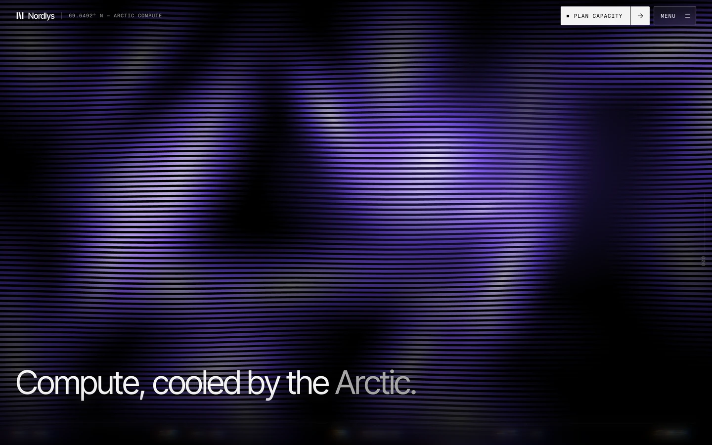
Tech design systems, the same colors first.


Bring any of them to your AI tool
All Access unlocks all 398 design systems, ready for Claude, ChatGPT, Gemini, Cursor, v0 and Lovable, plus 400+ templates on all 5 platforms.
Get All AccessUpgrade to All AccessHow to use the Basalt design system
Pick a file to see what it’s for and where it goes.
What it is
The whole design system in one markdown file, written for AI: every color, type style, spacing value, component and motion rule, plus do's, don'ts and a ready prompt.
Best for
Claude, ChatGPT, Gemini, Cursor and v0, or any other AI tool that builds pages or code.
How to use it
- Put
DESIGN.mdin your project and mention it in your request, or save it as.cursor/rules/basalt.mdc - For the rule file, start it with a front-matter block that sets
alwaysApply: true, so every chat uses it - Ask: “Build a pricing page using DESIGN.md.” Cursor follows the colors, fonts, spacing and rules
- Put
DESIGN.mdin the project root - Add one line to
CLAUDE.md: “Follow DESIGN.md for all UI.” - Ask for any page or component; Claude reads the file first
- Attach
DESIGN.mdto the chat (or paste it in) - Ask: “Build a landing page in this design system.”
- Keep the file in the chat or project knowledge, so follow-up pages stay on style
What it is
Every token as data, in the W3C Design Tokens format: colors with their roles, type styles, radius, spacing, and component tokens that point at them.
Best for
Figma (Tokens Studio), Style Dictionary and other design-token tools, and build scripts.
How to use it
- In Figma, open Tokens Studio, choose Import, and pick
tokens.json - Or point Style Dictionary’s
sourceat it to generate tokens for any platform - In code, import it like any JSON file
What it is
A Tailwind CSS v4 theme: every color, font, type style, radius and spacing value becomes a Tailwind utility, like bg-canvas, text-headline-lg or rounded-md.
Best for
Tailwind v4 projects, and AI builders that write Tailwind (v0, Lovable, Bolt).
How to use it
- Save
theme.cssnext to your main CSS file - Import it after Tailwind:
@import "tailwindcss"; @import "./theme.css"; - Use the classes:
bg-canvas text-ink rounded-md p-lg
What it is
The same tokens as plain CSS variables on :root. Component values point at the color variables, so changing one color updates everything that uses it.
Best for
Any website: plain CSS, Webflow custom code, Framer, WordPress.
How to use it
- Add it to your stylesheet, or in Webflow paste it into Site settings → Custom code inside a
<style>tag - Use the variables anywhere:
color: var(--color-ink) - Change a token once and every place that uses it follows