 flowmance
Nordlys Design System
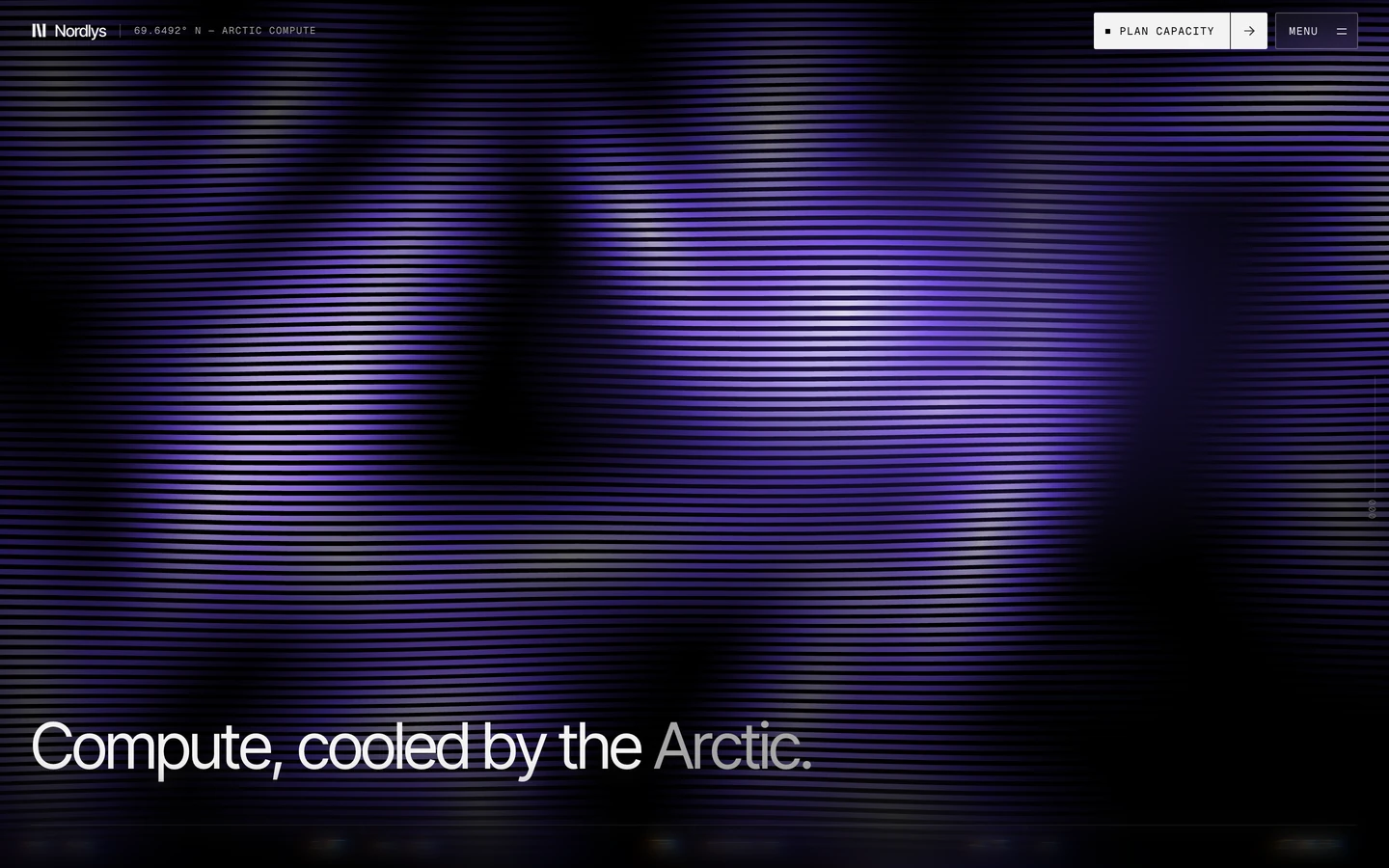

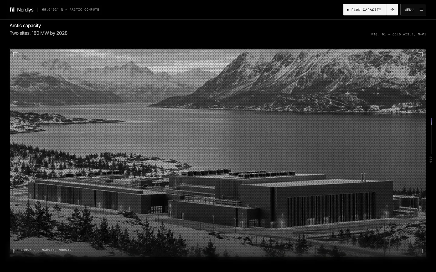
Nordlys is a pure-black template for AI compute and data-centre companies, styled like a control room in the Arctic. The page is #000000, the type is light Inter Tight with tight tracking, every label is wide-tracked Geist Mono, and the only colour is violet light: a ribbed "silk through fluted glass" shader in the hero and preview images, thin violet glows and progress lines. Everything is ruled with faint hairlines and nearly square.
Four signatures make it recognisable:
- Violet only as light. #6E4BFF and lilac #C9BDFF never fill a button or panel (only the style-guide colour swatches show them solid); they appear as the shader, 8px glows, gradient lines and small lilac counts. The style-guide page says it outright: "Violet appears only as light: the shader, glows and hover lines."
- Split buttons with an arrow cell. The action buttons are 38px, 2px-radius blocks: ■ PLAN CAPACITY in mono plus a separate square cell holding → (the MENU button is the exception: a label and a = icon, no arrow cell). On hover a fill wipes across and the arrow cell opens.
- Coordinates and counters in mono. 69.6492° N — ARCTIC COMPUTE beside the logo, a vertical scroll counter (000, 022, 045, 070) on the right edge with a violet line, two-digit indexes (05) before card titles, and lilac superscript counts after section titles (Pricing 03).
- Two-tone headlines. The H1 runs in ink, then its second line drops to grey: An AI-infrastructure template, / cooled to 69° N.
Nordlys is dark-only.
Colors
Surfaces
#000000Page background, true black
#0A0A0APreview frames, tiles behind images
Ink
#000000Text on primary
#F3F3F3Headlines, titles, values; the light button fill
#A6A6A6Body copy, leads, mono labels, the grey half of headlines
#8A8A8ASecondary meta
Action
#F3F3F3Light split button
#000000#6E4BFFShader light, 0 0 8px glows at 60%, the scroll-progress line
#C9BDFFSuperscript section counts, gradient end, 35% inset ring on highlighted chips
#C9BDFF · 35%#7FD4A8One status dot
Lines & effects
#F3F3F3 · 12%All rules and card rings (1px borders and inset 0 0 0 1px)
#F3F3F3 · 30%Ring on secondary and menu buttons
#F3F3F3 · 5%Menu button fill
#0E0B18 · 78%Overlay menu panel
#000000 · 45%Dimming over imagery
Typography
Inter Tight · display-hero
The quick brown fox jumpsH1, second line in ink-muted. 66px · 400 · 0.96 · -3.31px
Inter Tight · headline-lg
The quick brown fox jumps16 uses lower on the page, most likely the closing CTA Start with Home 01. 53px · 400 · 0.96 · -2.13px
Inter Tight · title-md
The quick brown fox jumpsMid-size titles (14 uses), lower on the page than the screenshots reach. 20px · 400 · 1.15 · -0.6px
Inter Tight · body
The quick brown fox jumpsHero lead and section copy in ink-muted. 16px · 400 · 1.5 · 0.32px
Inter Tight · label
The quick brown fox jumpsStat values 24, GSAP · SVG, 1920 → 375. 14px · 500 · 1.5 · 0.32px
Inter Tight · caption
The quick brown fox jumpsSmall copy. 14px · 400 · 1.5 · 0.32px
Spacing & shape
| Purpose | Value |
|---|---|
| Grid | 12 columns with a 24px gap for page structure; preview cards are 4 columns with a 22px gap; the colour swatches are 5 columns with an 8px gap; split rows are 2 columns with a 24px gap |
| Section rhythm | 201.6px (14vw) top and bottom on the first content section, then 0 top and 201.6px bottom on the following sec-b sections; the hero is 120px top and 56px bottom and fills the 900px viewport; the CTA has 144px bottom padding; the footer 25px |
| Section header | a full-width line rule, then the headline-md title with a lilac superscript count on the left and a mono descriptor (THREE LAYOUTS, ABOUT AND HIRING) on the right |
| Breakpoints | Webflow defaults, 991px, 767px and 479px |
Spacing scale
| Token | Value | Preview |
|---|---|---|
hair | 1px | |
xs | 8px | |
sm | 12px | |
md | 22px | |
lg | 24px |
Layout spacing
| Token | Value | Preview |
|---|---|---|
column-gap | 24px | |
gutter | 32px | |
hero-bottom | 56px | |
nav | 65px | |
hero-top | 120px | |
cta-bottom | 144px | |
section | 202px |
Border radius
Surfaces
How the surfaces stack, from the page background up. Hex codes and roles are in Colors above.
Motion
| Headline blur-in | SplitText; filter blur to sharp, 0.8s cubic-bezier(0.16, 1, 0.3, 1), with opacity 0.4s and transform 0.6s on the same curve |
| Entrance | power4.out, 1.6s |
| Cursor follow | x / y with power3.out, 1.4s (shader light and hover elements) |
| Drifting particles | Elements drift x, y (±140px), rotation (±10°) and opacity (0.27–0.84) on sine.inOut loops of 6.5–12s |
| Blink | opacity → 0.25 with steps, 0.8s (status and cursor dots) |
| Parallax | ScrollTrigger top bottom → bottom top, scrubbed |
| Nav state | Toggles after 20px of scroll |
| Button wipe | background-size 0.6s, color 0.4s, same curve |
| Card hover | box-shadow 0.5s, filter 0.5s, transform 0.6–0.7s on the curve; links color 0.3s |
Do’s and don’ts
- Use true black #000000 for the page and #F3F3F3 for text, with #A6A6A6 for body and the grey half of headlines.
- Set headlines in Inter Tight 400 with about −5% tracking; never bold.
- Set every label in Geist Mono 12px uppercase with +1.2px tracking.
- Build buttons as 38px, 2px-radius split blocks: ■ LABEL plus a square → cell, with a fill wipe on hover over 0.6s.
- Rule everything with 1px #F3F3F3 at 12%, and keep images and cards square.
- Use violet #6E4BFF only as light: shader, 8px glows, gradient lines and lilac #C9BDFF counts.
- Fill buttons, cards or sections with violet or lilac.
- Round anything beyond 2px, except the 14px overlay menu.
- Use pure #FFFFFF text or a second sans or serif.
- Add drop shadows to content; the only deep shadow belongs to the overlay menu.
- Use mono larger than 12px for labels, or in lowercase for button text.
- Animate with bounce or overshoot; use cubic-bezier(0.16, 1, 0.3, 1) throughout.
Example prompt
Any page in the Nordlys style
More design systems like this
Tech design systems, the same colors first.


Bring any of them to your AI tool
All Access unlocks all 398 design systems, ready for Claude, ChatGPT, Gemini, Cursor, v0 and Lovable, plus 400+ templates on all 5 platforms.
Get All AccessUpgrade to All AccessHow to use the Nordlys design system
Pick a file to see what it’s for and where it goes.
What it is
The whole design system in one markdown file, written for AI: every color, type style, spacing value, component and motion rule, plus do's, don'ts and a ready prompt.
Best for
Claude, ChatGPT, Gemini, Cursor and v0, or any other AI tool that builds pages or code.
How to use it
- Put
DESIGN.mdin your project and mention it in your request, or save it as.cursor/rules/nordlys.mdc - For the rule file, start it with a front-matter block that sets
alwaysApply: true, so every chat uses it - Ask: “Build a pricing page using DESIGN.md.” Cursor follows the colors, fonts, spacing and rules
- Put
DESIGN.mdin the project root - Add one line to
CLAUDE.md: “Follow DESIGN.md for all UI.” - Ask for any page or component; Claude reads the file first
- Attach
DESIGN.mdto the chat (or paste it in) - Ask: “Build a landing page in this design system.”
- Keep the file in the chat or project knowledge, so follow-up pages stay on style
What it is
Every token as data, in the W3C Design Tokens format: colors with their roles, type styles, radius, spacing, and component tokens that point at them.
Best for
Figma (Tokens Studio), Style Dictionary and other design-token tools, and build scripts.
How to use it
- In Figma, open Tokens Studio, choose Import, and pick
tokens.json - Or point Style Dictionary’s
sourceat it to generate tokens for any platform - In code, import it like any JSON file
What it is
A Tailwind CSS v4 theme: every color, font, type style, radius and spacing value becomes a Tailwind utility, like bg-canvas, text-headline-lg or rounded-md.
Best for
Tailwind v4 projects, and AI builders that write Tailwind (v0, Lovable, Bolt).
How to use it
- Save
theme.cssnext to your main CSS file - Import it after Tailwind:
@import "tailwindcss"; @import "./theme.css"; - Use the classes:
bg-canvas text-ink rounded-md p-lg
What it is
The same tokens as plain CSS variables on :root. Component values point at the color variables, so changing one color updates everything that uses it.
Best for
Any website: plain CSS, Webflow custom code, Framer, WordPress.
How to use it
- Add it to your stylesheet, or in Webflow paste it into Site settings → Custom code inside a
<style>tag - Use the variables anywhere:
color: var(--color-ink) - Change a token once and every place that uses it follows