 flowmance
Platform Design System


Platform is a bright, airy fintech-app landing page. It feels like an App Store feature: lots of white, warm off-white light in the hero, big Inter Tight 600 headlines, and tilted iPhone mockups standing in front of tall arch-topped colour panels. The UI is greyscale with soft #F7F7F7 fills; the colour comes from a neon green #3FFF00, a few pale pastels, and a single electric-blue #0000FF metric.
Four signatures make it recognisable:
- Arch panels behind phones. Each product shot is a phone mockup, tilted (about 20° in the hero, only a few degrees further down), in front of a panel with border-radius: 200px 200px 0 0 filled by a 353° gradient from a colour (#3FFF00, #F6E5F6, #D7FCF7) up to transparent. The phone overlaps the arch's edges.
- Faded headline tails. Headlines start in black and finish in a pale grey: Innovative finance app / for the future., Simple and convenient / payment transactions.
- Centred logo with social circles. The nav is a 3-column grid: four social icons in light grey circles on the left, the two-tone Platform wordmark in the centre, and a thin 40px + cross on the right that opens a full-screen menu.
- Soft grey pills for secondary actions. Learn More > and Get Started > secondary buttons are #F7F7F7 blocks with #777777 text and a small chevron, next to one dark #222222 pill CTA.
Platform is a light-only design.
Colors
Surfaces
#FFFFFFPage background (--white-smoke, which is white despite the name)
#F7F7F7Secondary buttons, testimonial card, social and app-icon circles (22 uses)
#F5F5F5The contact submit (--gray is #F5F5F7)
#FAFAFAContact inputs and their 1px border
#000000 · 9%With field: Contact inputs and their 1px border
#81818B · 6%The footer subscribe field
Ink
#FFFFFFText on primary
#777777Text on secondary
#222222#000000Headlines, titles, quotes
#222222Leads, the primary button fill, footer links (--black-second)
#777777Paragraphs and secondary-button labels (--grey, 36 uses)
#777777 · 50%The faded tail of headlines (renders about #BBBBBB)
#FFFFFFAction
#222222Get Started dark pill
#222222#F7F7F7Learn More >; text goes #222222 on hover
#3FFF00Neon green: the hero arch, the phone UI, and the blockquote rule (--green)
#0000FFThe 99% metrics and small inline links (--blue-main)
Lines & effects
#F4F4F43px rings around overlapping avatars
#F6E5F6Arch panels, avatar and menu-count backgrounds
#D7FCF7Arch panels, avatar and menu-count backgrounds
#FBF1E6Arch panels, avatar and menu-count backgrounds
#EBFAF8Arch panels, avatar and menu-count backgrounds
Typography
Inter Tight · display-metric
The quick brown fox jumps99% in accent-blue. 120px · 600 · 0.9
Inter Tight · headline-lg
The quick brown fox jumpsSection titles with faded tails (8 uses). 44px · 600 · 1.3
Inter Tight · lead-lg
The quick brown fox jumpsLarge intro statements in #222222. 32px · 600 · 1.4
Inter Tight · title-blog
The quick brown fox jumpsBlog card titles. 27px · 600 · 1.3
Inter Tight · body
The quick brown fox jumpsParagraphs in #777777. 18px · 500 · 1.3
Inter Tight · label-lg
The quick brown fox jumpsThe dark pill and the submit. 18px · 600 · 1.11
Spacing & shape
| Purpose | Value |
|---|---|
| Container | .container max 1200px, centred |
| Breakpoints | 991px, 767px and 479px (125 rules at 479), plus a 1440px+ step |
Spacing scale
| Token | Value | Preview |
|---|---|---|
xs | 10px | |
sm | 15px | |
md | 25px | |
lg | 30px | |
xl | 40px | |
2xl | 50px | |
3xl | 100px | |
4xl | 150px |
Layout spacing
| Token | Value | Preview |
|---|---|---|
gutter | 72px | |
section-cta | 100px | |
section | 120px |
Border radius
Surfaces
How the surfaces stack, from the page background up. Hex codes and roles are in Colors above.
Motion
| Headline reveal | Lines rise from y 200% → 0% over 1100ms ease-out-quint while un-skewing skewY 7° → 0° over 500ms, inside an overflow-hidden line |
| Fade in | opacity 0 → 1, 300ms ease to 1000ms ease-out-quart |
| Pop in | scale 0 → 1, 1500ms ease-in-out-back, for arch panels and badges |
| Mouse parallax | Phones and floating cards shift ±10px to ±80px with the cursor |
| Logo and image hover | A filter change, 300ms ease |
| Button arrow | The 26px arrow slides up from 100px below inside the dark pill |
| Menu link roll | The word rolls up inside its 87px window on hover |
| Footer and link hover | Opacity 60% → 100% or underline, 0.3s |
Do’s and don’ts
- Put every phone mockup in front of an arch panel (200px top radius, a 353° gradient from #3FFF00, #F6E5F6 or #D7FCF7 to transparent), tilted and overlapping the arch.
- Finish headlines with a faded tail in #777777 at 50%, keeping the first words in #000000.
- Use one dark #222222 pill (40px radius, 60px tall) per section and #F7F7F7 10px-radius buttons with #777777 text for the rest.
- Set leads in #222222 600 and paragraphs in #777777 500 at 18px.
- Keep sections at 120px vertical padding in a 1200px container.
- Use #0000FF only for the big percentage metrics.
- Add shadows, borders on cards, or dark sections; the page stays white.
- Set #777777 text below 15px or on #F7F7F7 at small sizes; it sits right at 4.5:1 on white and below it on grey. Keep Learn More labels at 17px 600.
- Use ink-subtle (#777777 at 50%) for anything but headline tails of 25px and up.
- Put neon green #3FFF00 text on white, or use the pastels for cards and buttons.
- Use weights other than 500 and 600, or uppercase labels.
- Animate longer than 1500ms; the slow pop-ins are already the ceiling.
Example prompt
Any page in the Platform style
More design systems like this
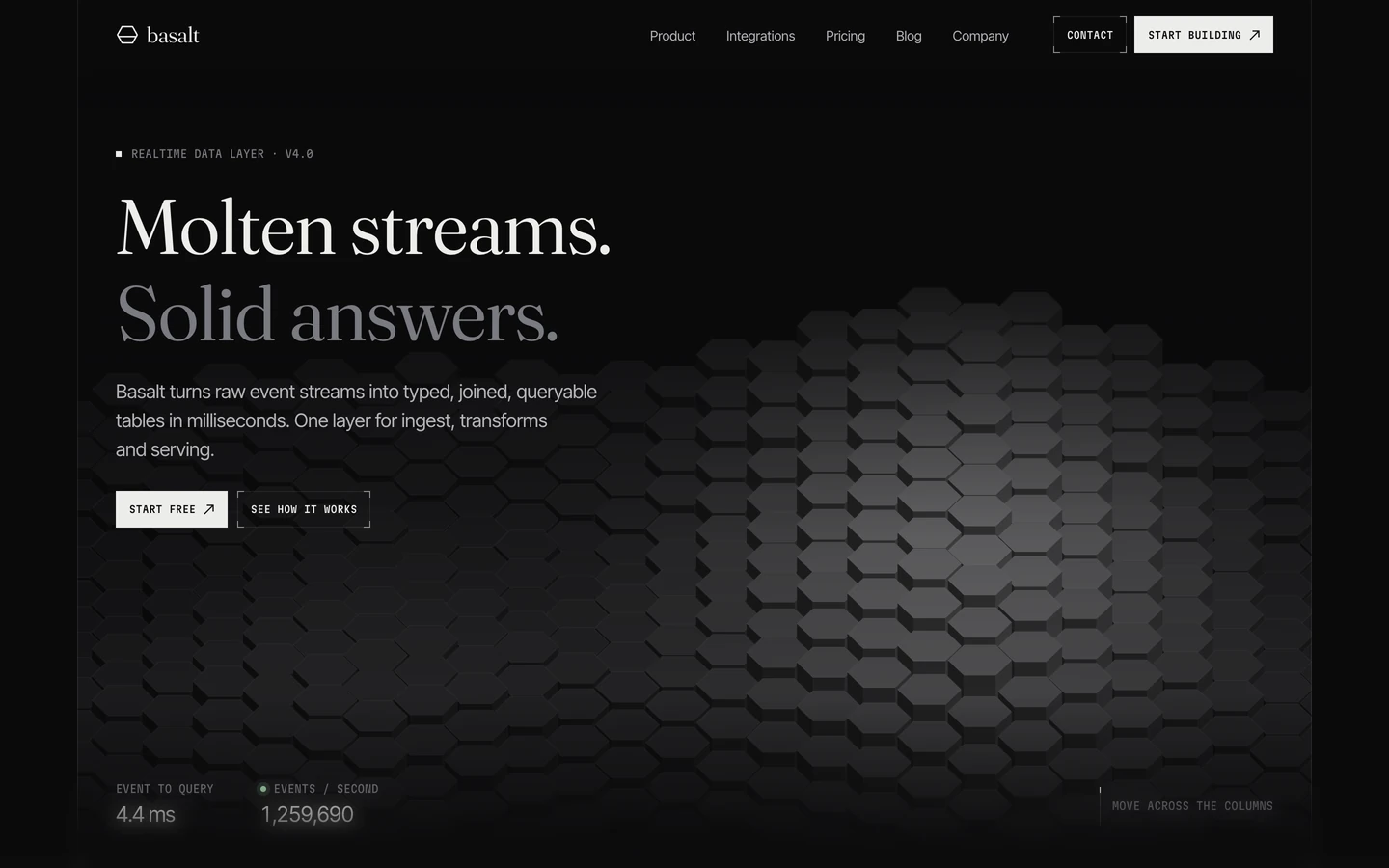
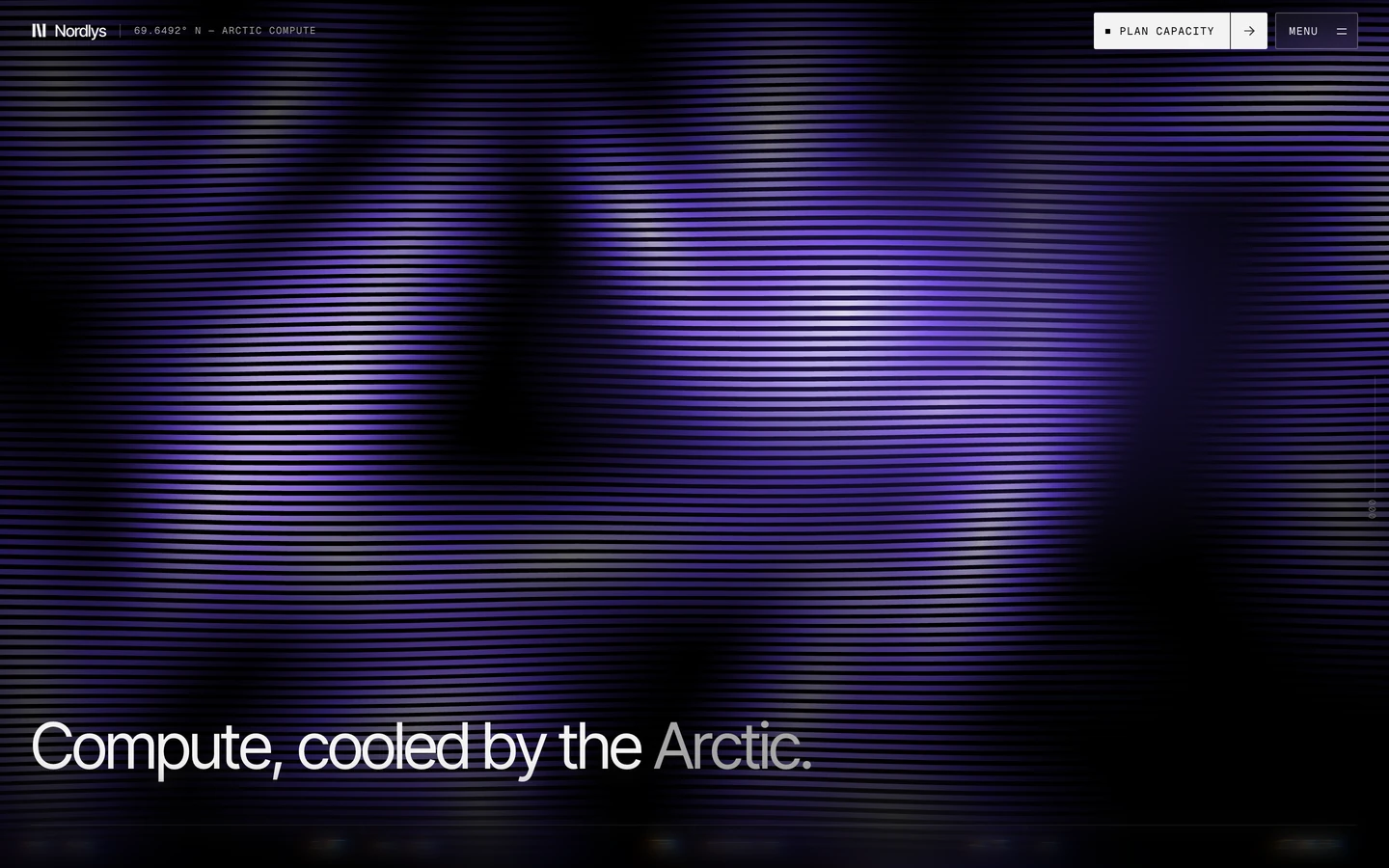
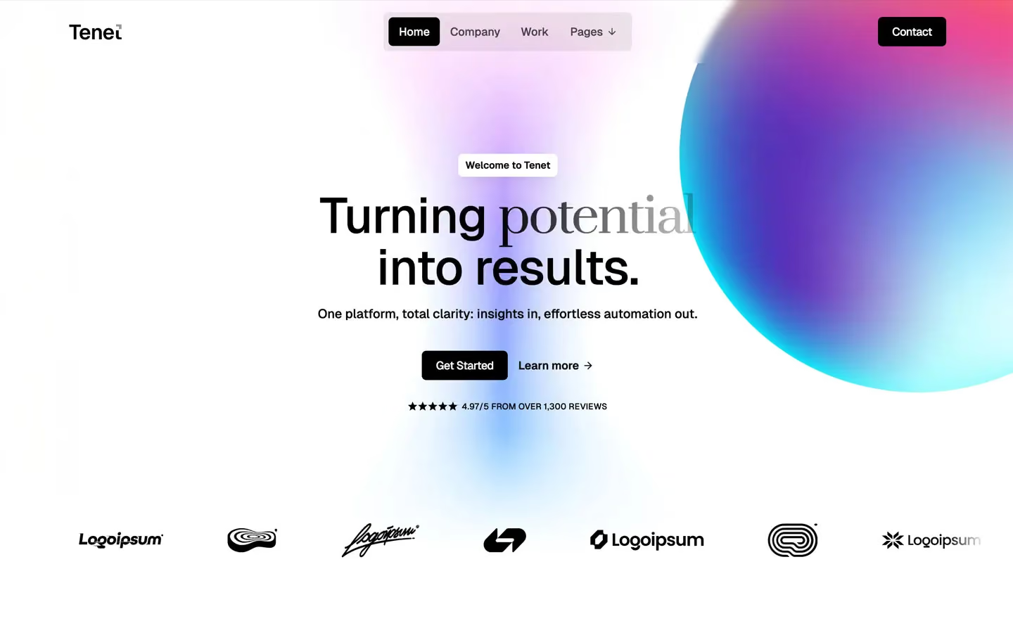
Tech design systems, the same colors first.

Bring any of them to your AI tool
All Access unlocks all 398 design systems, ready for Claude, ChatGPT, Gemini, Cursor, v0 and Lovable, plus 400+ templates on all 5 platforms.
Get All AccessUpgrade to All AccessHow to use the Platform design system
Pick a file to see what it’s for and where it goes.
What it is
The whole design system in one markdown file, written for AI: every color, type style, spacing value, component and motion rule, plus do's, don'ts and a ready prompt.
Best for
Claude, ChatGPT, Gemini, Cursor and v0, or any other AI tool that builds pages or code.
How to use it
- Put
DESIGN.mdin your project and mention it in your request, or save it as.cursor/rules/platform.mdc - For the rule file, start it with a front-matter block that sets
alwaysApply: true, so every chat uses it - Ask: “Build a pricing page using DESIGN.md.” Cursor follows the colors, fonts, spacing and rules
- Put
DESIGN.mdin the project root - Add one line to
CLAUDE.md: “Follow DESIGN.md for all UI.” - Ask for any page or component; Claude reads the file first
- Attach
DESIGN.mdto the chat (or paste it in) - Ask: “Build a landing page in this design system.”
- Keep the file in the chat or project knowledge, so follow-up pages stay on style
What it is
Every token as data, in the W3C Design Tokens format: colors with their roles, type styles, radius, spacing, and component tokens that point at them.
Best for
Figma (Tokens Studio), Style Dictionary and other design-token tools, and build scripts.
How to use it
- In Figma, open Tokens Studio, choose Import, and pick
tokens.json - Or point Style Dictionary’s
sourceat it to generate tokens for any platform - In code, import it like any JSON file
What it is
A Tailwind CSS v4 theme: every color, font, type style, radius and spacing value becomes a Tailwind utility, like bg-canvas, text-headline-lg or rounded-md.
Best for
Tailwind v4 projects, and AI builders that write Tailwind (v0, Lovable, Bolt).
How to use it
- Save
theme.cssnext to your main CSS file - Import it after Tailwind:
@import "tailwindcss"; @import "./theme.css"; - Use the classes:
bg-canvas text-ink rounded-md p-lg
What it is
The same tokens as plain CSS variables on :root. Component values point at the color variables, so changing one color updates everything that uses it.
Best for
Any website: plain CSS, Webflow custom code, Framer, WordPress.
How to use it
- Add it to your stylesheet, or in Webflow paste it into Site settings → Custom code inside a
<style>tag - Use the variables anywhere:
color: var(--color-ink) - Change a token once and every place that uses it follows