 flowmance
Loyal Design System


Loyal is a dark, cinematic photography showcase. The home page is one screen: a full-bleed photo under a black gradient, a transparent nav, a light-weight Poppins title, one line of serif text and a single deep-pink button. The mix of thin sans titles and Playfair Display serif lines gives it a gallery-catalogue feel.
Four signatures make it recognisable:
- One-screen slider home. Five full-viewport slides (one per photo) with nothing below them. The page is exactly 900px tall at 1440×900.
- Thin sans over serif. Titles are Poppins 62px weight 300 in Title Case; the line under them is Playfair Display 18px in #DDDDDD.
- Deep pink, used once. The only colour in the UI is --deep-pink #E23B7D on the LEARN MORE button (and the blockquote rule). Everything else is white on black.
- Gallery furniture in the corners. Photo by: William Lee bottom-left (serif label, sans name), slider dots bottom-centre, an outlined VIEW GALLERY button bottom-right, and square black arrow tabs flush to the left and right edges.
The home page is dark (photo plus gradient); inner pages are white.
Colors
Surfaces
#FFFFFFBody background (inner pages)
#FFFFFFSame as canvas
#000000The slide gradient base and the text on it
Ink
#FFFFFFText on primary
#212121h1
#333333Default body text, form text, blockquotes
#919191Paragraphs (Poppins 300)
#777777Uppercase field labels
#FFFFFFNav, titles, credits, outline button on photos
#DDDDDDSerif subtitles on slides
#FFFFFFText on inverse-canvas
Action
#E23B7DThe main button (--deep-pink)
#AC285BButton background on hover
Lines & effects
#E1E1E1Field underlines and the form wrapper border
#CCCCCCThe 50px circular close button outline
#FFFFFF · 23%1px rule under the nav
#000000 · 23%Nav link background on hover
#FFFFFF · 40%Inactive slider dots (active is white)
#000000 · 80%Square arrow tabs
Typography
Poppins · display-slide
The quick brown fox jumpsSlide titles (Minimalistic Architecture), text-transform: capitalize. 62px · 300 · 1.16
Poppins · headline-lg
The quick brown fox jumpsh1 on inner pages. 34px · 500 · 1.29
Playfair Display · quote
The quick brown fox jumpsBlockquotes, 3px pink left rule. 30px · 400 · 1.33
Poppins · title-lg
The quick brown fox jumpsh3. 24px · 400 · 1.25
Playfair Display · body-serif
The quick brown fox jumpsSlide subtitles in #DDDDDD. 18px · 400 · 1.78
Poppins · label-nav
The quick brown fox jumpsNav links. 14px · 500 · 1.43
Spacing & shape
| Purpose | Value |
|---|---|
| Container | 940px, centred (Webflow default) |
| Breakpoints | 991px, 767px and 479px |
Spacing scale
| Token | Value | Preview |
|---|---|---|
xs | 8px | |
sm | 15px | |
md | 20px | |
lg | 25px | |
xl | 30px | |
2xl | 40px |
Layout spacing
| Token | Value | Preview |
|---|---|---|
nav-side | 25px | |
field-height | 40px | |
arrow | 70px | |
nav-height | 83px |
Border radius
Motion
| Slide change | Webflow slider default slide transition |
| Nav link hover | all 400ms: opacity 0.8 → 1, background to black at 23% |
| Button hover | all 400ms: #E23B7D → #AC285B |
| Close button hover | all 400ms: outline #CCCCCC → #E23B7D |
Do’s and don’ts
- Use full-bleed photos under linear-gradient(9deg, #000000 10%, #00000033).
- Set slide titles in Poppins 62px weight 300, white, with one Playfair Display 18px line in #DDDDDD below.
- Use #E23B7D for one button per view, hovering to #AC285B.
- Keep buttons at 12px uppercase with 1px tracking, padding 17px 25px 15px and a 5px radius.
- Credit the photographer in the bottom-left corner.
- Draw forms with 1px #E1E1E1 lines, not filled fields.
- Add a second accent colour or use pink for text blocks.
- Bold the slide titles; the light 300 weight is the look.
- Add drop shadows or rounded image corners.
- Shrink the pink button text below 12px or drop the uppercase; white on #E23B7D is only about 4.1:1, so it needs the tracking and caps to read.
- Use ink-muted #919191 for text under 15px; it is about 3.2:1 on white.
- Use ink-subtle #777777 for anything but the 13px uppercase field labels.
Example prompt
Any page in the Loyal style
More design systems like this
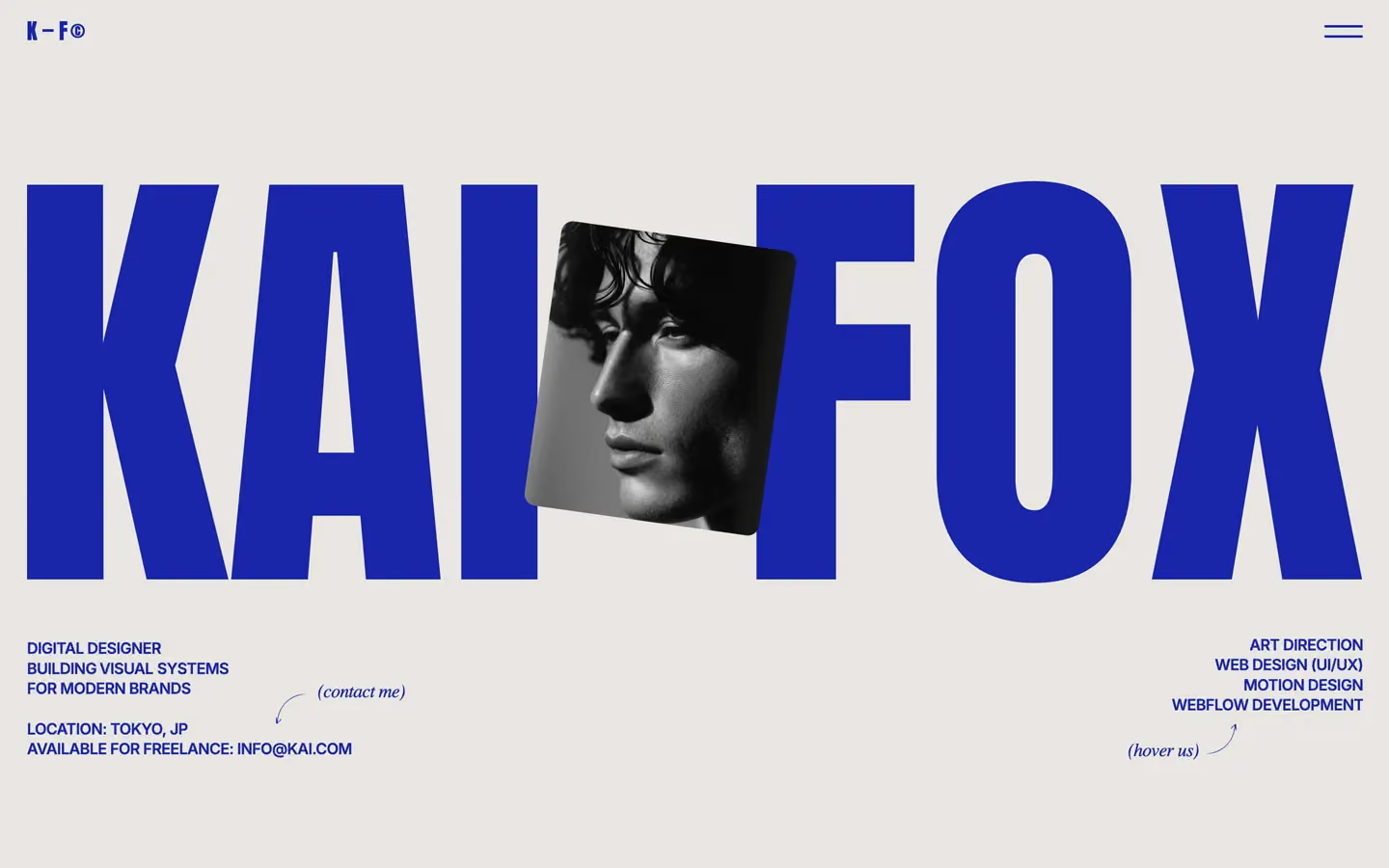
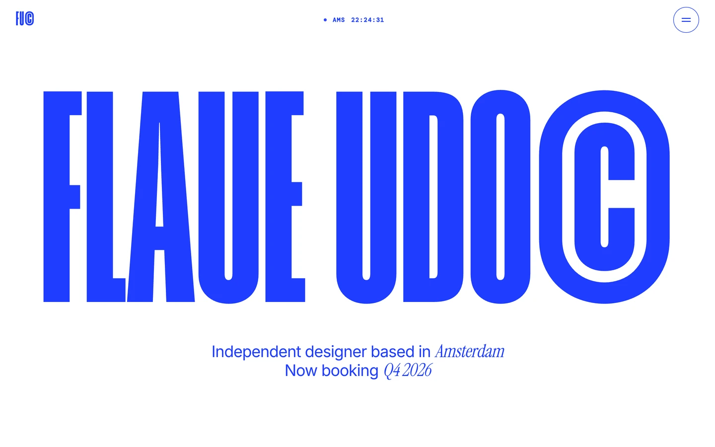
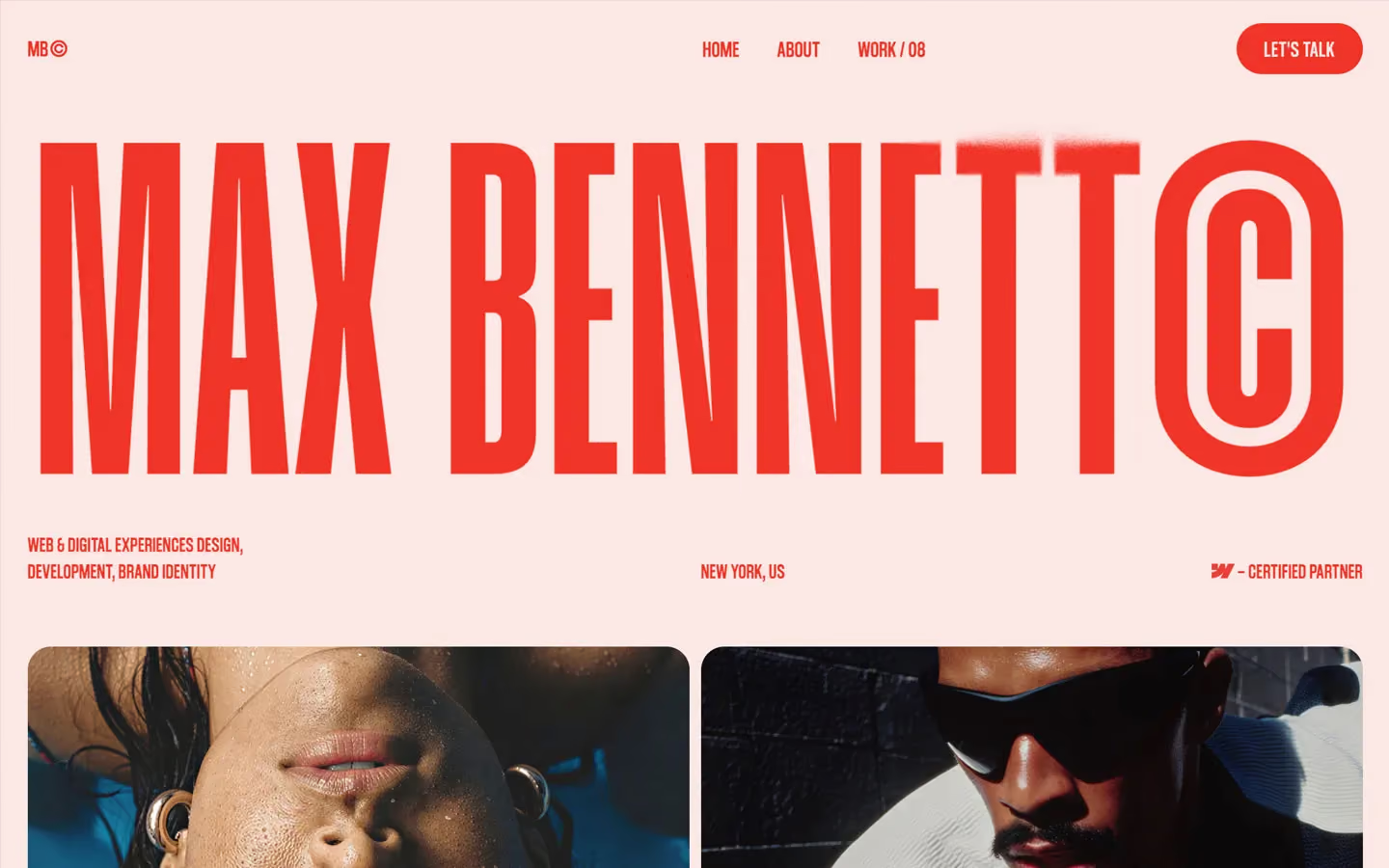
Portfolio design systems, the same colors first.

Bring any of them to your AI tool
All Access unlocks all 398 design systems, ready for Claude, ChatGPT, Gemini, Cursor, v0 and Lovable, plus 400+ templates on all 5 platforms.
Get All AccessUpgrade to All AccessHow to use the Loyal design system
Pick a file to see what it’s for and where it goes.
What it is
The whole design system in one markdown file, written for AI: every color, type style, spacing value, component and motion rule, plus do's, don'ts and a ready prompt.
Best for
Claude, ChatGPT, Gemini, Cursor and v0, or any other AI tool that builds pages or code.
How to use it
- Put
DESIGN.mdin your project and mention it in your request, or save it as.cursor/rules/loyal.mdc - For the rule file, start it with a front-matter block that sets
alwaysApply: true, so every chat uses it - Ask: “Build a pricing page using DESIGN.md.” Cursor follows the colors, fonts, spacing and rules
- Put
DESIGN.mdin the project root - Add one line to
CLAUDE.md: “Follow DESIGN.md for all UI.” - Ask for any page or component; Claude reads the file first
- Attach
DESIGN.mdto the chat (or paste it in) - Ask: “Build a landing page in this design system.”
- Keep the file in the chat or project knowledge, so follow-up pages stay on style
What it is
Every token as data, in the W3C Design Tokens format: colors with their roles, type styles, radius, spacing, and component tokens that point at them.
Best for
Figma (Tokens Studio), Style Dictionary and other design-token tools, and build scripts.
How to use it
- In Figma, open Tokens Studio, choose Import, and pick
tokens.json - Or point Style Dictionary’s
sourceat it to generate tokens for any platform - In code, import it like any JSON file
What it is
A Tailwind CSS v4 theme: every color, font, type style, radius and spacing value becomes a Tailwind utility, like bg-canvas, text-headline-lg or rounded-md.
Best for
Tailwind v4 projects, and AI builders that write Tailwind (v0, Lovable, Bolt).
How to use it
- Save
theme.cssnext to your main CSS file - Import it after Tailwind:
@import "tailwindcss"; @import "./theme.css"; - Use the classes:
bg-canvas text-ink rounded-md p-lg
What it is
The same tokens as plain CSS variables on :root. Component values point at the color variables, so changing one color updates everything that uses it.
Best for
Any website: plain CSS, Webflow custom code, Framer, WordPress.
How to use it
- Add it to your stylesheet, or in Webflow paste it into Site settings → Custom code inside a
<style>tag - Use the variables anywhere:
color: var(--color-ink) - Change a token once and every place that uses it follows