 flowmance
Max Bennet Design System
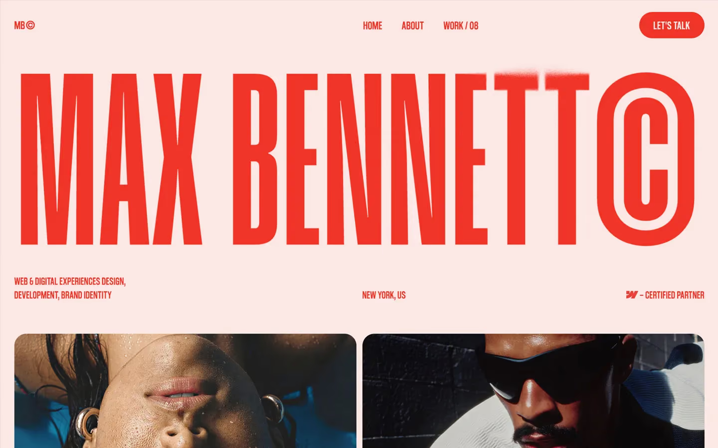


Max Bennet is a loud, two-colour personal portfolio. The whole page is signal red (#F13427) on a pale blush (#FBE7E4): a red name set so large and so condensed that it fills the width, small red uppercase labels, and a grid of saturated, flash-lit editorial photos. There is no black, no grey and no third colour in the interface, so the photos and the red do all the work.
Four signatures make it recognisable:
- The giant smeared name. MAX BENNET© runs edge to edge in Humane at 490px, an ultra-condensed face with tall, narrow letters. Part of the word dissolves into a red spray-paint blur that follows the pointer (a Unicorn Studio WebGL effect).
- Red on blush only. Text, buttons and the footer use #F13427; the page, and all text on red or on photos, use #FBE7E4. Nothing else.
- The © habit. The logo is MB©, the name ends in a tall stadium-shaped ©, and every project caption ends with a year (© 2026, © 2025, © 2023).
- The rising footer. At the end of the page a red card with a 40px radius rises over a sticky full-height footer and reveals LET'S TALK at 360px.
Max Bennet is a light design with one inverse block, the red footer.
Colors
Surfaces
#FBE7E4Page background
#FBE7E4 · 50%Soft blurred layers (8 uses), such as the band behind captions at the bottom of photos
#F13427The footer card and its text
Ink
#FBE7E4Text on primary
#FFFFFF#F13427Every text on the blush: the hero name, nav, labels, meta
#F13427Body text uses the same red; there is no secondary text colour
#FBE7E4Project captions and years on photos
#FFFFFFClient logos centred on photos
#FBE7E4Text on inverse-canvas
Action
#F13427The LET'S TALK pill
#2B2B2BThe dark fill that slides up inside the pill on hover
Lines & effects
#FBE7E4 · 50%The 1px base line under footer links
#FBE7E4The 1px line that wipes across a footer link on hover
Typography
Humane · display-hero · shown in Big Shoulders (fallback)
The quick brown fox jumpsMAX BENNET© (34vw at 1440). 490px · 400 · 0.91 · 7.3px
Coolvetica Condensed · title-caption · shown in Oswald (fallback)
The quick brown fox jumpsProject names and years on photos: FORMA DIGITAL, 2026. 22px · 400 · 0.85 · 0.4px
Inter · copyright-mark
The quick brown fox jumpsThe © glyph before years. 19px · 400 · 0.85 · 0.4px
Coolvetica Condensed · nav · shown in Oswald (fallback)
The quick brown fox jumpsHOME V1, ABOUT, WORK / 08. 19px · 600 · 1.1 · 0.5px
Coolvetica Condensed · label · shown in Oswald (fallback)
The quick brown fox jumpsFooter line links. 19px · 500 · 1.1 · 0.5px
Coolvetica Condensed · logo · shown in Oswald (fallback)
The quick brown fox jumpsMB©. 19px · 600 · 1.3 · 0.5px
Spacing & shape
| Purpose | Value |
|---|---|
| Container | 100% wide; sections pad 2% on every side (29px at 1440) |
| Breakpoints | 991px, 767px, 479px |
Spacing scale
| Token | Value | Preview |
|---|---|---|
hair | 4px | |
xs | 10px | |
sm | 20px | |
md | 30px | |
lg | 50px | |
xl | 60px | |
2xl | 100px | |
3xl | 120px |
Layout spacing
| Token | Value | Preview |
|---|---|---|
grid-gap | 10px | |
caption-pad | 16px | |
gutter | 29px | |
section | 29px | |
nav-height | 84px |
Border radius
Motion
| Smooth scroll | Lenis on the page |
| Hero smear | Unicorn Studio WebGL blur on the name |
| Fade in | Opacity 0 → 1, 500ms |
| Rise in | y 20% → 0%, 500ms; y → 0%, 300ms ease |
| Skew-in reveal | skewX 30° → 0, y → 0% and opacity, 400ms outCubic |
| Text roll | y 0 → −100% with a copy rolling in, 300ms ease |
| Scale in | scale 0 → 1, 500ms, for small badges |
| Image hover | scale 1.05, 600ms outExpo; filter change 200–300ms ease |
| Hover dim | Opacity to 0.6, 300ms easeIn |
| Line wipe | Width change, 300ms ease or 500ms |
| Rotate | 500ms, or 600ms outExpo for icons |
Do’s and don’ts
- Use only #F13427 and #FBE7E4: red on blush, blush on red and on photos.
- Set the hero name in Humane at about 34vw so it fills the width, ending in ©.
- Set every label, link and caption in Coolvetica Condensed uppercase at 17–22px with +0.4 to +0.6px tracking.
- Give project photos a 20px radius and a 10px gap, captioned NAME left and © YEAR right.
- Use the red pill (44px tall, 50em radius) for the single action, with the #2B2B2B slide-up hover.
- End the page with the sticky footer and the 40px-radius red card.
- Add black, grey or any third colour to the interface.
- Set small body text below 17px in red on blush; the pair is 3.4:1 and only works for large or bold type.
- Use mid-sized headlines (40–120px); the style is enormous or small.
- Use the loaded Playfair Display or the declared Caveat.
- Add borders, shadows or dividers on the blush.
- Put coloured overlays on photos.
Example prompt
Any page in the Max Bennet style
More design systems like this
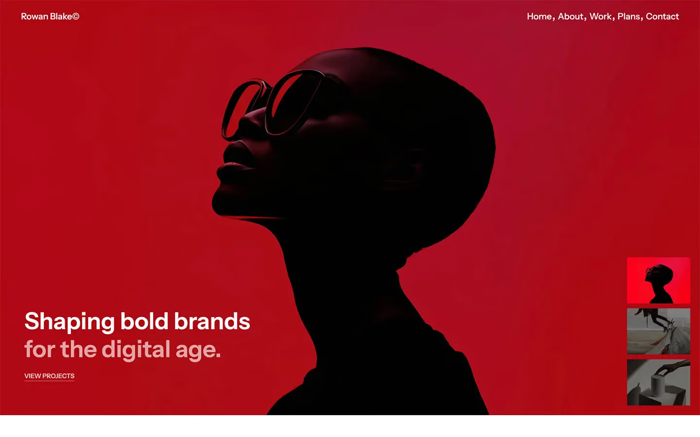
Portfolio design systems, the same colors first.


Bring any of them to your AI tool
All Access unlocks all 398 design systems, ready for Claude, ChatGPT, Gemini, Cursor, v0 and Lovable, plus 400+ templates on all 5 platforms.
Get All AccessUpgrade to All AccessHow to use the Max Bennet design system
Pick a file to see what it’s for and where it goes.
What it is
The whole design system in one markdown file, written for AI: every color, type style, spacing value, component and motion rule, plus do's, don'ts and a ready prompt.
Best for
Claude, ChatGPT, Gemini, Cursor and v0, or any other AI tool that builds pages or code.
How to use it
- Put
DESIGN.mdin your project and mention it in your request, or save it as.cursor/rules/max.mdc - For the rule file, start it with a front-matter block that sets
alwaysApply: true, so every chat uses it - Ask: “Build a pricing page using DESIGN.md.” Cursor follows the colors, fonts, spacing and rules
- Put
DESIGN.mdin the project root - Add one line to
CLAUDE.md: “Follow DESIGN.md for all UI.” - Ask for any page or component; Claude reads the file first
- Attach
DESIGN.mdto the chat (or paste it in) - Ask: “Build a landing page in this design system.”
- Keep the file in the chat or project knowledge, so follow-up pages stay on style
What it is
Every token as data, in the W3C Design Tokens format: colors with their roles, type styles, radius, spacing, and component tokens that point at them.
Best for
Figma (Tokens Studio), Style Dictionary and other design-token tools, and build scripts.
How to use it
- In Figma, open Tokens Studio, choose Import, and pick
tokens.json - Or point Style Dictionary’s
sourceat it to generate tokens for any platform - In code, import it like any JSON file
What it is
A Tailwind CSS v4 theme: every color, font, type style, radius and spacing value becomes a Tailwind utility, like bg-canvas, text-headline-lg or rounded-md.
Best for
Tailwind v4 projects, and AI builders that write Tailwind (v0, Lovable, Bolt).
How to use it
- Save
theme.cssnext to your main CSS file - Import it after Tailwind:
@import "tailwindcss"; @import "./theme.css"; - Use the classes:
bg-canvas text-ink rounded-md p-lg
What it is
The same tokens as plain CSS variables on :root. Component values point at the color variables, so changing one color updates everything that uses it.
Best for
Any website: plain CSS, Webflow custom code, Framer, WordPress.
How to use it
- Add it to your stylesheet, or in Webflow paste it into Site settings → Custom code inside a
<style>tag - Use the variables anywhere:
color: var(--color-ink) - Change a token once and every place that uses it follows